It was a first in sailing, shedding new light on an event taking place hundreds of kilometers from the shoreline.
The crashing waves and turbulent seas of the Volvo Ocean Race have never been captured in more dramatic style than when Sam Greenfield first brought drone footage to the event often dubbed the world's toughest race.
"It was just a shot that hadn't been done before and it was, you know, an opportunity to get a perspective off the boat that no one had ever seen," Greenfield tells CNN Mainsail.
"I just went for it on the most absolutely dead calm day in the middle of the ocean and slowly worked up confidence ... it's really awesome to see that it's just something that everyone's embracing."
Yann Riou (team Brunel) shows how you do a drone flight on moving ship on the middle of the ocean.
This year's Volvo Ocean Race is 46,000 nautical miles, traversing four oceans, six continents and 12 host cities.
The event's nine-month long progress can be tracked online, where competitors are currently on their sixth leg between Hong Kong and Auckland.
Onboard reporter Sam Greenfield is the first person to record the iconic Volvo Ocean Race from an aerial perspective.
Travelling together with the ship’s crew, he used a DJI Phantom to capture the race from his behind-the-scenes point of view.
These unique images show the true scale of the Volvo Ocean Race.
Mastering the art
Growing up in the Noank, Connecticut, a small village with a rich history on fishing, sailing and ship-building, Greenfield hails from seafaring stock.
He made history in the 2014-15 edition when he successfully flew a drone above the Dongfeng Race Team yacht while serving as an on-board reporter (OBR).
He describes his role as "the direct link between the race yacht crew and the rest of the world," wrestling with the elements to capture the perfect angle of the race for each of the seven teams competing.
"It can be really easy or it can be really challenging depending on the sea state and the wind conditions," says Greenfield.
"If it's over 25 knots (46km/h) you get sea spray which can take the drone down. If you have a lot of waves and you're going up-wind retrieving it is incredibly difficult.
"But if you're running down-wind and the boat's going fast and you have long waves it's actually kind of pleasant after a bit of practice."
courtesy of Ugo Fonollá, mediaman onboard of Mapfre
'More risks' lie ahead
On the surface, the Volvo Ocean Race may not seem particularly spectator-friendly; but take a tour of the race's website, and you'll find videos, photos, live satellite trackers, blogs and leaderboards -- much of which has been captured within the past hour.
Mirpuri Foundation "Turn the Tide on Plastic" boat drone footage during Volvo Ocean Race Leg 2 from Lisbon to Cape Town.
courtesy of James Blake, mediaman onboard of "Turn the Tide on Plastic"
Greenfield's innovation may have been a leap into the future of sailing, but he predicts that viewers will be brought even closer to the sport in the coming years.
"I think people really want to see live stream content from really remote parts of the world," he says.
"Basically launch a drone, have it direct back into somebody's living room with commentary from the boat and I think that's probably available now if not very soon.
"And beyond that it's just going to be bigger conditions, bigger waves and more risks ... in terms of what you're seeing and what it's actually like out there."
A powerful new weather satellite launched today (March 1) from Cape Canaveral Air Force Station in Florida, heading toward a perch above the eastern Pacific Ocean to monitor extreme weather as it develops.
NOAA's GOES-S satellite launched March 1 on ULA's Atlas V rocket from Cape Canaveral Air Force Station in Florida.
The advanced weather satellite will give researchers and meteorologists unparalleled views of the U.S. West
The satellite, called GOES-S (Geostationary Operational Environmental Satellite-S), lifted off on ULA's Atlas V rocket at 5:02 p.m.EST (2202 GMT).
The National Oceanic and Atmospheric Administration (NOAA) will operate GOES-S in partnership with NASA.
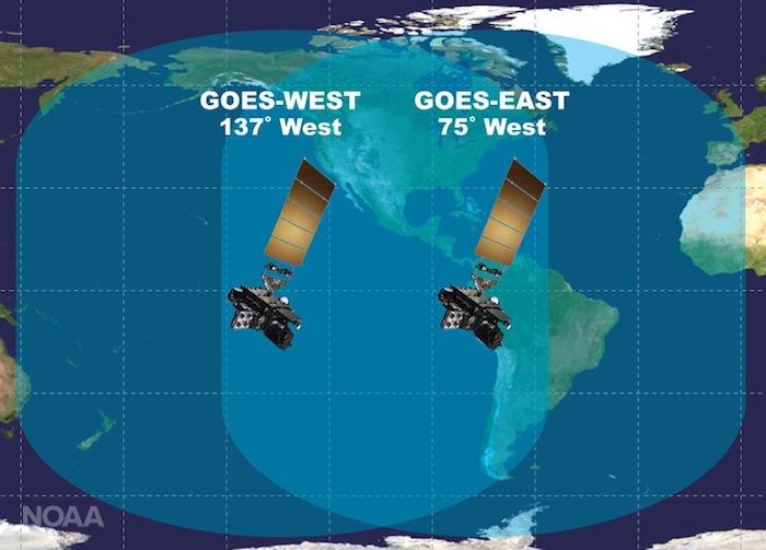
The Lockheed Martin-built satellite will join GOES-East, currently in orbit, to provide a broad, high-definition view of weather on Earth.
It is the second in a series of four advanced weather satellites that will reside in geostationary orbit — hanging in place over one spot on Earth as they orbit and the world turns.
"GOES-S will provide more accurate data with higher temporal resolution to track storm systems, lightning, wildfires, the coastal fog [and] volcanic ash plumes that impact the western U.S., Alaska, Hawaii and the coastal to eastern Pacific ocean," Louis Uccellini, director of the National Weather Service at NOAA, said during a news conference Tuesday (Feb. 27).
"There are unique aspects of these intense Pacific storms that we'll be able to observe more accurately and use in our forecast process."
"I believe very strongly GOES-S will improve the scientific understanding for the western U.S., just like GOES-East has for the eastern U.S., and is another step forward in our overall effort to build a weather-ready nation," Uccellini added.
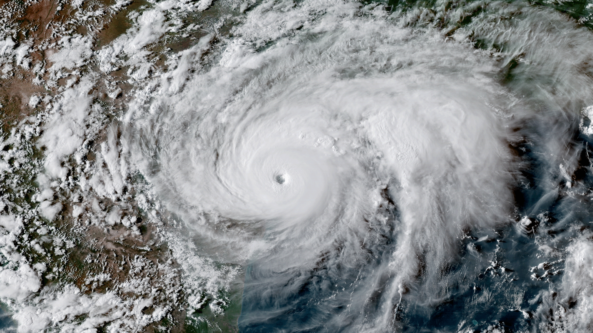
GOES-16 imagery of Hurricane Harvey making landfall in Texas on August 25, 2017. (NOAA) Like GOES-16, which provided groundbreaking new data and imagery during the severe 2017 Atlantic hurricane season, GOES-S will bring this same new technology to the Pacific Ocean.
This means forecasters will have new high-resolution imagery of atmospheric rivers, as well as Pacific hurricanes that track toward Hawaii or Mexico during the summer and autumn.
The current GOES-East satellite launched in 2016, and it has provided views of developing weather in unprecedented detail.
NOAA used GOES-East to track hurricanes Harvey, Irma, Maria and more, as well as January's bomb cyclone and other extreme weather events, including wildfires developing in northern Texas.
The new GOES-S will be at a vantage point to help analyze California's wildfires in more detail, as well.
The satellite will scan the skies five times faster than the GOES-West satellite it will replace, will have four times the spatial resolution and use three times as many spectral bands.
Besides fire, lightning and tropical storms, the satellite can also track the influx of charged particles and radiation from the sun called space weather.
The satellite will be able to scan each spot below it every 5 minutes, or every 1 minute to 30 seconds on special focus areas — in the latter case, for developing weather events.
Together, GOES-S (which will be renamed GOES-West) and GOES-East will be able to focus on four locations to refresh views every minute, or two locations to refresh views every 30 seconds.
"Those of us in the severe weather community are really excited about the data we're seeing from GOES-16 [GOES-East]," Kristin Calhoun, a research scientist with NOAA's National Severe Storms Laboratory, said during the conference.
"And we're also eagerly anticipating the increased coverage from GOES-S across the United States."
"For the first time, space-based observations from geostationary satellites and ground-based observations such as Doppler weather radars are in cadence with each other, providing the ability to create a top-to-bottom, linked profile of a severe thunderstorm through direct observation," Calhoun added.
"This has a direct impact on severe thunderstorm research, diagnosis and hazardous weather forecasting."
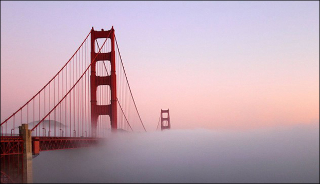
You don’t have to live on the West Coast to know that coastal fog is a hallmark weather event in places like San Francisco and parts of the Pacific Northwest.
Not only will GOES-S provide high-resolution, real-time imagery of fog conditions, but the satellite’s rapid scanning capabilities will also help forecasters predict when fog will clear.
A visceral view
At the news conference and at another one held earlier on Feb. 27, NOAA and NASA researchers shared stories of how GOES-East's remarkably clear views have aided in search-and-rescue operations as well as in forecasting.
During Hurricane Harvey, for instance, data from the satellite allowed first responders to know when it was safe to go out as the storm's eye passed overhead, rescuing more than 200 people — and when to take shelter just before the back of the eyewall swept back over.
During wildfire season in California, people using GOES data were able to warn local authorities about fires before they'd even been spotted on the ground.
And just viewing weather events in so much detail makes it easier to learn how they work.
"The impact of the visualization, the actual videos, the movies coming out is really visceral," Steve Volz, NOAA's director for satellite and information services, said in the earlier conference.
"It allows the researchers to see the dynamics in a way that just looking at numbers just doesn't reveal — the visual impact is remarkable."
Special mention: A major upgrade for AlaskaCurrent geostationary satellite coverage of Alaska, such as this recent GOES-15 visible imagery, will be replaced by high-resolution imagery in 16 different channels. GOES-S will boost weather prediction all across the western U.S., but the new satellite will be especially valuable to Alaska.
That’s because NOAA’s current geostationary satellites lack sufficient resolution in regions near the Arctic.
GOES-S, however, will provide a significantly clearer view of the Last Frontier - all the way to Alaska’s North Slope, and allow for applications such as tracking sea ice.
The satellite was deployed a little after 8:30 p.m. EST today (1:30 a.m. GMT on March 2).
It will now spend about three weeks making its way into geostationary orbit.
After about six months at that latitude preparing its instruments and running checks, it will move to its final vantage point over the eastern Pacific Ocean, taking on the official name GOES-West.
GOES-S will complement other geostationary satellites, like GOES-East, as well as polar-orbiting satellites like JPSS-1, which launched last November.
Several other nations share weather satellite data with each other and NOAA to provide more complete coverage.
"Every forecast, whether it's one day, two days, three days, out to seven days in advance, depends on sophisticated numerical models, the world's fastest computers and a global observing system," Uccellini said.
"And NOAA's satellite data provides the backbone for the global observing system, and is the critical element for weather forecasting in the extended ranges.
The geostationary satellite, the GOES series, is a crucial component of today's global observing system."
The four-satellite GOES-R program has a total budget of $10.8 billion through its entire life cycle.
Development began in 2005, and the program will extend through 2036.
The next satellite, GOES-T, is scheduled for launch in 2020.
Winter temperatures are soaring in the Arctic for the fourth winter in a row.
The heat, accompanied by moist air, is entering the Arctic not only through the sector of the North Atlantic Ocean that lies between Greenland and Europe, as it has done in previous years, but is also coming from the North Pacific through the Bering Strait.
“We have seen winter warming events before, but they’re becoming more frequent and more intense,” said Alek Petty, a sea ice researcher at NASA’s Goddard Space Flight Center in Greenbelt, Maryland.
Scientists are waiting to see how much this heat wave will impact the wintertime sea ice maximum extent, which has been shrinking in the past decades and has hit record lows each of the past three years.
The sea ice levels are already at record lows or near-record lows in several areas of the Arctic.
Another exceptional event this winter is the opening up of the sea ice cover north of Greenland, releasing heat from the ocean to the atmosphere and making the sea ice more vulnerable to further melting.
“This is a region where we have the thickest multi-year sea ice and expect it to not be mobile, to be resilient,” Petty said.
“But now this ice is moving pretty quickly, pushed by strong southerly winds and probably affected by the warm temperatures, too.”
An alarming heatwave in the sunless winter Arctic is causing blizzards in Europe and forcing scientists to reconsider even their most pessimistic forecasts of climate change.
Although it could yet prove to be a freak event, the primary concern is that global warming is eroding the polar vortex, the powerful winds that once insulated the frozen north.
Daily 2 m surface air temperature for the Arctic averaged above 80°N.
Individual years from 1958-2017 are shown by the sequential blue/purple to yellow lines.
2018 is indicated by the red line.
ERA40 has been applied for the 1958-2002 climatology (white line), while the operational ECMWF is used for the current year.
The north pole gets no sunlight until March, but an influx of warm air has pushed temperatures in Siberia up by as much as 35C above historical averages this month.
Greenland has already experienced 61 hours above freezing in 2018 - more than three times as many hours as in any previous year.
Seasoned observers have described what is happening as “crazy,” “weird,” and “simply shocking”.
“This is an anomaly among anomalies.
It is far enough outside the historical range that it is worrying – it is a suggestion that there are further surprises in store as we continue to poke the angry beast that is our climate,” said Michael Mann, director of the Earth System Science Center at Pennsylvania State University.
“The Arctic has always been regarded as a bellwether because of the vicious circle that amplify human-caused warming in that particular region.
And it is sending out a clear warning.”
Although most of the media headlines in recent days have focused on Europe’s unusually cold weather in a jolly tone, the concern is that this is not so much a reassuring return to winters as normal, but rather a displacement of what ought to be happening farther north.
Annual average 2-m temperature anomalies in the Arctic (67°N+) for various reanalysis data sets.
Anomalies are calculated from a 1981-2010 baseline. courtesy of Zachary Labe
At the world’s most northerly land weather station - Cape Morris Jesup at the northern tip of Greenland – recent temperatures have been, at times, warmer than London and Zurich, which are thousands of miles to the south.
Although the recent peak of 6.1C on Sunday was not quite a record, but on the previous two occasions (2011 and 2017) the highs lasted just a few hours before returning closer to the historical average.
Last week there were 10 days above freezing for at least part of the day at this weather station, just 440 miles from the north pole.
“Spikes in temperature are part of the normal weather patterns – what has been unusual about this event is that it has persisted for so long and that it has been so warm,” said Ruth Mottram of the Danish Meteorological Institute.
“Going back to the late 1950s at least we have never seen such high temperatures in the high Arctic.”
NASA satellite imagery shows a strong storm near Greenland on Feb. 23 that drew a major pulse of warm air into the Arctic.
The cause and significance of this sharp uptick are now under scrutiny.
Temperatures often fluctuate in the Arctic due to the strength or weakness of the polar vortex, the circle of winds – including the jetstream – that help to deflect warmer air masses and keep the region cool.
As this natural force field fluctuates, there have been many previous temperature spikes, which make historical charts of Arctic winter weather resemble an electrocardiogram.
But the heat peaks are becoming more frequent and lasting longer – never more so than this year.
“In 50 years of Arctic reconstructions, the current warming event is both the most intense and one of the longest-lived warming events ever observed during winter,” said Robert Rohde, lead scientist of Berkeley Earth, a non-profit organisation dedicated to climate science.
The question now is whether this signals a weakening or collapse of the polar vortex, the circle of strong winds that keep the Arctic cold by deflecting other air masses.
The vortex depends on the temperature difference between the Arctic and mid-latitudes, but that gap is shrinking because the pole is warming faster than anywhere on Earth.
While average temperatures have increased by about 1C, the warming at the pole – closer to 3C – is melting the ice mass.
According to Nasa, Arctic sea ice is now declining at a rate of 13.2% per decade, leaving more open water and higher temperatures.
GFS model analysis of temperature difference from normal (in Celsius) on Sunday over the Arctic.
The temperature is above freezing at the North Pole.
(University of Maine Climate Re-analyzer)
GFS model analysis of temperatures (in Celsius) on Sunday over the Arctic.
(University of Maine Climate Re-analyzer)
Some scientists speak of a hypothesis known as “warm Arctic, cold continents” as the polar vortex becomes less stable - sucking in more warm air and expelling more cold fronts, such as those currently being experienced in the UK and northern Europe.
Rohde notes that this theory remains controversial and is not evident in all climate models, but this year’s temperature patterns have been consistent with that forecast.
Longer term, Rohde expects more variation.
“As we rapidly warm the Arctic, we can expect that future years will bring us even more examples of unprecedented weather.”
Jesper Theilgaard, a meteorologist with 40 years’ experience and founder of website Climate Dissemination, said the recent trends are outside previous warming events.
“No doubt these warming events bring trouble to the people and the nature.
Shifting rain and snow – melt and frost make the surface icy and therefore difficult for animals to find anything to eat.
Living conditions in such shifting weather types are very difficult.”
Others caution that it is premature to see this as a major shift away from forecasts.
“The current excursions of 20C or more above average experienced in the Arctic are almost certainly mostly due to natural variability,” said Zeke Hausfather of Berkeley Earth.
“While they have been boosted by the underlying warming trend, we don’t have any strong evidence that the factors driving short-term Arctic variability will increase in a warming world.
If anything, climate models suggest the opposite is true, that high-latitude winters will be slightly less variable as the world warms.”
Although it is too soon to know whether overall projections for Arctic warming should be changed, the recent temperatures add to uncertainty and raises the possibility of knock-on effects accelerating climate change.
“This is too short-term an excursion to say whether or not it changes the overall projections for Arctic warming,” says Mann.
“But it suggests that we may be underestimating the tendency for short-term extreme warming events in the Arctic.
And those initial warming events can trigger even greater warming because of the ‘feedback loops’ associated with the melting of ice and the potential release of methane (a very strong greenhouse gas).”
In 1939, Coast Survey published its first chart with a new focus on depth contours. The new depth curves helped navigators of that era locate the position of their vessels by comparing a line of echo soundings with the charted depth contours. Publisher: US C&GS Coast & Geodetic Survey (1939) Image: 5101a-03-1939 / Scale: 1:232702
In 1844, the United States Coast Survey published its first official nautical chart.
It was the result of an immense amount of manual topographic and hydrographic surveying, manual drafting, manual engraving on copper printing plates, and manual intaglio printing (using black ink from copper plates).
In 1939, the United States Coast and Geodetic Survey (C&GS) published its first nautical chart that included isobaths as the primary representation of the seafloor rather than individual depth soundings.
Data for the isobaths were collected by a recording echo sounder, while topographic revision was performed from aerial photographs.
The production process included manual and mechanical scribing on wet-plate glass negatives; additional chart compilation using photography to merge in standard elements; photographic transfer to aluminum lithographic printing plates; and printing in multiple colors on a powered rotary offset press.
A major innovation for the C&GS came in March 1939 with the publication of a new edition of Chart 5101, designated 5101A (U.S. Department of Commerce et al. 1940, 99; Shalowitz 1964).
It marked the beginning of a new role for bathymetric contours.
It was the first chart designed for ships that have their own echo-sounders on board.
Recording echo sounders allowed the survey to collect orders of magnitude more information about landforms at the bottom of water bodies.
Continuing to place primary responsibility for representing this information with the point data that soundings represent did not do justice to the richness of the data now available.
Instead of playing a subsidiary role to the soundings on the chart, contours could now play the same role as topographic contours, that of being the primary representation of the land surface.
This change in role can be seen in such chart editions as MH400 1938, 1942, and 1951, and E1200 1927, 1938, and 1948.
As these series progress, contours gain significant detail, while soundings either remain as they were or, as in E1200 1948, are dramatically reduced.
NOAA 18740 (click on the link to see the interactive map) current nautical chart with the GeoGarage platform overlaid on Google Maps imagery and bathymetry
The beginning of the full transition away from the last of the original techniques began in 1939 when the first chart was published that fully incorporated the possibilities for different symbology offered by the vast quantities of data created by recording echo sounders.
Charts continued to evolve after 1939, entering a new phase around 1980 based on internationally approved symbology, but the greatest changes are evident by 1939.





:gifv():no_upscale()/cdn.vox-cdn.com/uploads/chorus_asset/file/10314755/GOES_satellites.gif)