Friday, July 8, 2016

Intensification and poleward shift of oceanic boundary currents

Climatological annual mean ocean surface net heat flux: The black rectangle local the position of subtropical western boundary currents. Color present the ocean surface net heat flux. Positive values mean that the ocean release heat to the atmosphere, and vice versa. So, in general, ocean get heat from the tropical regions and release them to the mid-latitudes, especially over the routes of the subtropical western boundary currents. In a warming climate, the subtropical western boundary currents (except the Gulf Stream) are going to be stronger and shifting toward the poles. They will bring more heat and contribute to a much warmer climate over the adjacent regions (e.g.., Japan, China). (Grafik: Hu Yang)

From AWI

Global warming results in fundamental changes to important ocean currents.
As scientists from the Alfred-Wegener-Institute show in a new study, wind-driven subtropical boundary currents in the northern and southern hemisphere are not only going to increase in strength by the end of this century.
The Kuroshio Current, the Agulhas Current and other oceanic currents are shifting their paths towards the pole and thus carry higher temperatures and thus the risk of storms to temperate latitudes.
For this study, researchers evaluated a wealth of independent observational data and climate simulations.
They showed the same pattern for all boundary currents, with the Gulf Stream as the only exception. According to the data, the latter will weaken over the next decades.
The study has been published today in the Journal of Geophysical Research professional journal.

Along the eastern coasts of South Africa, Asia, Australasia, and South America, weather and climate will get significantly warmer over the next 100 years and thus presumably also significantly stormier on global average.
The reason for this are changes to the western boundary currents that are already beginning to have a significant impact on weather events in these coastal regions.

These surface currents are driven by the wind; with flow speeds of up to nine kilometres per hour, they are amongst the fastest ocean currents in the world.
They reach down to a depth of 1000 metres and move warm bodies of water from the tropics to the coastal regions of the temperate latitudes.
The best-known western boundary current in Europe is the Gulf Stream.
Across the world, however, these also include the Kuroshio Current off the coast of Japan, the Brazil Current off the eastern coast of South America, the Eastern Australia Current as well as the Agulhas Current off the coast of South Africa.

Scientists from the Alfred-Wegener-Institute, Helmholtz Centre for Polar and Marine Research (AWI) have discovered these changes in a major comparative analysis of eleven independent climate data bases.
On the one hand, the scientist evaluated oceanographic observational data as well as satellite data on the currents’ heat loss between 1958 and 2001.
On the other, they considered simulations for past and future climates as well as indicators for the flow speed of the currents, for water temperature and air pressure at the sea surface.

“Our analysis shows that the surface temperature of the boundary currents has increased two to three times faster than in other oceanic regions. In addition, the currents release 20 percent more heat than they did half a century ago, which leads to the conclusion that the temperature of the water has risen, its flow speed has increased and the currents thus transfer more water and also more heat from the tropics towards the pole. The cause of these changes were increasing winds in both hemispheres,” explains Hu Yang, AWI climate researcher and author of the study.

The greater the heat transfer from the sea, the higher possibly the probability of storms.
“Over the next decades, Japan, China and Korea will need to expect higher air temperatures particularly in winter, because the Kuroshio Current will transport more heat and shift northward with the wind.
This heat will change the atmospheric condition in such as way as to make storms more likely in this region.
For the Eastern Australian Current, the Brazil Current and the Agulhas Current on the southern hemisphere, our analyses predict a southward shift, because there, too, the winds shift poleward,” explains Prof. Gerrit Lohman, climate modeller at the Alfred-Wegener-Institute and co-author of the study.


The ocean get heat from the tropical regions and release them to the mid-latitudes, especially over the routes of the subtropical western boundary currents.
In a warming climate, the subtropical western boundary currents (except the Gulf Stream) are going to be stronger and shifting toward the poles.
They will bring more heat and contribute to a much warmer climate over the adjacent regions (e.g.., Japan, China).
(Foto: Frank Rödel)

The Gulf Stream will become weaker

Warmer, stronger, poleward - according to the results, this pattern applies to all western subtropical boundary currents.
The only exception is the Gulf Stream.
“All of our results predict its long-term weakening. The reason for this is that the Gulf Stream is not only driven by the wind, but is also coupled with the thermohaline circulation. This is also often referred to as a global conveyor belt. Our results indicate that the power of this conveyor belt will weaken in the long term - and in an order of magnitude that more than compensate for the plus of increasing winds. Without the influence of this circulation, the Gulf Stream would follow the same patterns as the other boundary currents,” outlines Gerrit Lohmann.

The climate scientists also fear far-reaching consequences for the fauna and flora of the coastal regions.
“As these currents bring higher temperatures to these temperate latitudes, while advancing further north or south, many species will be forced to move to colder regions.
But some of them won’t be able to face this challenge,” explains Gerrit Lohmann one of the possible consequences of the observed changes.   

Thursday, July 7, 2016

Renaissance worldview: Pierre Desceliers' 16th-century map

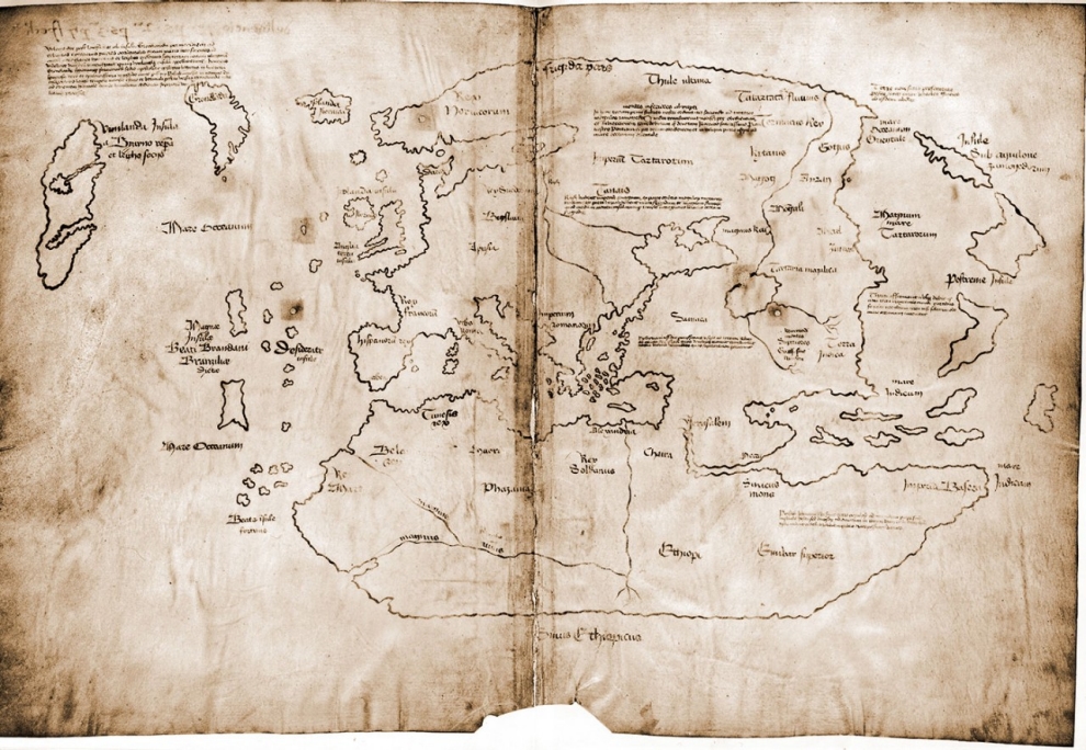
Pierre Desceliers, World Map, 1550, 178 x 219cm, manuscript on vellum:
This compendious hand-painted map of the world was produced in Dieppe for the King of France, and celebrates the recent discoveries of Jacques Cartier on the north-east coast of America. But it is more than simply a map of French glory for its ruler: it is a visual encyclopaedia of the legends, natural history and ethnography of the world.
With it, the King could learn and display his worldly knowledge.
The map was meant to be viewed on a table, and so the information to the top of the map appears upside-down to the modern viewer.
It is the most extravagant of all geographical indexes.
Photograph: The British Library

From SantaFeNewMexican 

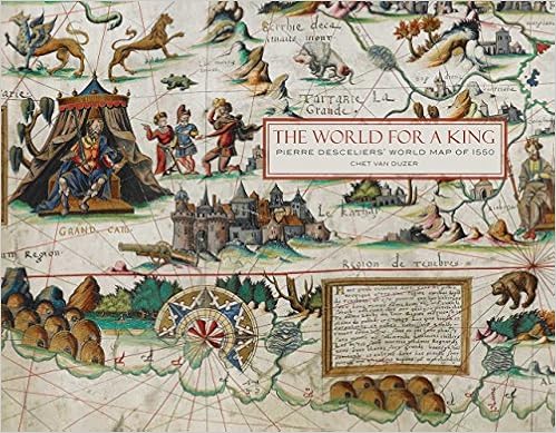
“The World for a King: Pierre Desceliers’ Map of 1550” by Chet Van Duzer was published last year by The British Library. 

Map aficionados will arrive from near and far for this weekend’s Map Mania Symposium at the New Mexico History Museum.
Some will probably be guided to their destination by the reassuring voice of a GPS system built into their cars or accessed through their cellphones.
Harnessing satellite communications to provide instantaneous global positioning has become the norm for navigation in the early 21st century, but the accuracy gained through this technology has come at the cost of another desirable trait of cartography: fantasy.
Pasatiempo last met up with the work of cartographic historian Chet Van Duzer two and a half years ago, when we paged through his opulent volume Sea Monsters on Medieval and Renaissance Maps, published by The British Library.

 This lavishly produced new study features a full-scale color reproduction and commentary on one of the British Library's greatest treasures, the manuscript world map of 1550 produced by Pierre Desceliers.
The map is one of the most important of the "Dieppe School" of cartography that flourished in Normandy from the 1540s to the 1560s.
Chet Van Duzer's fascinating text situates the map in context among Desceliers' other surviving works; analyzes the map's many illustrations of people, animals, and cities; discusses its curious hypothetical southern continent; and includes translations of all the long descriptive texts on the map.
The text makes a major contribution to cartographic history and to our understanding of one of the most beautiful maps ever produced.
Following a substantial introduction, the map is reproduced at real size in 42 sections, each accompanied by detailed explanatory notes, and a reduced-size removable reproduction of the entire map is inserted at the back of the book.
The product of several years' research, this study follows the author's best-selling Sea Monsters on Medieval and Renaissance Maps and is sure to appeal to the same wide audience of map-lovers.

In that book, he focused on the beasts that populate the otherwise empty oceans of medieval and Renaissance maps, ranging from the hostile (such as the sawfish that swims beneath vessels and slices them in half) to the beneficent (the whale that allowed the friar Bernardo Buil to construct an altar on its back) and the merely curious (like the marine dog and marine chicken).
Among the many fauna-filled maps he considered, Van Duzer passed fleetingly over Pierre Descelier’s “large … and gloriously coloured manuscript world map of 1550,” which he found to be “not very rich in sea monsters,” although it did have a few.
That map, it turns out, was unusually interesting in other ways.

It is the subject of his latest book, The World for a King: Pierre Desceliers’ Map of 1550, also published by The British Library and no less sumptuous than its predecessor.
Van Duzer offers a précis of the map at the outset: “This book is about one of the most spectacular maps to survive from the sixteenth century, the world map made by the Norman cartographer Pierre Desceliers for presentation to King Henry II of France in 1550.
It is composed of four conjoined pieces of parchment that together measure an imposing 135 x 215 centimeters (4 feet 5 inches by 7 feet 1 inch), and is elaborately hand-painted with illustrations of cities, kings, exotic peoples, animals, ships, and sea monsters, and has twenty-six long descriptive texts that seem to have been composed especially for this map.”
The scale of the map suggests that it was meant to be displayed on a table, with viewers ranged around it.

Indeed, the inscriptions on the bottom half look normal to us, but those on the top half are upside down; that is a practical solution to aid legibility for readers standing on either side.
Van Duzer knows how to read a map — which is to say, a map’s details come alive to him as embodiments of history, tradition, and individuality.
Three coats of arms are drawn on Desceliers’ map — those of Henry II; Anne de Montmorency, Constable of France; and Claude d’Annebault, Admiral of France.
Van Duzer believes that they provide a framework for understanding why this undertaking came about.

It strikes him as unusual that the insignia of any high officials would grace the map along with that of the king, but he thinks their presence suggests that this map helped resolved a political altercation.
Montmorency had fallen out of favour with Henry’s father, Francis I, toward the end of his reign, and Annebault had risen to become Francis’ favourite and most trusted counselor.
But when Henry became king in 1547, he reinstated his friend Montmorency who, harbouring a grudge against Annebault and also eager to solidify his position as the king’s closest adviser, persuaded Henry to make Annebault understand that he was no longer welcome at court.
In 1550, when Desceliers made his map, Annebault was still trying to find his way back into Henry’s favour — and into Montmorency’s as well.
In fact, the best explanation of the coats of arms on Desceliers’ 1550 map is that the map was a gift from Annebault to Henry and Montmorency, part of his efforts to restore himself to their good graces, and perhaps a signal of his desire to cooperate with Montmorency.
… This map’s extravagant decoration may be seen as Annebault’s attempt to give a gift so beautiful as to dim all memory of resentments past, and a nautical chart is certainly an appropriate offering from an admiral.

It does indeed fall in the tradition of nautical charts.
These were the most common kind among maps that charted large areas or, as here, the world.
It stands to reason: Most exploration in the 16th century was achieved aboard ship.
Explorers experienced distant lands mainly from sailing along their perimeters, with forays to the interior being rare in comparison.
“The cartographic emphasis was on the coastlines,” Van Duzer writes, “while the hinterlands were thought of largely as areas for decoration.”
Apart from the paucity of sea monsters, Desceliers’ decoration is marvelous.
It was almost certainly carried out not by Desceliers himself, but rather by a specialist artist in his workshop.

Desceliers would have been more personally involved in the aspects more directly bearing on navigation: the accuracy of coastlines and land masses, the proper situation of cities, the overlay of a geometric grid of lines that would have been relevant to mariners plotting courses.
In many ways, Desceliers’ map is accurate by the standards of 1550.
It reveals that he was reasonably conversant with the information coming in from European explorers in distant corners of the globe.
Nonetheless, the mapmaker resists giving up on certain longstanding beliefs and traditions, some of which date back to Ptolemy and even earlier.

One example “is his retention of the designation La zona torrida or La zone torride for the equatorial regions. The idea that the equatorial regions were uninhabitably hot had first been proposed by Aristotle in the fourth century BC, and was both elaborated on and debated throughout the Middle Ages; but during the European expansion explorers quickly realized that the equatorial zones were not only habitable, but inhabited. By 1550 Desceliers certainly should have known this.”

So far as geographical accuracy is concerned, the map does quite well with Europe, although the scale is somewhat off and Scandinavia is plotted with considerable vagueness.
The city of Paris appears prominent beyond reasonable proportions, but of course there was a political reason for that.
Africa and Asia are pretty much on target, while South America and North America show considerable room for improvement.
Desceliers includes a further continent called La Terre Australe (The Southern Land) along the bottom of the map.

Van Duzer is of the camp that doubts that this has anything to do with what we know as Australia, a continent not represented on his map.
He does not address the possibility that this Southern Land might represent Antarctica, the existence of which was no more than a hypothetical belief at that time.

In other details, Desceliers provides eye-opening information through both his imagery and the 26 descriptive captions that make this map so unusual.
(Around the border are also “twenty-six decorative wind-heads, blowing into the world from one of the traditional wind directions”; one wonders if any meaning might be attached to this numerical coincidence.)
Van Duzer reproduces the map in its entirety, with a large-scale folded version (at about 60 percent of the original size) in a pocket inside the back cover.
For discussion within the book itself, he divides the map into 42 rectangular segments and presents each of these, beautifully reproduced in color, with insightful commentary that helps explain some of the peculiarities we encounter.
The interiors of Desceliers’ continents are abuzz with human activity, filled with depictions of praying, hunting, and interactions both peaceful and bellicose.

We of the New World may satisfy our vanity by considering how Desceliers portrays us.
In 1550, the region that is now New Mexico was still a vague concept in European minds, although by then explorers were wandering about looking for the Seven Golden Cities of Cibola, which was ultimately a wild goose chase.
Desceliers probably knew nothing about this, but in any case his map doesn’t deal with it.
For him, Neufve Espaigne (New Spain) consists of the Caribbean islands and the lands bordering the Gulf of Mexico.
Alongside the appendage we know as Florida is the inlet of a river identified as Gofanto merosto (Gulf leading to the eastern sea).
This body of water, which did not exist, is a holdover from earlier maps that attached it to the (fictional) Sea of Verrazzano, which the Italian explorer Giovanni da Verrazzano dreamed up as a route that must facilitate passage through the newly discovered continent.
A turkey in the margin “is one of the earliest surviving European depictions of the New World bird.” It stands near an architectural grouping (also in the margin) labeled Temixtitan, another name for Tenochtitlán — the ancestor of Mexico City.
Except for that, New Spain is essentially left to the imagination.

Looking to the north, however, Desceliers has interesting things to tell us about Canada, where French explorers were more active.
The name Canada, written boldly in gold, was new to mapmakers; it is thought to have first appeared on a map made in the period 1542-1544.
As with more southerly regions, the Atlantic coast is charted in considerable detail, and just off Terre Neufve (Newfoundland) one of the map’s few sea monsters is spraying water from twin spouts.
Things get still more interesting as we move westward.
Two miners with pickaxes are busy extracting ore, alluding “to widely held hopes about the riches that the New World would contain.”
Next to them stands a unicorn.

Just above the unicorn is a picture of a battle between a band of pygmies and a flock of cranes, explicated by one of Desceliers’ text captions: “Above is an illustration of a people called pygmies, a people of small stature, of about a cubit.
At the age of three they procreate and at the age of eight they die without having before their eyes shame, justice, or honesty.
For this reason they are called brutes, not men.
It is said that they are constantly at war with the birds called cranes.”
Van Duzer transcribes all of the captions in their original French and provides accurate translations and enlightening commentaries.
Here, he observes that the mythical tale of battling pygmies and cranes goes back to Homer, but that Desceliers’ depiction seems more directly derived from the 13th-century philosopher Albertus Magnus.
Albertus set the story in Africa, but more commonly it related to Asia.
“This,” Van Duzer writes, “is an interesting case of the migration of ‘monstrous races’ to the New World.
Their presence in North America was perhaps inspired by Jacques Cartier’s report, in his account of his second voyage made in 1635-6, that Donnacona, ‘King of Canada,’ told him that there were ‘Picquemyans,’ or pygmies, in Canada.” Desceliers had included a similar scene on a map he made in 1546, but there he placed it in Asia.
By 1550, Europeans were increasingly clear about the distinction between Asia and America, but Desceliers seemed not quite ready to commit to the cartological border between the two.
In his fantasy, the Canadian pygmies and cranes belonged to those two regions separately — or perhaps it was one region together.

Links :

Wednesday, July 6, 2016

Maps have ‘north’ at the top, but it could’ve been different

The first known compass rose depicted on a map, in a detail from the Catalan Atlas from 1375, attributed to cartographer Abraham Cresques of Majorca.
Bibliotheque national de France/Wikipedia

From BBC by Caroline Williams

Why are almost all modern maps the same way up?
Caroline Williams explores the intriguing history that led to this orientation – and discovers why it shapes how we see the world in more ways than we realize.

Imagine looking at the Earth from space.
What is at the top of the planet?
If you said the North Pole, you probably wouldn’t be alone.
Strictly speaking, you wouldn’t be right either.
The uncomfortable truth is that despite almost everybody imagining that the world is this way up, there is no good, scientific reason to think of north as being the roof of the world.
The story of how it came to be considered to be that way is heady mix of history, astrophysics and psychology.
And it leads to an important conclusion: it turns out that the way we have decided to map the world has very real consequences for how we feel about it.

 The Vinland map, a 15th century world map purportedly based on a 13th century original.
If authentic, it is the first known depiction of the North American coastline.
Yale University/Wikipedia

Navigating brain

Understanding where you are in the world is a basic survival skill, which is why we, like most species come hard-wired with specialised brain areas to create cognitive maps of our surroundings.
Where humans are unique, though, with the possible exception of honeybees, is that we try to communicate this understanding of the world with others.
We have a long history of doing this by drawing maps – the earliest versions yet discovered were scrawled on cave walls 14,000 years ago.
Human cultures have been drawing them on stone tablets, papyrus, paper and now computer screens ever since.
Given such a long history of human map-making, it is perhaps surprising that it is only within the last few hundred years that north has been consistently considered to be at the top.
In fact, for much of human history, north almost never appeared at the top, according to Jerry Brotton, a map historian from Queen Mary University, London and author of A History of the World in Twelve Maps.
“North was rarely put at the top for the simple fact that north is where darkness comes from,” he says. “West is also very unlikely to be put at the top because west is where the sun disappears.
Confusingly, early Chinese maps seem to buck this trend. But, Brotton, says, even though they did have compasses at the time, that isn’t the reason that they placed north at the top.
Early Chinese compasses were actually oriented to point south, which was considered to be more desirable than deepest darkest north.
But in Chinese maps, the Emperor, who lived in the north of the country was always put at the top of the map, with everyone else, his loyal subjects, looking up towards him.
“In Chinese culture the Emperor looks south because it’s where the winds come from, it’s a good direction. North is not very good but you are in a position of subjection to the emperor, so you look up to him,” says Brotton.

The Kangnido map, a Chinese-influenced Korean map from 1402 (Credit: Wikipedia)

Given that each culture has a very different idea of who, or what, they should look up to it’s perhaps not surprising that there is very little consistency in which way early maps pointed.
In ancient Egyptian times the top of the world was east, the position of sunrise.
Early Islamic maps favoured south at the top because most of the early Muslim cultures were north of Mecca, so they imagined looking up (south) towards it:

Tuesday, July 5, 2016

How rogue waves are created in the ocean : understanding rogue ocean waves may be simple after all


From Georgia University

An international team of scientists has developed a relatively simple mathematical explanation for the rogue ocean waves that can develop seemingly out of nowhere to sink ships and overwhelm oil platforms with walls of water as much as 25 meters high.

The waves stem from a combination of constructive interference – a known wave phenomenon – and nonlinear effects specific to the complex dynamics of ocean waves.
An improved understanding of how rogue waves originate could lead to improved techniques for identifying ocean areas likely to spawn them, allowing shipping companies to avoid dangerous seas. Furthermore, new insights into the unsolved problem of wave breaking and into the wave manifestation of light are to be gained, according to the researchers.

Based on an analysis of the two famous real world Andrea and Draupner rogue waves observed at different oil platforms in the North Sea over the course of a decade, and the recently observed Killard rogue wave at a site for marine renewable energy off the coast of Ireland, the research was reported this week in the journal Scientific Reports.
The work was done by researchers at the Georgia Institute of Technology, University College Dublin, and the Institut FEMTO-ST CNRS-Université de Franche-Comté.
“We saw similar wave behaviors at all three rogue wave sites,” said Francesco Fedele, a professor in the Georgia Tech School of Civil and Environmental Engineering.
“We found that the main mechanism responsible for generating these waves is the constructive interference of elementary waves due to directional dispersive focusing enhanced by second-order bound nonlinearities.”

Rogue waves have been observed in oceans around the world.
They typically last only 20 seconds or so before disappearing, and are different from tsunami waves that can travel great distances after being created by underwater earthquakes or landslides.
Earlier research had suggested a phenomenon known as “modulational instability” to explain the rogue waves.
That theory had been demonstrated in laboratories, but didn’t adequately explain the complex three-dimensional waves that were being measured in the open ocean without boundaries to constrain them. As a result, energy is not ‘trapped’ as in a long unidirectional channel.
Instead, it is free to flow and spread directionally diminishing any exchange mechanisms between neighboring waves, Fedele said.


Though ocean waves have a predominant direction, in the open ocean, waveforms from other directions can arrive.
In rare conditions, those waves arrive in an organized way or almost in phase, leading to an unusual case of constructive interference that can double the height of the resulting wave.

But this doubled height still cannot explain the size of the rogue waves observed in the North Sea – and elsewhere.
That difference can be accounted for by the nonlinear nature of the waves, which are not sinusoidal – but instead have rounded troughs, along with sharp peaks that result from the water being pushed upward against the pull of gravity.
“You have to account for the nonlinearity of the ocean, which is manifested in the lack of symmetry between the crests and the troughs,” said Fedele, who also has an appointment in Georgia Tech’s School of Electrical and Computer Engineering
 “These nonlinear effects can produce an enhancement of 15 to 20 percent in wave height, which adds onto the effects of constructive interference.”

Using advanced mathematical techniques, the researchers modeled how waves could combine in very unusual circumstances to produce the Draupner and Andrea rogue waves measured at two different oil platforms in the North Sea in 1995 and 2007 and the Killard rogue wave observed in 2014 off the coast of Ireland.
Their model’s predictions match the waves measured.
“We describe the complex energy flow of a wave field by what we call its directional spectra,” said Frédéric Dias, a professor at University College Dublin.
“What we have shown is that by combining knowledge of this spectra and using mathematics that accounts for second-order nonlinearities, we can reproduce the measured rogue waves almost exactly.”


While ocean waves can differ from other waveforms, the research team gained important insights from the optical community and the study of how light waves interact.
“These are fascinating results,” said John Dudley, a professor at the Institut FEMTO-ST CNRS-Université de Franche-Comté.
“There are many different effects that can cause wave amplification, but it is essential as a scientist to keep an open mind and to keep looking for new possible explanations. It is not for us to tell Nature how to work – we must follow where it leads us, even if it means changing our ideas.”

The research has been the basis for a new rogue wave model that could be used to identify ocean areas where nonlinear effects could give rise to the waves and to provide new insights into the unsolved problem of wave breaking.
That could give shipping companies and others as much as an hour’s warning to avoid those areas.

In the end, Fedele said, the formation of the rogue wave is simply chance: the rare combination of waves in what turns out to be a bad place for ships or oil platforms.
“It’s just a bad day at the ocean,” he added.

In future work, Fedele hopes to apply the model to optical waves.
“What we would like to do next is show that there are wave groups in the ocean and in optics that behave in the same way,” he said.
“There is an underlying physical entity which is the wave group. We see a wave packet, a travelling group of waves that grows in amplitude to reach a maximum before it decays.”
In addition to those already mentioned, the research team included graduate student Joseph Brennan and postdoctoral researcher Sonia Ponce de Leon.

Links :
  • citation : Francesco Fedele, et al., “Real world ocean rogue waves explained without the modulational instability,” (Scientific Reports, 2016). http://dx.doi.org/10.1038/srep27715


Monday, July 4, 2016

China’s ‘Historic Rights’ in the South China Sea: Made in America?


The Diplomat by Bill Hayton

The current understanding of “historic rights” in the South China Sea in China can be traced back to a U.S. diplomat.

In a matter of weeks, perhaps even days, an international tribunal will pass judgement on some of China’s claims in the South China Sea.
The judges could – potentially – rule that China’s “U-shaped line” is incompatible with international law.
The implications of such a ruling will shake the region.
Before they can consider this question, however, the tribunal judges must first consider whether they have the necessary jurisdiction.
Chinese officials have argued that the question of the “U-shaped line” is fundamentally a question of territory, about which the Permanent Court of Arbitration has no right to rule.
However, new research tells us that the judges should ignore such arguments.
Documents in China’s own archives prove that when Chinese officials approved the U-shaped line they never intended it to be a territorial boundary.
Other evidence suggests that it only became one because of the intervention of an American oilman in the 1990s.


Despite many claims to the contrary, China has never made an official “historic claim” to all the water within the U-shaped line.
It has asserted claims to the reefs and islands and to “surrounding” or “relevant” waters – but never spelled out their exact extent.
In May 2009, Chinese diplomats attached a map of the U-shaped line to an official submission to the United Nations Commission on the Limits of the Continental Shelf but didn’t explain its significance. Until they do, no one can be sure what it actually means.
The most coherent formulation of what it might mean comes from Dr. Wu Shicun, president of the National Institute for South China Sea Studies (an organization jointly sponsored by China’s Ministry of Foreign Affairs and Hainan Province).


For Wu, the U-shaped line claim contains three elements:
  • sovereignty over the features within the line;
  • sovereign rights and jurisdiction over water as defined by the Law of the Sea (UNCLOS);
  • “historic rights” over fishing, navigation and resource development.[1]
The first two components: sovereignty claims over features (assuming that Wu is referring to rocks and islands rather than underwater reefs) and UNCLOS-based rights over waters surrounding those features are relatively uncontroversial.
China’s neighbors dispute the extent of those claims but they are at least grounded in commonly-understood international law.
The problem – for the region, for China and for the world – is the third part of Wu’s formulation.

China’s legal scholars are working hard, but they’ve yet to come up with a convincing justification for China to enjoy “historic rights” to waters up to 1,500 km away from undisputed Chinese territory.

South China Sea (1947)

New evidence suggests they shouldn’t even bother trying.
Thanks to the pioneering work of a Canadian researcher, we now know that the Chinese officials who drew the U-shaped line back in 1946-7 never meant it to be an historic claim to waters.
It was simply a cartographic device to indicate which islands China claimed in the South China Sea and which it did not. 
Christopher Chung, a PhD student at the University of Toronto, is the first person to forensically examine the archives of the official Republic of China (ROC) committee that drew the line.
He has discovered that, “On September 25, 1946, representatives of the Ministry of Foreign Affairs, Ministry of the Interior, Ministry of National Defense, and ROC Navy General Headquarters 海軍總司令部 (NHQ) convened in the Ministry of the Interior to resolve several issues pertaining to the South China Sea islands.”
In its meeting that day, the committee defined which islands China would claim, according to a “Location Sketch Map of the South China Sea Islands 南 海諸島位 置略圖” previously drawn up by cartographers in the Ministry of Interior.
This map is the very first Chinese government document to show the U-shaped line and its meaning was clear to that ROC committee: it defined “the scope of what is to be received for the purpose of receiving each of the islands of the South China Sea” (“接收南海各島應如何劃定接收範圍案”). The committee’s interest was only in the islands.
They made no mention of waters, historic or otherwise.

Nothing changed when that map was published a year and a half later.
In February 1948, the ROC formally concluded four decades of internal Chinese arguments about where its borders lay with the publication of the Atlas of Administrative Areas of the Republic of China.
The Atlas included the new official map of the South China Sea – the first public document produced by any Chinese government to include the line. Again, it was only about islands; there were no references to “historic rights.”

Nothing changed in China’s claim after the victory of the Communist revolution in 1949 either.
When Zhou Enlai, premier of the People’s Republic of China, denounced the draft Treaty of San Francisco in 1951, he talked only of islands, not waters.
The PRC’s 1958 “Declaration on the Territorial Sea” went further. While claiming a 12 nautical mile territorial sea, it explicitly noted that the islands were separated from the Chinese mainland by “the high seas.” There was no mention of “historic rights.”

 South_China_Sea_Islands_Map, 1935

 
 South_China_Sea_Islands_Map, 1947

The first maritime claims became more vague in January 1974, just before the Battle of the Paracels in which Chinese forces evicted Vietnam from the western half of those islands.[2]
On January 12 that year, the People’s Daily declared that,
“The resources of these islands and their adjacent seas also belong entirely to China.”
But this was not a historic rights claim either.
Rather it was the first sign that China understood the implications of the negotiations at the UN Convention on the Law of the Sea (UNCLOS), which had begun the year before: claims to maritime resources would be measured from coasts and islands.
In mid-1973 the Republic of Vietnam (South Vietnam) had begun to auction off the rights to offshore blocks off its southeastern coast. China wanted a piece of that action.

The PRC participated in the UNCLOS negotiations from the beginning until their end in 1982.
The final UNCLOS text, which it and all the other participants agreed to, makes no mention of “historic rights,” except in the very limited context of “historic bays” close to a country’s coast.
China ratified the Convention in 1996, again without making any mention of historic rights.

So, the ROC government didn’t claim “historic rights” in the South China Sea in 1946-8 and neither did the PRC in its 1958 decree, its 1974 statement, at the UNCLOS negotiations, or subsequently in its 1992 Law concerning Territorial Waters and Adjacent Regions.
Something changed in the 1990s, however. By the time the PRC passed its Law on the Exclusive Economic Zone and the Continental Shelf in June 1998, officials felt it necessary to include wording that, “the provisions of this Law shall not affect the historic rights enjoyed by the People’s Republic of China.”[3]
The concept of “historic rights” only entered the official Chinese lexicon in the late 1990s: but why then?

While there were many factors at work in 1990s China, one that has been overlooked is the contribution of a buccaneering oilman from Denver, Colorado.
In early 1991, Randall C. Thompson’s one-man oil company, Crestone, sealed a deal in the Philippines that opened his eyes to the potential riches of the South China Sea.
Engineers with BP advised him that “the next big play” would be around the Spratly Islands.

In April 1991, Thompson traveled to the South China Sea Institute of Oceanography in Guangzhou.
There he examined the results of Chinese seismic surveys the institute had carried out around the Spratlys since 1987.
“They showed me some structures, I got excited about it and then I did some more research,” he told me.
Thompson kept trying to persuade the Chinese to take Crestone seriously until, in February 1992, after much deliberation at the highest levels in Beijing, he finally got to pitch his proposal to the board of the China National Offshore Oil Company (CNOOC).
Thompson took along a legal advisor to precisely define the patch of seabed he wanted the rights to: Daniel J. Dzurek, the former chief of the Boundary Division of the U.S. Department of State.

It was Thompson and Dzurek who persuaded the Chinese that they could make a legal case to exploit oil fields hundreds of miles away from China, off the southern coast of Vietnam.
According to Thompson, “I used him [Dzurek] to help get validity to our concept this is Chinese waters and he strongly espoused many positions that this is Chinese waters, not Vietnamese waters based upon sovereignty of claim and historic stuff.”
Dzurek, however, plays down his role. In an email he told me that he, “never gave China any ‘boundary advice’,” but “merely helped negotiate an offshore lease.”
However in a key academic paper published after the Crestone episode, he noted that the Chinese term for the “U-shaped line” might best be translated as “traditional sea boundary line.”[4]
He seems to have accepted – and developed – the idea that China had “historic rights” in the area beyond those spelled out in UNCLOS.

At the same time, lawyers in Taiwan, not mainland China, were also trying to develop the concept of historic rights.
In 1993, the ROC government issued its South China Sea Policy Guidelines, which stated, “the South China Sea area within the historic water limit is the maritime area under the jurisdiction of the Republic of China, in which the Republic of China possesses all rights and interests.”[5]
The phrase appeared in Taiwan’s draft Territorial Sea Law, but disappeared on the bill’s second reading in the Legislative Yuan.[6]
The argument about whether or not to claim “historic rights” within the U-shaped line continues to divide Taiwanese maritime lawyers.

The concept has taken on new life in the Chinese mainland, particularly with officials such as Wu with an interest in maximizing the country’s maritime claims.
This is no mere academic argument; the “historic rights” claim is the only possible basis for China’s auctioning of oil exploration blocks along the Vietnamese coast in June 2012: they are well beyond any potential Exclusive Economic Zone that could be drawn from land features claimed by China.
It also lies behind the claims that Chinese fishing boats are operating in their “traditional fishing grounds” when they are found within Indonesia’s claimed EEZ off the Natuna Islands.
Above all it provides the basis of China’s claim to have the right to regulate navigation within the U-shaped line – and obstruct “freedom of navigation” by other countries’ ships.
This is the fundamental cause of the dispute between China and the United States in the region and the one most likely to lead their armed forces to come to blows.

The irony is that China seems prepared to risk conflict to defend a claim to “historic rights” that was first set out by an American boundary expert, and which is—at best—no more than 20 years old.
Some have called for China to clarify its claims in the South China Sea.
I argue the opposite.
Imagine if Beijing clarified the claim in what the rest of the world would regard as “the wrong way” – stating that the U-shaped line is a boundary and all the waters within it are historically China’s. China would have nailed its colors to the mast and be forced to publicly defend its position, regardless of its legal and historical ridiculousness.


China has recently begun what it says is a five year process to draw up a new maritime law.
Chinese officials and academics privately admit that there is still much confusion about what China should claim in the South China Sea and why.
Some internal lobbies – such as Hainan Province with its large fishing industry – want to press a maximalist claim.
But that claim will bring China into collision with its neighbors and the United States.
Now is the time for China’s friends to explain that such a claim not only has no basis in international law, but also no basis in China’s own history.
It is nonsense.

While that process of discussion continues, it is much better that China leave its claims vague and then quietly bring them into line with commonly-understood international law over time.
Forcing China into a corner, in a legally adversarial manner, might sound attractive but there’s a risk that it could force the outcome least desired by the rest of the world.

[1] Shicun Wu, Keyuan Zou Arbitration Concerning the South China Sea: Philippines Versus China, Routledge, 2 Mar 2016 p.132
[2] Chris P.C. Chung, Drawing the U-Shaped Line: China’s Claim in the South China Sea, 1946–1974, Modern China 1–35 (2015)
[3] Zou Keyuan, Historic Rights in International Law and in China’s Practice, Ocean Development and International Law, 32:149–168, 2001
[4] Daniel J. Dzurek, The Spratly Islands Dispute: Who’s On First? Maritime Briefing Vol. 2 No. 1, International Boundaries Research Unit, University of Durham, UK. 1996
[5] Quoted in Keyuan Zou ‘Law of the Sea in East Asia: Issues and Prospects’ Routledge, 2013 p.149

Sunday, July 3, 2016

Giraglia Rolex Cup 2016 – Offshore Race Wrap Up


The 2016 Giraglia Rolex Cup offshore race organized by the Yacht Club Italiano and the Société de Saint-Tropez, set off from Saint-Tropez on 15 June.
 268 yacht participated in 64th edition.
The race was characterized by a range of weather conditions that eventually favoured the slower yachts.
While the 100 foot Magic Carpet Cubed secured line honours, it was the 36 foot French yacht Tip owned by Gilles Pages that prevailed in the battle for overall victory on corrected time.
The iconic regatta takes its name from an isolated cliff formation at the northern tip of Corsica, La Giraglia. Here stands a lighthouse, which must be rounded.
On the one hand, this lighthouse became the race’s landmark.
On the other hand, it heralds the final leg towards Genoa.
Throughout the history of the Giraglia Race, to give the endurance race its official title, various different courses have been sailed.
However, they have all had one thing in common: La Giraglia had to be rounded.
Since 1998, a 243-nautic mile route from St. Tropez to Genoa has become the established course, which sophisticated maxi yachts take on every year.
 Ile de la Giralglia (Cap Corse) with the GeoGarage platform (SHOM chart)