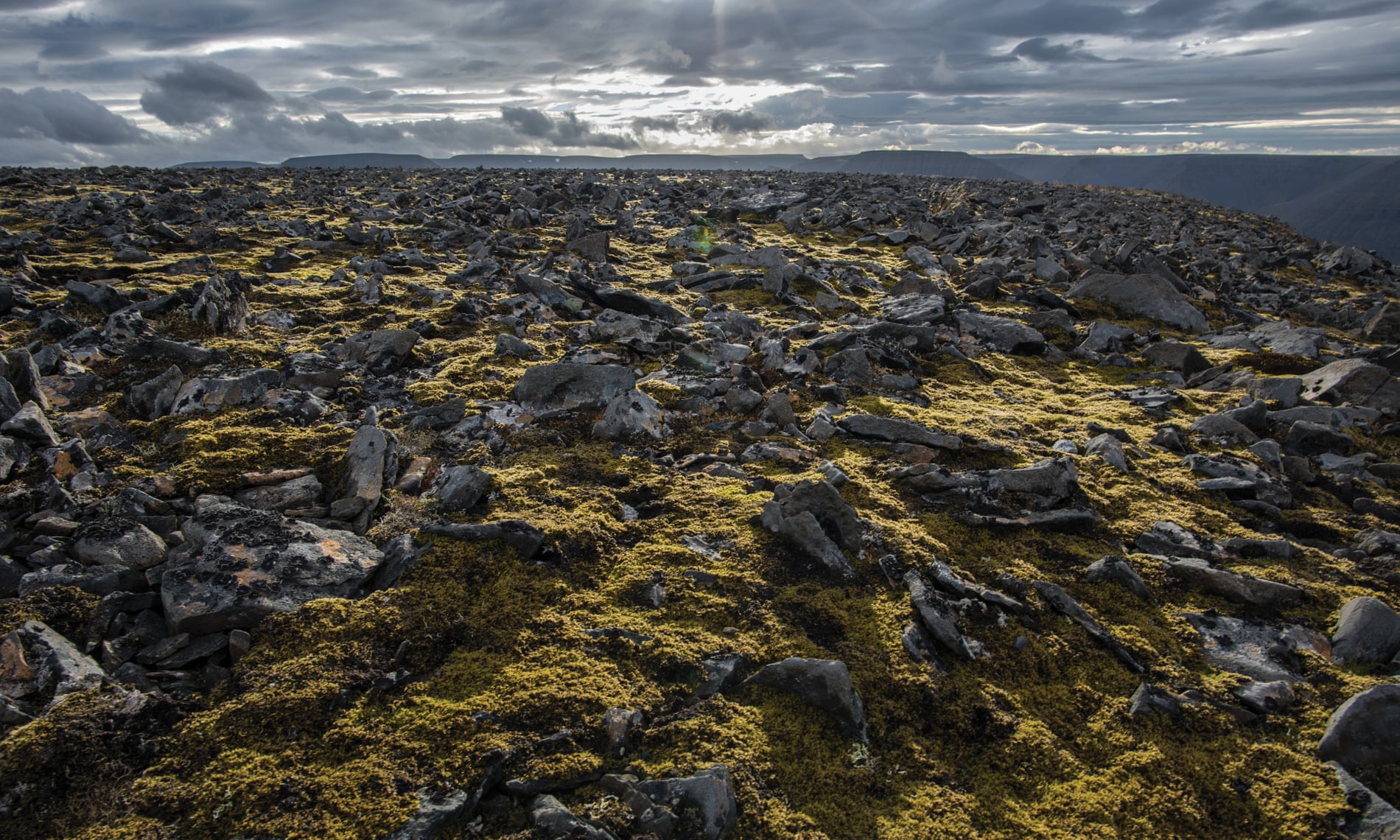
Main photograph: Sean McDermott
From The Guardian by Lois Parshley
This article is adapted from an essay published in the winter 2017 issue of the Virginia Quarterly Review
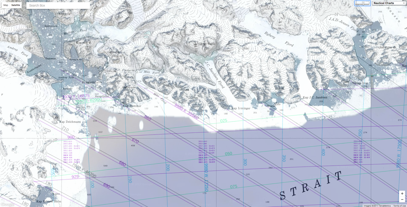
In the era of satellites and Google Maps there are still areas that remain a mystery
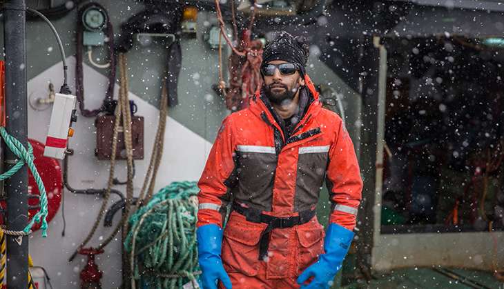
In a quiet summer evening, the Aurora, a 60ft cutter-rigged sloop,
approaches the craggy shore of eastern Greenland, along what is known as
the Forbidden Coast.
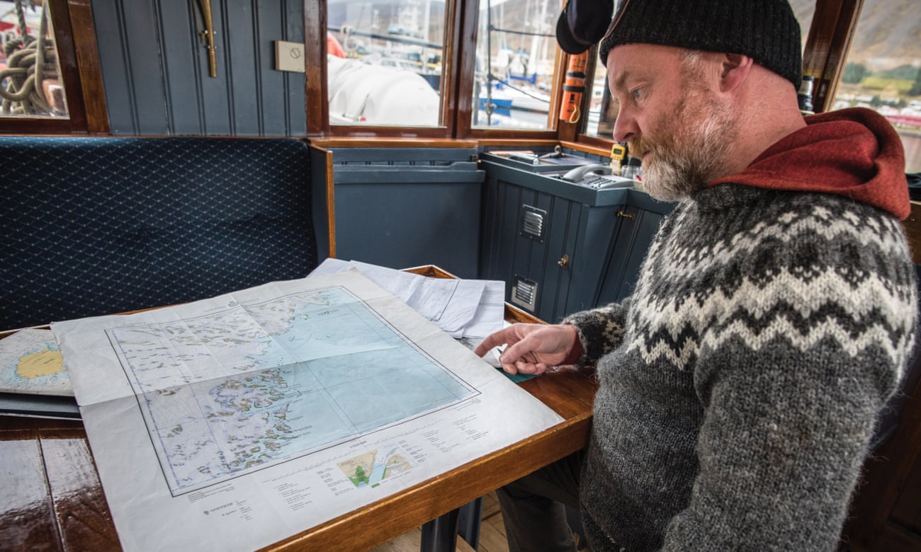
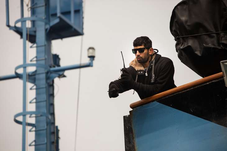
Its captain, Sigurdur Jonsson, a sturdy man in his
50s, stands carefully watching his charts.
The waters he is entering
have been described in navigation books as among “the most difficult
in Greenland;
the mountains rise almost vertically from the sea to form a narrow
bulwark, with rifts through which active glaciers discharge quantities
of ice, while numerous off-lying islets and rocks make navigation
hazardous”.
The sloop is single-masted, painted a cheery, cherry red.
Icebergs float in ominous silence.
Where Jonsson, who goes by Captain Siggi, sails, he is one of few to
have ever gone.
Because the splintered fjords create thousands of miles
of uninhabited coastline, there has been little effort to map this
region.
“It’s practically uncharted,” he says.
“You are almost in the
same position as you were 1,000 years ago.”
A naval architect turned explorer, Siggi navigates by scanning aerial
photos and uploading them into a plotter, the ship’s electronic
navigation system.
Sometimes he uses satellite images, sometimes shots
taken by Danish geologists from an open-cockpit plane in the 1930s, on
one of the only comprehensive surveys of the coast.
Siggi sails by
comparing what he sees on the shore to these rough outlines.
“Of course,
then you don’t have any soundings,” he says, referring to charts of
ocean depths that sailors normally rely on to navigate and avoid running
aground.
“I’ve had some close calls.”
Over the years, he has got better
at reading the landscape to look for clues.
He looks for river mouths,
for example, where silt deposits might create shallow places to anchor,
so that icebergs will go to ground before they crush the boat.
In the
age of GPS and Google
Maps, it’s rare to meet someone who still entrusts his life to such analogue navigation.
Even when Siggi is retracing his own steps, the landscape of
the Forbidden Coast is constantly changing.
“Where the glaciers have
disappeared,” he explains, pointing at washes of green on a creased,
hand-drawn chart, “a peninsula turns out to be an island.
It was
actually sea where you thought there was land.” To account for this, he
often trades notes with local hunters, who are similarly adept at
reading the coast.
“Their language is very descriptive,” Siggi explains.
“So all the names of places mean something.” Although locations may
have official Danish names, they are often ignored.
 Kraemer island, East Greenland
An island
technically called Kraemer, for instance, in East Greenlandic means “the
place that looks like the harness for a dog’s snout”.
Until
a century ago, Greenlandic hunters would cut maps out of driftwood.
“The wooden part would be the fjord, so it would be a mirror image,”
Siggi says.
“Holes would be islands.
Compared to a paper map, it was
actually quite accurate.”
These driftwood sculptures were first recorded
by a Danish expedition in the 1880s, along with bas-relief versions of
fjords, carefully grooved and bevelled to represent headland depths.
A
Danish ethnologist,
Gustav Holm,
noted that notched into the wood, “the map likewise indicates where a
kayak can be carried” when the path between fjords is blocked by ice.
Unlike drawings, the contoured wood could be felt by hand – useful in a
region where the sun disappears for months at a time.
As a source of information, a map is always a way of groping through
the darkness of the unknown.
But locating yourself in space has never
been cartography’s sole function: like these driftwood pieces, maps
inevitably chart how cultures perceive not only their landscapes but
their lives.
“Everything we do is some kind of spatial interaction with objects or
ourselves,” says John Hessler, a specialist in geographic information
systems at the Library of Congress in Washington DC.
“A map is a way to
reduce this huge complexity of our everyday world.”
For the last few
decades, Hessler has been conducting research in the library’s map
collection – the largest in the world – in stacks the lengths of
football fields.
“Geographic information systems have revolutionised
everything,” he says.
Explorers have long filled in our understanding of the world, using
and then discarding the sextant, the compass, MapQuest.
“The project of
mapping the Earth properly is to some extent complete,” Hessler says.
But while there are no longer dragons fleshing out far-flung places, a
surprising number of spaces are still uncharted – and the locations we
have discovered to explore have only expanded.
“Where we were just
trying to accurately map terrestrial space,” Hessler says, we have moved
into a “metaphor for how we live.
We’re mapping things that don’t have a
physical existence, like internet data and the neural connections in
our heads.”
From mapping the dark between stars to the patterns of disease
outbreaks, who is making maps today, and what those maps are used for,
says a lot about the modern world.
“Now anything can be mapped,” says
Hessler.
“It’s the wild west. We are in the great age of cartography,
and we’re still just finding out what its powers are.”
Sigurdur Jonsson looks at maps of the Greenland coast on his boat, the Aurora.
Photograph: Sean McDermott
The Amundsen-Scott South Pole Station sits on the
Earth’s axis, at an altitude just above 9,000ft, in the world’s largest,
coldest desert, where a small settlement of metal shipping containers
takes shape in rows on a windblown sheet of continental ice.
Heavy
equipment beeps in the polar air.
In these harsh conditions, Naoko
Kurahashi Neilson has been trying to map black holes.
It’s
a thorny problem: how do you map something you cannot see?
Normally,
when you look up at the sky and see a star, “the star emitted a light
particle called a photon that travelled millions of years and ended up
in your eyeball”, Kurahashi Neilson explains.
“That’s how your eye knows
there’s a star there.”
But photons, like almost everything else, cannot
escape a black hole’s gravity.
Among the only things that can are tiny,
high-energy particles called neutrinos, which do not often interact
with other matter – trillions of them pass through our bodies every
second.
So detecting neutrinos requires using a massive object.
Kurahashi Neilson, for example, began looking for them by using the
ocean itself.
“Very high-energy neutrinos make a splash when they enter
water,” she says.
To detect those splashes, she installed highly
sensitive microphones in the waters off the Bahamas, but soon realised
that she would need much better equipment.
The answer was at the South Pole Station, amid the summer chaos when
scientists around the world flock to take advantage of the short season.
Kurahashi Neilson joined the team running the
IceCube South Pole Neutrino Observatory, where scientists have created a particle detector
so large it covers a cubic kilometre, with sensors buried beneath a mile
and a half of ice.
As part of her job researching neutrinos, she needed
to upgrade the computers.
When neutrinos are detected, the information
is reported back to a massive collection centre that scientists around
the world can access.
However, there is no easy way for scientists in,
say, Wisconsin, to communicate with the computers at the South Pole.
The
internet for the South Pole Station comes from satellites, which, in
polar regions, often orbit below the horizon.
“Most of the day, you
can’t connect from the South Pole to the outside world,” says Kurahashi
Neilson.
“So even if it’s a simple algorithm update, you have to go do
it yourself.”
As an assistant professor at Drexel University in Philadelphia,
Kurahashi Neilson is using these tiny particles to study the biggest
ideas.
She hopes that mapping where neutrinos come from will lead to the
discovery of new black holes, and possibly explain what physical
processes take place inside them.
Because the majority of neutrinos were
created around 14bn years ago, shortly after the birth of the universe,
this might help answer a fairly fundamental question: what are the
conditions that create energy?
“The only way to study something you can’t go to or touch is to look
at it in many different ways,” Kurahashi Neilson says.
“The funny thing
is, if you map the universe in optical light – what humans see – or
gamma rays, or radio rays, our universe doesn’t look the same.
That’s
the beauty of this.
You create a map of the same thing in different
light, and when you compare them, you understand the universe better.”
Whether on the Forbidden Coast or tracking neutrinos at the South
Pole, this curiosity – to compare, to see something no one has seen
before – is a fairly basic human compulsion.
That’s why Robert Becker – a
radio astronomer who has recently retired from the University of
California, Davis – got into physics.
When he started studying
astronomy, the only map of the entire sky was a simple contour map, like
the ones used for hiking.
In the 1990s, Becker decided to conduct a
Very Large Array radio survey – using radio waves to map the sky in much
greater detail – finding scores of new phenomena.
In most other areas of science, a question leads to an experiment
that tests a hypothesis.
In astronomy, you cannot conduct experiments.
“We can’t build new stars,” Becker explains.
“So we do survey maps.”
The
goal is to create a catalogue of the sky, which is essentially a record
of all the ongoing experiments in space.
“In an infinite universe, all
things that can happen will happen,” Becker says, paraphrasing
Douglas Adams.
He’s
not being cute; this is one of the fundamental principles of quantum
physics.
We can only observe as far as light has had the chance to
travel in the 13.7bn years since the big bang.
But space-time extends
far beyond that.
Because there are only a finite number of ways
particles can be arranged, at some point patterns start repeating, even
if we cannot detect them.
The principle suggests that, in all
likelihood, there are many other universes besides our own, coexisting
in a kind of cosmic patchwork quilt.
If we could look far enough, we
would encounter other versions of ourselves – actually, infinite
versions.
“So all the possible experiments are already out there, it’s
just a question of finding them and watching,” Becker says.
Hypothetically, a perfect map would “facilitate all the questions
astronomers have”.
Of course, we do not yet have the equipment to
observe even a fraction of the universe we are in, never mind others.
In 1995, Becker surveyed 25% of the sky with a radio telescope array,
making the galaxy accessible to astronomers through an image that was
more accurate than those that previous arrays could provide.
Though a
quarter of the sky doesn’t sound like much, it was such a monumental
project that, along with the results, he published an image of his head
superimposed on to
Michelangelo’s Adam touching the hand of God.
According to Becker, astronomers one day hope to have surveys like this
from every part of the electromagnetic spectrum.
“Once you make an
image, you’ll find a whole bunch of new phenomena. Every new survey
opens new dimensions,” he says – and he means this literally. In physics, Becker explains, “most of what we take for granted today
wasn’t dreamed of 30 years ago. It’s like science fiction – dark matter,
gravitational waves, quantum entanglement”.
Since he began mapping the
sky, for example, we have learned to predict where black holes are
through their gravitational pull – if they’re orbiting a star, the star
wobbles.
“Any time you talk about black holes, you’re on the verge of
science fiction,” he says.
“Can you fall into a black hole and be
transported across the universe? Some physicists don’t think that’s
totally far-fetched.”
In much the same way that early explorers
stretched the human imagination, astronomy continues to push the limits
of our understanding of creation itself, requiring a kind of faith.
As
Becker notes, more data usually just gives rise to even more questions.
“In the outer reaches of even our own universe,” Becker says, “dragons
are still there.”
If you could somehow drain the seas, scientists
predict you would see not sea monsters but a few volcanoes sprouting
from an immense, flat floor, which is hundreds of thousands of hills
covered by millennia of falling sediment.
Because of these cloaking
deposits, developing a better map of the ocean could shed light on the
distant past.
“It’s one of the most complete records of history on
Earth,” says Alan Mix, an oceanographer at Oregon State University.
“All
of history accumulates in layers on the ocean floor.”
The problem is
that this wealth of information lies submerged just out of reach.
Because satellites cannot read through water, mapping the sea has been
much more difficult than mapping land.
“The joke,” Mix says, “is that we know more about the back side of
the moon than the bottom of the ocean.”
In the meantime, we work with
best guesses.
On Google Earth, for example, the sea floor appears to be
mapped, displaying mountain ranges and submerged islands, but these
shapes are actually based on inferred data.
“It’s an interpreted map,”
Mix explains.
Because a mountain on the bottom of the ocean has a lot of
mass, its gravity pulls on the water around it, causing a dip in the
surface that a satellite can observe.
“But it’s like looking through a
bad pair of glasses,” Mix says.
“To really know what’s going on below
the surface, scientists must still send out an expedition.”
Deep-sea
submersibles, now the tool regularly used to map the ocean floor, were
not invented until the 1930s.
Their utility expanded with the ability to
be operated remotely as an unmanned, robotic craft.
In the 1980s, the
US navy recruited the scientist Robert Ballard to push the limits of
remote-controlled submersibles to find two nuclear submarines that had
gone missing during the height of the cold war.
They cloaked the
top-secret mission as an attempt to find the Titanic – which Ballard
finally did, during the last 12 days of the expedition, using what he
had learned while looking for the submarines.
Since then, Ballard’s idea
of deploying remote-controlled robots closer to the bottom of the sea
has become standard practice.
But the ocean is huge and submersibles can
only travel so far.
Even today, only about 17% of the ocean has been
mapped with sonar, meaning that a ship or submersible has physically
driven back and forth over the ocean floor in a grid, like mowing a
lawn.
Still, as our knowledge of the ocean floor slowly expands, what
scientists learn about ancient history could prove crucial for the
future.
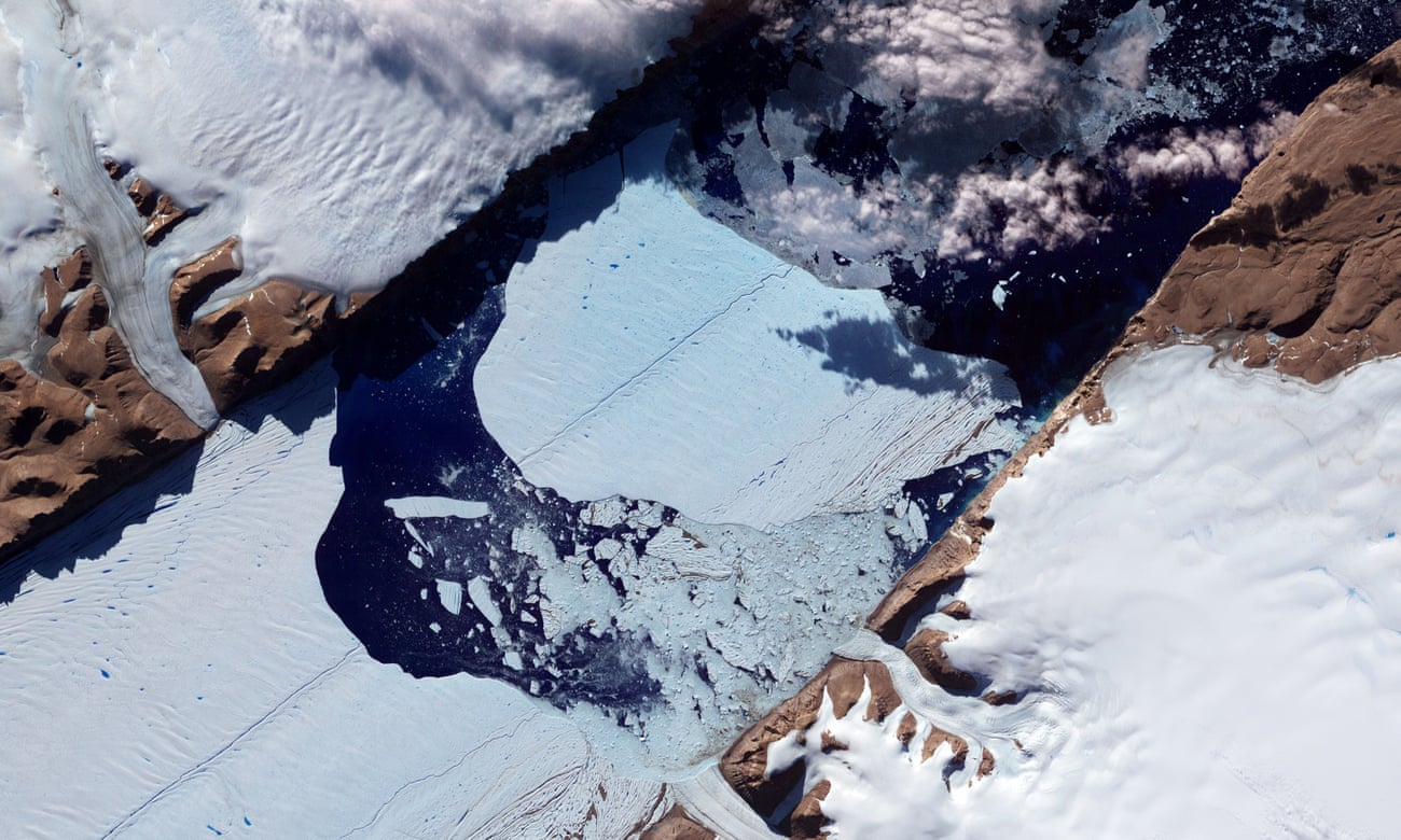
Mix, for example, has spent the better part of a decade studying
the bottom of the sea near the Petermann glacier,
an enormous ice sheet
on the north-west coast of Greenland, across the island from where
Captain Siggi sails.
Ice flows across bedrock as it melts and refreezes
throughout the year, draining rivers off the Petermann glacier into the
sea.
The rate of Petermann’s melt over the last five years has changed
dramatically.
(In 2012, an iceberg twice the size of Manhattan tore off
the glacier.)
Mix explains that the ice shelf “acts like the flying
buttress of a cathedral.
The ice in the ocean helps hold ice back on
land.
So when it shrinks, it’s easier for the ice to go out into the
ocean,” catalysing the already increasing rate of melt.
“To understand this process, first you have to make a map,” Mix says,
although “making a map is more complicated when you’re dodging bergs.”
To make his map, Mix sent an icebreaking ship as close as he dared to
the glacier, using sonar signals to chart the glacier’s historical path
by recording the marks “scraped like sandpaper on steroids” along the
bottom.
Radiocarbon dating on samples suggests how fast the glacier once
moved.
These streams of information have been combined by Larry Mayer,
director of the School of Marine Science and Ocean Engineering at the
University of New Hampshire, who developed a 3D visualisation tool for
the expedition.
Like a first-person-viewer video game, it takes all the
data and turns it into an image “like flying over the landscape on the
seafloor”, Mix says.
The new maps Mix’s team have created suggest that “actual change
events [such as catastrophic ice melt] may happen on very human time
scales.
Civilisation is built on the assumption that tomorrow will be
kind of like today.
That has been true since the advent of agriculture.
But if we do trigger the melting of ice sheets, it would change the
system.”
Once that tipping point has been reached, the seas will rise so
dramatically that for the next thousand years, humans would have to
continuously move away from the ocean.
The block of ice bigger than Manhattan that broke off the Petermann glacier in 2012.
Photograph: NASA/AFP
A multibeam image of Petermann Fjord – looking from Ice Shelf out to entrance of fjord
This summer, Mayer took his 3D visualisation tool on an icebreaker up
to the Arctic as part of a project to map the ocean floor for the US
government.
Under the Law of the Sea treaty, Mayer explains, “you’re
allowed to establish sovereign rights 200 nautical miles into the sea”.
But if the sea floor has certain morphological characteristics, the
country’s territory can be extended beyond that 200 nautical-mile limit,
into an area called the extended continental shelf.
As the rush to
claim the Arctic begins – Russia has symbolically staked its claim to
recently discovered oil reserves by planting a titanium flag in the
bottom of the Arctic Ocean – maps such as this will be a crucial part of
the manoeuvring.
Even when not displaying contested territory, making a map is
inherently political.
Mapping a round thing in two dimensions is
difficult: imagine flattening the unbroken peel of an orange and trying
to connect the edges.
“In order to make a map, you have to give
something up,” says John Hessler.
The decision of which variable to hold
true – distance or area or shape or scale – is called a projection, and
every one of them distorts the surface of the Earth in some capacity.
The world maps you probably remember from school are Mercator
projections, where Greenland appears larger than Africa – a continent 14
times the island’s size – in order to preserve the accuracy of angles.
In the 1960s, Arno Peter created
a map that looks strangely elongated
in comparison, preserving a more accurate sense of scale.
Now called
the Peters projection, “he thought [it] had a better sense of equality
for third world countries”, Hessler explains.
Since then, the number of
potential projections has only expanded.
Which distortion of the world
works best depends on what you think is important.
On January 12, 2010, the epicentre of
Haiti’s 7.0 magnitude earthquake
registered just 15 miles from the country’s capital.
By the time the
aftershocks ceased, Port-au-Prince was left in ruins.
Hundreds of
thousands died, and many of the survivors had nowhere to go; 1.5 million
people lost their homes overnight.
Over the following days and weeks,
healthcare workers and UN troops from around the world flocked to the
country to aid those affected by the earthquake, bringing
a strain of the cholera virus that ultimately triggered one of the worst epidemics in recent history.
Until
then, Haiti was an epidemiologically naive population, an island with
no previous encounter with this particular strain of cholera, and
therefore possessing no innate resistance.
There were many places that
medical personnel were unable to reach.
Where aid workers were able to
estimate rates, 5% of the population contracted the disease, and without
treatment, 40% of those patients died.
Health centres struggled to keep
up with the caseload, triaging people in tents.
Those in acute stages
of the illness lay in cots with holes cut in them and a bucket
underneath.
“Every patient that walked in, we asked them where they were from,”
recalls Ivan Gayton, the head of mission for Doctors Without Borders
(MSF) in Haiti during the cholera outbreak.
It may seem like common
sense, but it wasn’t until 1854 that doctors thought to map disease
outbreaks.
Like Haiti in 2010, London was suffering a severe cholera
epidemic when a physician named John Snow plotted the addresses of cases
on to a simple street map.
“He went door to door knocking, asked
everyone where they were getting their water from,” Gayton explains.
When Snow saw the clusters, it became clear certain water pumps were
spreading the disease.
It was the foundational moment of epidemiology.
“It was a stunningly important moment in medicine,” Gayton says.
“He was
possibly one of the greatest physicians in all of history, and his
claim to fame wasn’t a new treatment or a drug – it was making a map.”
More than a century and a half later in Haiti, MSF doctors could not
even do that.
Though everyone being treated in Haitian clinics was asked
where they were from, the information proved confounding, since none of
the informal neighbourhoods and slums in Haiti were adequately mapped.
Doctors lacked the ability to connect the place names with geographical
coordinates.
“It was effectively being recorded in random syllables,”
Gayton says.
Though staff tried to record cases in a spreadsheet,
without locations, doctors could not tell if cases were adjacent to one
another or on opposite sides of the city, making it difficult to trace
or stop the sources of infection.
“We couldn’t do our job,” says Pete
Masters, the
Missing Maps project coordinator at MSF.
“We didn’t have
the evidence to take the best action.”
At the peak of the outbreak, Gayton was wandering through the hallway
of a clinic and spotted a colleague, Maya Allan, crouched on a
windowsill with a laptop.
“She was trying to place pins [of cholera
cases] on Google Earth by hand,” Gayton says.
Frustrated, he thought
there had to be a better way.
So he called Google, which was “like
calling the Batcave”.
A few days later, Google software engineer Pablo Mayrgundter flew to
Port-au-Prince, bringing with him Google Earth programs and map data
downloaded on to hard drives so he could work in the field without the
internet.
He trained Haitians how to use GPS units, then sent them into
neighbourhoods to get latitude and longitude coordinates for Haitian
place names.
Google’s engineers were aided by a group called the
Humanitarian OpenStreetMap (Hot) team – “Earthquake nerds, looking at
the TV, looking at the street map of Port-au-Prince, and realising
there’s nothing there,” Masters says.
After the earthquake, the group
coordinated with members of the Haitian diaspora to map Haiti’s slums
and identify local landmarks for the first time.
Within 72 hours of the
earthquake, search-and-rescue teams were using their maps.
Together,
Google and Hot worked to geolocate all of the information they had
gathered and to write a script to import the case records.
Suddenly, the
MSF patient list could be transformed into an animated map of cases.
“Boom. All of a sudden, we could do what Snow did years ago,” Gayton
says.
“Hallelujah.”
A couple of days after the Google team left, Gayton was able to
pinpoint a water outage in a neighbourhood where cholera cases had
suddenly jumped.
After notifying the water utility, workers were
dispatched to the site to make repairs.
“Fewer people were dying because
a map allowed us to correlate a spike in cases to a specific event,”
Gayton says.
“That’s the holy grail of mapping – actual lives saved.”
Following the project’s success in Haiti, Gayton was invited to MSF
headquarters in London to try to set up a system for mapping other
disasters.
It didn’t work, mainly because reactive mapping, it turns
out, can’t possibly keep up with the scale and speed of humanitarian
disasters.
“Because of the horrible earthquake, HOT volunteer mapping
got done [before the cholera crisis],” Gayton says.
“A map that comes
post-disaster doesn’t save lives.”
During the Ebola crisis in west Africa, cases moved too swiftly for
maps to be created of all of the areas that the virus reached.
What is
needed is proactive mapping on a continental scale, of all vulnerable
areas.
That’s why Gayton helped coordinate Missing Maps, a collaboration
between existing aid groups and volunteers using open-source data to
map places where crises are likely to occur.
The organisation holds
“mapathons”, where volunteers connect to people in the field.
“Take
names of streets,” Gayton says.
“You’re on the Avenue of Church – there
are 200 of those in Lubumbashi.
You have to trace it, have to have
imagery, have to go into the field and get names, and then integrate all
of that into a nice visual map.” He describes the process as being
similar to fitting a Russian doll together.
“I like maps,” Gayton says.
“But really what I care about is
equitable distribution of healthcare.
As long as 1 billion people don’t
have it, sooner or later it’ll come and bite people in rich countries.”
He scoffs at the idea that there are no blank spaces left on Earth.
“Anyone who says the world is mapped, ask them to show you where the
population of Congo is living.
Ask them where the villages are.
If they
can do it, please let me know.”
To Gayton, it’s not an idle distinction.
“When you have a place like
South Sudan, where millions of people live and die without ever figuring
in a database anywhere, their names will never be written down.
There’s
not a lot of dignity in that – to not be on the map is quite a powerful
statement of uncaring.”
That’s what Missing Maps is about.
“We still don’t know who they are,
but at least we know where their house is.
At least the map actually
contains them, rather than a blank wash of green,” Gayton says.
“I tell
people at mapathons sometimes, ‘That house you’re tracing right now,
that hut – that’s the first time in the history of humanity someone
cared enough about them to take note.’”
Things don’t exist just because
we name them, but giving them a name engenders new meaning.
At its most
basic, to exist on a map is to have value.
It isn’t coincidental that humans have been drawn to maps for almost as long as we have had written records.
“Our
best way of sharing knowledge – whether it’s a physical representation
of land or an energy space variable – it’s a map,” says Naoko Kurahashi
Neilson.
“Every scientific analysis produces maps or visual plots to
look at.
That’s the way we intuitively understand the best.”
By building narratives that orient us – not only where we are
physically standing, but in the past and future – maps are an
instinctual way of ordering chaos, of turning stars to constellations
and glacial scratches to predictions.
“A map in the hands of a pilot is a
testimony to a man’s faith in other men; it is a symbol of confidence
and trust. It is not like a printed page that bears mere words,” wrote
Beryl Markham in the 1940s, shortly after becoming the first woman to
fly solo across the Atlantic from the east to the west.
“A map says to
you, ‘Read me carefully, follow me closely, doubt me not.’”
The daughter of a colonial horse trainer, Markham grew up hunting
barefoot with the Nandi, and learned to fly a plane when there were only
a few in all of Africa.
In early September 1936, Markham took off in a
turquoise-and-silver Gull, with what she hoped was enough fuel to make
it across the Atlantic.
She flew for more than 21 hours across the open
ocean, mostly in the dark.
Recalling those interminable hours, she later
wrote: “Were all the maps in this world destroyed and vanished … each
man would be blind again, each city made a stranger to the next, each
landmark become a meaningless signpost pointing to nothing.”
Since Markham’s record-breaking flight, we’ve sent a spaceship to the
edge of the solar system.
As technology shrinks the world, the concept
of nothingness can feel obsolete; our very understanding of distance has
fundamentally changed.
But that doesn’t mean small spaces can no longer
be large enough to get lost in.
Several fjords over from Captain Siggi’s winter anchorage in Iceland,
a pot-holed gravel road winds steeply up a mountain.
Beyond the summit,
a valley plunges into the sea.
An Arctic fox pads silently downhill.
Sheep graze over the moss and late blueberries.
On the beach, waves eat
away at the walls of an ancient sod-and-stone house.
After generations
of farmers ploughing a living into this stony plain, only a single
woman, Betty, remains.
The road to her valley is closed for half the year; the rare visitor
arrives only by snowmobile.
Betty’s TV cable went out two years ago, and
the telephone doesn’t work in the rain.
She cares for the family
church, where baptisms and deaths have been recorded for centuries, an
imposition of will into a world that will exist without us.
On winter
nights when the northern lights come out, she piles on hand-knitted
sweaters and stomps down to the beach to watch the sky perform.
“The notion that place is capable of imparting its qualities to
people may sound a little fanciful,” writes geographer Yi-Fu Tuan, “so
let me say, first, something that is merely common sense, namely good
soil yields good crops, bad soil poor crops.”
In humans, the phenomenon
is subtle, but place just as surely moulds what used to be called
character.
When Betty leaves the valley, these hills will be mapped, though no
one will know their wind and their weather.
Until then, when the sheep
give birth in the spring, she’ll watch over the miracle.
If one day the
distant universe is as mundane as the road that leads to our doors, even
in the most familiar, there will always be wonder.
It’s where all
exploration begins.
Links :

)


