 see GeoGarage news
Saturday, October 14, 2023
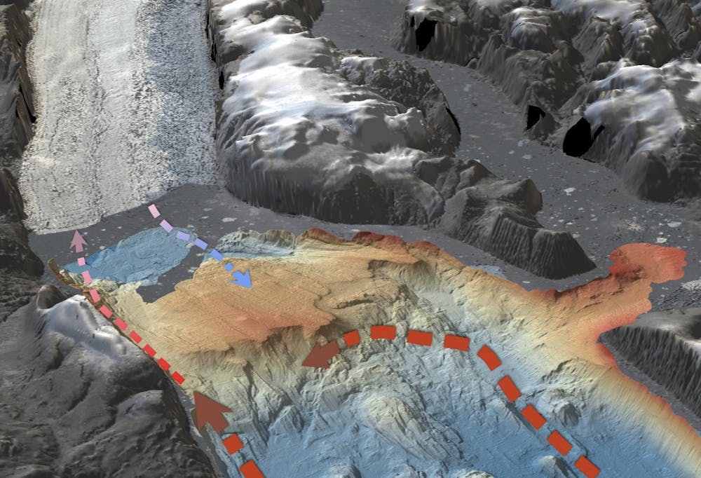
3D view of Kerguelen Plateau-Williams Ridge
3D fly-through of Kerguelen Plateau and Willaims Ridge in the Southern Ocean using a new bathymetry (depth) model.
Coloured depths range from 0-5040 metres.
Land is shown as grey colour.
courtesy of Robin Beaman, James Cook University

Friday, October 13, 2023
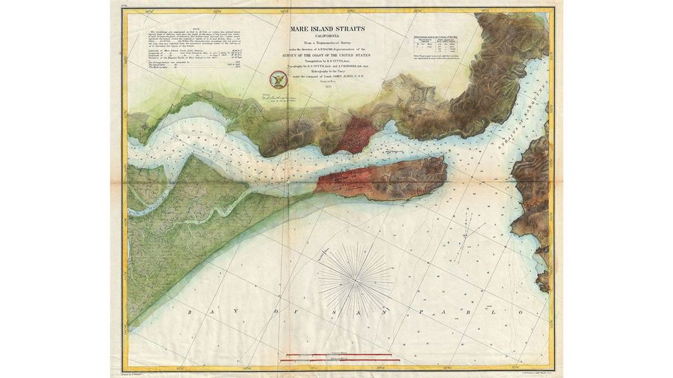
Ancient maps and the rise of a nation
 Photograph courtesy of Leon Gallery
 From Inquirer by Ambeth R. Ocampo
Geography used to be required, or part of social science subjects, in
elementary and high school until it was pulled out long ago.
Nobody
noticed nor howled to ask for its return.
Geography, where one memorizes the names of countries and their
capital city, is probably considered a useless subject but it does make a
young Filipino more cosmopolitan, more marketable in a global world.
I guess geography has been merged with other subjects and is tucked
away in the new K-to-12 and college general education curricula.
“Intermediate Geography” by Miller and Polley was the last textbook
used in Philippine schools in the 1950s that probably became extinct
when people realized that except for Mayon volcano on the cover, the
content was exactly the same as the 1918 edition!
My appreciation of how the physical shape of the Philippines came to be took root outside of a classroom while browsing the Lopez Museum map collection, fascinated first by its antiquity, and later by the way it told the story of how the nation came to be.
It included the earliest nautical charts made in the 15th and 16th centuries, jealously guarded by the Portuguese and Spanish that both claimed rights to the islands following the 1493 Papal Bull “Inter Caetera” issued by Pope Alexander VI that cut the world in half like an orange and granted rights to discover the unknown world to the competing crowns of Portugal and Spain.
It is not well-known that the Philippines fell on the Portuguese side.
Dutch mapmakers entered the game in the 17th century charting the
known world and carving out what we know as Indonesia that, in some
maps, included the Philippines.
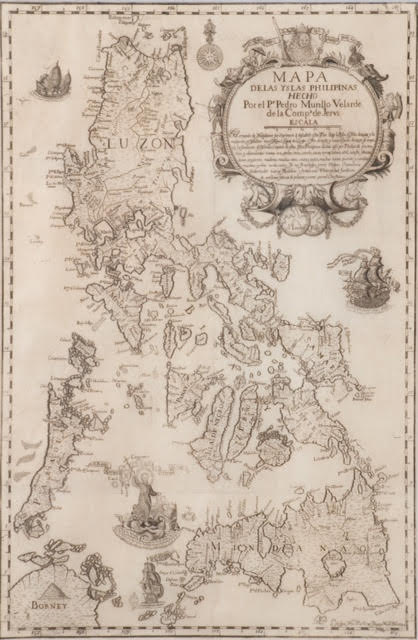
Then came Jesuit Father Pedro Murillo
Velarde and his 18th-century map that spawned many copies by French and
German mapmakers.
Maps show us that Filipinas was under Spain from 1565 to 1898, with a
short British interlude of 20 months between 1762 and 1764, followed by
the United States from 1898 to 1946, with a Japanese interlude between
1942 and 1945.
Maps, like history, include and exclude depending on the person who
made them, and the person reading them.
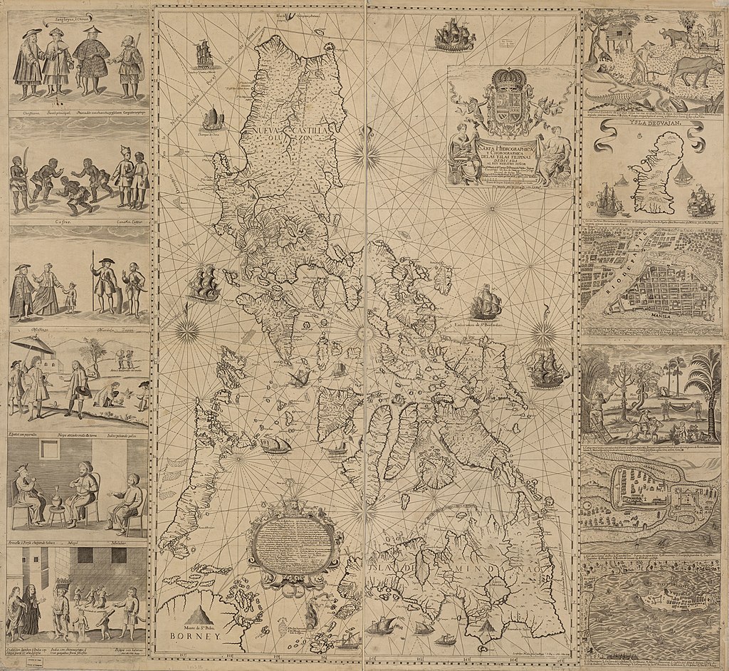
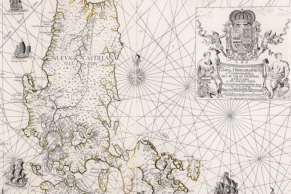
Carta Hydrographica y Chorographica de las Yslas Filipinas Dedicada al Rey Nuestro Señor por el Mariscal d. Campo D. Fernando Valdes Tamon Cavallº del Orden de Santiago de Govor.
E. Aguilar Cruz introduced me to the Velarde map, guiding me through its cartouche, in French, that stated it was a hydrographic and chorographic map depicting both bodies of water in relation to land arranged by regions.
It was dedicated by governor-general Fernando Valdes Tamon, drawn by
Velarde, and printed by Nicolas de la Cruz Bagay in 1734.
Cruz’s map was
a reduced version made in 1750 in Nuremberg by George Maurice Lowitz
and republished in 1760.
He asked me to translate the long text at the bottom of the map, this
being a short history from Magellan to Legazpi followed by a detailed
listing of the agricultural and mineral products of the islands by
region.
Reading it meant going beyond the placenames to looking at the
mountains and hills and tracing the path of waterways where people built
early settlements that developed into today’s barangays, towns, cities,
and provinces that altogether formed el pais (the country).
In the late 19th century, Jose Rizal and his generation saw
themselves as hijos del pais (sons of the country), one step into taking
Filipinas not as an overseas territory of Spain, but as a nation.
Antique maps of the Philippines are valuable as singles but, when
seen in a series, depict in their detailed differences the emergence of a
nation.
Velarde’s map may be three centuries old but it gained contemporary
relevance when China drew a “nine-dash line” on the map, literally
changing the face of the earth.
From their point of view, parts of the
Philippines are theirs by traditional and “historic” rights, but the
South China Sea to them is the West Philippine Sea to us.
Panacot
Historical rights are irrelevant following agreements in the United
Nations Convention on the Law of the Sea but the Philippines has proven
that China cannot produce a map older than the 1734 Velarde map showing
Panacot (Scarborough Shoal) and Los Bajos de Paragua (Spratlys) in their
territory.
It is significant that the three shoals indicated in the map bear the
names: Galit (Anger), Panacot (Threat) and Lumbay (Sorrow), ancient
names that can be emoticons that express how Filipinos feel about our
territorial dispute with China.
Maps teach us more than geography, they teach us nationhood and identity.
Links :
- Inquirer : Catch ancient maps exhibit ‘Mapping the Philippine Seas / The 1734 Murillo Velarde Map / Mother of Philippine maps’ settles sea dispute with China
- Rappler : Ever heard of the 1734 Murillo Velarde map and why it should be renamed? / Ancient maps support PH claim over Scarborough
- GeoGarage blog : Philippines uses 18th-century English aristocrat's map to claim disputed islands / China revises mapping law to bolster claims over South China Sea land, Taiwan
Thursday, October 12, 2023
Turtles carry signs of humanity’s nuclear history in their shells
A turtle can’t crawl out of its shell. In fact, the shell is actually part of a turtle’s skeleton, as much of our ribcage is of ours. But if you could peer inside a shell, you’d find some of the most unusual features in the animal kingdom, such as a butt — err, cloaca — that some species use to breathe underwater.
From Wired by Celta Ford
Turtles’ shells contain a chemical record of the environment—including
highly enriched uranium, an indicator of nuclear weapons development.
What can we learn from these accidental archivists?
What can we learn from these accidental archivists?
ON A SPRING day in 1978, a fisherman caught a tiger shark in the lagoon surrounding Enewetak Atoll, part of the Marshall Islands in the north Pacific.
That shark, along with the remains of a green sea turtle it had swallowed, wound up in a natural history museum.
Today, scientists are realizing that this turtle holds clues to the lagoon’s nuclear past—and could help us understand how nuclear research, energy production, and warfare will affect the environment in the future.
In 1952, the world’s first hydrogen bomb test had obliterated a neighboring island—one of 43 nuclear bombs detonated at Enewetak in the early years of the Cold War.
Recently, Cyler Conrad, an archeologist at Pacific Northwest National Laboratory, began investigating whether radioactive signatures of those explosions had been archived by some particularly good environmental historians: turtles.
“Anywhere that nuclear events have occurred throughout the globe, there are turtles,” Conrad says.
It’s not because turtles—including sea turtles, tortoises, and freshwater terrapins—are drawn to nuclear testing sites.
They’re just everywhere.
They have been mainstays of mythology and popular culture since the dawn of recorded history.
“Our human story on the planet is really closely tied to turtles,” Conrad says.
And, he adds, because they are famously long-lived, they are uniquely equipped to document the human story within their tough, slow-growing shells.
Collaborating with researchers at Los Alamos National Laboratory, which was once directed by J.
Robert Oppenheimer, Conrad was able to use some of the world’s most advanced tools for detecting radioactive elements.
Last week, his team’s study in PNAS Nexus reported that this turtle, and others that had lived near nuclear development sites, carried highly enriched uranium—a telltale sign of nuclear weapons testing—in their shells.
Turtle shells are covered by scutes, plates made of keratin, the same material in fingernails.
Scutes grow in layers like tree rings, forming beautiful swirls that preserve a chemical record of the turtle’s environment in each sheet.
If any animal takes in more of a chemical than it’s able to excrete, whether through eating it, breathing it in, or touching it, that chemical will linger in its body.
Once chemical contaminants—including radionuclides, the unstable radioactive alter egos of chemical elements—make their way into scute, they’re basically stuck there.
While these can get smeared across layers in tree rings or soft animal tissues, they get locked into each scute layer at the time the turtle was exposed.
The growth pattern on each turtle’s shell depends on its species.
Box turtles, for example, grow their scute outward over time, like how humans grow fingernails.
Desert tortoise scutes also grow sequentially, but new layers grow underneath older layers, overlapping to create a tree ring-like profile.
Because they are so sensitive to environmental changes, turtles have long been considered sentinels of ecosystem health—a different kind of canary in the coal mine.
“They’ll show us things that are emergent problems,” says Wallace J.
Nichols, a marine biologist who was not involved in this study.
But Conrad’s new findings reveal that turtles are also “showing us things that are distinct problems from the past.”
Conrad’s team at Los Alamos handpicked five turtles from museum archives, with each one representing a different nuclear event in history.
One was the Enewetak Atoll green sea turtle, borrowed from the Bernice Pauahi Bishop Museum in Honolulu, Hawaii.
Others included a Mojave desert tortoise collected within range of fallout from the former Nevada Test Site; a river cooter from the Savannah River Site, which manufactured fuel for nuclear weapons; and an eastern box turtle from Oak Ridge, which once produced parts for nuclear weapons.
A Sonoran desert tortoise, collected far from any nuclear testing or manufacturing sites, served as a natural control.
While working at Los Alamos, Conrad met isotope geochemist and soon-to-be coauthor Jeremy Inglis, who knew how to spot even the most subtle signs of nuclear exposure in a turtle shell.
They chose to look for uranium.
To a geochemist, this might initially feel like an odd choice.
Uranium is found everywhere in nature, and doesn’t necessarily flag anything historically significant.
But with sensitive-enough gear, uranium can reveal a lot about isotope composition, or the ratio of its atoms containing different configurations of protons, electrons, and neutrons.
Natural uranium, which is in most rocks, is configured very differently from the highly enriched uranium found in nuclear labs and weapons.
To find the highly enriched uranium hidden among the normal stuff in each turtle shell sample, Inglis wore a full-body protective suit in a clean room to keep his uranium from getting in the way.
(“There’s enough uranium in my hair to contaminate a picogram of a sample,” he says.)
Inglis describes the samples like a gin and tonic: “The tonic is the natural uranium.
If you add lots of natural uranium tonic into your highly enriched uranium gin, you ruin it.
If we contaminate our samples with natural uranium, the isotope ratio changes, and we can’t see the signal that we’re looking for.”
The team concluded that all four turtles that came from historic nuclear testing or manufacturing sites carried traces of highly enriched uranium.
The Sonoran desert tortoise that had never been exposed to nuclear activity was the only one without it.
They collected bulk scute samples from three of their turtles, meaning that they could determine whether the turtle took in uranium at some point in its life, but not exactly when.
But the researchers took things a step further with the Oak Ridge box turtle, looking at changes in uranium isotope concentrations across seven scute layers, marking the seven years of the turtle’s life between 1955 and 1962.
Changes in the scutes corresponded with fluctuations in documented uranium contamination levels in the area, suggesting that the Oak Ridge turtle’s shell was time-stamped by historic nuclear events.
Even the neonatal scute, a layer that grew before the turtle hatched, had signs of nuclear history passed down from its mother.
It’s unclear what this contamination meant for the turtles’ health.
All of these shells were from long-dead animals preserved in museum archives.
The best time to assess the effects of radionuclides on their health would have been while they were alive, says Kristin Berry, a wildlife biologist specializing in desert tortoises at the Western Ecological Research Center, who was not involved in this study.
Berry adds that further research, using controlled experiments in captivity, may help figure out exactly how these animals are taking in nuclear contaminants.
Is it from their food? The soil? The air?
Because turtles are nearly omnipresent, tracing nuclear contamination in shells from animals living at various distances from sites of nuclear activity may also help us understand the long-term environmental effects of weapons testing and energy production.
Conrad is currently analyzing desert tortoise samples from southwestern Utah, collected by Berry, to better relate exposure to radionuclides (like uranium) to their diets over the course of their lives.
He also hopes that these findings will inspire others to study plants and animals with tissues that grow sequentially—like mollusks, which are also found in nearly all aquatic environments.
The incredible migratory patterns of sea turtles, which sometimes span the entire ocean (as anyone familiar with Finding Nemo may recall), open up additional opportunities.
For example, sea turtles forage off the Japanese coast, where in 2011 the most powerful earthquake in Japan’s history caused a tsunami that led to a chain reaction of failures at the Fukushima Daiichi Nuclear Power Plant.
With lifespans of up to 100 years, many of those turtles are likely still alive today, carrying traces of the disaster on their backs.
Recently, the Japanese government started slowly releasing treated radioactive waterfrom the Fukushima Daiichi plant into the Pacific Ocean.
Scientists and policymakers seem to hesitantly agree that this is the least bad option for disposing of the waste, but others are more concerned.
(The Chinese government, for instance, banned aquatic imports from Japan in late August.) Through turtle shells, we may better understand how the plant’s failure, and the following cleanup efforts, affect the surrounding ocean.
The bodies of these creatures have been keeping score for millennia.
“For better or for worse, they get hit by everything we do,” Nichols says.
Maybe, he adds, “the lesson is: Pay more attention to turtles.”
Links :
Wednesday, October 11, 2023
Can a map of the ocean floor be crowdsourced?
Image credit: Getty Images
From BBC by Laura Trethewey (author of The Deepest Map: The High-Stakes Race to Chart the World’s Oceans -see GeoGarage blog-)
Many maps of the ocean floor are decades old.
The race is on to properly chart them by 2030 – and crowdsourcing could be part of the answer.
Tucked inside a federal government building in the American Rockies is the world's best collection of seafloor maps.
Occasionally a hard drive arrives in the mail, filled with new bathymetric – or seafloor – charts collected by survey vessels and research ships cruising the seas.
The world's largest public map of Earth's oceans grows just a little bit more.
Cloaked in ocean, the seafloor has resisted human exploration for centuries.
Folklore and myths told of it as the domain of terrifying sea monsters, gods, goddesses and lost underwater cities.
Victorian-era sailors believed that there was no ocean floor at all, just an infinite abyss where the bodies of drowned sailors came to rest in watery purgatory.
Throughout the last century, modern scientific techniques and sonar have dispelled the stories and revealed a little understood seascape of crusted brine lakes, steaming volcanoes, and vast undulating underwater plains.
We have only just begun to map, much less explore, this enormous subsea world.
The Victoiran era saw a massive effort to chart the world's oceans, but many areas have seen minimal mapping since
(Credit: Getty Images)
One organisation wants to change this – and quickly.
In 2023, Seabed 2030 announced that its latest map of the entire seafloor is nearly 25% complete.
The data to make the world's first publicly available map is stored at the International Hydrography Organization (IHO)'s Data Centre for Digital Bathymetry (DCDB) in a government building in Boulder, Colorado.

So far, the DCDB holds over 40 compressed terabytes of seafloor data.
The biggest contributor is the US academic fleet: 17 research vessels owned by American universities which constantly circle the globe studying the deep ocean.
Other contributors include the National Oceanic and Atmospheric Administration (NOAA) fleet, the Geological Survey of Ireland, and Germany's Federal Maritime and Hydrographic Agency.
The biggest users are scientists all over the world who rely on the data to conduct research.
Seabed 2030 has made extraordinary progress by asking countries and corporations to share maps with the DCDB.
But unfortunately, the map is not growing quickly enough.
Between 2016 and 2021, the map leapfrogged from 6% to 20%.
Since then, the pace has slowed.
In 2022, it reached just 23.3% complete; in 2023, 24.9%.
The ocean mappers came up with a new plan: crowdsourcing.
By attaching a data logger to a boat's echosounder, any vessel can build a simple map of the seafloor
"Crowdsourced bathymetry came about a few years ago when the IHO was saying: 'At this rate, we're never going to map the whole darn ocean; we need to start looking outside the box,'" says Jennifer Jencks, the director of the DCDB and the chair of a crowdsourced working group at the IHO.
By attaching a data logger to a boat's echosounder, any vessel can build a simple map of the seafloor.
This is crucial in developing coastal and island nations.
Tion Uriam, the head of the Hydrographic Unit at the Republic of Kiribati's Ministry of Communications, Transport and Tourism Development, recently received two data loggers that he's planning to install on local ferries.
"It's a win to be part of that initiative," he says.
"Just to put us on the map and raise our hands [to say] we want to be part of a global effort.
Our contribution might be small – but it's a contribution."
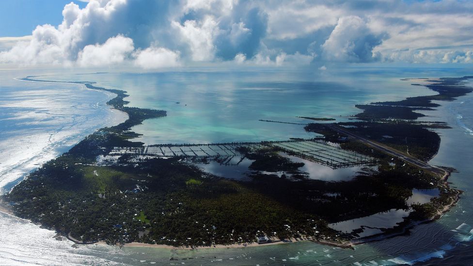
Kiribati is a Pacific island nation of about 130,000 people spread across 33 coral atolls, only 20 of which are inhabited.
British charts published in the 1950s and 1960s have been the most accurate maps to date; the United Kingdom and United States claimed various islands as protectorates or territories, mining them for phosphate or using them as whaling stations.
Other British maps used are old and inaccurate; some date back to the late Victorian age or list depth measurements in fathoms, which most countries moved on from years go (the US only retired it in 2022).
The biggest contributor is the US academic fleet: 17 research vessels owned by American universities which constantly circle the globe studying the deep ocean.
Other contributors include the National Oceanic and Atmospheric Administration (NOAA) fleet, the Geological Survey of Ireland, and Germany's Federal Maritime and Hydrographic Agency.
The biggest users are scientists all over the world who rely on the data to conduct research.
Seabed 2030 has made extraordinary progress by asking countries and corporations to share maps with the DCDB.
But unfortunately, the map is not growing quickly enough.
Between 2016 and 2021, the map leapfrogged from 6% to 20%.
Since then, the pace has slowed.
In 2022, it reached just 23.3% complete; in 2023, 24.9%.
The ocean mappers came up with a new plan: crowdsourcing.
By attaching a data logger to a boat's echosounder, any vessel can build a simple map of the seafloor
"Crowdsourced bathymetry came about a few years ago when the IHO was saying: 'At this rate, we're never going to map the whole darn ocean; we need to start looking outside the box,'" says Jennifer Jencks, the director of the DCDB and the chair of a crowdsourced working group at the IHO.
By attaching a data logger to a boat's echosounder, any vessel can build a simple map of the seafloor.
This is crucial in developing coastal and island nations.
Tion Uriam, the head of the Hydrographic Unit at the Republic of Kiribati's Ministry of Communications, Transport and Tourism Development, recently received two data loggers that he's planning to install on local ferries.
"It's a win to be part of that initiative," he says.
"Just to put us on the map and raise our hands [to say] we want to be part of a global effort.
Our contribution might be small – but it's a contribution."
Kiribati is a Pacific island nation of about 130,000 people spread across 33 coral atolls, only 20 of which are inhabited.
British charts published in the 1950s and 1960s have been the most accurate maps to date; the United Kingdom and United States claimed various islands as protectorates or territories, mining them for phosphate or using them as whaling stations.
Other British maps used are old and inaccurate; some date back to the late Victorian age or list depth measurements in fathoms, which most countries moved on from years go (the US only retired it in 2022).
(Credit: Getty Images)
Kiribati's most accurate charts, made by the British, are nearly 70 years old

Kiribati in the GeoGaage platform (UKHO nautical raster chart)

Title : Kiritimati Atoll (Christmas Island)
United Kingdom
Scale : 90000 / Cat : 3 / Type : Coastal
Edition_date : 20150320 / Edition : 4
Update_date : 20220413 / Update : -
United Kingdom
Scale : 90000 / Cat : 3 / Type : Coastal
Edition_date : 20150320 / Edition : 4
Update_date : 20220413 / Update : -
That isn't so unusual in the Pacific, according to marine geologist Kevin Mackay, who oversees Seabed 2030's South and West Pacific Regional Centre at New Zealand's National Institute of Water and Atmospheric Research (Niwa) in the capital Wellington.
"The big problem in the Pacific is the relic of the colonial system.
So, in the Pacific, who looks after the mapping? It's the Americans through their territories, or the UK through their territories, or the French and their islands, even though they're now officially independent." Kiribati gained independence in 1979, but there's been little progress on surveying since then.
In 2020, the World Bank funded a $42m (£34.1m) project to improve maritime infrastructure in the outer islands.
A portion of that will go toward seabed mapping.
As one of the least developed countries in the world, most i-Kiribati (the name for Kiribati's inhabitants) live in the capital of South Tawara: a 17 sq km (6.5 sq mile) crescent-shaped atoll with a population density equal to Tokyo.
More people are crowding into the capital in search of a modern life, while the rest live on remote islands where poverty and unemployment is high, amenities are poor and the long-term future uncertain because of rising sea levels and severe tropical storms.
The military or commercial value of nautical charts will always be a barrier to achieving complete coverage of the world map
Improved charts could boost trade, transit and tourism on the outer islands.
They could help communities plan for tsunamis, storm surges and rising shorelines.
Many islands lack basic tide gauges, and so visiting ships time their arrival for high tide.
In his meetings with government ministers, Uriam tries to stress the economic benefits of improving nautical charts in Kiribati.
However, there's a roadblock when it comes to sharing maps with the DCDB archive back in Boulder.
Around a third of the IHO's 98 member states allow crowdsourcing inside territorial waters.
However, the Pacific island nations of Kiribati, the Independent State of Samoa and the Cook Islands, which all recently received data loggers from Seabed 2030, are not among them.
Until the governments give their blessing, the new crowdsourced maps will remain under wraps.
Despite Seabed 2030's publicly stated scientific goal, the military or commercial value of nautical charts will always be a barrier to achieving complete coverage of the world map.
"Sea charts, by their very nature, were destined to be removed from the academic realm and from general circulation," wrote the map historian Lloyd Brown in his book The Story of Maps.
"They were much more than an aid to navigation; they were in effect, the key to empire, the way to wealth."
In a world where only a quarter of the seafloor is charted, there's still an advantage in knowing more than your rivals.
Niwa's Mackay experienced this himself on a scientific-mapping expedition.
He received a call from a military he chooses not to name and "they said 'you need to destroy that data because there was military value in what you're mapping, because it's a place where submarines like to hide'," he recalls.
"Obviously, we ignore them because we're [mapping] for science, we don't care.
But the military, they find lots of value in bathymetry that, as a scientist, we don't even think about."
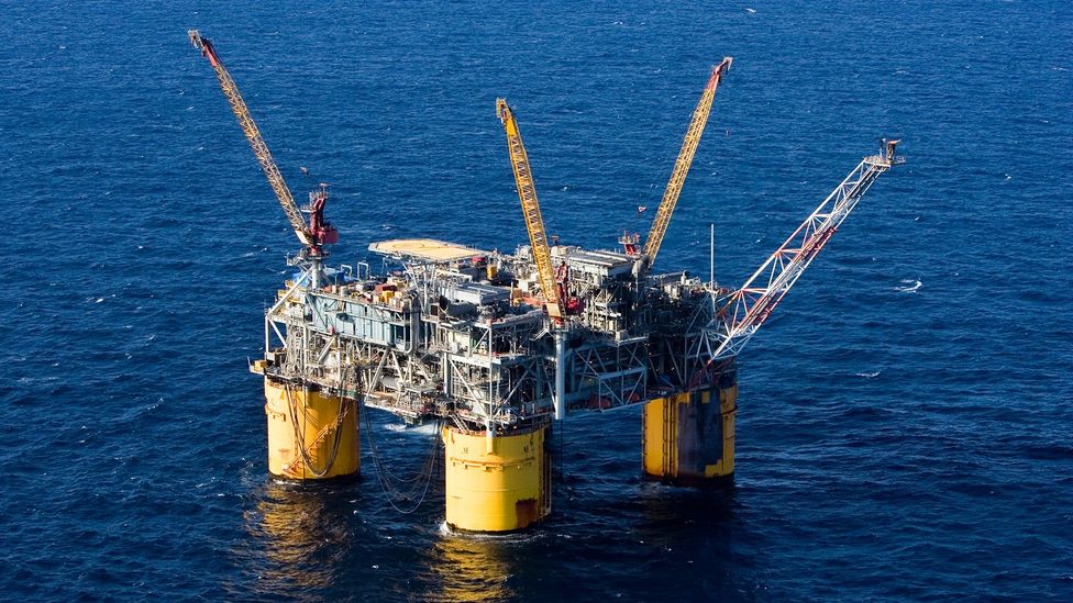
Accurate charts have made it much easier for countries to explot resource such as oil far out to sea (Credit: Getty Images)
For some nations, it's also suspicious that the DCDB is based in the United States, which has the world's most powerful military.
"We have seen concerns as well, that the DCDB is hosted by the United States.
Not everyone loves that," says Jencks.
She tries to assuage these concerns by stressing that the DCDB was endorsed by all IHO member states back when it was created in 1990.
In Kiribati, the challenges are less political, more practical, according to Uriam.
His position as the head of the Hydrographic Unit only became permanent about a year ago.
He used to work in the fisheries department and he knows just how hard is to share data across departments, let alone with outsiders.
There's also hurdles around storing data and hiring people with the right expertise to manage them.
Another concern: foreign research vessels have mapped some of Kiribati's territorial waters before and neglected to share data with the country's government.
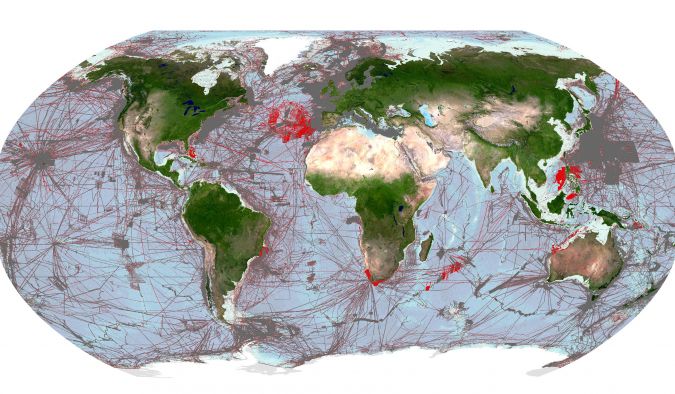
Image shows areas of the global seafloor that are considered mapped within the GEBCO grid. The regions coloured grey depict the coverage of mapped areas within the 2022 release of the GEBCO grid and the areas coloured red show the additional coverage included in the 2023 release.
(Image courtesy: The Nippon Foundation-GEBCO Seabed 2030 Global Center)
With just over six years left until the deadline, Seabed 2030 faces serious challenges in finishing the first public map of the seafloor.
The staggering size of the ocean, the depths, the hostile offshore working environment where ocean mappers are constantly contending with wind, waves, and the corrosive effects of salt water.
Then there's the cost of mapping remote international waters where no country has a responsibility to map.
However, all these challenges seem small compared to the work of uniting countries behind a collective goal, particularly ones as diverse as the US and the Republic of Kiribati.
The differences help explain why the goal of finishing a complete map of the seafloor may remain out of reach for many decades to come.
Links :
- BBC : The quest to map the mysteries of the ocean floor / The rush to claim an undersea mountain range
- Hydro : Pioneering ocean mapping for a better world
- NOAA : NOAA and International Hydrographic Organization Collaborate on Digital Bathymetry Data
- GeoGarage blog : NOAA announces launch of crowdsourced bathymetry database / smart ocean planning using crowdsourced data / Studying Arctic fjords with crowdsourced science and sailboats / Beta test of crowdsourced bathymetry holds promise for ... / The 15th-century monk who crowdsourced a map of ... / Mapping our ocean with the help of superyachts / One-fifth of Earth's ocean floor is now mapped / Citizen scientists to help map the reef
Tuesday, October 10, 2023

France & misc. (SHOM) layer update in the GeoGarage platform

174 nautical raster charts updated
see GeoGarage news
To predict future sea level rise, we need accurate maps of the world’s most remote fjord
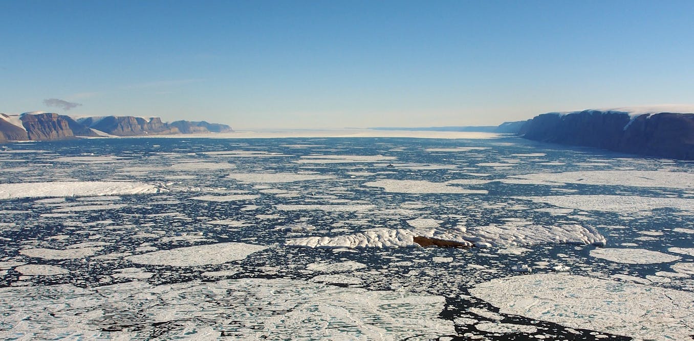
The 10km wide Petermann Fjord in northern Greenland.
The author’s icebreaker ship is a small dot in the middle.
The cliffs on either side are a kilometre high.
In the distance is the ‘ice tongue’ of the glacier flowing into the fjord.
Martin Jakobsson, CC BY-SA
In the distance is the ‘ice tongue’ of the glacier flowing into the fjord.
Martin Jakobsson, CC BY-SA
From The Conversation by Martin Jakobsson
Understanding how glaciers interact with the ocean is akin to piecing together a colossal jigsaw puzzle.
And on various icebreaker expeditions to some of the most remote fjords in northern Greenland, colleagues and I have showed that the shape of the seafloor is one of the key pieces of that puzzle.
To understand why the seabed is so important, we have to look at the glaciers themselves and what is causing them to retreat or even disappear.
The large glaciers that meet the ocean in Greenland and Antarctica balance their mass over time largely in pace with the climate.
When it snows or rains they accumulate ice, and they lose ice to melting and calving – the process where chunks of ice break off and eventually melt away into the sea.
But over the past few decades they are losing mass at an accelerated pace, with more icebergs calving into the ocean and more ice being melted from below by relatively warm seawater.
Estimating how much mass will be lost is often highlighted as glaciology’s grand challenge as it constitutes a large uncertainty in our predictions of future sea-level rise.
To hone our predictions, it is crucial to find the areas where warmer ocean water reaches the these glaciers.
Most glaciers in Greenland drain into fjords in which the waters near the surface are very cold, heavily influenced by meltwater from the glaciers.
Some fjords also allow in warmer water of Atlantic origin, which is saltier and therefore heavier so it enters the fjords at a greater depth.
The shape and depth (or “bathymetry”) of the seafloor determines whether this warmer water can reach the glaciers and cause them to melt.
These fjords may have particularly complex bathymetry as they themselves were formed by glaciers which also eroded the seabed.
While the inner parts can be a kilometre deep, a shallower “sill” at the entrance (formed when eroded materials accumulate or from resistant bedrock) can act as a shield against inflowing warmer water.
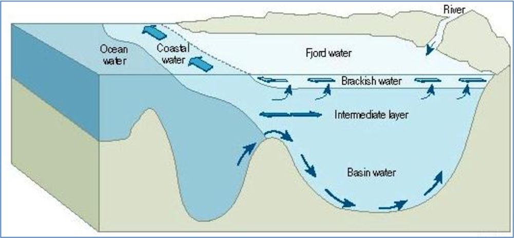
Diagram of a fjord showing a sill that keeps out the warmer ocean water (note in Greenland the fjords are fed by glaciers not rivers).
AMAP, CC BY-SA
AMAP, CC BY-SA
That’s why mapping these fjords is one of the most critical steps in assessing the future of the glaciers that flow into them.
This is unfortunately easier said than done, since many of these glaciers flow into some of the most remote areas of the world.
Ireland-sized glacier, Manhattan-sized icebergs
The Petermann Glacier – the largest in the northern part of the Greenland ice sheet – drains an area of about 74,000 square kilometres, similar to the size of Ireland.
The Petermann Glacier – the largest in the northern part of the Greenland ice sheet – drains an area of about 74,000 square kilometres, similar to the size of Ireland.
Petermann is one of a few glaciers around Greenland with a floating ice tongue extending tens of kilometres from where the glacier is grounded on the seafloor.
These ice tongues may act as a brakes on the flow of ice into the sea, slowing down mass loss.
In 2010, Petermann made headlines when a huge chunk broke off and formed an iceberg four times the size of Manhattan island.
This was followed by another huge calving two years later.
While calving is a natural process, these unusually large events were likely influenced by warmer waters from the Atlantic melting the tongue from below, making it thinner and more prone to break.
In 2015 colleagues and I mapped the entire seabed of Petermann Fjord for the first time.
We found the entrance was still very deep: 443 metres – as deep as the Empire State Building is tall.
Deep enough for that warm, heavy, salty glacier-melting Atlantic water to enter.
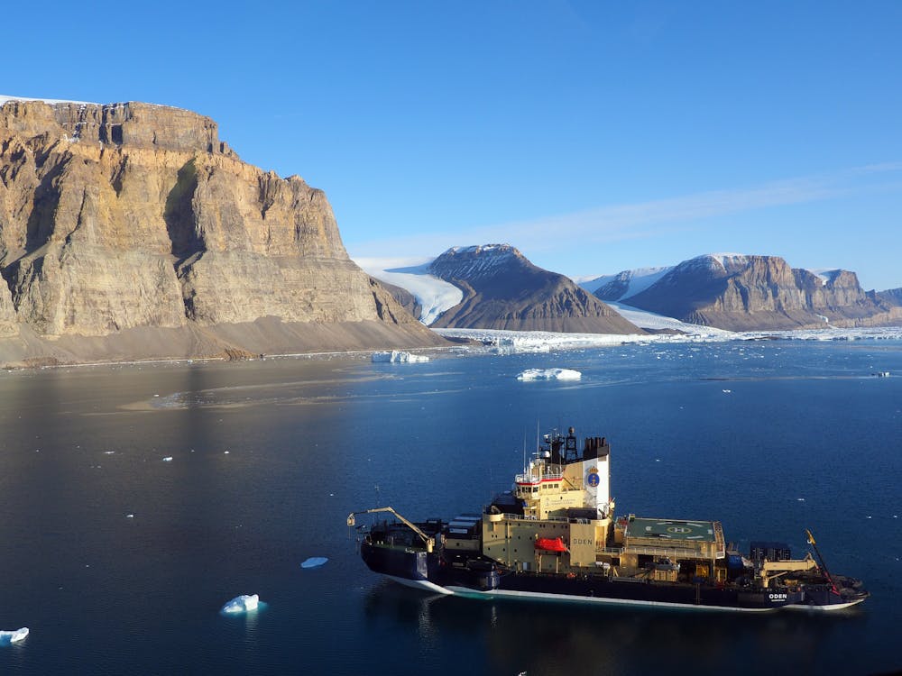
The icebreaker Oden in Petermann Fjord.
The same ship appears as a tiny dot in the image at the top of the article.
Martin Jakobsson, CC BY-SA
The same ship appears as a tiny dot in the image at the top of the article.
Martin Jakobsson, CC BY-SA
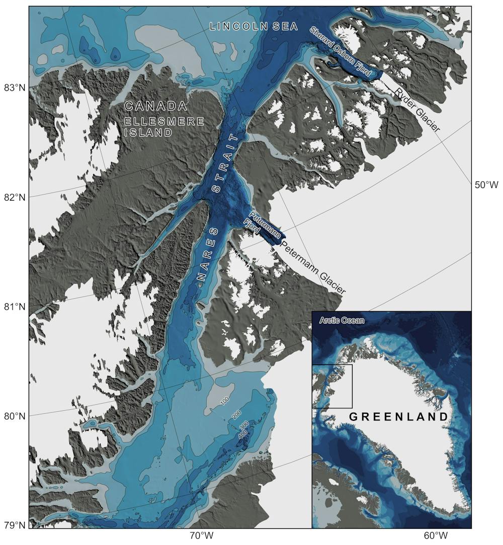
We next wanted to compare Petermann to the Ryder Glacier to its northeast, which has been more stable since at least the 1950s.
Was it kept in place by a shallow fjord entrance keeping out warmer water?
At the time, no ship had ever entered Sherard Osborn Fjord where Ryder Glacier drains, because the sea ice in that region is the toughest in the entire Arctic Ocean.
Therefore, nothing at all was known about the seafloor.
Ryder Glacier became the target for our next expedition with icebreaker Oden in 2019.
Shielded from warmer water
Thick ice in the narrow passage separating Ellesmere Island from Greenland made it hard to even get to Sherard Osborn Fjord.
And entering the fjord was a true challenge, as large icebergs that had calved from the ice tongue floated around and occasionally blocked the entire entrance.
Thick ice in the narrow passage separating Ellesmere Island from Greenland made it hard to even get to Sherard Osborn Fjord.
And entering the fjord was a true challenge, as large icebergs that had calved from the ice tongue floated around and occasionally blocked the entire entrance.
It turned out the fjord has a prominent shallow sill in front of Ryder Glacier.
This sill shields the glacier from warmer subsurface Atlantic water, which appears to explain why it has behaved very differently compared to Petermann.
This sill shields the glacier from warmer subsurface Atlantic water, which appears to explain why it has behaved very differently compared to Petermann.
An underwater sill in front of Ryder Glacier shields it from inflowing warmer water from the Atlantic.
Martin Jakobsson, CC BY-SA
Martin Jakobsson, CC BY-SA
The bathymetry of both Petermann and Sherard Osborn fjords has now been incorporated into the Seabed 2030 Project, which aims to completely map the world’s ocean floor before the end of the decade.
Knowing more about the seabed, and the glaciers that flow into the sea, will in turn help us to sustainably manage the ocean and, ultimately, the planet.
The are more completely unmapped areas in North Greenland.
In 2024, we are planning another expedition with icebreaker Oden even further north to Victoria Fjord, where C.H. Ostenfeld Glacier drains.
This glacier recently lost its floating ice tongue and whether or not Atlantic water makes into the fjord remains to be seen.
Monday, October 9, 2023
'One of the biggest on record': Ozone hole bigger than North America opens above Antarctica

A simulation of this year's ozone hole opening up above Antarctica,
based on data collected by the European Space Agency's Copernicus
Sentinel-5P satellite.
(Image credit: ESA/Copernicus Sentinel data (2023)/processed by CAMS/ECMWF)
(Image credit: ESA/Copernicus Sentinel data (2023)/processed by CAMS/ECMWF)
From LiveSciences by Harry Baker
Satellite data shows that this year's ozone hole grew to around twice the size of Antarctica.
Researchers say the eruption of Tonga's underwater volcano early last year may be partially to blame for the enormous cavity
This year's hole in the ozone layer above Antarctica is one of the biggest ever seen, satellite data shows.
Experts believe the huge gap in Earth's protective shield may have been caused by the eruption of Tonga's underwater volcano in early 2022.
The ozone layer is a band of Earth's atmosphere between 9 and 18 miles (15 and 30 kilometers) above the surface, where there is a high concentration of ozone— a type of oxygen molecule with three atoms instead of two.
The ozone layer blocks out harmful levels of ultraviolet (UV) rays from the sun, which is necessary for various life forms, including humans, to survive.
In 1985, researchers discovered that large holes were appearing in the ozone layer above Earth's polar regions, and that chlorofluorocarbons (CFCs) — a common chemical used in aerosol cans, packing materials and refrigerators at the time — were reacting with the ozone in Earth's atmosphere, depleting ozone levels.
This led to the international community banning CFCs in 1989, allowing ozone levels to recover over time.
However, gaps in the ozone layer still form above the polar regions during each hemisphere's winter months when cold air creates polar stratospheric clouds (PSCs) — extremely high clouds made from tiny ice crystals that sometimes appear to be rainbow-colored — which further deplete the already limited amount of ozone above the poles.
This year's ozone hole above Antarctica reached its maximum size on Sept.
16 when it peaked at a whopping 10 million square miles (26 million square kilometers), according to the European Space Agency (ESA), which monitors the hole with the Copernicus Sentinel-5P satellite.
That is around the same area as North America, three times the size of Brazil, the equivalent of Russia and Chinacombined or around twice the size of Antarctica itself.
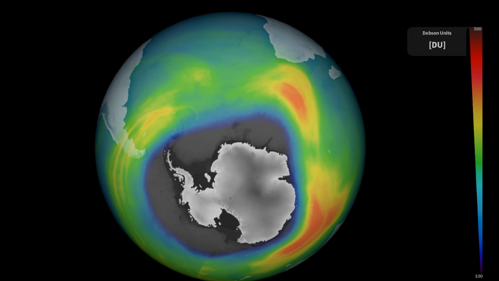
The ozone hole reached its maximum size on Sept.
16.
16.
(Image credit: ESA/Copernicus Sentinel data (2023)/processed by DLR)
"The 2023 ozone hole got off to an early start and has grown rapidly since mid-August," Antje Inness, a researcher at the European Center for Medium-Range Weather Forecasts, said in the statement.
It is "one of the biggest ozone holes on record," she added.
The enormous gap could be attributed to the eruption of the Hunga Tonga-Hunga Ha'apai volcano, which exploded with the force of more than 100 Hiroshima bombs and created the tallest-ever recorded eruption plume when it popped its top in January 2022, researchers said.
In August 2022, a separate group of scientists warned that the eruption could destabilize the ozone layer after more than 50 million tons of water was launched into the upper atmosphere, which is equivalent to a 10% increase in the amount of atmospheric water.
The scientists suggested the water vapor could further destabilize the ozone layer after breaking down into ions, or charged molecules, that react with ozone in a similar way to CFCs.
Water vapor also increases the chance of PSCs forming in polar regions, according to ESA.
It now appears that those scientists were right, Inness said.
But further research is needed to confirm the link between this year's ozone hole and the eruption, she added.
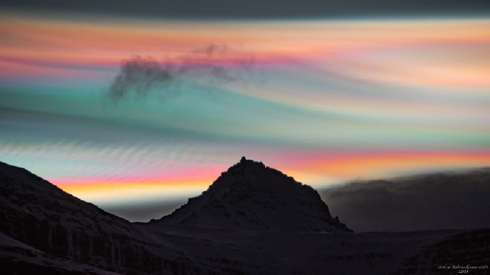
Rainbow-colored polar stratospheric clouds (PSCs) photographed in the Arctic above the peak of Mount Jökultindur in Iceland on Jan. 25 this year.
(Image credit: Jónína Guðrún Óskarsdóttir)
(Image credit: Jónína Guðrún Óskarsdóttir)
The ozone holes above both poles display natural variability that could also play a role in this year's giant cavity.
In 2019, Antarctica's ozone hole shrunk to its smallest size on record, due to unusually warm temperatures that prevented PSCs from forming.
But from 2020 to 2022, the ozone hole grew in size year on year as colder temperatures returned.
This year's El Niño event may also have played a small role in altering temperatures around the poles, but this relationship is unclear at present.
Although the current ozone hole is one of the largest ever seen, there is no reason to panic, ESA researchers said.
The area below the ozone hole is largely uninhabited, and it should fully close up again within a few months.
If CFC levels remain low, then the ozone layer should be fully healed by 2050, they added.
Links :
Sunday, October 8, 2023
Light beams for Helena
Light Beams For Helena from Little Bear Creative
Helena Bourdillon has pushed her limits in the freediving world, using a single breath to dive to seemingly impossible depths.
Helena Bourdillon has pushed her limits in the freediving world, using a single breath to dive to seemingly impossible depths.
But her path to discovering her diving potential started 20 years ago, when she was on the verge of suicide.
Light Beams For Helena explores her journey with depression, her ongoing mental health efforts, and what diving into the darkness of deep water has taught her about life and light.
"Not all scars are visible but they all tell stories of survival"
Subscribe to:
Posts (Atom)