Sunday, December 31, 2017

Sea pilgrim

Sea Pilgrim from Will Mayer
Sea Pilgrim is a meditative film on Brazilian sailor Tassio Azambuja.
While sailing alone this past year, the silence I felt petrified me.
It opened up a great amount of insignificance in my own life.
As a response to this, I set out to create this film exploring silence in a day and age infiltrated with busyness.
We’ve become conditioned that the pursuit of fame and commercial success are the only ways we can be content.
My hope is simply to propose an alternative.
Living a life dedicated to the surrender of something greater than yourself.
Something unknown. 

Saturday, December 30, 2017

Locator beacon - saving lives for over 50 years

In the UK, by 1959 the first automatic beacon for liferafts had been produced by Ultra Electronics, and at the same time Burndept produced the TALBE (Talk and Listen Beacon Equipment) - VHF, and SARBE - Search-And-Rescue-Beacon Equipment (UHF) range of beacons which were used by the Fleet Air Arm and later, Royal Air Force
Later, SARBE beacons included a radio for voice communication by the survivor with the rescuing personnel. 
In the video : L/S of a man struggling from the sea into an inflatable dinghy.
We see a Wessex helicopter from RAF Acklington, Northumberland preparing to take after the crew climb aboard and set off to rescue the man.
The man in the dinghy takes out a Sarbe Beacon; a little battery pack with an aerial that sets off a signal.
Commentator in 1967 tells us Sarbe stands for 'Search and Rescue Beacon Equipment'.
Various shots at the Vidor Factory in South Shields, Tyne and Wear, show the Sarbe Beacons being made; the workers, mainly women, are seen putting the battery packs together.
A man tests the batteries by putting them in a tank of salt water.
Commentator gives us more of the technical details as a woman tests a battery on a voltmeter.
Cut back to the man in the dinghy as the helicopter approaches; several shots of the control dials on the helicopter control board.
A man is lowered from the helicopter; he picks up the man from the dinghy and they are both brought back up to safety

 Search and Rescue (SAR) operations involve locating and helping people in distress.
They can be carried out in a variety of locations including at sea, in mountains or deserts, and in urban areas.
With the launch of Initial Services, Galileo will help SAR operators respond to distress signals faster and more effectively while also lowering their own exposure to risk…
Search and Rescue service is Galileo’s contribution to the international Cospas-Sarsat network. Galileo is a EU programme, carried out in cooperation with the European Space Agency.

Links :

Friday, December 29, 2017

Bizarre, enormous 16th-century map assembled for first time

Urbano Monte’s enormous 1587 map is a unique vision of the world as he knew it.

From National Geographic by Greg Miller 

The largest known world map of its time—made of 60 individual sheets—can finally be seen as the mapmaker intended.

This colorful and intricately detailed map from 1587 is more than nine feet by nine feet when fully assembled.
For the last 430 years, its 60 individual sheets were bound together as an atlas, but now they have finally been put together—digitally—to reveal a complete picture of the world as it was understood at the time.

 Monte included a portrait of himself at age 43 (left)
and later updated it at age 45 by pasting a new portrait over it (right).

And what a world it was.
The map is packed with fantastical creatures, from unicorns in Siberia to mermen frollicking in the Southern Ocean and a terrifying bird flying off with an elephant in its talons.
The map reflects the geographical knowledge (and misconceptions) of its time, but in some ways it’s surprisingly advanced.
It portrays the Earth as it would be seen looking directly down on the North Pole from space, a perspective not commonly used by mapmakers until the 20th century.

 Monte’s depiction of Japan is oddly shaped and oriented east to west instead of north to south, but it includes many places not present on other Western maps of the time.

“It’s unique in many ways,” says G. Salim Mohammed, the head and curator of the David Rumsey Map Center at Stanford University, which recently added the map to its collection.
“No one has really studied this because it’s been hidden for centuries.”
Only three surviving versions of the map are known to exist.

The map is made up of 60 individual sheets, like this one showing northern Europe.

Little is known about the mapmaker, Urbano Monte.
He came from a wealthy and well-connected family in Milan, and like many gentleman scholars of his day, he had a keen interest in geography. It was, after all, an exciting age of discovery, writes Katherine Parker, a historian of cartography, in a recent essay about Monte’s map: “Their world was growing each day and Monte wanted to understand all of it.”

This sheet shows the islands of Tierra del Fuego (bottom), discovered just a few decades earlier.

Monte appears to have been quite geo-savvy for his day.
He drew on the works of more famous cartographers like Gerardus Mercator and Abraham Ortelius, and he included recent discoveries of his time, such as the islands of Tierra del Fuego at the tip of South America, first sighted by the Portuguese explorer Ferdinand Magellan in 1520.

 A bird flies over the Southern Ocean with an elephant in its talons.

Thanks to his connections in high places, Monte met with the first official Japanese delegation to visit Europe when they came to Milan in 1585.
Perhaps as a result, his depiction of Japan contains many place names that don’t appear on other Western maps of the time.

 A merman appears to pay tribute to King Philip II of Spain off the coast of South America.

Like many mapmakers of the era, Monte had a tendency to fill in the empty spaces on his map. Animals roam the land, and his oceans teem with ships and monsters.
King Philip II of Spain rides what looks like a floating throne off the coast of South America, a nod to Spanish prominence on the high seas.

 To digitize the map, the team scanned all 60 sheets and began assembling them as a series of five concentric rings. Four sheets make up the innermost ring.

A more unusual feature of Monte’s map, however, is the projection—that is, the method he uses to flatten the globe onto a map. Monte’s map is circular, with the North Pole at the center and lines of longitude radiating outward from there—what modern cartographers call a polar azimuthal projection, a very unusual choice for his time.
The projection became popular only with the advent of air travel in the 20th century, when the shortest route between two points often involved arcing up over the Arctic (here’s one example).

At this stage of assembly, two more rings have been added.
This is the map with all five concentric rings of sheets stitched together.

“I think Monte was really trying to show the circular nature of the Earth,” says David Rumsey, the map collector who bought the map and donated it to the center he founded last year at Stanford.
The polar projection has the advantage of accurately portraying the continents of the northern hemisphere.
It grossly exaggerates the size of Antarctica, but that actually fit with the cartographic thinking of the time, Rumsey says.
“Most cartographers thought it had to be massive to counterbalance the large landmasses to the north,” he says—a misguided but influential idea dating back to the ancient Greeks.

Monte’s map was re-projected so it could be aligned with the modern globe in Google Earth.

Bringing Monte's vision to life

Rumsey purchased the Monte map in September, and his nephew Brandon did most of the work to scan each page and stitch the images together.
They fit almost perfectly, which suggests it’s what Monte had intended all along.
The individual sheets and composite are now online, as is a version of the map aligned with the modern globe in Google Earth:


Using modern technology to fulfill the vision of a 16th century cartographer is exactly the sort of thing the new map center at Stanford was set up to do, say Rumsey and Mohammed.
Making the new digital version freely available should make it easier for scholars to learn more about Monte and his map.
For the rest of us, it’s a chance to explore an extremely rare map that happens to be one of the most spectacular of its time.

Links :

Thursday, December 28, 2017

Extremities of the Earth: The most remote inhabited island

Creator: Bellin (1746)
Publisher: Arkstée et Merkus

From LOC by Julie Stoner

Where is the lowest point on dry land?
Or the northernmost inhabited point on earth?
How about the highest city?
All of these questions and many more will be unraveled in this new occasional series, Extremities of the Earth, created to explore the farthest reaches of our planet.
For this inaugural post for the series, I found myself fascinated by the most remote inhabited island in the world: Tristan da Cunha. Located in the South Atlantic Ocean, this small island with a 25-mile circumference is farther away from the next outpost of humanity than any other inhabited place in the world.
About 1,200 miles away from the island of St. Helena and 1,750 miles from Cape Town, South Africa, Tristan da Cunha (colloquially known simply as Tristan) is home to 256 people.
The island is part of an archipelago of six small islands, with Tristan being the only permanently inhabited one.
It is believed that the island was first sighted by Admiral Tristao da Cunha, pictured below, in 1506, as he and his crew were sailing from Portugal to the east coast of Africa.
However, it was not until 1643 that the first recorded landing took place by the crew of the Dutch vessel Heemstede.

 “Triastao da Cunha, 1460?-1540.” Woodcut of Triastao da Cunha by Tobias Stimmer. Illustrated in Elogia Virorum Bellica Virtute Illustrium…by Paolo Giovio, 1575.
Rare Book Division, Library of Congress.

Due to its location, Tristan was a convenient place for ships to resupply on long sea voyages from Europe to Asia in the 16th and 17th centuries.
Although the first large-scale charts of the archipelago were created by the Dutch in 1656, the islands can be seen marked on earlier maps, such as on this portolan chart from 1633 by Pascoal Roiz.
Can you spot the island of Tristan da Cunha on this map?

 “A portolan chart of the Atlantic Ocean and adjacent continents,” Pascoal Roiz, 1633.
Geography and Map Division, Library of Congress.

 Detail of “A portolan chart of the Atlantic Ocean and adjacent continents,” Pascoal Roiz, 1633. Geography and Map Division, Library of Congress.

The first attempt at settlement of the island was made in 1810 by Jonathan Lambert of Salem, Massachusetts, who arrived on the island with three other men.
Lambert became the self-proclaimed “ruler” of the island.
His reign was short, however, as Lambert and two of the other men drowned while on a fishing expedition in 1812.
The expedition’s one survivor, Thomas Curry, was left to continue farming on Tristan, but he was soon joined by several more settlers.
In 1816, the United Kingdom annexed the archipelago and a garrison of British troops was sent to secure Tristan, although the troops were soon recalled in 1817.
Several men led by Corporal William Glass decided to remain and settle on the island, becoming the ancestors of many of today’s islanders.

 “Tristan da Cunha,” published by Directorate of Colonial Surveys, 1948.
Geography and Map Division, Library of Congress.

As seen in the map above, there is only one town on the island, officially named Edinburgh of the Seven Seas but locally known simply as the Settlement.
This is the only relatively flat plain on the island, with the remainder dominated by Queen Mary’s Peak, an active volcano and the highest island mountain in the South Atlantic Ocean.
In 1961, a volcanic eruption forced residents to evacuate the island, moving temporarily to England. The majority of Tristan residents chose to return in 1963.

 Tristan da Cunha NGA nautical chart with the GeoGarage platform

Today, the social and economic organization of the island is much the same as it was set up by William Glass in 1817.
All land is communally owned and all Tristan families are farmers at least part-time, working on family plots of land in an area known as the Patches.
Anyone interested in visiting the island today must receive prior approval by the island Administrator.
Although it is the most isolated settlement in the world, Tristan da Cunha remains a vibrant and successful community.

Links :

Wednesday, December 27, 2017

Nightmare scenario: ship critical systems easy target for hackers

Naval Dome exposes vessel vulnerabilities to cyber attack

From World Maritime News

Hackers can easily access and over-ride ship critical systems, results of a series of cyber penetration tests conducted by Naval Dome, an Israel-based cyber security specialist, show.
The tests were carried out on systems in common use aboard tankers, containerships, superyachts and cruiseships, under the supervision of system manufacturers and owners,
Naval Dome’s cyber engineering team hacked into live, in-operation systems used to control a ships’ navigation, radar, engines, pumps and machinery, and was able to shift the vessel’s reported position and mislead the radar display.

Another attack resulted in machinery being disabled, signals to fuel and ballast pumps being over-ridden and steering gear controls manipulated.
“We succeed in penetrating the system simply by sending an email to the captain’s computer,” Asaf Shefi, Naval Dome’s CTO, the former Head of the Israeli Naval C4I and Cyber Defense Unit, said commenting on the penetration into the ship’s Electronic Chart Display and Information System (ECDIS).

“We designed the attack to alter the vessel’s position at a critical point during an intended voyage – during night-time passage through a narrow canal. During the attack, the system’s display looked normal, but it was deceiving the Officer of the Watch. The actual situation was completely different to the one on screen. If the vessel had been operational, it would have almost certainly run aground.”


According to Shefi, the Naval Dome hack was able to alter draught/water depth details in line with the spurious position data displayed on the screen.
“The vessel’s crucial parameters – position, heading, depth and speed – were manipulated in a way that the navigation picture made sense and did not arouse suspicion,” he said.
“This type of attack can easily penetrate the antivirus and firewalls typically used in the maritime sector.”


Commenting on the ease with which Naval Dome was able to by-pass existing cyber security measures, Shefi explained: “The Captain’s computer is regularly connected to the internet through a satellite link, which is used for chart updates and for general logistic updates. Our attacking file was transferred to the ECDIS in the first chart update. The penetration route was not too complicated: the attacking file identified the Disk-On-Key use for update and installed itself. So once the officer had updated the ECDIS, our attack file immediately installed itself on to the system.”

In a second attack, the test ship’s radar was hit. While the radar is widely considered an impregnable, standalone system, Naval Dome’s team used the local Ethernet Switch Interface – which connects the radar to the ECDIS, Bridge Alert System and Voyage Data Recorder – to hack the system.
“The impact of this controlled attack was quite frightening,” said Shefi.
“We succeeded in eliminating radar targets, simply deleting them from the screen. At the same time, the system display showed that the radar was working perfectly, including detection thresholds, which were presented on the radar as perfectly normal.”


A third controlled attack was performed on the Machinery Control System (MCS).
In this case, Naval Dome’s team chose to penetrate the system using an infected USB stick placed in an inlet/socket.
“Once we connected to the vessel’s MCS, the virus file ran itself and started to change the functionality of auxiliary systems. The first target was the ballast system and the effects were startling. The display was presented as perfectly normal, while the valves and pumps were disrupted and stopped working. We could have misled all the auxiliary systems controlled by the MCS, including air-conditioning, generators, fuel systems and more.”

Itai Sela, CEO of Naval Dome, added that the virus infecting ship systems can also be unwittingly transferred by the system manufacturer.
“As manufacturers themselves can be targeted, when they take control of onboard computers to carry out diagnostics or perform software upgrades, they can inadvertently open the gate to a cyber attack and infect other PC-based systems onboard the ship. Our solution can prevent this from happening.”

Links :

Tuesday, December 26, 2017

Does this 17th-century map show an early image of Father Christmas?

The map images are Crown Copyright, courtesy of The National Archives (FO 925/4111, folio 11).


From IanVisits

A rare map of the Arctic Ocean held at The National Archives may contain some of the earliest colour images ever produced of Father Christmas.

Found inside a volume of John Seller’s Atlas Maritimus, the custom-made chart dates from around 1675.
Significantly this is also just a few years after the restoration of the Monarchy, and the overthrowing of the ban on Christmas that was introduced by the Puritans.

At the time also Father Christmas wasn’t seen as a gift-giving figure in the style of Santa Claus as we think of today, but as a personification of the Christmas festival, not dissimilar to John Bull or The Green Man, or for Americans, Uncle Sam.

Back to the map, and in the 17th century, as part of the bespoke production process, buyers could choose from a selection of maps for their own volume of an atlas showing seas and coasts then known around the world.

Hand-tinting, applied as an extra service, made each chart unique.
Curiously, the particular choice of red colouring applied in this example may make it the first ever map to depict Santa in his customary red clothing.

On the right hand side of the chart, in Novaya Zemlya, a sleigh crosses the snowy wastes pulled by reindeer with a red-coated driver; another image on the lower right shows a figure dressed in red and white, leaning on the scale bar as if chatting with the polar bear.


The icy waters shown on this ‘Chart of the Sea Coasts of Russia Lapland Finmarke Nova Zemla and Greenland’ lie to the extreme north of Europe, chiefly within the Arctic Circle.
These are the ‘seas of the midnight sun’ where the sun shines day and night in the middle of the short summer.
The lower edge of the chart shows the northern shores of Scandinavia at left – Norway and Lapland – on the White Sea, with Archangel in the centre lower edge, and the coastline then sweeps to the right across the top of north-west Russia to Novaya Zemlya.

This chart was not intended for navigation.
It lacks information useful to mariners, such as soundings, warnings of rocks and sandbanks, and the locations of harbours.
The space is filled instead with decorative details.

What is marked as Greenland at top left of the whole chart is really its eastern neighbour, Spitsbergen. ‘Finmarke’ is part of modern Norway, ‘Corelia’ (Karelia) lies to right of the prancing goat, while Lapland forms the ‘nose’ of the horse’s head shape.

Pictures of ships and a blowing whale at top centre, plus compass roses, and ornate cartouches for title and scale, were designed to appeal to an expanding market for charts among the nobility and gentry of Europe.

For those with an interest in the origins of Christmas, however, it may chart the beginnings of what became the fable of Santa Claus.
The red decorative details of the two figures dressed as Father Christmas are perhaps what bring a legend to life.

Sunday, December 24, 2017

How do the oceans assist in removing carbon dioxide from the atmosphere?


 Carbon dioxide ocean–atmosphere exchange
Atmospheric carbon dioxide is the most important human-made greenhouse gas responsible for global warming.
Oceans assist in removing carbon dioxide from the atmosphere: phytoplankton accumulate carbon dioxide through photosynthesis and their chlorophyll colours the ocean’s waters.
Satellites use this colour to measure chlorophyll, which helps scientists to calculate how much carbon dioxide is absorbed or emitted. 
Planetary Visions (credit: ESA/CCI Ocean Colour/Climate Monitoring User Group/Planetary Visions) 

 CO2 Monitoring Task Force presents architecture and definition of an operational system capacity for Anthropogenic CO₂ Emissions Monitoring & Verification Support.

 Use case of Copernicus Marine Service : save fuel, reduce CO2 emissions, safest navigation

Links :

Friday, December 22, 2017

US NOAA layer updated in the GeoGarage platform

5 nautical raster charts updated

The real blue planet: Incredible NASA image shows Antarctic iceberg surrounded with a 'glowing halo'


 In 2017, NASA's Operation IceBridge flew for the ninth year over Antarctica to map the ice.
This video features photographs of land ice and sea ice, shot with a handheld camera and with the Digital Mapping System (DMS), during IceBridge flights in November 2017.

 From DailyMail by Cheyenne MacDonald

NASA’s airborne Operation IceBridge mission has captured a stunning image of an Antarctic iceberg surrounded by an otherworldly blue halo.
At first glance, the striking neon color appears artificial – but, according to the space agency, the submerged layer of the eroded iceberg truly is ‘the bluest of ice

Stunning new image from NASA's Operation IceBridge mission
shows a blue 'glowing' iceberg in Antarctica

According to NASA, the effect is the result of blue light in the water of Antarctica's McMurdo Sound
As the water erodes the iceberg, and changes its shape, the older, bluer layers are brought to the surface
NASA’s airborne Operation IceBridge mission has captured a stunning image of an Antarctic iceberg surrounded by an otherworldly blue halo.
At first glance, the striking neon color appears artificial – but, according to the space agency, the submerged layer of the eroded iceberg truly is ‘the bluest of ice.’

The remarkable effect was spotted during a flight to Victoria Land, as the aircraft passed over Antarctica’s McMurdo Sound.
Operation IceBridge wrapped up its Antarctic survey earlier this week, marking the completion of five polar campaigns this year.


The stunning image of the glowing iceberg was captured on November 29, revealing the incredible effect of blue light from the Sound.
‘The undersides of some icebergs can be eroded away, exposing older, denser, and incredible blue ice,’ NASA explains.
‘Erosion can change in iceberg’s shape and cause it to flip, bringing the sculpted blue ice above the water’s surface.
‘The unique step-like shape of this berg – compared to the tabular and more stable berg in the top-right of the image – suggests that it likely rotated sometime after calving.’

Flying low over the Earth's southernmost continent, Operation IceBridge is wrapping up its eighth consecutive field season of mapping the ice sheet and glaciers of Antarctica, as well as the surrounding sea ice.
With more than 300 hours logged in the air over 24 science flights, the mission is considering 2016 one of the most successful seasons yet.

The mission recently completed several flights out of the McMurdo and Amundsen-Scott South Pole stations.
This year was the ninth consecutive year the space agency has conducted flights over the continent.
NASA recently released a series of dramatic images taken during the course of its Antarctic survey.
The images include sweeping shots of mountains and land ice, carpets of icebergs spreading from the Antarctic coast, and even a snap of a researcher taking a rest during a return flight.

Links :

Thursday, December 21, 2017

How forecast models can lead to bad forecasts


From WDT blog by David Moran

As a meteorologist, I've seen my share of forecast models depicting extreme scenarios.
These models can go from forecasting heavy snow to forecasting nothing in as little as 12 hours.
How does this happen?
Before we get too far, let's describe a forecast model.
Simply put, a model is a set of complex mathematical equations solved by a computer to produce a forecast.
To begin the forecast process, data representing the current state of the atmosphere is ingested into the model.
Using this data, the equations that comprise the model produce a forecast at a set interval (this interval could be one hour, three hours, six hours, etc.) for multiple days.
The better the data going into the model, the better the resulting forecast may be.
Take a look at these maps.
They are two forecasts for Friday at 12pm CST.
The only difference is that the image on the left is from a model 12 hours before the image on the right.

GFS Model Comparison Friday, December 22, 2017 12pm CST
with 22 km resolution grid

You can see a few differences in the two images.
The earlier forecast has the snow associated with the area of low pressure in the Great Lakes extending further westward into Iowa and Minnesota.
Another difference is in the placement of this low.
While the differences are relatively small, they could have various implications (a major metro area getting snow versus not getting snow, for example).

There are a couple things that can impact the model forecast.
Current observations play a vital role in model forecasts; if there are errors in the observations (as a result of instrument malfunction, for instance), the model's forecast will be impacted.
In addition, when observations are scarce, such as over oceans or in mountainous areas, model forecasts will also be impacted.
In these areas, the lack of observations affects the forecast because the current state of the atmosphere is not fully represented.
In addition, errors in model forecasts tend to increase further into the future; small errors early in the forecast can increase with time.
As a result, forecasts at these later times may not make sense.
Beyond about 7 days, the accuracy of a forecast decreases significantly.
Here's is an illustration of how a model works and why forecasts at long ranges aren't reliable:

Forecast Model scenario

The images above were from a model run two days ago.
Now let's compare those two images with a look at the most recent run (at the time of this writing).

GFS Model Comparison for Friday, December 22, 2017 1pm CST

You can see differences in each image, with the latest model image on the far right, now showing only light snow for North Dakota into northwestern Minnesota.
In many cases, the model forecast typically begins to become more consistent within 48-72 hours from an event.
Looking at the national forecast for Friday, there is a potential for snow across the Northeast; accumulations of 3-6 inches with locally higher amounts in excess of 8 inches are currently forecast. In the graphics above, you notice all three images suggest the potential for rainfall across the Tennessee Valley.
This still appears to be a possibility with models suggesting rainfall amounts of 2-4 inches and some locally higher amounts.
In addition, there will be the potential for some flooding.

courtesy of Windy

While these model images can be fun to look at, especially when they indicate the potential for a significant event, the points outlined above should be kept in mind when looking at them.
Also, knowing your source is important to determine whether or not the information is trustworthy.

Links :

Wednesday, December 20, 2017

A defiant map-hunter stakes Vietnam’s claims in the South China Sea

Philippe Vandermaelen, “Partie de la Cochinchine,” Atlas universel de geographie physique, politique, statistique et mineralogique, 1827.
David Rumsey Historical Map Collection.

From NYTimes by Mike Ives

Eight years ago, officials in Danang asked Tran Duc Anh Son to travel the world in search of documents and maps that support Vietnam’s territorial claims in the South China Sea.

 Dr. Son in his office with a historical map of the South China Sea — or the East Vietnam Sea,
as his government calls it.
Credit Quinn Ryan Mattingly for The New York Times

He did, and he concluded that Vietnam should challenge China’s activities in waters around some of the sea’s disputed islands, as the Philippines successfully did in a case that ended last year. But his bosses would not be moved.
“They always say to me, ‘Mr. Son, please keep calm,’” he said during an interview at his home in Danang, the coastal city where he is the deputy director of a state-run research institute. 
“‘Don’t talk badly about China.’”
Vietnam’s top leaders are “slaves” to Beijing, he added bitterly, as torrential rain beat against his windows.
“That’s why we have many documents that are kept in the dark.”
Dr. Son’s mission, and his bosses’ demurrals, are signs of the times in Vietnam, which has always lived in China’s shadow but also harbors a fierce independent streak.

On October, 21st 2010, Chinese State Bureau of Surveying and Mapping launched Map World, its online map service, at www.tianditu.cn and www.chinaonmap.cn, in which the nine-dotted line is present and encroaches Hoang Sa (Paracel) and Truong Sa (Spratly) Archipelagos and the waters of Vietnam.

China’s assertiveness in the sea has caused deep anxiety for Vietnam, which regards territorial sovereignty as a sacred principle, and emboldened the government to promote claims over the disputed Spratly and Paracel archipelagos more aggressively.
Yet even as evidence for such claims piles up, analysts say that Hanoi has been reluctant to weaponize it.
China, after all, is Vietnam’s next-door neighbor and largest trading partner, as well as an increasingly assertive hegemon that is building a string of military outposts on reclaimed land in the sea.
Everyone in Vietnam, “government and nongovernment, has the same sense that the Chinese should stay away from those islands,” said Liam C. Kelley, a professor of history at the University of Hawaii at Manoa who has studied the roots of the relationship between the two countries.
But he said the recent surge of nationalism over China’s expansive vision raises a thorny question: “How do you position yourself as defending Vietnam from China when China is basically your backbone?”

Fishermen preparing to go to sea from Danang.
A Chinese oil rig towed into waters nearby provoked a tense maritime standoff in 2014 and set off anti-Chinese riots.
Credit Quinn Ryan Mattingly for The New York Times

Chinese dynasties ruled present-day Vietnam for a millennium, leaving positive cultural legacies but also a trail of resentment.
Beijing helped Hanoi defeat the French to win independence in 1954 but also invaded northern Vietnam in 1979, setting off a brief border war.
In 2014, anti-China sentiment flared when a state-owned Chinese oil company towed an oil rig to waters near Danang, provoking a tense maritime standoff and anti-Chinese riots at several Vietnamese industrial parks.
Interest in territorial sovereignty has long been “in the heart” of the Vietnamese people, said a senior Vietnamese legal expert in Hanoi, who insisted on anonymity to discuss a sensitive political matter. But the oil rig crisis has greatly magnified the interest.
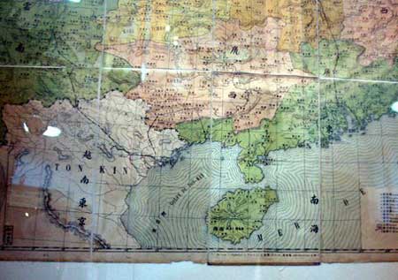
 UKHO map (1984)
China has controlled the Paracels since 1974, when it seized them from the former government of South Vietnam in a naval clash.
It has bolstered its foothold in the Spratlys recently through an island-building campaign.
Chinese officials and scholars seek to justify Beijing’s claim to sovereignty over waters that encircle both archipelagos — represented by what they now call the nine-dash line — by citing maps and other evidence from the 1940s and ’50s.
But some in Vietnam, like Dr. Son, are trying to marshal their own historical records — even if they may have little power to dissuade China.

 A historical map of China and South-east Asia, in Danang, Vietnam
China’s assertiveness in the sea has caused deep anxiety for Vietnam, which regards territorial sovereignty as a sacred principle.
Photo: The New York Times

Dr. Son, 50, and other Vietnamese scholars say the Nguyen dynasty, which ruled present-day Vietnam from 1802 to 1945, wielded clear administrative control over the Paracels by sending survey parties and even planting trees on them as a warning against shipwrecks.
This happened decades before imperial or post-revolutionary China showed any interest in the islands, they say.
“The Chinese know very clearly they never mentioned the Hoang Sa or the Truong Sa in their history books or historical maps,” Dr. Son said, using the Vietnamese terms for the Paracels and Spratlys.
By contrast, he said, he found evidence in more than 50 books — in English, French, Dutch, Spanish and Portuguese — that a Nguyen-era Vietnamese explorer planted the royal flag in the Paracels in the 1850s.
International arbitration over territorial sovereignty can only proceed if both parties agree, analysts say, and China has shown no interest in that.

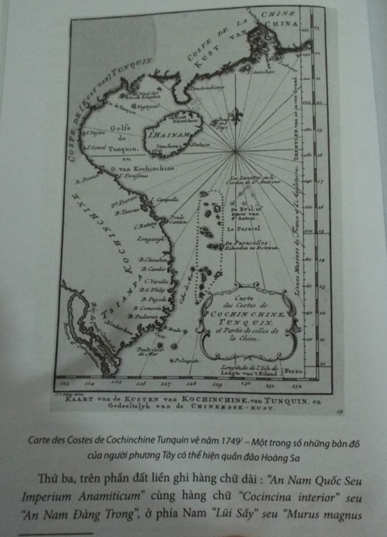
 The map published in 1749 by western navigators (Carte des Costes de Cochinchine Tunquin),
with Hoang Sa as Vietnam's territory.

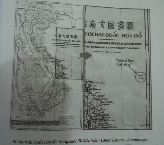
 A Chinese map published in 1904 reveals that the Hoang Sa (Paracel) and Truong Sa (Spratly) Archipelagos did not belong to China.
source : VietnamNet
Still, the frenzy of interest in Vietnam’s maritime history since about 2012 has produced a buzz in the state-run news media — and a few unexpected heroes.
One is Tran Thang, a Vietnamese-American mechanical engineer who lives in Connecticut.
He said by telephone that he had donated 153 maps and atlases to the Danang government in 2012 after ordering them on eBay for about $30,000.
Among Vietnamese academics who study the government’s territorial claims in what it calls the East Vietnam Sea, Dr. Son is among the most prominent.
He was born in 1967 in Hue, about 50 miles northwest of Danang, and his father was killed in 1970 while fighting for South Vietnam.
“I only remember the funeral,” he said.
He grew up poor, he said, but excelled at Hue University, where his history thesis explored Nguyen-era porcelain.
He later directed Hue’s fine arts museum and led a successful bid to make its imperial citadel a Unesco World Heritage site.

Map of An Nam by French priest Jean-Louis Taberd.

As a student poking around dusty archives, Dr. Son said, he would photocopy maps that highlighted Vietnamese territorial claims in the South China Sea.
So when top officials in Danang asked him in 2009 to pursue the same research on the government’s behalf, he said, he leapt at the chance.
“I’m always against the Chinese,” he said by way of explanation.
Chinese scholars have been conducting rival research for years with support from Beijing, he added, and he sees his own work as payback.
Danang officials allowed Dr. Son to recruit a seven-member support team, he said, but did not fund his international travel.
He said he paid for some of the research that he has conducted since 2013 across Europe and the United States, where he was a Fulbright scholar at Yale University, out of pocket.
Dr. Son, the deputy director at the Danang Institute for Socio-Economic Development, said he still held out hope that Vietnam would take China to court.
But he also said he was not holding his breath and had little say in the outcome.
“I’m not political,” he added. “I’m a scientist.”

Links :

Tuesday, December 19, 2017

Unruly Antarctica could change sea-level outlook without much warning

Researchers from several institutions, including Rutgers University, Princeton and Harvard, worked with Climate Central to create an interactive map which illustrates sea level projections in cities across the globe.
The map provides projections that both include and exclude the new Antarctic research.
Local rises would vary from region to region under the same scenario and would exceed the global average for all US Gulf and Atlantic coast locations, according to the report.
The study ‘Evolving Understanding of Antarctic Ice-Sheet Physics and Ambiguity in Probabilistic Sea-Level Projections’ is the first to integrate Antarctic models into sea-level projections.

From Ars Technica by Scott K. Johnson

These sea-level rise scenarios aren’t new, but they are food for thought. 
Sea-level rise is one of the more challenging effects of climate change to project.
It’s not that the direction of the change is unclear—sea level will rise as the planet warms—but it’s extraordinarily difficult to know when which sections of which glaciers will slide into the sea.
Many factors are involved besides temperatures, including ocean currents and the topography of the bedrock below ice sheets.


The flow of glaciers into the sea has accelerated in this vulnerable area of the West Antarctic Ice Sheet along the Amundsen Sea.


As a result, the projections of sea-level rise presented to entities like the Intergovernmental Panel on Climate Change (IPCC) have been heavily caveated and have changed significantly over time.
The 2013 IPCC report, for example, projected considerably higher sea-level rise than the 2007 report, which explained that it was leaving out important ice-sheet processes that needed more research.
And the recent 2017 US National Climate Assessment again increased projections of sea-level rise based on the current state of the science.

A new study from a group of researchers led by Rutgers’ Bob Kopp has made for splashy headlines in recent days, some of which claimed the study showed that sea-level rise will be “worse than thought” or that the study confidently predicted how many people would be inundated by rising seas this century.
Neither description is really true, as there is nothing new about the sea-level rise scenarios shown.
In fact, Kopp also helped put together the sea-level chapter of the US National Climate Assessment, and the numbers in the new study obviously match those in the report.

That doesn’t mean the study from Kopp et al. isn’t notable and interesting.
It relates to something the scientific community has been wrestling with for the last couple of years—a pair of studies using an improved ice-sheet model that simulated much faster ice loss from the vulnerable West Antarctic Ice Sheet.
While this simulation was more compatible with recent research in Antarctica, it’s not easy to fold the model’s alarming first results—which are not the final word—into the existing outlook.

Partly because ice-sheet models have not reached the point where researchers feel they accurately represent everything we know, several past efforts have produced a hybrid sort of projection incorporating detailed surveys of experts in the field.
This new study takes a hybrid projection like that from 2014 and replaces the Antarctic ice-loss estimates with the alarming model simulations to find out what the implications would be.
The answers are more interesting (and wonky) than “sea-level rise goes higher.”
But yes, the new study definitely does increase the estimated future sea-level rise.

The top two graphs show sea-level projections for three emissions scenarios from a 2014 study.
The bottom two graphs update those projections with recent model simulations of vulnerable Antarctic glaciers.

In the high greenhouse-gas emissions scenario, the 2014 projection estimated about 0.5 to 1.25 meters of sea-level rise by 2100, whereas this new version shows 0.9 to almost 2.5 meters.
(For reference, the 2013 IPCC report projected about 0.5 to 1 meter, and the new 2017 US National Climate Assessment put it in the neighborhood of 1 to 2.5 meters using a different scenario scheme.)

Once you move past 2100, the scenarios diverge in a big way. By 2300, the difference in sea level between the low and high emissions scenarios grows to more than 10 meters.
Once ice sheets become destabilized, they keep raising sea levels for a long, long time—our actions this century can shape the world for many centuries to come.

Beyond that, here’s what the study really reveals: in this century, the biggest variable controlling how much sea-level rise we get is the behavior of Antarctic ice.
We don’t know whether to expect the high end or the low end of the range of projections, even assuming we follow the high emissions path.

And because the situation can change in Antarctica in a matter of decades, we can’t really know what will happen in the second half of the 21st century based on what we see in the first half.
The model simulations with the highest rate of sea-level rise in 2100 weren’t necessarily those with the highest rate in the 2020s.
The lesson, the researchers write, is that “this means that ‘extreme’ future scenarios need to be considered even if they overestimate current rates of sea-level rise.”

Again, the researchers emphasize that these model simulations of higher sea-level rise provide a realistic “worst-case scenario” more than they predict the most likely outcome.
But because the real possibility of a worst-case scenario isn’t likely to be ruled out any time soon, planning should account for an uncertain future.

To add some more meaning to these numbers, the researchers calculated the present population living in areas that could become inundated by sea-level rise in 2100.
Even in the lowest emissions scenario (where global warming is limited to about 1 degree Celsius beyond current temperatures), that includes at least 75 million people worldwide.
In the high emissions scenario, the “worst-case” pushes that number as high as 235 million.
The difference between these two future worlds is far from academic.

Links :


Monday, December 18, 2017

Nautical maps no safeguard against subsea cable breakages

Submarine cable on a UKHO map in Cape Town (Marine GeoGarage)

From WebAfrica

International maritime law and nautical maps have failed to prevent instances of ship captains dropping anchors on key undersea broadband cables.


This is according to Didier Mainguy (pictured), who is chief mission for Cape Town docked cable repair ship CS Leon Thevenin.
The CS Leon Thevenin consists of a sixty‐man team and is on standby in Cape Town to respond to broadband subsea cable damage along African shores.
The ship, in turn, is owned by a subsidiary of French telecoms giant Orange.
Mainguy has told ITWeb Africa that his ship conducts up to three major subsea cable repairs per year, with the latest being a fix on an undersea network at Mtunzini, near Durban, South Africa.
Cable cuts by ship anchors, such as those on the South East Asia-Middle East-Western Europe 4 (SEA-ME-WE 4) cable near Egypt last year, have proven to be highly disruptive for internet services in Africa, resulting in little to no online access in affected areas.


But the problem is exacerbated by ship captains who either deliberately, or accidentally, fail to follow international maritime laws stipulating that vessels must take note of nautical charts, which are regularly updated with the position of all submarine cables.
The likes of the ‘United Nations Convention on the Law of the Sea’ requires that seafarers avoid conduct likely to damage cables or pipes. Meanwhile, several countries have national legislation to regulate their territorial waters.
“We are not living in a perfect world where 100% of driving licence holders stop at the red traffic light. It’s unfortunate but that’s the way it is,” Mainguy told ITWeb Africa.
“At sea it is the same, not 100% of the masters ticket holders, or ship captains, always comply with the laws,” Mainguy said.
Mainguy explained to ITWeb Africa that there have been instances of trawlers intentionally fishing “very close to the cables and pipes” because there are more fish around those vicinities.
These ships have then dropped their anchors dangerously close to the cables.
Cables, particularly in shallow waters, are also placed within a “protection zone” where activities harmful to this infrastructure is typically banned, Mainguy told ITWeb Africa.
Meanwhile, Mainguy said there have been other instances of ship captains who drop their anchors at a “safe distance from the cable but strong winds come or stormy weather, and the anchor is dragged onto the seafloor towards the cable.”
In other emergency cases, such as engine failure, the only option to save a vessel and the crew is to drop an anchor to stop the ship drifting towards shore, Mainguy said.


Overall; though, the dropping of anchors on subsea broadband cables is among the biggest cause of damage to this infrastructure.
Mainguy told ITWeb Africa that other causes of cable damage include fishing activity, climatic events such as tropical storms or cyclones, submarine tectonic or volcanic activity, strong currents and even shark bites.
More measures needed to halt damage
Cost of repairs for subsea cable damages range from $500,000 to $3 million per repair, excluding the price of alternative solutions that may need to be purchased by subsea cable operators, according to Byron Clatterbuck, chief commercial officer for pan-African broadband company SEACOM.
Clatterbuck further told ITWeb Africa that information regarding the position of subsea cables “is often not widely and actively communicated to relevant shipping and fishing organisations” for various reasons.
Clatterbuck noted that more clear and comprehensive communication regarding the position of these cables then is key to preventing this problem.
But he added that another key solution to mitigating the problem of cable cuts by anchors is the actual positioning of the cables along the seabed.
SEACOM itself operates a 17,000 km subsea network connecting Africa to Europe and Asia.
“The first and most important way to prevent ship anchors from dragging up and damaging subsea cables is for the cables to be laid in areas where there is little shipping activity or at least little chance of anchoring activity,” Clatterbuck told ITWeb Africa.
“Although this is an important element, it is unfortunately not always practical or possible to take it into consideration when choosing the subsea cable route,” he said.

 Telegraph and cable lines (1914)


Other solutions could be more costly as well, according to Clatterbuck.
“Most subsea cables are buried deeply close to the shore end or are housed in rock trenches to protect them from inadvertent damage. While this can be done in greater depths and increase distance between the cable and the shore end, it is a more costly procedure and is not always a guarantee of security.
“In some cases the seabed is shallow and it is not possible for a subsea cable to be buried deeply for many kilometers from shore and many sea anchors, particularly from large ships, can drag up a subsea cable even if it is deeply buried in a soft seabed,” Clatterbuck told ITWeb Africa.

courtesy of GeoData

Are African nations taking subsea cable protection seriously?
African nations such as South Africa and Nigeria have companies such as Telkom and Main One that are members of the International Cable Protection Committee (ICPC).
The ICPC looks to enforce protection of all subsea cables, but, in particular, emphasis has been placed on broadband infrastructure owing to the global economy’s increased dependence on telecommunications technology.
“Most African countries understand the importance of reliable subsea cable infrastructure to the economic development of the continent, and are aware of the importance of protecting them from accidental damage,” Clatterbuck told ITWeb Africa.

Undersea cable repairing

But Clatterbuck added that more could be done to safeguard subsea cables along African shores.
In particular, he said stiff penalties for ship operators are key to curbing the problem.
ITWeb Africa reported earlier this year that representatives of a ship that damaged two submarine internet cables near Egypt in March 2013 had to pay $12.535 million in damages.
Telecom Egypt inked a settlement with lawyers representing the ‘B-Elephant’ tanker ship that damaged and cut two submarine cables, Europe India Gateway (EIG) and Telecom Egypt (TE) North, last March.
The ship’s anchor dragged through the cables on 22 March 2013, resulting in widespread internet disruptions.
“It is a positive thing to see ships -- and the companies or organisations that manage them -- being penalised for ignoring maritime laws and regulations and damaging subsea cables.
“This tends to help educate other ship captains about the importance of abiding by these regulations to avoid damaging these vital economic assets,” Clatterbuck said.

Links :