Climate is changing faster than ever. Alex has become a hurricane near the Azores in the middle of the Atlantic Ocean. It marks the first Atlantic hurricane to form in the month of January since 1938 and is the first Atlantic hurricane to exist during January since Alice in 1955. Alex formed in the Atlantic Ocean on Wednesday, making it one of the earliest tropical systems to form in the Atlantic Hurricane Basin since records began in 1851. Images from the National Oceanic and Atmospheric Administration show Hurricane Alex as it moves north over the Atlantic Ocean on Thursday. (NOAA)
The low pressure area known as System 90L developed rapidly since Jan. 13 and became Hurricane Alex on Jan. 14. Several satellites and instruments captured data on this out-of-season storm.
NASA's RapidScat instrument observed sustained winds shift and intensify in the system and NASA's Aqua satellite saw the storm develop from a low pressure area into a sub-tropical storm.
NOAA's GOES-East satellite data was made into an animation that showed the development of the unusual storm.
Early on Jan. 13 (left) NASA's RapidScat instrument saw the strongest sustained winds near 27 meters per second (60.4 mph/97.2 kph) northwest of center.
Eight hours later strongest sustained winds near 30 mps (67.1 mph/108 kph) shifted east of center. Credit: NASA JPL/Doug Tyler
Twice on Jan. 13 NASA's RapidScat instrument measured the strongest sustained winds in what was then a tropical low pressure area called "System 90L."
RapidScat flies aboard the International Space Station. RapidScat's earliest view of System 90L showed strongest sustained winds were near 27 meters per second (mps)/60.4 mph/97.2 kph) and were located northwest of center.
Eight hours later at 1200 UTC (7 a.m. EST) strongest sustained winds shifted east of center and increased to near 30 mps (67.1 mph/108 kph), making them tropical-storm force.
Later in the day at 2100 UTC (4 p.m. EST) satellite images indicated that the low pressure system developed into a subtropical storm and was named Alex.
At the time, Alex was located near 27.1 degrees north latitude and 30.8 degrees west longitude, about 782 miles (1,260 km) south-southwest of the Azores.
By 1500 UTC (10 a.m. EST) on January 14, hurricane force winds extended outward up to 25 miles (35 km) from the center and tropical storm force winds extend outward up to 150 miles (240 km).
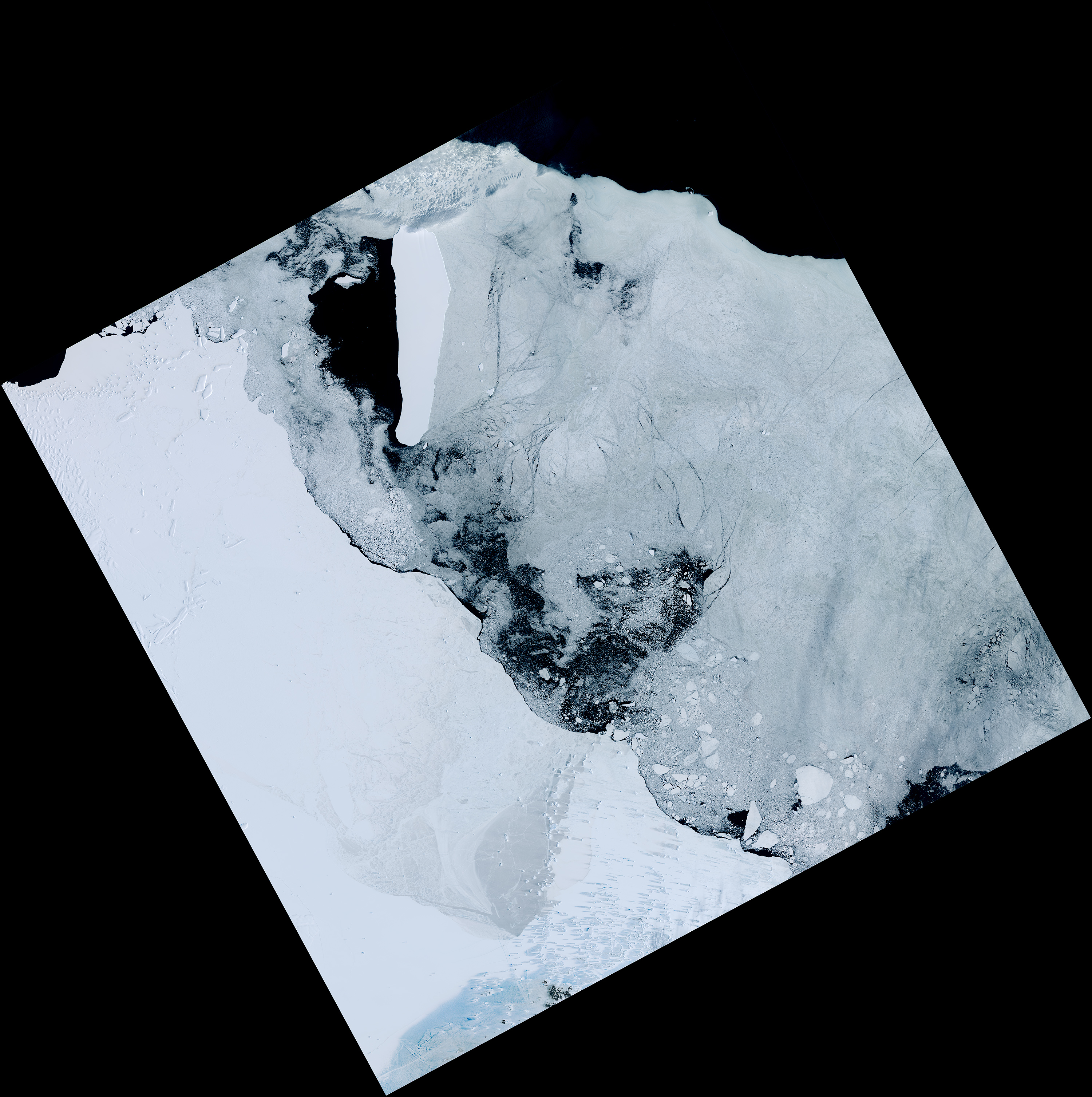
Hurricane Alex on Jan. 14 at 15:30 UTC (10:30 a.m. EST) in the central Atlantic Ocean.
The
image revealed an eye and showed bands of thunderstorms spiraling into
the low level center of circulation. Credit: NASA Goddard MODIS Rapid
Response
An animation of GOES-East satellite visible and infrared imagery from Jan. 10 to 14 showed the development of Hurricane Alex in the Central Pacific Ocean.
The animation was created at the NASA/NOAA GOES Project at NASA's Goddard Space Flight Center in Greenbelt, Maryland.
The animation showed the sub-tropical low pressure area consolidate quickly on Jan. 13 and reach hurricane status on Jan. 14, 2016.
The Moderate Resolution Imaging Spectroradiometer or MODIS instrument that flies aboard NASA's Aqua satellite captured a visible image of Hurricane Alex on Jan. 14 at 15:30 UTC (10:30 a.m. EST) in the central Atlantic Ocean.
The image revealed an eye and showed bands of thunderstorms spiraling into the low level center of circulation.
According to the National Hurricane Center, Alex is the first hurricane to form in the month of January since 1938.
Alex is also the first North Atlantic hurricane thriving in January since Alice of 1955, which formed on Dec. 30, 1954. Alice developed on December 30, 1954 from a trough of low pressure in the central Atlantic Ocean in an area of unusually favorable conditions.
This animation of GOES-East satellite imagery from Jan. 10 to 14 shows the development of Hurricane Alex in the Central Pacific Ocean. Credit; NASA/NOAA GOES Project
The Azores Meteorological Service has issued a Hurricane Warning for the islands of Faial, Pico, Sao Jorge, Graciosa, and Terceira in the central Azores, and a Tropical Storm Warning for the islands of Sao Miguel and Santa Maria in the eastern Azores.
A Hurricane Warning is in effect for Faial, Pico, Sao Jorge, Graciosa, and Terceira in the central Azores and a Tropical Storm Warning is in effect for Sao Miguel and Santa Maria in the eastern Azores.
At 10 a.m. EST (1500 UTC), the National Hurricane Center said that the center of Hurricane Alex was located near latitude 31.5 North, longitude 28.4 West.
Alex was moving toward the north-northeast near 20 mph (31 kph) and a turn toward the north with an increase in forward speed is expected over the next day or two.
On the forecast track, the center of Alex will move near or over portions of the Azores Friday morning, Jan. 15.
Maximum sustained winds are near 85 mph (140 kph) with higher gusts. Little change in strength is forecast through Friday.
The estimated minimum central pressure is 981 millibars.
NHC's Forecaster Pasch said "Remarkably, Alex has undergone the transformation into a hurricane. A distinct eye is present, embedded within a fairly symmetric mass of deep convection.
It is very unusual to have a hurricane over waters that are near 20 degrees Celsius, but the upper-tropospheric temperatures are estimated to be around -60 degrees Celsius, which is significantly colder than the tropical mean.
The resulting instability is likely the main factor contributing to the tropical transition and intensification of Alex."
Alex is expected to maintain hurricane status on Friday, Jan. 15 and transition into an extra-tropical storm by Jan. 16 as it continues to move north toward Greenland.
The European refugee crisis
isn’t so much a crisis as it is a catastrophe.
Fleeing violence in
Africa and the Middle East, particularly Syria, more than a million
migrants crossed by sea into Europe in 2015.
Almost 4,000 of them lost their lives in the journey.
The sea crossings can be especially dire, as leaky, unsafe boats
capsize or break apart in rough water.
In Greece the danger has proven
massive, particularly off the island of Lesvos, which takes in an
average of 2,000 refugees daily.
Every day around Lesvos the Coast Guard must rescue boats that have
capsized, run out of fuel, or simply broken down.
Which is why the Coast
Guard invited a team from Texas A&M University’s Center for Robot-Assisted Search and Rescue to launch a pilot project this week for a very special robot—Emily, the Emergency Integrated Lifesaving Lanyard.
Think of Emily as a life preserver melded with a jet ski. It’s about
four feet long and shaped like a pickle spear.
An operator remotely
controls the robot, tethered to a rope up to 2,000 feet long, to
migrants struggling at sea.
The victims take hold of the buoyant bot and
a rescuer reels the line in.
Quadcopter drones called Fotokites, themselves tethered on 30-foot ropes near the operators, pipe back an overhead view.
In fact, NGOs on the island had already been thinking about using
UAVs to aid rescue efforts, says Robin Murphy, the Texas A&M
roboticist running the project.
“In the meantime we were saying, ‘You’re
talking about people drowning,'” Murphy says.
“There’s this new
technology, Emily, these robots that are life preservers.”
UAVs turn out
to run afoul of Greek aviation regulations anyway—and a tethered
quadcopter isn’t considered a UAV.
Combined with Emily, the drones make
for a powerful (and legal) way to spot and save people in the water.
It's deployable from both boat and land and hit speeds of 20 mph
At a constant full speed of 20 mph, the robot has enough juice for 20
minutes at sea, plenty of time to make several trips to fetch
victims—especially since it only needs to propel itself on the outbound
leg.
And it’s buoyant enough to hold five people at once.
“We can run the boat out there and we can start plucking people that
can actually hold on and get them out of the way,” says John Sims, a
fire captain formerly of the US Coast Guard, who’s operating the robots
for the deployment.
“And then the live lifeguard can do his job and get
out there to get the unconscious people.”
That’s the plan, anyway. Emily has never faced a test like this.
The
robot has helped struggling swimmers here in there in America, but
deploying it in Greece is a tremendous scale-up.
“One has to be a little bit careful,” says M. Ani Hsieh, co-chair of
the Safety, Security and Rescue Robotics committee at the IEEE Robotics
and Automation Society.
“What many people who work with rescue robots
will tell you is a lot of things start with good intentions.”
You never
really know what the best use is for a robot “until you actually have
people on the ground and see things being tested.”
It may well be, for
instance, that Emily is more useful for plucking a single swimmer out of
the water instead of big groups.
The buoyant bot can hold around 5 people.
And as with any interaction between humans and increasingly
sophisticated robots, the pilot project has risks.
Its designers know,
for example, that Emily’s long tether could get tangled in the propeller
of a Coast Guard boat.
(Those kinds of concerns led the Coast Guard to
prohibit the 81 NGOs on Lesvos from operating their own boats without
specific permission.)
But the important distinction here is the team has the Coast Guard’s
blessing.
Coordination among NGOs, independent volunteers, and the Greek
government has been lousy on Lesvos, says Boris Cheshirkov, spokesman
on Lesvos for the Office of the United Nations High Commissioner for
Refugees.
The Texas A&M roboticists hope to avoid those conflicts.
“As long as it’s coordinated with the government,” Cheshirkov says, “it
can only be a welcome addition to the response.”
The Emily team is confident enough in the robot’s abilities that it’s
already raising funds to leave one of the robots behind in Greece.
The
machine can’t stop war or uncapsize boats, but but any tool that helps
in the fight against catastrophe is a good one.
Coast Survey has issued provisional charts for barge operators and
others traversing Alaska's challenging Yukon River, relying solely on
satellite images to create the electronic navigational charts
that only display shoreline and shoals (shallow areas).
The ENCs,
which display no depth soundings, will give the mariners annually
updated information to help their navigation along the changeable
river.
During a virtual meeting on January 6 with barge operators who
requested NOAA's charting assistance, Andrew Kampia, the cartographer
in charge of the project explained, “You may hear me refer to them as
an experiment because we have not created or released a navigational
product like this before.”
“The Yukon was literally uncharted,” Kampia told the group. “After
some analysis and brainstorming, we decided to create a prototype ENC
using only satellite data. This is unprecedented.”
Yukon River with Google imagery (Terrametrics provider)
Coast Survey is not able to provide contemporary surveys to acquire
data for charting the length of the river, as funding, survey vessel
availability, remoteness, and small windows of opportunity to survey
are major obstacles.
Satellite-derived bathymetry from two navigation
seasons between July 2014 and October 2015 helps to fill the void of
contemporary data for Western Alaska.
The charts will help to address the concerns of the local barge
industry that supplies goods and services to western Alaska and who
have had to deal with a lack of data inshore of the 12-foot contour.
(The average draft of vessels transiting up river for village
deliveries is four to six feet.)
The new Yukon River provisional ENCs
US4AK98M, US4AK99M, and US4AK00M offer 1:90,000 scale coverage that
spans the entrance to the Yukon River, including Apoon Pass to Kotlik,
and continues east to Russian Mission.
Satellite-derived bathymetry uses satellite images and histograms
and performs some logarithmic calculations that can sometimes estimate
depths in relatively shallow areas.
Or, as in the case of the Yukon,
satellite-derived bathymetry can estimate shoals, which are displayed
on the Yukon ENCs as obstruction areas.
Unlike traditional hydrography,
however, satellite-derived bathymetry doesn’t provide exact depth
measurements or tidal data at the time the satellite imagery was taken.
“Shoreline depictions are derived from automated processing of
satellite imagery,” Kampia said.
“We felt pretty confident in the
position of the shoreline, but it is below our customary standards, so
we added notes to the ENCs.”
These screenshots show the western entrance to the Yukon River on ENC US4AK98M with zoom
Entrance of Yukon River with Google imagery (Terrametrics provider)
Coast Survey has provided two special notes for the Yukon River ENCs:
WARNING PROVISIONAL ENC
This ENC was constructed using the best data available. All or much
of the shoreline, depths and shoals within this ENC are below customary
quality, are not corrected for tides, nor based on a known sounding
datum. All or much of the charted detail is highly changeable.
Navigators should use this ENC with extreme caution.
SATELLITE DERIVED DEPTHS
Shoreline, depths, and obstruction areas within the area of this ENC
are derived from satellite imagery from 2015. Their vertical accuracy
is typically ± 2m. Uncharted dangers may exist.
Since the river is in a constant state of change, Coast Survey will
use satellite images after the spring thaws to make annual updates.
Late this spring, a satellite-derived bathymetry analyst will examine
the first satellite images after the Yukon thaws and is navigable.
The Landsat
8 images are available every 16 days as the satellite makes it trip
around the globe, so the first usable images may not be available until
May or June.
After turning the images into shoreline and bathymetric
updates, updated ENCs will be issued in early July – or earlier if
possible.
“We would like to routinize and improve this process over the coming
years based on our analyses,” Kampia said.
“We hope to build on these
successes and use these solutions in areas other than the Yukon, where
traditional surveys aren’t able to provide the charts that navigators
need.”
The Office of Coast Survey recently issued the revised U.S. Arctic Nautical Charting Plan,
but agency officials stress that it is a “living document,” needing
adjustments as priorities change.
Hydrographic and cartographic experts
will travel to Alaska in March to ask the state’s maritime industry
for input that will help future surveying and charting activities for
the State.
As giant icebergs bob across the open seas they leave behind a trail
of nutrient-rich meltwater, sparking new life in the world’s remotest
and least hospitable oceans.
This in turn means more carbon is taken
from the atmosphere and stored below the waves.
Massive icebergs may be a
symptom of climate change – but they can also help keep it in check.
“Giant” icebergs are technically those at least 18km in length.
At
any one time several dozen are afloat in the Southern Ocean, and
individually they can survive for up to a decade.
They make up roughly
half of the ice discharged from Antarctica, so around 1000km3 per year – equivalent to the annual flow of the Congo River.
However these icebergs come in fits and starts.
Some years hardly any
break off, whereas five of the biggest icebergs recorded in the
satellite era broke off into the Southern Ocean during 1999-2003.
So a big iceberg year can have a huge impact.
In fact, during
previous ice ages huge “iceberg armadas” from Northern Hemisphere ice
sheets are believed to have redirected the Gulf Stream – albeit thanks to melting on a slightly larger scale.
It’s clear then that meltwater from giant icebergs can directly
impact circulation of the Southern Ocean, and the climate above it.
However, in a recent paper in Nature Geoscience,
colleagues at the University of Sheffield and I have shown there is
also a significant impact on the carbon sink, and hence the rate of
exchange of CO2 between the ocean and atmosphere.
Antarctica's giant icebergs are helping fight climate change
Why icebergs mean oceans store more carbon
Here’s how it works: as Antarctic ice sheets slowly slide towards the
ocean they bump along the continent’s bedrock, picking up iron and
other nutrients which become imprisoned within the ice.
When icebergs
melt they release these chemicals into the sea.
As icebergs are
essentially freshwater, their water is buoyant and ascends to the ocean
surface, where the iron and nutrients are utilised by phytoplankton –
tiny plant-like organisms at the bottom of the marine food web.
This makes a big difference in the Southern Ocean, where limited dissolved iron
– important for cell growth – restricts productivity despite an
abundance of nitrate.
Melting icebergs release iron in a bio-available
form, so encourage phytoplankton growth, photosynthesis, and the
draw-down of atmospheric CO2.
Chlorophyll – a direct product of
phytoplankton photosynthesis –
shows life blossoming for hundreds of
kilometres around this giant iceberg.
Giant icebergs are especially important as we found the increase in
productivity from their meltwater could be as much as a factor of ten
above background levels, and extend hundreds of kilometres away from the
melting iceberg, both upstream and downstream.
At fixed points, the
effect could last for up to a month after passage of an iceberg.
This is
a far larger impact on the surrounding ocean than the limited previous
observational studies had found, and could provide as much as 10-20% of
the net carbon export into the deep waters of the Southern Ocean.
Giant icebergs could hold back global warming
We’ve only accurately tracked giant icebergs since the 1980s so it’s
difficult to know exactly what the future holds.
However, the increasing
amounts of ice discharged from Antarctica in recent decades, combined
with likely acceleration of change under global warming, suggests we’ll
see more giant icebergs in future. If this were so, the enhanced
productivity of the Southern Ocean, taking more CO2 from the atmosphere, will act as a small check on global warming.
What of the Arctic?
Icebergs are abundant in parts of the northern oceans, as the Titanic tragedy showed.
However, those calved from Greenland are only very rarely more than a
kilometre or so long, and are almost never “giants".
The North Atlantic
also has plenty of iron, mostly thanks to Saharan dust
carried there in the atmosphere.
The Arctic and North Atlantic are
therefore missing key ingredients for a strong biological response to
iceberg meltwater.
However, large amounts of freshwater entering the North Atlantic could affect the meridional overturning circulation,
a current which sends the Gulf Stream northwards along the surface
while cooler, deeper water moves southwards.
More icebergs from
Greenland, or further ice melting due to global warming, may help slow
this current and check climate change.
Fortunately, the Northern
Hemisphere no longer has the large ice sheets with a history of
instability that could cause this sort of “Day After Tomorrow” scenario.
So if any giant icebergs are going to help slow climate change they
will likely come from Antarctica, one of global warming’s most symbolic
places.
Early this month, Inmarsat confirmed that global commercial service introduction has been achieved for its new Global Xpress (GX) constellation.
The constellation consists of three Ka-band, high-speed mobile broadband communications satellites.
GX is the first high-speed broadband network to span the world, and Inmarsat says that its maritime functionality, Fleet Xpress, will make video a viable proposition for remote assistance and diagnostics and will enable advanced applications such as telemedicine and video surveillance.
But the potential for very high availability has many ship management and safety applications and could ultimately include the potential for the safe deployment of unmanned vessels.
Purposely designed for mobility, the new GX system will provide a continuous, consistent service as traffic is handed seamlessly across each spot beam and from one satellite to another.
Global Xpress operates in the Ka-band, but, combined with the Inmarsat L-band network it is anticipated to deliver 99.9 percent overall network availability.
In announcing the launch of the company’s third GX satellite last year, Rupert Pearce, CEO of Inmarsat, said: “We have been working towards this day ever since we announced plans to create the Global Xpress constellation in 2010…
Global Xpress will deliver broadband speeds that are an order of magnitude faster than our fourth generation (I-4) constellation, to customers on the move on land, at sea and in the air, globally.
“As such, the GX fleet will offer a host of new opportunities for both our existing and new customers to significantly enhance their connectivity capabilities and to deploy bandwidth-hungry applications and solutions efficiently and effectively, even in the remotest and most inaccessible parts of the world. Global Xpress is, therefore, an important enabler for continued growth in global mobile broadband – it is the ‘Internet of Everywhere.”
In a series of videos Inmarsat will be taking you on a transformational connectivity journey
that is set to change the way we live our lives – watch the trailer to find out more.
The Power of Availability
New communication capabilities that have very high availability will be an enabler for the real-time transfer of significant amounts data from ship to shore and vice versa, says DNV GL in its 2015 position paper Ship Connectivity.
Potential applications include condition monitoring, remote maintenance, decision support tools and energy optimization such as those offered by engine manufacturers and system integrators, such as Rolls Royce, Wärtsila and Marorka.
In the case of Marorka, the company’s on board system can log, track, and analyse more than 500 data sources, including fuel consumption, speed, weather and draft.
The E.U. and the IMO are introducing regulations for monitoring, reporting and verification of emissions, and new satellite communications capabilities could aid in meeting these requirements by providing reliable, transparent data without unnecessary burdening ships’ crew.
Another potential environmental application would be using vessels as sailing weather stations, says DNV GL. (see WMO)
“If an advanced weather station is fitted on a vessel, relevant data may be transmitted regularly to an onshore data centre, for further analysis or data sharing.
If many vessels participate, a network with continuous feeds of weather data from many locations would be created.
This could become a meteorological Big Data application in which the collated data could be used to calibrate weather models and improve weather forecasts.”
Safety applications include the live monitoring of critical systems, says DNV GL.
This could determine the integrity and status of various safety systems and alert shoreside personnel if, for example, fire detectors are offline, watertight doors are kept open too often or if ECDIS is using an obsolete version of maps.
During emergencies, shore parties could benefit from additional data being transferred live from the vessel.
They could keep informed of the status of the navigation system and safety systems (e.g. fire and flooding status), stability information from the vessel’s loading computer and possibly video streams from strategic positions on board the vessel.
DNV GL also proposes VDR-in-the-cloud as a way of sending vessel black box data to shore on a regular basis in case the voyage data recorder is not found after an accident.
Remote control and autonomy
Ultimately, the increased reliability and capacity of data transfer could enable the controlling of ship functions from shore.
“Remote control of vessel functions will have intensive requirements regarding the communication link to the vessel,” says DNV GL.
“Firstly, the connection needs broadband in order to be able to transfer sufficient amount of information to the onshore operator and back to the vessel. The bandwidth requirements for the forward link will be smaller as it will be mainly control commands from pilot to vessel.
“Secondly, as loss of communication will result in loss of ability to control the vessel, the communication system must be highly reliable. Furthermore, the connection should have low latency to avoid an introduced lag impeding reaction times, which may be critical for adequate response times.”
The provision of a robust and dependable communication link could be provided by redundancy and diversity where several independent communication systems are used.
Backing up a satellite connection with a terrestrial connection, such as 3G or 4G, is another alternative.
If communication is lost, a fail-safe logic could be applied, so that the autonomous system configures the vessel to the safest possible state until communication is restored.
Rolls-Royce leads a project for ship automation
Satellite Number 4
Inmarsat continues to build its capacity for VSAT service technology.
A fourth GX satellite – Inmarsat-5 F4 – is currently completing construction and testing by Boeing in California.
This satellite is now likely to be launched in the second half of 2016 in order to provide additional GX network capacity.
During the course of 2016, Inmarsat will be introducing a series of market-specific, high-speed connectivity services powered by Global Xpress.
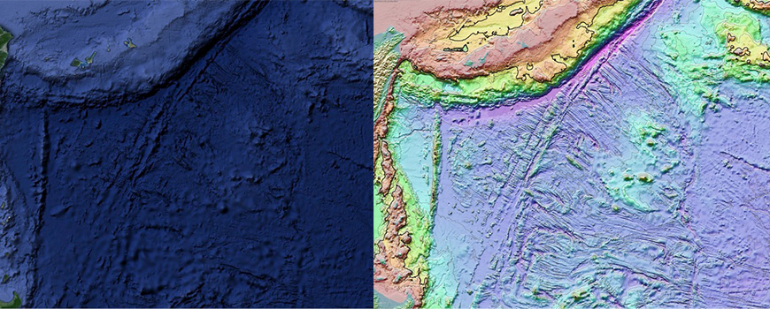
Undersea mountains near
the Hawaiian Islands, from the Marine Geoscience Data System. Images of
the mountains and nearby seafloor are derived from sonar readings taken
along the paths sailed by research ships.
The bottom of the ocean just keeps getting better.
Or at least more interesting to look at.
In an ongoing project, mappers at Lamont-Doherty Earth Observatory have been gathering data from hundreds of research cruises and turning it all into accessible maps of the ocean floor with resolutions down to 25 meters.
You can see some of the results here, at a mapping site that allows scientists—and you—to zero in on a particular location, zoom in and download topographical maps of the ocean floor.
The Lamont data has also contributed to the latest version of Google ocean map, which now offers its own more closely resolved view of the ocean floor globally.
(You can take a quick tour of the updated Google map here.)
"I love looking at everything," said Vicki Ferrini, a scientist at Lamont who oversees the team that synthesizes the data and creates the maps. Ferrini may have absorbed more data about the ocean floor than anyone; a self-professed map and data geek, she says she has her own map of the oceans in her head.
"I really like these sinuous channels in the deep sea, they're very cool to me. … There [are] clearly concentrated areas of energy that are able to scour these river-like features through the seafloor. And the [mid-ocean] ridges are all pretty cool."
A map showing the tracks of research vessels where more detailed imagery of the seafloor is available.
The new data from
Lamont covers about 8 percent of the ocean floor, a fraction of the
oceans, but a sizable piece overall of the earth's surface. The data
mostly comes as a byproduct of scientific expeditions that send research
vessels criss-crossing the seas, explained Suzanne Carbotte, a
professor of marine geology and geophysics at Lamont. The cruises may
not be focused on ocean topography at all; but as the ships sail, they
keep their measuring instruments humming and collect sonar data.
The sonar sends a pulse of sound down through the water column, and
uses the speed of the sound's return to calculate depth. Data from U.S.
expeditions is archived by the National Oceanic and Atmospheric
Administration. Lamont processes that data, gathers more from scientists
around the world, and turns it into maps.
The Google ocean map, covering the entire ocean floor, relies mostly
on data collected by satellite that is curated by the Scripps
Institution of Oceanography, in partnership with NOAA, the U.S. Navy and
the National Geospatial Intelligence Agency, with contributions from
the Japan Agency for Marine-Earth Science and Technology and Australia
Geosciences-AGSO. It also incorporates the more precise data from
Lamont. (A video produced by Scripps at this site offers an interesting
global tour of mid-ocean ridges.)
The new data from Lamont covers about 8 percent of the ocean floor, a fraction of the oceans, but a sizable piece overall of the earth's surface.
The data mostly comes as a byproduct of scientific expeditions that send research vessels criss-crossing the seas, explained Suzanne Carbotte, a professor of marine geology and geophysics at Lamont.
The cruises may not be focused on ocean topography at all; but as the ships sail, they keep their measuring instruments humming and collect sonar data.
The sonar sends a pulse of sound down through the water column, and uses the speed of the sound's return to calculate depth.
Data from U.S. expeditions is archived by the National Oceanic and Atmospheric Administration. Lamont processes that data, gathers more from scientists around the world, and turns it into maps.
Welcome to a Deep Sea Vents Tour in Google Earth, where you can watch
the deepest volcanic eruption ever captured on video at the West Mata
volcano, near Fiji and learn about the exciting discovery of
hydrothermal vents.
Columbia University's Lamont-Doherty Earth
Observatory highlights Ridge 2000 discoveries in this tour now visible
with the new underwater terrain data published in Google Earth from
Columbia's Global Multi-Resolution Topography Synthesis covering half of
the ocean that has ever been mapped in detail.
The Google ocean map, covering the entire ocean floor, relies mostly on data collected by satellite that is curated by the Scripps Institution of Oceanography, in partnership with NOAA, the U.S. Navy and the National Geospatial Intelligence Agency, with contributions from the Japan Agency for Marine-Earth Science and Technology and Australia Geosciences-AGSO.
It also incorporates the more precise data from Lamont.
The seafloor off the northwest coast of the United States and southwest Canada.
From the Marine Geoscience Data System.
The satellite data details small changes in sea surface height which, through gravity, reflect the underlying topography of the sea floor.
The latest version of the Scripps-NOAA ocean map offers a resolution of roughly 500 meters—an improvement over the earlier, 1 kilometer resolution.That means one data point for every 500-meter-square grid of the seafloor.
Even that rough picture is valuable, Carbotte said.
"The coarse data does a beautiful job revealing the detailed boundaries of earth's tectonic plates and other large-scale seafloor structures, and the map covers the entire ocean," she said.
Those measurements allowed researchers to discover a new "microplate" in the Indian Ocean—a remnant from the crustal shifts that sent the Indian subcontinent crashing into Eurasia, creating (and still forming) the Himalaya mountains.
Researchers studying that plate have come up with a more precise date for when that collision began, 47.3 million years ago.
But the finer resolution mapping processed by Lamont opens up other avenues for scientists.
"It allows you to study the active modern processes that shape the seafloor," Carbotte said, like earthquakes and undersea landslides that can flush sediments across long distances.
A section from the Marine Geoscience Data System map shows details along the mid-Atlantic ridge.
Scientists can dive into the maps and data and use various tools at the Marine Geoscience Data System site, created to provide free public access to marine geoscience data.
Lamont-Doherty serves as the host laboratory; funding comes from the National Science Foundation, and from Google.
The mapping page, here, has a "masking" tool (at the upper right) that allows the viewer to see the tracks of research vessels and contrast the sonar data results with the broader ocean map.
Some of the more interesting features include the deep ocean trenches, the zigs and zags of fault lines where earth's crust is forming and deforming, and massive oceanic plateaus and undersea volcanoes that reflect volcanic outpourings away from the mid-ocean ridges.
There are "fabulous canyons that carve the continental margins and channels that extend out into the deeper oceans," Carbotte said.
2015 Ocean in Google Earth Global Map Update- After. “We're updating the entire Google ocean at once- the Scripps, NOAA, US Navy, NGA, GEBCO SRTM15plus global ocean map and the Columbia Lamont high resolution ocean map synthesis together at the same time- something that we've never done before." Six years ago, we launched an explorable ocean seafloor in Google Earth and Maps. Since then, Google Earth has been downloaded over 2 billion times, and Google Maps has over 100 million users a month, enabling a new generation of virtual ocean explorers. Three years ago, we released the 2nd major global update in partnership with the Scripps Institution of Oceanography, NOAA, the US Navy, NGA, and GEBCO with major contributions from IFREMER and the IBCAO arctic synthesis), resulting in a 1 km resolution global map. Today, we announce our 3rd and biggest update to our global ocean map with the first ever SRTM15 global grid curated by Scripps Institution of Oceanography, in partnership with NOAA, the US Navy, NGA, and with major contributions from JAMSTEC (2.2% of the seafloor), Australia Geosciences- AGSO (0.5% of the seafloor) and Lamont-Doherty Earth Observatory at Columbia University with their latest high resolution synthesis. There’s a brand new major discovery- the first microplate discovered in the Indian Ocean over an area larger than the state of West Virginia, named the “Mammerickx Microplate” after Jacqueline Mammericks, who is the author of all the original GEBCO maps in the Pacific Ocean. The full data reference list is here. New areas to explore include the Philippine Sea, Ryukyu Trench, the Seafloor fabric east of Hawaii, the continental margins around Australia, and the Reykjanes Ridge. Incorporating data from 3 satellite altimeters significantly improves the spatial resolution of areas having no ship coverage. The SRTM15 grid is in the public domain and available online here. Our partners at the Lamont-Doherty Earth Observatory at Columbia University have curated more than 33 years of ship-based data from nearly 900 global research cruises conducted aboard more than 20 ships. This latest update representing 3 years of work adds nearly 1.6 million ship-track km of coverage from 400 additional cruises conducted by 18 different institutions including the Schmidt Ocean Institute. This release brings the total ship-track coverage to 28 million square km of the ocean at 100m resolution. This is a 3% increase from the 2011 publication, bringing the total area in the Columbia compilation to ~8% of the ocean in high resolution. High-res underwater mapping is vital to understanding important earth processes such as how tsunamis spread around the globe. This is the best multi-resolution map of the ocean that’s been created in history.
Explore the ocean seafloor with Columbia University's Lamont-Doherty
Earth Observatory Global Multi-Resolution Topography (GMRT) Synthesis
covering half of all of the ocean that has ever been mapped in detail,
an area larger than North America.
You can also view new data of Cordell
Bank and the Gulf of the Farallones off of the California coast from
California State University Monterey Bay (CSUMB) along with a beautiful
50 meter synthesis of the Hawaiian Islands from the University of
Hawai'i at Manoa's School of Ocean and Earth Science and Technology
(UHM-SOEST).
Scientists expect to see plenty of activity along the edges of tectonic plates including at the mid-oceanic ridges, where new crust is formed from upwelling and melting of the mantle below, and at subduction zones, where enormous slabs of earth's crust collide and one plate sinks beneath another.
But the new mapping has helped scientists see that there's also geologic activity in the broad interior spaces of the oceanic plates, Carbotte says, such as fields of volcanic seamounts of many sizes, and far-reaching channels of sediments transported into the deep ocean.
The finer resolution helps scientists study how the crust forms at mid-ocean ridges and then deforms before descending into earth's mantle, bending and faulting along subduction zones.
"With the new detailed data from many subduction zones, we can conduct comparative studies of this bend faulting and relationships to the rate of subduction, the age of the plate and sediment cover, and [that] helps us in … understanding the subduction process," Carbotte says.
Multibeam sonar
readings from the R/V Falkor opened up the details of Scott Reef, off
the west coast of Australia, to view at about a 10 m resolution, shown
here from the GeoMapApp.
Multibeam sonar readings from the R/V Falkor opened up the details of Scott Reef, off the west coast of Australia, to view at about a 10 m resolution, shown here from the GeoMapApp.
The process of
mapping the ocean floor in detail continues; there's enough data already
available to keep Carbotte, Ferrini and the staff busy for a long time.
Covering just 8 percent of the oceans has involved hundreds of cruises
over millions of miles. The oceans are so large that a thorough mapping
would involve an estimated 125 to 200 ship-years of cruises (mapping on
land, even on distant planets, can happen far more quickly using
satellites). The Lamont crew updates their maps every six months.
Lamont has been collecting measurements and other data
about the oceans for more than half a century. The first comprehensive
map of the global ocean floor was created by Lamont oceanographers Marie
Tharp and Bruce Heezen and published in 1977. In the 1980s, another
Lamont scientist, William Haxby, used satellite measurements to compose
the first "gravity field" map of the oceans. Now, the same database
contributing to Google Earth feeds Lamont's EarthObserver, a global
scientific mapping application for iPads and other mobile devices.
When we step onto an airliner, "We have map displays at our seats
that show the flight paths, and it used to be the ocean was just a
single flat, featureless blue," Carbotte said. "Now they make use of
these new ocean floor maps, so when you're flying across the middle of the Atlantic, you can see the mid-ocean ridge right from your airplane seat."
The process of mapping the ocean floor in detail continues; there's enough data already available to keep Carbotte, Ferrini and the staff busy for a long time.
Covering just 8 percent of the oceans has involved hundreds of cruises over millions of miles.
The oceans are so large that a thorough mapping would involve an estimated 125 to 200 ship-years of cruises (mapping on land, even on distant planets, can happen far more quickly using satellites).
The Lamont crew updates their maps every six months.
New Global Seafloor Map Incorporated into Google Ocean
Updated Google Earth image at right shows new seafloor features in the western Philippine Sea compared to earlier version
Lamont has been collecting measurements and other data about the oceans for more than half a century.
The first comprehensive map of the global ocean floor was created by Lamont oceanographers Marie Tharp and Bruce Heezen and published in 1977.
In the 1980s, another Lamont scientist, William Haxby, used satellite measurements to compose the first "gravity field" map of the oceans.
Now, the same database contributing to Google Earth feeds Lamont's EarthObserver, a global scientific mapping application for iPads and other mobile devices.
Global map of ocean depths and land elevations,
with data mapped to colour (cyan to dark grey) by quantile.
courtesy of geotheory.co.uk
When we step onto an airliner, "We have map displays at our seats that show the flight paths, and it used to be the ocean was just a single flat, featureless blue," Carbotte said.
"Now they make use of these new ocean floor maps, so when you're flying across the middle of the Atlantic, you can see the mid-ocean ridge right from your airplane seat."
References:
Charctic Interactive Sea Ice Graph. National Snow and Ice Data Center. Animation by NOAA Climate.gov team, based on research data provided by Mark Tschudi, CCAR, University of Colorado. Sea ice age is estimated by tracking of ice parcels using satellite imagery and drifting ocean buoys.
Since the 1980s, the amount of perennial ice in the Arctic has declined.
This animation tracks the relative amount of ice of different ages from 1987 through early November 2015.
The oldest ice is white; the youngest (seasonal) ice is dark blue.
Key patterns are the export of ice from the Arctic through Fram Strait and the melting of old ice as it passes through the warm waters of the Beaufort Sea.
In 1985, 20% of the Arctic ice pack was very old ice, but in March 2015, old ice only constituted 3% of the ice pack.
NASA-supported researchers have found that ice covering Greenland is
melting faster than previously thought. The action is happening out of
sight, below the surface.