Saturday, September 9, 2017

Comparing forecast models for Irma

courtesy of Google Crisis

From WeatherNation by Meteorologist Jeremy LaGoo

There’s a lot of talk of the uncertainty of exact track of Hurricane Irma as it nears a potential U.S.
landfall.
While we do our best as meteorologists to forecast an exact path of a given storm, there are countless factors that go into determining a given path.

NASA image of Irma's Towering Clouds
The MISR instrument on NASA’s Aqua satellite is comprised of nine cameras that view Earth at different angles. By combining two of MISR’s images of Hurricane Irma, you can get a 3-D look at the storm. You’ll need red-blue glasses to see the full effect.

The best forecasters of a potential path are at the National Hurricane Center.
Forecasting tropical systems is what these men and women do, so it only makes sense that they do it well.
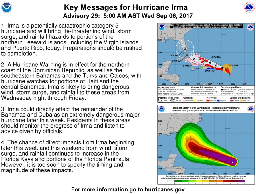
This is where we get our forecast cone, and if you’re looking for a potential path– this is what you should trust

Keep in mind the cone is the possible path track.
It could still stray to the far eastern or western side of the forecast cone, drastically changing the impacts of the storm on the southeastern U.S.

The Models

For those that want something more, we can take a look at the individual models that go into the complete forecast.
  • GFS: Global Forecast System. 13 kilometer grid covering the entire planet factoring in numerous variables to predict weather out to 16 days.
  • NAM: North American Mesoscale Forecast System. 12 kilometer grid covering the North American continent, with the ability to run high-resolution forecasts.
  • EURO (ECMWF) European Center for Medium-Range Weather Forecasts. 9 kilometer grid and historically one of the most accurate models in tropical forecasting.
  • BAMS: Baron Services proprietary model used by WeatherNation. 15 kilometer forecast grid used in this model run.
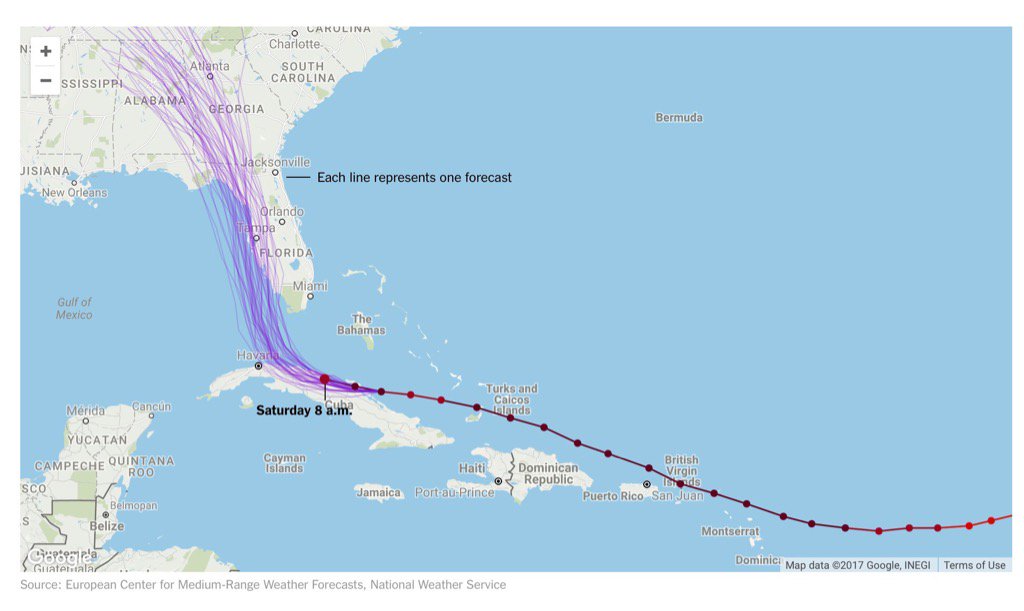
 ECMWF model forecasts (courtesy of NYTimes)
often considered as more accurate than GFS model

Through Saturday morning these 4 models are less than 40 miles apart.
Sitting between Cuba and the Bahamas.


By Sunday morning the different forecast movements start to become more prominent.
Still no more than 100 miles apart, there is agreement on path– speed becomes the separator.


By Sunday afternoon both the EURO and the NAM make a southern Florida landfall while the GFS and BAMS stay off the east coast of Florida.


Sunday evening both the NAM and EURO move inland while the BAMS nears the Miami coastline.
The GFS remains offshore and speeds up with no land interaction.


Monday morning the models start spreading out.
Tens of miles turn to hundreds of miles as land makes its mark on the storm’s speed.
To be perfectly honest, the faster and farther offshore the better.


By Monday evening even more so.


Your Best Bet

Prepare for the worst and hope for the best.
The most accurate forecast at any time will be the National Hurricane Center’s forecast cone.


It is updated every few hours throughout the day alone with advisories from around the region.

Hurricane Irma questions to National Hurricane Center acting Director Ed Rappaport

Links :

Friday, September 8, 2017

The coral reef loss data hidden in old navigational charts


Example of nearshore coral loss near Key West, Florida.
(A) Excerpt of Guald’s 1774 nautical chart, with locations of coral indicated with black rectangles. The inset shows an enlarged image of two adjacent historical coral references. (B) Same area today, represented by Google Earth imagery overlaid on the compiled modern benthic habitat map. Black rectangles indicate areas of coral persistence; gray rectangles indicate coral loss.

Credit: Loren McClenachan

From AtlasObscura by Cara Giaimo

In the Florida Keys, researchers have found an important new way to estimate what’s been lost.

In 1774 and 1775, as the upper part of North America girded for war, a British surveyor named George Gauld was sailing around the Florida Keys, putting together maps.
The British Admiralty had sent him, and he made a point of marking, directly on his charts, wherever the natural landscape could affect naval movement.
“The Bank is full of Coral Patches and no Vessel ought to venture into less than 3 fathoms,” he wrote along the coast of one island in the South Keys.
He captioned blocks of water, carefully noting where “Coral” gave way to “Large Rocks,” or “Fine white Sand & Clay.”


Sepia tone: Gauld (1775), Upper Keys

Nearly two and a half centuries later, a different group of people are eager to know what he found. For a recent paper in Science Advances, a group of environmental scientists and historians teamed up to compare Gauld’s detailed maps to contemporary satellite surveys of coral reefs, in order to calculate how much reef cover has diminished over the past 250 years.
This long view, they think, could provide a more nuanced look at where coral is, was, and could be.

A detail of Gauld’s 1774 map, demonstrating his precise coral recording.
Loren McClenachan

Scientists hoping to get a handle on historic species populations have long turned to creative sources, many repurposed from more commercial endeavors.
Researchers working on the Census of Marine Life’s History of Marine Animal Populations project, for example, have looked at whaling records, fishery statistics, and even restaurant menus to estimate species counts.
Oyster fisheries have mapped out their beds since the late 19th century, and the same era’s nautical charts can help current geographers keep track of shoreline changes.

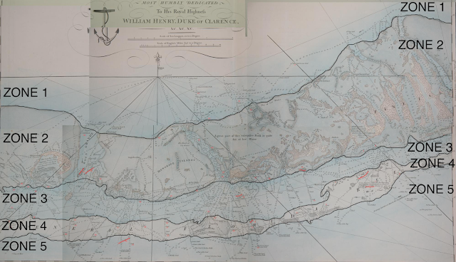
 Historical coral maps and zones and all historical coral observations
Color map: Gauld (1774), Lower Keys.

When Loren McClenachan came across Gauld’s maps nearly 10 years ago, in the archives of the United Kingdom Hydrographic Office, she knew they’d prove similarly useful.
“There was a lot of ecological information in them,” McClenachan, the study’s lead author and an environmental studies professor at Colby College, says.
“He wrote down where the turtles nested, and he described the mangroves.”
It did take her a while to figure out exactly how best to make use of them, though.
“I actually printed out a life-size replica and put it on my wall of my graduate student apartment at the time, and just sort of looked at it for a while.”

 Coral (Co nautical chart symbol) area in the Florida Keys
with the GeoGarage platform (NOAA chart)

Eventually, it clicked.
Gauld had been particularly careful about coral in the Keys, noting exactly where and how deep down the reefs were—the 18th century version of high-resolution data.
Meanwhile, a number of recent surveys, including the National Oceanic and Atmospheric Administration’s Unified Florida Coral Reef Tract Map and the United Nations’ Millennium Coral Reef Mapping Project, had done satellite sweeps of that same area.
“We figured out that we could compare [Gauld’s observations] to the satellite data,” McClenachan says.

George Gauld's Plan of Part of the Florida Keys,
from Bahia Honda to Cayo Largo,
 courtesy of Heritage Charts

To do this, the researchers first translated Gauld’s various notes and markings into 143 geographically discrete “coral observations,” basically dots on a map that meant “coral was here.”
They then used a composite of three modern satellite surveys to check whether it was still present in that spot.
For over half the space surveyed, the answer was a resounding “no.”
“We estimate a 52 percent loss in the occurrence of corals in the Florida Keys over 240 years,” the researchers write.
“That is, just more than half of the historical coral observations are in locations where coral habitat does not exist today… Our analysis demonstrates that entire sections of the reef that were present before European settlement are now largely gone.”
They call these sections “ghost reefs.”
"An accurate chart of the Tortugas & Florida Keys or Martyrs surveyed..."
(scale : 1:135,000), bathymetrics shown by shading and soundings
published by William Faden (1790), and based on surveys conducted by George Gauld in the area from 1773-1775, who had been assigned by the British Admiralty to chart the waters off West Florida, where he was taken prisoner by Spanish forces during the siege of Pensacola, in 1781.
source : State Library of Florida, Florida Map Collection

When the researchers examined their results more closely, they also found that the coral vanished asymmetrically: the areas that lost the most reef cover tended to be closer to the shore.
Meanwhile, the farther out you went, the more coral stuck around.
In fact, “the alignment of historical and modern coral is nearly exact in some locations,” the researchers write, “suggesting little change to the overall reef structure.”

This also posits a diagnosis for the disappearance.
“We can’t pinpoint the reasons for decline—we just have these snapshots of then and now,” says McClenachan.
“But other lines of evidence make it seem likely that those [inshore corals] were lost due to human impacts,” such as dredging, shoreline hardening, and the rechanneling of the Everglades, which changed the salinity of Florida Bay.


A strong spatial gradient to coral loss in the Florida Keys.
(A) Study area.
(B). Modern and historical coral occurrences in the Florida Keys. The color of dots corresponds with the five delineated coral zones.
(C) Enlarged area demonstrates the loss of coral from Florida Bay (red).
(D) Enlarged area (Bahia Honda) demonstrates the loss of the nearshore patch reef (yellow) and the persistence of coral in the reef crest zone (blue).
For (C) and (D), corals that no longer remain are indicated with an X.
(E) Percent loss by zone. Bars represent the mean estimate of loss derived from three distance thresholds diameters (0.25, 0.5, and 0.75 km).
Error bars represent the SEs across those three estimates.

Coral today also live precarious lives: pollution is choking them out, careless boating is breaking them up, and climate change is warming and acidifying their habitats, killing off the algae that bring them to life.
(Hurricanes, like the one currently barreling toward the Keys, also don’t tend to do them any favors.)
If you’re used to reading coral studies, which regularly describe 75 percent declines in live coral over mere decades, a 52 percent loss over centuries might not seem so bad.

But McClenachan is quick to point out that this study is diagnosing a completely different category of disappearance: this 52 percent loss happened so completely, we no longer even look for coral in those places, because we don’t remember that it was ever there.
“It’s not a decline in live coral,” says McClenachan.
“It’s the entire loss of those reefs.”

To McClenachan, this recontextualization is part of what makes historical studies meaningful.
“If you don’t know about change, you’re not going to recognize it,” she says.
“When that happens over time, we have these lowered expectations for nature generally.”
It’s not just that we have a better idea of the destruction we’ve caused: expanding our historic imagination allows us to improve research in the present, and to think bigger for the future.

Currently, the Florida Keys are very invested in restoring coral reefs, re-seeding baby corals on existing reef sites and researching ways to make species more resilient as oceans change.
Knowing where the coral used to be could influence these plans.
“If you don’t know that it’s there it doesn’t make sense to look for it,” McClenachan says.
But if you know that George Gauld once kept his eyes peeled, you might start, too.

Links :

Thursday, September 7, 2017

Hurricane Irma’s epic size is being fuelled by global warming

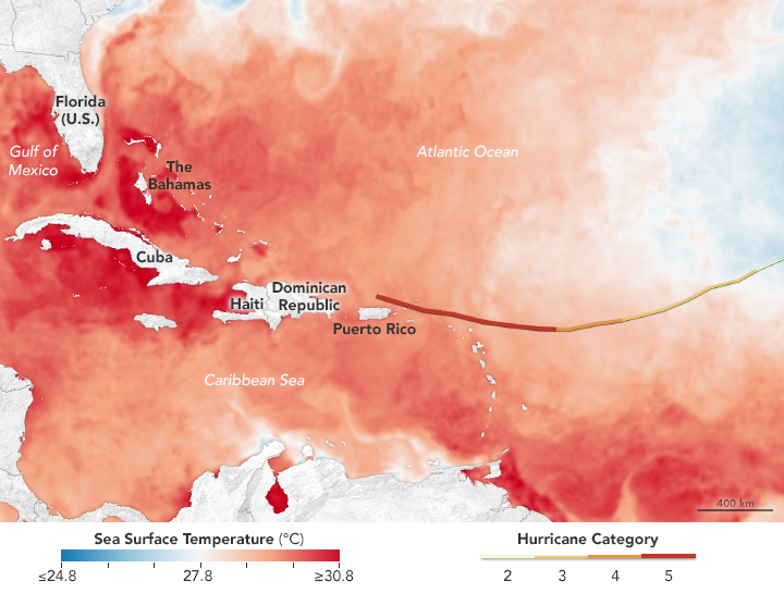
The map above shows sea surface temperatures in the Atlantic Ocean, Caribbean Sea, and Gulf of Mexico on September 5, 2017.
The data were compiled by Coral Reef Watch, which blends observations from the Suomi NPP, MTSAT, Meteosat, and GOES satellites and computer models.
The mid-point of the color scale is 27.8°C, a threshold that scientists generally believe to be warm enough to fuel a hurricane.
The yellow-to-red line on the map represents Irma’s track from September 3–6.

From New Scientist by Michael Le Page

It’s a monster.
As the eye of Hurricane Irma approached the tiny island of Barbuda this morning, wind speeds soared to 250 kph before the instrument broke.

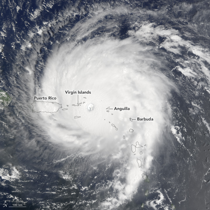
On September 6, 2017, Hurricane Irma slammed into the Leeward Islands on its way toward Puerto Rico, Cuba, and the U.S. mainland.
As the category 5 storm approaches the Bahamas and Florida in the coming days, it will be passing over waters that are warmer than 30 degrees Celsius (86 degrees Fahrenheit)—hot enough to sustain a category 5 storm.
Warm oceans, along with low wind shear, are two key ingredients that fuel and sustain hurricanes.
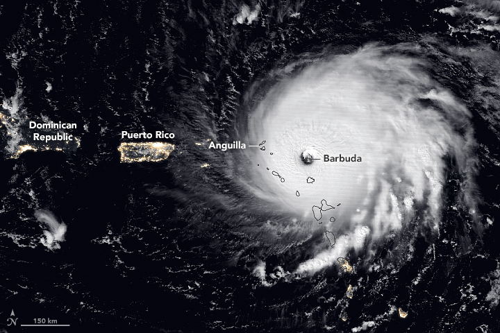
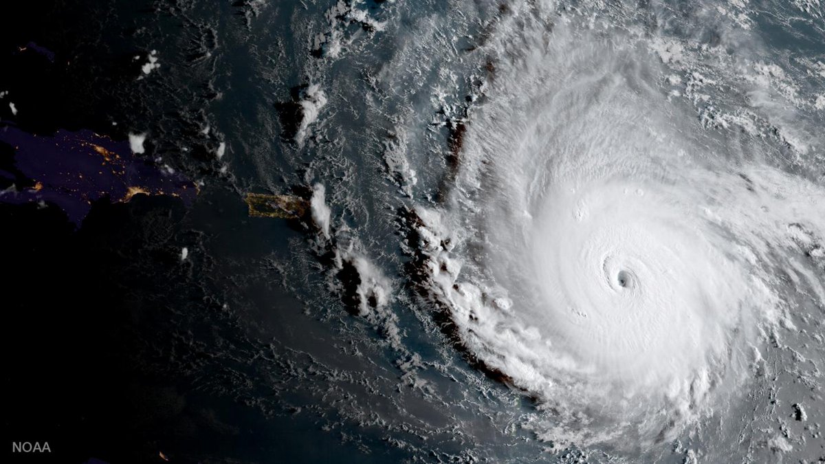
The Visible Infrared Imaging Radiometer Suite (VIIRS) on the Suomi NPP satellite captured a nighttime view of the storm at 1:35 a.m. local time (05:35 Universal Time) on September 6 as the eye was over the island of Barbuda.
The image was acquired by the VIIRS “day-night band,” which detects light in a range of wavelengths from green to near-infrared and uses filtering techniques to observe signals such as city lights, auroras, wildfires, and reflected moonlight.
In this case, the clouds were lit by the full Moon.
The image is a composite, showing storm imagery combined with VIIRS imagery of city lights.

At the time of writing, all contact with the island had been lost and it is unclear how the 1600 inhabitants have fared.
But already reports of severe destruction are coming in from other islands in Irma’s path.

The destruction could be extreme.
Hurricane Irma has the strongest winds of any hurricane to form in the open Atlantic, with sustained wind speeds of 295 kph.

The Moderate Resolution Imaging Spectroradiometer (MODIS) on NASA’s Terra satellite acquired the third image at 10:35 a.m. local time (14:35 Universal Time) on September 6, 2017.
By then, the storm had also hit Anguilla and was poised to strike the Virgin Islands.

It is also huge.
The strongest winds are limited to a relatively small area around its centre, but hurricane-force winds of 118 kph or more extend out 85 kilometres from its eye.

Irma could yet grow stronger and is going to graze or directly hit many densely-populated islands in the Caribbean before possibly making landfall in Florida on Sunday – but there is still a lot of uncertainty about its path and intensity this far ahead.

 NASA SPoRT Sea Surface Temperature product shows warm water along projected path of Hurricane Irma, favorable for maintaining strength.

Warmer waters

So why did Irma grow so strong?
Most likely because climate change is making Atlantic waters ever warmer.

Tropical cyclones are fuelled by warm surface waters of around 26°C or more.
They draw in moist air from all around them, and as it rises, the water vapour condenses out and releases latent heat, which drives further uplift. Irma’s clouds are 20 kilometres high.


However, as tropical cyclones grow stronger they churn up the ocean and bring deeper water to the surface.
Usually this deeper water is cooler, and cuts off the energy supply.

The strongest hurricanes, then, can only grow if warm waters extend down to depth of 50 or 100 metres – conditions normally only found in the Gulf or Caribbean.

In 1990, Hurricane Allen reached 305 kph winds, fuelled by these warmer waters.
In 2017’s warmer world, Irma began growing way out in the Atlantic, thanks to sea surface temperatures that were more than 1°C above average.

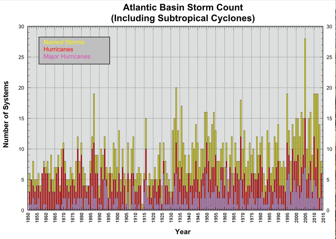
Bars depict number of named systems (yellow), hurricanes (red), and category 3 or greater (purple), 1850-2014

Stronger storms

Hurricane intensity depends on many other factors, too, though.
For instance, winds high in the atmosphere are often faster than those lower down, blowing away rising air and preventing hurricanes from forming, or growing very strong.
Low wind shear helped Irma grow into a perfect storm.

Computer models suggest global warming is likely to increase wind shear over the Atlantic, meaning there could no more or fewer hurricanes overall, but that storms grow stronger when they do form.

While tropical cyclones are currently ranked according to their wind speed, storm surges and flooding from high rainfall typically cause most of the damage, as we saw with Harvey.

The height of a storm surge depends not just on the strength of winds, but on their extent.
Hurricane Sandy’s winds were not that strong but the size of the storm piled up the huge storm surge that caused most of the damage in New York and elsewhere.

So strong winds don’t necessarily mean big damage.
The record is held by Hurricane Patricia in the eastern Pacific in 2015, with sustained winds of 345 kph.
Fortunately Patricia was small, weakened dramatically before landfall and struck a sparsely populated area.


Irma, ominously, is both big and intense, and could cause big storm surges in highly populated places. Barbuda recorded a storm surge of 2.4 metres.

The amount of rainfall dumped by hurricanes can also vary widely depending both on a storm’s intensity, local factor and how fast it moves.
Harvey produced huge amounts of rain because it barely moved for days.

Irma, thankfully, is moving faster – but its behaviour more than two or three days ahead remains highly uncertain.

Links :

Wednesday, September 6, 2017

Irma: Atlantic's most powerful hurricane ever makes landfall in Caribbean

 This animation of NOAA's GOES East satellite imagery from Sept. 2 at 7:45 a.m. EDT (1145 UTC) to Sept. 5 ending at 7:15 a.m. CDT (1115 UTC) shows Hurricane Irma move west toward the Leeward Islands and strengthen to a Category 5 storm on Sept. 5.
Credit: NASA-NOAA GOES Project


Eye of hurricane passes over Barbuda, bringing down phone lines, as heavy rain and howling winds hit neighbouring island of Antigua

The most powerful Atlantic Ocean hurricane in recorded history has made its first landfall in the islands of the north-east Caribbean, following a path predicted to then rake Puerto Rico, the Dominican Republic, Haiti and Cuba before possibly heading for Florida over the weekend.

How strong is Hurricane Irma?
It’s registering on earthquake-detecting seismometers
 courtesy of NOAA

The eye of Hurricane Irma passed over Barbuda at about 1.47 am local time, the National Weather Service said.
Residents said over local radio that phone lines went down.
Heavy rain and howling winds hit the neighbouring island of Antigua, sending debris flying as people huddled in their homes or government shelters.

GOES-16 captured this infrared imagery of category 5 hurricane Irma bearing down on the Leeward Islands on September 5, 2017.
Note the gravity wave pattern emanating outward.
Irma was centered at 2 p.m. EDT on September 5, 2017, about 180 miles east of the Antigua, moving toward the west near 14 mph.
Reports from an Air Force Hurricane Hunter aircraft indicate that the maximum sustained winds have increased to near 185 mph with higher gusts.
On the forecast track, the extremely dangerous core of Irma is forecast to move over portions of the northern Leeward Islands tonight and early Wednesday.

Officials warned people to seek protection from Irma’s “onslaught” in a statement that closed with: “May God protect us all.”

In Barbuda, the storm ripped off the roof of the island’s police station, forcing officers to seek refuge in the nearby fire station and at the community centre that served as an official shelter.
The Category 5 storm also knocked out communication between islands.

The category 5 storm had maximum sustained winds of 185mph (295kph) by early Tuesday evening, according to the US National Hurricane Center (NHC) in Miami.


Irma strengthens into a category 5 hurricane with winds reaching up to 180 MPH and moving west at 14 MPH. It is the most powerful storm in 10 years.
Keep an eye on the forecast and hope for the best.
Category 5 hurricanes are rare and are capable of inflicting life-threatening winds, storm surges and rainfall.
Hurricane Harvey, which last week devastated Houston, was category 4.

Other islands in the path of the storm included the US and British Virgin Islands and Anguilla, a small, low-lying British island territory of about 15,000 people.

US president Donald Trump declared emergencies in Florida, Puerto Rico and the US Virgin Islands.

Warm water is fuel for hurricanes and Irma is over water that is one degree celsius (1.8F) warmer than normal.
The 26C (79F) water that hurricanes need goes about 250 feet deep (80m), said Jeff Masters, meteorology director of the private forecasting service Weather Underground.

Four other storms have had winds as strong in the overall Atlantic region but they were in the Caribbean Sea or the Gulf of Mexico, which are usually home to warmer waters that fuel cyclones. Hurricane Allen hit 190mph in 1980, while 2005’s Wilma, 1988’s Gilbert and a 1935 great Florida Key storm all had 185mph winds.

The storm’s eye was expected to pass about 50 miles (80km) from Puerto Rico late on Wednesday. Hurricane-force winds extended outward up to 60 miles (95km) from Irma’s centre and tropical storm-force winds extended outward up to 175 miles (280km).

credit : EarthNull

with tropical storm José close behind Irma
credit : Meteo France

The northern Leeward Islands were expected to see waves as high as 11 feet (3.3 metres), while the Turks and Caicos Islands and south-eastern Bahamas could see towering 20-foot (six-metre) waves later in the week, forecasters said.

Irma is expected to dump up to 18 inches (45cm) of rain in some areas when it hits land.
“These rainfall amounts may cause life-threatening flash floods and mudslides,” the NHC warned, calling the storm “potentially catastrophic” and urging that “preparations should be rushed to completion” in the region.

Schools and government offices in French overseas territory Guadeloupe have been ordered shut, while hospitals are stocking up on medicines, food and drinking water.
People living on shorelines will be moved to safety, authorities said.

The popular holiday destinations of Saint Barthelemy and St Maarten – a French territory and a French-Dutch split island respectively – are expected to be especially hard hit.
The Dutch defense minister said soldiers arrived in the Dutch part of St Maarten on Monday and two vessels, including one equipped with a helicopter, were in place to help.

Officials had on Monday ordered the evacuation of 11,000 people living in affected areas on both islands, which began in many neighbourhoods on Tuesday.
 
Winds and waves on W4D 2.0 mobile app

“This is not an opportunity to go outside and try to have fun with a hurricane,” US Virgin Islands governor Kenneth Mapp warned.
“It’s not time to get on a surfboard.”

The National Weather Service said Puerto Rico had not seen a hurricane of Irma’s magnitude since Hurricane San Felipe in 1928, which killed a total of 2,748 people in Guadeloupe, Puerto Rico and Florida.
“The dangerousness of this event is like nothing we’ve ever seen,” Puerto Rico governor Ricardo Rossello said.
“A lot of infrastructure won’t be able to withstand this kind of force.”
The director of the island’s power company has warned that storm damage could leave some areas without electricity for about a week and others for four to six months.
The utility’s infrastructure has deteriorated greatly during a decade-long recession, and Puerto Ricans experienced an island-wide outage last year.

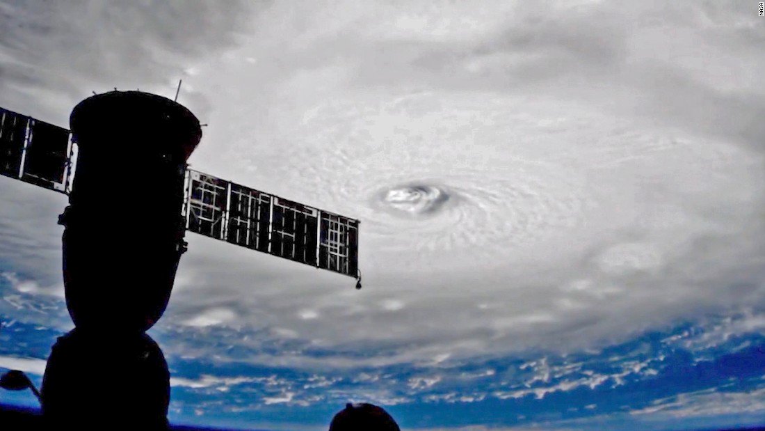
 Irma view from the ISS

Government officials began evacuations and urged people to finalize all preparations as store shelves emptied out around Puerto Rico.
“The decisions that we make in the next couple of hours can make the difference between life and death,” Rossello said.
“This is an extremely dangerous storm.”
No directly storm-related deaths were reported by Tuesday evening but a 75-year-old man died in the central Puerto Rico mountain town of Orocovis after he fell from a ladder while preparing for the hurricane, police said.
The eye of the storm was expected to roar westward on a path taking it north of millions of people in Puerto Rico, the Dominican Republic, Haiti and Cuba, but meteorologists warned that it could still cause life-threatening storm surges, rains and mudslides.

The northern parts of the Dominican Republic and Haiti could see 10 inches (25cm) of rain, with as much as 20 inches in the south-east Bahamas and Turks and Caicos.

The storm seemed almost certain to hit the United States by early next week.
“You’d be hard pressed to find any model that doesn’t have some impact on Florida,” said University of Miami senior hurricane researcher Brian McNoldy.
In Florida, people also stocked up on drinking water and other supplies.
Governor Rick Scott activated 100 members of the Florida National Guard to be deployed across the state, and 7,000 National Guard members were to report for duty on Friday when the storm could be approaching the area.
On Monday, Scott declared a state of emergency in all of Florida’s 67 counties.
Officials in the Florida Keys geared up to get tourists and residents out of Irma’s path, and the mayor of Miami-Dade county said people should be prepared to evacuate Miami Beach and most of the county’s coastal areas.
Mayor Carlos Giménez said the voluntary evacuations could begin as soon as Wednesday evening. He activated the emergency operation centre and urged residents to have three days’ worth of food and water.

Links :

Tuesday, September 5, 2017

These are the cleverest, weirdest mapping ideas ever patented

Drawings from a 1934 patent for a translucent globe with an internal light that rotates through a 24-hour day-night cycle.
Courtesy U.S. Patent Office

From National Geographic by Betsy Mason

Inventors have dreamt up some strange ways to map and navigate the world—and have patented nearly 100 different ways to fold a map.


Drawings for a 1912 patent for an automobile navigation system, a precursor to modern GPS navigation.
A handheld device, connected to the front wheel axle, would rotate discs that displayed directions for a predetermined route.
Courtesy U.S. Patent Office

In 1912 an inventor in New York City named Joseph W. Jones filed a patent for a “Combined Road-Map and Odometer” that is arguably the forerunner to today’s dashboard GPS navigation systems.

Jones’ invention was for a complex apparatus (see first slide in gallery above) that would display route directions and landmarks as a car travels between two specific points.
The disc in the patent drawing above describes the route from Columbus Circle in Manhattan to Waterbury, Connecticut.

This is just one of the more than 300 map-related inventions uncovered by Mark Monmonier, a geographer at Syracuse University’s Maxwell School.
Monmonier’s new book Patents and Cartographic Inventions is a fascinating look at more than a century and a half of clever—and not-so-clever—ideas, and the inventors behind them.
The patents cover everything from internally illuminated globes to streetcar transfer tickets to complicated map-folding schemes.


Drawing from a 1911 patent for a programmable route indicator that used movable type to display the names of places being passed and the distance to the next place.
Courtesy U.S. Patent Office

Patents have generally been ignored by map historians, Monmonier says, but they reveal a lot about how people have used maps over the years.
He found that like many discoveries and inventions, patents for similar ideas seemed to spring up independently around the same time—a phenomenon known as the theory of multiple discoveries.


Drawing from a 1916 patent for a “Vehicle Signaling System” that used a phonograph to play directions for the driver to follow.
Courtesy U.S. Patent Office

Navigating the road

Such was the case for several patents for inventions, including Jones’ apparatus, intended to help drivers find their way around at the beginning of the 20th century.
At the time, automobiles were just starting to become popular, but good roads, decent signposting, and accurate road maps were still scarce.
Inventors responded with a variety of solutions.
“Some of them I think were extremely clever,” Monmonier says.

The Chadwick Automatic Road Guide, patented in 1916 by Lee Sherman Chadwick of Pottstown, Pennsylvania used a rotating disc connected to the speedometer to help drivers find their way along a predetermined route, similar to Jones’ system.
But Chadwick’s invention, possibly inspired by the player pianos that were popular at the time, added a warning sound to alert drivers of impending turns or hazards and displayed symbols to indicate what was ahead.

Anticipating GPS voice navigation by almost a century, George Boyden of Manhattan patented a “Vehicle Signaling System” in 1916 that included a phonograph and a megaphone (indicated by number 22 in the drawing above) to announce directions for the driver to follow.
Boyden apparently never developed the idea, though Jones and Chadwick briefly manufactured and marketed their competing devices.


A Sputnik-inspired 1963 patent drawing for a globe with a rotating satellite.
Courtesy U.S. Patent Office

Many of the patents Monmonier discovered were impractical and some were downright ridiculous. Several inventors inspired by Sputnik’s successful launch into orbit in 1957 designed mechanical globes with satellites circling them.
The wildest of these ideas was a 1963 patent that, Monmonier writes, “might have made made cartoonist [Rube] Goldbergscratch his head.”
The patent, by Brothers Thomas and Frank Novak of Brownsville, Pennsylvanis, described a stationary globe with a rotating air duct that would use an “upward air blast” to hold a sphere aloft as it orbited the Earth (above).
You don’t need to be an engineer to know this would have never worked.

Drawing from a 1933 patent for an “Educational Apparatus” that quizzed students on geography.
Courtesy U.S. Patent Office


Drawings from a 1986 patent for an educational map-projection puzzle that divided the Earth’s surface along coastlines and could be rearranged to focus on different parts of the globe.
Courtesy U.S. Patent Office

Drawings from a 1953 patent for a system to create city maps that magnify certain areas for emphasis.
Courtesy U.S. Patent Office
 
 Drawing for a 1904 patent for the Van der Grinten map projection, which reduced distortion near the poles relative to the more familiar Mercator projection.
The projection was adopted by the National Geographic Society for its world maps from 1922 to 1988.
Courtesy U.S. Patent Office

The perennial challenge of folding a map

Ninety-two of the 304 filings Monmonier mined from U.S. Patent Office records were for map-folding schemes.
The frustration of refolding maps, he notes, is perhaps best described by James M. Barrie, the author of “Peter Pan.”
Barrie wrote in 1889: “Prominent among the curses of civilisation is the map that folds up ‘convenient for the pocket.’ There are men who can do almost anything except shut a map. It is calculated that the energy wasted yearly in denouncing these maps to their face would build the Eiffel Tower in thirteen weeks.”
Map-folding is a category that has received scant attention from historians, Monmonier says.
It may seem mundane, “but when it comes down to making map information accessible, how one folds is very important,” he says.


A complicated folding scheme for maps patented in 1925.
Courtesy U.S. Patent Office

From the late 19th century into the early 21st century, a number of inventors tackled the problem of map folding with increasingly complex schemes.
One of the most interesting ideas is a “Book Fold Map” patented by Stacy Boyer of Casper, Wyoming in 1925.
It took nine drawings to explain the scheme, which involved numerous folds and cuts to fashion an accordion fold partitioning a map into 48 panels.
Those panels would then be attached to a cover, like a book (fig. 9 above).

Users would move around the map by leafing through the panels like book pages from left to right, or by flipping them up and down.
Monmonier found correspondence between Boyer and his patent examiner in which the examiner claimed he had unsuccessfully tried to make a working version of Boyer’s book based on his drawings, concluding that the “map fails to function.”
He asked the inventor to submit a working model.

Intrigued, Monmonier attempted to make one himself.
It was a struggle, even for a noted map expert, but eventually he was able to reverse engineer a working model by carefully studying figures 1 and 9, making the prescribed cuts and folds, and taping the map to a card (If you want to give it a go, it’s US Patent 1,531,065).
In all, it took Boyer 27 months of revisions and rejections to finally get his patent approved.


Drawing from a 1915 patent for Plato’s clock system, a method of assigning addresses to rural properties. Courtesy U.S. Patent Office

A dairy farmer turned inventor

By scouring documents including census records, newspapers, government employment records, military service records, and city directories, Monmonier was able to gain insight into the lives of the people behind the patents.

His book highlights the story of John Byron Plato of Colorado, a high school-educated dairy farmer with several patents to his name, including a device to stop a horse from running away with a wagon attached to it.
His map-related patent was for a clever “clock system” for assigning addresses to rural residences in areas that lacked a regular street numbering system (above).

It was a failed attempt to sell cattle that inspired Plato to devise the clock system.
He had lined up some out-of-town buyers to come to rural Bloomfield, Colorado, to inspect his cattle, but since Plato’s only address was a P.O Box, they went to the post office to ask for directions to his farm.
The clerk didn’t know Plato and said they would need to wait for the mail carrier, who would not return until the next day.
Annoyed, the buyers left, and as Plato told the magazine Illustrated World in 1917, “that killed a mighty profitable bargain.”

Unlike most of the inventors in the book, Plato managed to successfully market his clock system, selling licenses to several counties in New York.
His business appears to have foundered during the Great Depression, but Plato bounced back.
He became a map expert for the government in Washington D.C., married a woman 24 years his junior, donated 50 acres of woodland property for a Girl Scout camp, and lived to be 89.

Monmonier’s fascination with the details of some of these inventors’ lives was partly inspired by the discovery of an interesting biographical detail of his own: His maternal grandfather was an inventor, with several patents for things like milk bottle caps.
Monmonier hopes the inventors and inventions in his book will inspire others with an interest in map history to take a closer look at this neglected side of maps.


Links :

Monday, September 4, 2017

Walking in Shackleton's footsteps

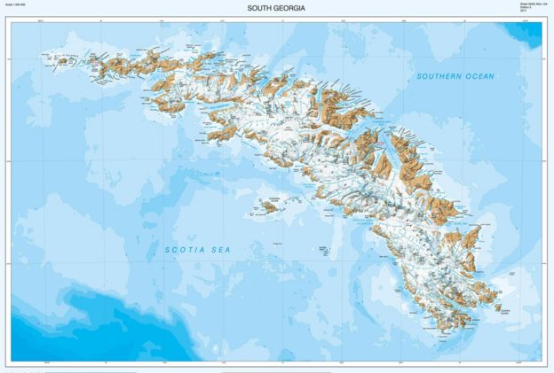
A detailed map of the Shackleton crossing features in our updated South Georgia map

From BBC by Jonathan Amos

Shackleton's escape from the Antarctic in 1916 is well told.
It is without doubt a remarkable story given the many challenges he and his crew had to overcome after losing their ship, the Endurance.
For months they drifted on sea-ice, before making a lifeboat dash to Elephant Island, followed by a hazardous sail across the Southern Ocean to South Georgia.
And if that wasn't enough, Shackleton and two colleagues then trekked over the mountains and ice fields of the British Overseas Territory to a whaling station to get help for the men stranded further back along the escape route.
Precisely how the explorer accomplished the last leg of the journey, across South Georgia, you can now follow in detail on a new map of the island.

 South Georgia island with the GeoGarage platform (UKHO chart)

The British Antarctic Survey (BAS) has updated its 1:200,000 rendering of the territory, with a special feature it calls The Shackleton Crossing on the map's B-side.
"We've never had a product like this before, and we've put a lot of effort into making it as detailed as possible," explained Laura Gerrish, a BAS mapping specialist.
"We've used stereo pairs of very high-resolution imagery to make the elevation data; and we've manually digitised all the rock and ice areas.
"We don't intend it as the route you must take, but it does show those who want to recreate the crossing the paths that are available," she told BBC News.

 A 2016 satellite image: The big glaciers are pulling back up their fjords
 
The Shackleton portion of the map is reproduced at 1:40,000 scale, with three insets at 1:25,000.
These illustrate the more dangerous parts of the 30km trek*, including The Razorback ridge and Breakwind Gap, which have near-vertical descents.
* The direct distance between Shackleton's landing point in King Haakon Bay and Stromness whaling station is just over 30km, but the men had to climb and descend 600m-high peaks, and at one point took a significant wrong turn. 
Shackleton, with Tom Crean and Frank Worsley, negotiated these obstacles by tobogganing on their coiled ropes.

 The South Georgia map was last updated in 2004
The new South Georgia map has been updated & includes new features such as bays and lakes.
see BAS
 
If the trio could retrace their steps today, they would be astonished at the changes that have taken place.
South Georgia is warming and its ice fields are in rapid retreat - something that has become very evident since 2004, the last time BAS updated the map.
"The data we have now is much more accurate of course, but there are many more new bays, coves, promontories and lakes, simply because the glaciers have retreated so much," Ms Gerrish said.
I wrote in March about the glacial history of South Georgia.
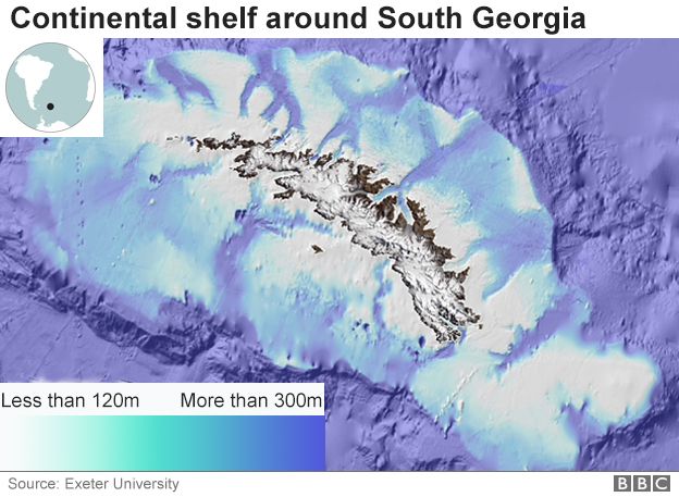
Some 20,000 years ago, during the last ice age, the island's glaciers pushed out 50km and more from their current positions, reaching to the edge of the continental shelf.


Now, the glaciers that formed that ice sheet are constrained to fjords, with some of the marine-terminating streams even pulling back on to land.
"I've been working at South Georgia for 15 years, and every time I go down I say to myself 'I can't believe the glaciers have moved again'," said Dr Mark Belchier, who is the South Georgia science manager at BAS.

Sir Ernest Shackleton and his crew took bitter defeat and turned it into heroic survival.
Early this century, members of the imperial Trans-Antarctic Expedition watched as their ship, the Endurance was crushed by the frozen sea.
They were left with no radio and no hope of rescue.
For more than a year, they drifted on packed ice, surviving on seal, penguin, and eventually dog meat, while battling freezing temperatures and mind-numbing boredom.
When Shackleton, along with all 28 members of the expedition, emerged at Stromness whaling station in May, 1916, almost two years after their departure, the world was shocked.

The fastest retreating ice streams are on the northern or eastern coast - depending on how you want to describe the arcing territory. It's the "sunny side".
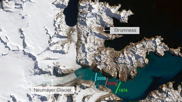
Neumayer and Nordenskjold, the two mighty glaciers that feed Cumberland Bay, have retreated 6km. But even on the south side, the changes are running at pace.
The 4km retreat of Twitcher Glacier since the last edition of the map has opened up a new bay. And with the next-door Iris Glacier also reversing, a new promontory has emerged.
Some of these features have yet to be labelled on the map.
By the time the next edition comes out, the UK Antarctic Place-names Committee should have suggestions.
You may well be wondering what climate change means for South Georgia.
You often hear people who've been there describe it as magical haven for wildlife.
It is said that on some beaches during breeding season you literally cannot move for all the penguins and seals.
One benefit then of the ice retreat is that more breeding grounds will open up.


On the other hand, the ice loss has big implications if there is a rodent infestation.
A lot of money and effort has gone into ridding South Georgia of the rats that once attacked the ground nests of seabirds like the wandering albatross.
The glaciers acted as barriers that limited the rodents' range.
If the rats come back - perhaps jumping off some tourist ship - they will find it much easier to get around.
"But just in general, a lot of the species on South Georgia are highly adapted to that relatively stable cold environment, and there's nowhere really for them to go if conditions change," explained Dr Belchier.
"And they could also be vulnerable to other species that invade from further north."
The new map was produced in collaboration with the expedition and advisory panel at the government of South Georgia and South Sandwich Islands (GSGSSI).
It can be purchased from the UK Antarctic Heritage Trust.
Much of the underlying data is also freely available to view and download from the South Georgia GIS portal.

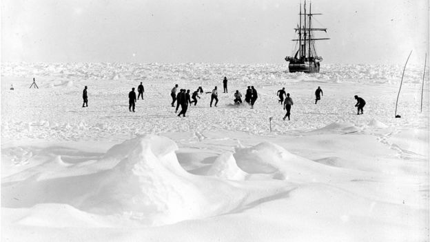
 The crew of the Endurance playing football on the Antarctic ice floes

 Links :

Sunday, September 3, 2017

Two canots in the Chausey islands

 Dream and Sud canots marauding in the West of the Cotentin in France,
between Robinson and the Artichaut rocks.
courtesy of Hervé Hillard

 Chausey islands with the GeoGarage platform (SHOM chart)