Saturday, November 4, 2017

Tinkerbelle : Manry's dream

Robert Manry was not a silly dreamer: in 1965, he sail across the Atlantic in a 25 foot sloop
He sailed his tiny sloop, Tinkerbelle, from Falmouth, Massachusetts to Falmouth, England.
Crowds turn out to cheer Robert Manry as he completes his lone crossing of the Atlantic. 

From DuckWorkMag by Bryan Lowe

It was a different time when Robert Manry set out to cross the Atlantic in a 13.5 foot boat.
In 1965 the world seemed consumed by Vietnam.
Manry was just another young father trying to raise a family and earn a living.
He was a copy editor of a good size newspaper.
He had no expectation of fame or financial reward. Even the idea of writing a book seemed no more than a secondary thought.
His goal didn't even seem clear to him.
He had bought a small boat to go on day trips with his family.

Like many of us, he seemed to enjoy working on the boat even more.
He took the modest little day sailer and added a small cabin, cleaned it up, and added some paint.
Seemingly out of the blue a friend asks Manry if he wants to sail across the Atlantic with him in a 25 foot sloop.
The offer was made mostly in jest, but it wasn't seen that way by Manry.
Although it seemed outside his nature, it had been a dream of his for almost 30 years.
Manry immediatly set to work on making the dream come true.
He was even granted time off from work.
His friends thought him a bit daft, but for some reason the idea seemed plausible to many.
Some even said they wished the could go along.

As Robert rolls along through heavy weather, people who knew him describe his voyage...

But within weeks he was alone.
His trip had fallen through and his crowd of would be sailors suddenly had others things to do.
For Manry the dream had gone too far.
Or perhaps he thought of some of his neighbors who had thought him a silly dreamer.
He still wanted to go.
He knew it would be an adventure, but it is clear he had no idea what he faced.
Without telling anyone but his wife and children he set about making plans to take their little family sailboat across the Atlantic alone.

The boat was a poor choice for his mission.
In addition to being too small, it's entire design was for a pleasant afternoon on the lake.
Even with his modest cabin addition, the boat had no business on open waters.
The hull wasn't deep enough... or wide enough... or strong enough.
The cockpit was almost an open shelf offering little protection from the wind or the waves.
There really wasn't enough room for provisions for the long journey ahead.
His ignorance created calm, if not exactly bliss.


This is a rough cut trailer for the documentary film. 

During his voyage he was remarkably lucky.
What I find so enjoyable about this book is not the blatant bravery or the remarkable hardships.
It is Manry's simple old fashioned charm and enthusiasm.
You get the feeling of sitting in his living room, his wife bringing snacks on the TV tray while the kids watch the latest episode of My Three Sons across the room.
There is no bravado.
His world is filled with people who want the best for him, and he wishes the best for them.
Nature is not put on a pedestal, nor is there a battle of man versus nature.
It's just a bloody nice trip.
Sure his rudder broke... yes there were some 20 foot seas... and yes he did get knocked overboard a few times.
But they seem mere footnotes to his constant enthusiasm and belief that he will make it.
There is no sex.
There are no fights.
There is no doubt.
Manry makes it, and we are there cheering for him as he pulls into harbor surrounded by the press of the World and thousands of well wishers.
The reception a total shock to Manry.
The book is something of a window into the past. It's writing style more akin to the Wind in the Willows than The Perfect Storm.
As I finished the book I wished Manry was still alive for I had many questions.
He seemed such an unlikely person to sail a boat across an ocean.
He didn't have that driving wanderlust or fear of commitment that seems to drive so many others.
What did he do next?
Was this the first in a series of adventures, or did he settle down to a life of family and work?
Why did he do it?

Friday, November 3, 2017

New Greenland maps show more glaciers at risk

UCI’s BedMachine ice mapping technique enabled the creation of a three-dimensional image of a portion of the northwest coast of Greenland.
Ocean bathymetry is shown in blue and ice surface topography are displayed in white and orange.
Mathieu Morlighem / UCI

From UCI

UCI-created high-resolution charts will inform future ice and sea level forecasts

New maps of Greenland’s coastal seafloor and bedrock beneath its massive ice sheet show that two to four times as many coastal glaciers are at risk of accelerated melting as had previously been thought.

Researchers at the University of California, Irvine, NASA and 30 other institutions have published the most comprehensive, accurate and high-resolution relief maps ever made of Greenland’s bedrock and coastal seafloor.
Among the many data sources incorporated into the new maps is data from NASA’s Ocean Melting Greenland campaign.

Lead author Mathieu Morlighem of UCI had demonstrated in an earlier study that data from OMG’s survey of the shape and depth, or bathymetry, of the seafloor in Greenland’s fjords improved scientists’ understanding of both the coastline and the inland bedrock beneath glaciers that flow into the ocean.
That’s because the bathymetry at a glacier’s front limits the possibilities for the shape of bedrock farther upstream.

(a) Data coverage, including ice-penetrating radar measurements (Center for Remote Sensing of Ice Sheets, High CApability Radar Sounder, University of Denmark, Uppsala University, Pathfinder Advanced Radar Ice Sounder, Alfred Wegener Institute) and ocean bathymetry (from single-beam data in dark blue),
and (b) BedMachine v3 bed topography sources, which include mass conservation (MC), kriging, Greenland Ice Mapping Project (GIMP) (Howat et al., 2014), RTopo-2/IBCAO v3 (Jakobsson et al., 2012; Schaffer et al., 2016), and bathymetry data from multibeam and gravity inversions acquired after the compilation of IBCAO v3.

The nearer to the shoreline, the more valuable the bathymetry data are for understanding on-shore topography, Morlighem said.
“What made OMG unique compared to other campaigns is that they got right into the fjords, as close as possible to the glacier fronts. That’s a big help for bedrock mapping,” he added.

Additionally, the OMG campaign surveyed large sections of the Greenland coast for the first time ever.
In fjords for which there are no data, it’s difficult to estimate how deep the glaciers extend below sea level.

(a) BedMachine v3 bed topography (m), color coded between −1500 m and +1500 m with respect to mean sea level, with areas below sea level in blue
and (b) regions below sea level (light pink) that are connected to the ocean and maintain a depth below 200 m (dark pink) and that are continuously deeper than 300 m below sea level (dark red).
The thin white line shows the current ice sheet extent.

The OMG data are only one of many datasets Morlighem and his team used in the ice sheet mapper, which is named BedMachine.
Another comprehensive source is NASA’s Operation IceBridge airborne surveys.
IceBridge measures the ice sheet thickness directly along a plane’s flight path.
This creates a set of long, narrow strips of data rather than a complete map of the ice sheet.

Savissuaq Gletscher area in the GeoGarage platform (DGA chart)

Besides NASA, almost 40 other international collaborators also contributed various types of survey data on different parts of Greenland.

No survey, not even OMG, covers every glacier on Greenland’s long, convoluted coastline.
To infer the bed topography in sparsely studied areas, BedMachine averages between existing data points using physical principles such as the conservation of mass.

Bed topography for different sectors of Greenland:
(a) the region of Savissuaq Gletscher, (b) Hayes Gletscher, (c) Illullip Sermia, (d) Mogens Heinesen N, (e) Heimdal Gletscher, and (f) Skinfaxe.
The yellow/red lines indicate the ice front position between 1985 and today from Landsat data, and the white dotted line shows the profile used in Figure 1.
The topography is color coded between −700 m and 800 m, and contours are shown every 200 m from −800 m to 200 m above sea level.
Some glaciers, such as the one 10 km northwest of Heimdal Gletscher, were not mapped using MC.

The new maps reveal that two to four times more oceanfront glaciers extend deeper than 600 feet (200 meters) below sea level than earlier maps showed.
That’s bad news, because the top 600 feet of water around Greenland comes from the Arctic and is relatively cold.
The water below it comes from farther south and is 6 to 8 eight degrees Fahrenheit (3 to 4 degrees Celsius) warmer than the water above.
Deeper-seated glaciers are exposed to this warmer water, which melts them more rapidly.

Surface and bed topography along six profiles (see white dotted lines in Figure 2) from this study (solid black) and bed from B2013 (dotted red, Bamber et al., 2013) and RTopo-2 (dotted yellow, Schaffer et al., 2016). Multibeam bathymetry data (MBES) are shown in blue.
The vertical lines show the ice front position between 1995 and today.

Morlighem’s team used the maps to refine their estimate of Greenland’s total volume of ice and its potential to add to global sea level rise if the ice were to melt completely, which is not expected to occur within the next few hundred years.
The new estimate is higher by 2.76 inches (7 centimeters) for a total of 24.34 feet (7.42 meters).

OMG principal investigator Josh Willis of JPL, who was not involved in producing the maps, said, “These results suggest that Greenland’s ice is more threatened by changing climate than we had anticipated.”

On Oct. 23, the five-year OMG campaign completed its second annual set of airborne surveys to measure for the first time the amount that warm water around the island is contributing to the loss of the Greenland ice sheet.
Besides the one-time bathymetry survey, OMG is collecting annual measurements of the changing height of the ice sheet and the ocean temperature and salinity in more than 200 fjord locations. Morlighem looks forward to improving BedMachine’s maps with data from the airborne surveys.

The maps and related research are in a paper titled “BedMachine v3: Complete bed topography and ocean bathymetry mapping of Greenland from multi-beam echo sounding combined with mass conservation” in Geophysical Research Letters.
This project received support from NASA’s Cryospheric Sciences Program and the National Science Foundation’s ARCSS program.

Links :

Thursday, November 2, 2017

How 16th-century European mapmakers described the World’s oceans

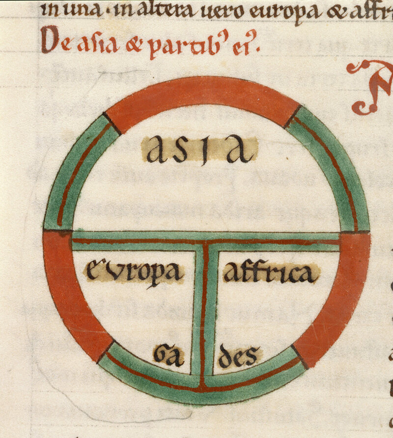
A 13th-century depiction of the world as a circle divided by into three continents, Asia, Europe, and Africa.

From Atlas Obscura by Genevieve Carlton

For some, they were an obstacle.
For others, they were an opportunity.

According to medieval mapmakers, the world was made up of three continents ringed by narrow bodies of water.
When the voyages of Christopher Columbus, Amerigo Vespucci, and Ferdinand Magellan uncovered continents previously unknown to Europeans, this posed a major problem for those cartographers.
But these explorers did not just stumble upon uncharted land—they also became aware of expansive stretches of ocean around the world.

 Bünting Clover Leaf Map.
A 1581 woodcut, Magdeburg.
Jerusalem is in the center, surrounded by Europe, Asia and Africa.

For the first time, Europeans were confronted with the realization that they lived on a blue planet, with 71 percent of the Earth’s surface covered by water.
The narrow strips of blue on medieval mappae mundi—also known as T-O maps, which showed the earth as a T centered on Jerusalem—were suddenly dwarfed by unimaginably vast oceans.
Stories about the European discovery of the New World are ubiquitous, but stories about the discovery of so much new water are much more rare.

 Map of Borneo by Pigafetta.

For explorers, these oceans were dangerous obstacles.
Attempting to traverse them could quickly turn deadly, as the sailors on Magellan’s expedition learned when only one of their five ships—and 18 of the original 280 crewmen—returned to Spain in 1522.
Antonio Pigafetta, one of Magellan’s surviving men, described this first Pacific Ocean crossing, which took three months and 20 days, in a report.
He wrote, “We only ate old biscuit reduced to powder, and full of grubs, and stinking from the dirt which the rats had made on it when eating the good biscuit, and we drank water that was yellow and stinking.”

 Claudius Ptolemy, 13th Century world map

The oceans also posed a problem for mapmakers.
Reports from explorers deviated wildly from pre-Columbian perceptions of the world’s water, as evidenced in mappae mundi.
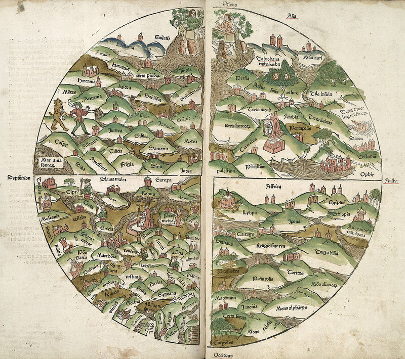
The 1475 world map in Lucas Brandis’s Rudimentum novitiorum captures this older outlook on the world.
Asia, at the top of the map, represents one hemisphere, while wedges depicting Europe and Africa sit in the bottom half of the world.
The map was not intended to be representative; instead it focused on a Christian ordering of space with Jerusalem at the world’s center.
The world’s territories appear as hills, and in Europe, rulers sit atop them, with the pope in Rome shown holding a gold cross.
Asia and Africa, less well known to 15th-century Europeans, have more fanciful illustrations, including a pair of dragons, a burning phoenix, and a man-eating demon chasing his victim while clutching his severed arm.
On the map, the Mediterranean separates Europe from Africa and the rivers Don and Nile mark the divide between Asia and its neighbors.
Yet on this particular map, these bodies of water are marked by thin black lines and nothing more.
The only water seems to flow from the four great rivers at the top of the map, which represents the Garden of Eden’s Earthly Paradise.

A 1475 woodcut world map, published in Rudimentum novitiorum.

The discovery of massive bodies of water forced mapmakers to devise creative solutions.
One of the earliest strategies was to shrink the oceans.
Here, mapmakers borrowed from Columbus himself, who minimized his trans-Atlantic voyage by claiming that the crossing took only 33 days.
However, Columbus only counted from the Canary Islands to the Indies, omitting the 37 days spent traveling from Spain to the Canaries, which included repairs on two of his three ships.

Cantino planisphere (1502)

One of the earliest maps to show the New World, the 1502 Cantino planisphere, shrunk the Atlantic by showing Flores Island, the westernmost of the Azores, just slightly west of the jutting coast of Brazil, when in fact it is several degrees of longitude east of the Brazilian coast.

 Battista Agnese world map (1544)

Battista Agnese, a Genoese mapmaker who produced at least 100 hand-drawn atlases for wealthy patrons, also narrowed the Atlantic in his 1544 world map.
Agnese drew only 10 degrees of longitude between Brazil’s furthest east point and Africa’s furthest west, nearly halving the actual distance of over 3,000 kilometers (1,864 miles).
These cartographic manipulations consistently under-measured the Atlantic, minimizing the distance between the Old World and the New.

From 1570, a world map by Abraham Ortelius. Public Domain

Sixteenth-century mapmakers also invented massive “undiscovered” continents to fill the oceans.
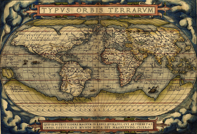
Two of the most famous maps from the 16th century, Abraham Ortelius’s 1570 world map in his atlas Theatrum Orbis Terrarum, and Gerhard Mercator’s 1569 world map, (which introduced the Mercator projection) rely on this approach.
Produced less than a hundred years after the Rudimentum novitiorum, Ortelius’s map shows a completely transformed globe.
The shapes of the world’s continents, recognizable to our contemporary eyes and now divided by the grid of latitude and longitude, are arranged with north at the top, a convention that only emerged in the 16th century.
The least familiar part of the globe is its southern stretches, which Ortelius labels “Terra Australis Nondum Cognita,” or southern land not yet known.

 1604 copy of 1602 Kunyu Wanguo Quantu

Both the Ortelius and Mercator map admitted that the world’s oceans were vastly larger than those shown on any pre-Columbian map, but both also hypothesized a massive southern continent to “balance” the landmasses north of the equator.
Mercator made this explicit in 1595, when he wrote, “it was necessary for such a continent to exist below to Antarctic Pole, which … would balance the other lands.” Europeans were so certain that this continent existed that Australia, first spotted by Europeans in 1606, took its name from the Latin term for Terra Australis.
These imagined continents did not just multiply the Earth’s land—they also limited the disturbing vastness of the world’s oceans.

 Gerard De Jode Universi Orbi seu Terreni Globi (1578)

Other cartographers embraced the ocean’s blank canvas in a different way: by emphasizing just how empty it was.
In addition to minimizing the size of the Atlantic in his beautifully-colored maps, Agnese painted the land a rich green, depicting the mountains, rivers, and lakes that dotted the territory.
On the land, water is drawn in brilliant blue, and the Red Sea and the Gulf of California are colored red, a convention borrowed from mappae mundi.
The ocean, by contrast, was largely blank, the untreated vellum standing in for water.
Agnese did scatter a few islands throughout and used the blank space to highlight Ferdinand Magellan’s route as he circumnavigated the globe.
But his map implies that Magellan did not discover anything notable in the ocean; rather, the ocean was an emptiness between “real” places, defined by the absence of land rather than containing anything worth recording.
Agnese’s unknown land, or terra incognita, which also faded into blank vellum, was visually identical to the explored oceans, perhaps hinting that the ocean was ultimately unknowable.

"A Complete Geographical Map of all the Kingdoms of the World" (坤輿萬國全圖),
the first Chinese world map, 1602

But the seeming blank space of the ocean signified more than peril and emptiness—it also posed an opportunity for enterprising mapmakers.
Blank spaces on the map could be filled with promotions for the map’s creator or his hometown.
The French royal cosmographer and mapmaker André Thévet manufactured not one but two fictional Thevet Islands in the Atlantic in the 1580s.
Similarly, in a 1558 book with an accompanying map, Nicolò Zeno, a Venetian nobleman from a flagging family, alleged that his familial predecessors, Nicolò (his namesake) and Antonio Zeno, had landed on the invented island of Frisland and led voyages in the North Atlantic that discovered the New World in 1380, over a century before Columbus’s Genoa or Vespucci’s Florence could claim the glory.
And on his 1560 world map, Paolo Forlani, one of Venice’s most active mapmakers, used the wide oceans to promote Venice by sprinkling the Atlantic, Pacific, and Indian Oceans with Venetian galleys, clearly not designed for transoceanic voyages.
The ships not only filled the water, but they also proclaimed Venetian dominance in an era when Venice had already lost the race to colonize distant territories.

Forlani’s map of North America from 1566. Public Domain

Mapmakers also explored a range of design techniques to fill the oceans.
Giovanni Lorenzo D’Anania’s 1582 map of the North Atlantic not only populated the waters with imaginary islands, but also filled the sea with dark dots and large labels for the land, minimizing the impression of blankness.
In his 1566 map of North America, Forlani similarly peppered the Atlantic with islands both real and invented, expanded the size of North America, and dotted the waters on his engraving to avoid the impression that the oceans were simply blank.
He also made the Pacific much smaller than the Atlantic, placing the island of Japan halfway between North America and Asia.

Map of the Southern hemisphere, 1593 by Gerard de Jode

These mapmakers and the explorers who crossed the newly found oceans saw the water both as an obstacle, separating Europeans from their destination and posing countless dangers, and as an opportunity.
A blank space on a map let a mapmaker reinvent himself, much like pirates who roamed the seas, by manufacturing islands or adding flourishes to promote his city.
And when mapmakers signed their works, they almost always did so in the ocean.

Links :

Wednesday, November 1, 2017

Tuesday, October 31, 2017

Mystery of Kitfield Ledge solved with a little nautical chart research

Left: Current edition of NOAA chart 13279   /   Right: 1912 edition of chart 243.

From NOAA by Nick Perrugini

Most NOAA Office of Coast Survey customers have a practical mariner’s bent—they are interested in up-to-date and accurate navigational products and services.
However, an increasing number of customers are using Coast Survey online resources for historical research.

In May 2017, Coast Survey received an inquiry via the Inquiry and Discrepancy Management System (IDMS) that illustrates this point.
Original message: My dad is from Manchester-By-Sea, MA. There is a ledge on the NAUTICAL charts, “Kitfield Ledge”. Is there a place where we can get some history, when it was named, and how it came about. We have not been able to find any information on that. My dad was born in 1926, and he and his dad, used to lobster off of Black Beach in the 1930’s. We were back there 2 years ago and did some research at the Cape Ann Museum, but were not able to locate any information. Appreciate any help you may be able to provide. Thank you.

 Kitfield Ledge with the GeoGarage platform
& Google Maps search


 Kitfield Ledge with the GeoGarage ENC platform and Bing satellite imagery
(ENC with depths in meters)

The first step in solving this mystery was to locate Kitfield Ledge on the current chart.
Using the “Place Names” search in the Chart Catalog, Kitfield Ledge was located on the current edition of chart 13279.

Using the Historical Map & Chart Collection, I was able to trace the name back to Coast and Geodetic Survey Chart 243 published in 1912.

 An historic nautical chart of Ipswich Bay to Gloucester Harbor, Massachusetts published in 1912 by the U.S. Coast & Geodetic Survey showing topography, water depths in fathoms, and nautical features.
source : Amazon

Interesting….but where to go from here?
I then accessed the hydrographic surveys archive maintained by NOAA’s National Center for Environmental Information (NCEI, formerly NGDC).
Using the interactive map interface for bathymetric data, I was able to view and download an 1896 hydrographic survey that showed Kitfield Ledge.
Geographic name references are not always included in hydrographic survey descriptive reports, however to my surprise,the following note was discovered in the hand written descriptive report.


(Transcription)
  1. “Kitfield’s Ledge.  This ledge lies SW of Crow Island with a least depth of 2 ½ fathoms.  It is covered with kelp and Crow Island Rock is situated on it. Its name was derived from the fact that at old woman, Granny Kitfield by name, used to fish for cod on it with much success.
Granny Kitfield must have been quite an angler to have a rocky ledge named after her!
The Granny Kitfield inquiry, and its resolution, illustrates that Coast Survey (and other organizations within the National Ocean Service) offer impressive online resources to assist in historical research.
Many customers are interested in what shoreline or coastal features looked like a century ago.
Others are interested in where a currently charted feature (like a wreck) originated.
Resources that may help customers interested in historical research include:
So go ahead, check these resources out.
Mysteries of the deep are waiting to be discovered—or maybe you’ll find another one of Granny Kitfield’s favorite fishing spots.

BP and Shell planning for catastrophic 5°C global warming despite publicly backing Paris climate agreement

Neither company sets targets to reduce emissions and
BP’s total investment in renewable and clean technologies has actually shrunk since 2005, 
the report said 

From The Independant by Ben Chapman

Companies are trying to 'have their oil and drink it' by committing to 2°C in public while planning for much higher temperature rises, says shareholder campaign group, ShareAction

Oil giants Shell and BP are planning for global temperatures to rise as much as 5°C by the middle of the century.
The level is more than double the upper limit committed to by most countries in the world under the Paris Climate Agreement, which both companies publicly support.

The discrepancy demonstrates that the companies are keeping shareholders in the dark about the risks posed to their businesses by climate change, according to two new reports published by investment campaign group Share Action.
Many climate scientists say that a temperature rise of 5°C would be catastrophic for the planet.

ShareAction claims that the companies’ actions put the value of millions of people's pensions at risk.
Two years after BP and Shell shareholders voted resoundingly in favour of forcing the companies to make detailed disclosures about climate risks, the companies have made unconvincing steps forward, according to the reports.
ShareAction said that Shell and BP are meeting their legal requirements, but are putting shareholders’ capital at risk because of numerous failings in their plans for the future.

Neither company sets targets to reduce emissions and BP’s total investment in renewable and clean technologies has actually shrunk since 2005, the reports said.
That’s despite the company’s public-facing image of being “beyond petroleum”.

BP invests just 1.3 per cent of its total capital expenditure in low-carbon projects while Shell has pledged to invest 3 per cent of its annual spend on low-carbon by 2020.


Both companies assess the resilience of their businesses against climate models in which temperatures warm by between 3°C and 5°C.
A maximum warming of 2°C beyond pre-industrial levels is the central aim of the landmark Paris climate agreement, which both firms say they support.
It is widely believed that any warming beyond 2°C could cause serious and potentially irreversible changes to the climate.
Shell reaffirmed its commitment to the Paris Agreement in a statement publicising its most recent AGM.
“Shell has a clear strategy, resilient in a 2°C world,” the company said, but its change modelling document states that “the emissions pathways until the middle of the century overshoots the trajectory of a 2°C goal”.

ShareAction’s report also found that top executives at both Shell and BP are still given incentives to pursue strategies centred on oil and gas and are paid bonuses over three to six years for fossil fuel projects that could have damaging effects for shareholders decades later.
Michael Chaitow, senior campaigns officer at ShareAction, said the report revealed an “uncomfortable discrepancy” between Shell and BP’s public support for a low-carbon economy and their actual business planning.
“Shell and BP want to have their oil and drink it too, by advocating for the landmark Paris Agreement to limit global temperature rises to below 2°C degrees, while planning for scenarios that would violate it,” he said.

The group called on Shell and BP shareholders, which include powerful institutional investors, to demand that the two oil companies do more to tackle climate change.

In 2015, more than 98 per cent of shareholders in both Shell and BP voted for resolutions that require the companies to regularly report on their emissions, resilience to climate change, investment in low-carbon technology and executive incentives.
The resolutions helped pave the way for subsequent shareholder resolutions on climate-related disclosure at oil and gas companies including Exxon and Occidental Petroleum.

Following the Shell and BP resolutions, billionaire businessman and former New York Mayor, Michael Bloomberg, founded a task force to press companies to properly disclose to the world the risks that climate change presents.

Catherine Howarth, chief executive of ShareAction, said the chief executives of both Shell and BP are running companies that look “poorly prepared for the speed of technological and economic change now underway in the global energy market”.
She added: “Millions of pension savers are exposed to Shell and BP’s shares. These reports challenge the professional investors looking after our pension savings to manage the growing financial risks facing BP and Shell more actively in the coming year.”

Neither BP nor Shell would comment on the report directly.
BP said it “anticipates a range of scenarios to give us flexibility in our approach".

Links :

Monday, October 30, 2017

New science suggests the ocean could rise more — and faster — than we thought

Shot just off the coast of Ilulissat , the best western Greenland has to offer, covering vast glaciers, icebergs and Icefjords melting away.
Rising air and sea temperatures is causing the massive Greenland ice sheet to shed 300 gigatons of ice a year into the ocean, the single largest source of sea level rise from melting ice!

From Washington Post by Chris Mooney


Climate change could lead to sea level rises that are larger, and happen more rapidly, than previously thought, according to a trio of new studies that reflect mounting concerns about the stability of polar ice.

In one case, the research suggests that previous high end projections for sea level rise by the year 2100 — a little over three feet — could be too low, substituting numbers as high as six feet at the extreme if the world continues to burn large volumes of fossil fuels throughout the century.

“We have the potential to have much more sea level rise under high emissions scenarios,” said Alexander Nauels, a researcher at the University of Melbourne in Australia who led one of the three studies.
His work, co-authored with researchers at institutions in Austria, Switzerland, and Germany, was published Thursday in Environmental Research Letters.

The results comprise both novel scientific observations — based on high resolution seafloor imaging techniques that give a new window on past sea level events — and new modeling techniques based on a better understanding of Antarctic ice.

The observational results, from Texas and Antarctica, examine a similar time period — the close of the last Ice Age a little over 10,000 years ago, when seas are believed to have risen very rapidly at times, as northern hemisphere ice sheets collapsed.

Off the Texas coast, this would have inundated ancient coral reefs. Usually, these reefs can grow upward to keep pace with sea level rise, but there’s a limit — one observed by a team of scientists aboard a vessel called the Falcor in 200 foot deep waters off the coast of Corpus Christi.

These so-called drowned reefs showed features that the researchers called “terraces,” an indicator of how the corals would have tried to respond to fast rising sea levels.
Because the organisms must maintain access to a certain amount of sunlight, they would have tried to grow higher to keep up with fast rising seas — but they wouldn’t have been able to do so over a very large area.
And so their growth became concentrated in progressively smaller, stepped regions:

A 3-D representation of Dream Bank, a long-dead reef offshore South Texas.
The vertical scale of the image has been increased to clearly illustrate the terrace structures that form due to rising sea levels via a process known as backstepping.
(Image courtesy of P. Khanna/Rice University)

“The reef under stress often has a tendency to kind of shrink to this higher elevated area,” said André Droxler, one of the authors of the study in Nature Communications and a researcher at Rice University.
“It creates this pyramid-like system.” (Droxler completed the research with colleagues from Rice and Texas A&M University, Corpus Christi.)

The youngest drowned corals date to the end of the last ice age, around 11,500 years ago — corresponding to what scientists believe were large warming events in the northern hemisphere and so-called meltwater pulses from now melted ice sheets.
And multiple drowned reefs off Texas show a similar pattern — and terminate in similar water depths.
“Over 120 kilometers, the reefs behaved the same way. It’s difficult to find any other reason why they would do this,” Droxler said.

Droxler thinks the reef structures suggest eras when sea level was rising by tens of millimeters annually, far beyond the current, roughly 3 millimeters per year.
(A 50 millimeter annual sea level rise would produce a meter, or over 3 feet, of rise every 20 years.)
The new study therefore concludes that during the last ice age, there were multiple bursts of fast sea level rise — and implies that our future could hold something similar.
“The steady and gradual sea-level rise, observed over the past two centuries [may] not be a complete characterization of how sea level would rise in the future,” the study concludes.

Meanwhile, far away in the Southern hemisphere, a team of scientists used a very similar seafloor mapping technology to detect ancient iceberg “plough marks” etched deep into the seafloor of Pine Island Bay, an ocean body that currently sits in front of one of West Antarctica’s most worrying glaciers, Pine Island.
The results were published in the journal Nature on Wednesday by researchers at the University of Cambridge, the British Antarctic Survey, and the Bolin Center for Climate Research in Stockholm.

The seafloor grooves, the researchers believe, were made during a similar era to the Texas coral steppes (the close of the last ice age), and signal a very rapid retreat of Pine Island over roughly a thousand years.

Here’s what they looked like in the seafloor imagery the study produced:


Linear-curvilinear iceberg-keel ploughmarks on the surface of a large grounding-zone wedge located in the mid-shelf Pine Island Trough, West Antarctica. (Martin Jakobsson)

What’s critical about the markings, explains lead study author Matthew Wise of the University of Cambridge, is their maximum depth — 848 meters, or around 2,800 feet.
Because ice floats with 10 percent of its mass above the surface and the remaining 90 percent below it, this suggests that when the ice broke from the glacier, close to 100 meters (over 3oo feet) of it was extending above the water surface.

That’s a key number, because scientists are converging on the belief that ice cliffs of about this height above the water level are no longer sustainable and collapse under their own weight — meaning that when you get a glacier this tall up against the ocean, it tends to crumble and crumble, leading to fast retreat and potentially fast sea level rise.
“If we think about how thick these icebergs would have needed to be considering these float with 90 percent of their mass and thickness beneath the sea,” Wise said, “we think of an ice cliff that was at the maximum thickness implied by the physics of the ice.”

 NASA

The problem is that if it happened then, well, it could happen again.
Both Pine Island glacier and its next door neighbor, Thwaites, are known to get thicker as one travels inland away from the sea, which means they are capable of once again generating ice cliffs taller than the critical size detected by the current study.
“If a cliff even higher than the ~100 m subaerial/900 m submarine cliffs were to form, as might occur with retreat of Thwaites Glacier in West Antarctica, it might break repeatedly with much shorter pauses than now observed, causing very fast grounding line retreat and sea level rise,” explained Richard Alley, a glaciologist at Penn State University, by email after reviewing the current study for the Post.

The final study, released Thursday morning in Environmental Research Letters, takes a different approach but provides perhaps the most sweeping verdict.

The study used five “shared socioeconomic pathways” that analyze possible futures for global society and its energy system, and resulting climate change, over the course of this century.
These scenarios will feed into the next report of the United Nations Intergovernmental Panel on Climate Change, the most influential scientific body that assesses climate change, according to the University of Melbourne’s Alexander Nauels, the lead author of the current study

The research combined these scenarios with tools to project future sea level rise in light of recent science suggesting that Antarctic ice in key regions could collapse relatively rapidly.
That includes possible fast retreat at Pine Island and Thwaites glaciers due, in part, to the problem of ice cliff instability.

The result was that in one scenario assuming high fossil fuel use and strong economic growth during the century, the study predicted that seas could rise by as much as 4.33 feet on average — with a high end possibility of as much as 6.2 feet — by 2100.
That includes possibly rapid sea level rise as high as 19 millimeters per year by the end of the century.

These numbers are considerably higher than high end projections released in 2013 by the Intergovernmental Panel on Climate Change.
(It is important to emphasize that the highest sea level numbers presented in the new study would result from human choices to pursue large fossil fuel exploitation and economic growth with little attempt to slow climate change. It is far from clear that this is the path the world will actually take.)

On the other hand, if the world limits global warming to the Paris climate agreement emissions target, the study finds that sea level rise might be held as low as 1.7 feet by 2100, on average.
Here’s an image illustrating the results:

21st century global mean sea level rise projections with median and shaded 66 percent model ranges under a baseline high warming scenario and low warming scenario.
The dashed lines represent scenarios consistent with the United Nations’ Intergovernmental Panel on Climate Change’s (IPCC) findings in 2013, while the solid lines present revised sea level rise modeling results based on Antarctic ice sheet contributions suggested by DeConto and Pollard (2016).
The IPCC consistent sea level rise likely ranges are based on Nauels et al. (2017).
Global mean sea level rise is provided in centimeters relative to the 1986-2005 mean.
(Nauels et al.)

When the IPCC undertakes a similar analysis, Nauels said, it could produce results like these.
“I think the numbers will go up,” he said of the body’s report, which is expected in 2021.

So in sum — new research is affirming that seas have risen quite rapidly in the planet’s past, and that major glaciers have retreated quickly because their enormous size makes them potentially unstable.
Meanwhile, additional modeling projects these kinds of observations forward and suggests that the century in which we are now living could — could — see similar changes, at least in more severe global warming scenarios in which the world continues to burn high volumes of fossil fuels.

But unlike those submerged corals off the coast of Texas, the difference is that we know this could be coming — which gives us a chance to stop it.

Links :


Sunday, October 29, 2017

Home

Home from Frost Films
A Cinematic Short Film celebrating the life of a man called Bob.
Throughout his entire life he's always put the ocean first,
which has lead to him being homeless and living in a van.
But he loves the ocean and his life as much as ever, and of course, still surfs every day.
"Your happiness comes within yourself"

Links :