Saturday, September 20, 2014

Norway, the slow way : the route of the Hurtigruten

 Enjoy the complete cruise of M/S Nordnorge from Bergen to Kirkenes in 37 minutes.
The original footage was 8040 minutes. The speed in this timelapse varies between 100x to 300x normal speed.
Footage is from the live broadcast "Hurtigruten Minutt for Minutt" aired on television in June, 2011.

Links :
  •  NYTimes by Reif Larsen : A journey in which I travel north, on the world’s most beautiful voyage, searching for the specter of my grandfather and a glimpse of the ever-elusive midnight sun.

Friday, September 19, 2014

Photos reveal China building on reefs in disputed waters

Johnson South Reef which China calls Chiga Reef with the Marine GeoGarage

From SMH by Lindsay Murdoch

Spy photographs obtained by Fairfax Media reveal that China is rapidly building artificial islands on reefs in fiercely disputed areas of the South China Sea.


For centuries they were dots in turquoise waters, home only to sea birds.
But the latest images show that land reclamation and construction is underway on Kennan and Burgos islands in the heart of the Spratly Islands and on its eastern and western extremes, as China aggressively presses territorial claims in the resource-rich waters.

 left picture : 31 March 2014 / right picture : 7 August 2014
CNES 2014, distribution Astrium Services/Spot Image SA/IHS


The United States warned last week that China's accelerated land reclamation work had proved "intimidating and worrisome" for other regional countries, including the Philippines and Vietnam.

Burgos Reef, June 2014. Materials for constructing breakers and dredging appear.
 Burgos Reef, June 2014. Materials for constructing breakers and dredging appear.

US Assistant Secretary of State Daniel Russel, the senior US diplomat for East Asia, said that while Beijing rightly points out it is not the only claimant country to have carried out such work "the pace of China's reclamation in the sensitive disputed waters of the South China Sea vastly outstrips what other claimants have done in the past by many orders of magnitude."
"What I think the effect of what they are doing is to destabilise the situation and make it harder, not easier, for the claimants to resolve their claims peacefully," he said.
The US has stepped up surveillance flights over the region, despite Chinese protests, including reportedly from bases in east Malaysia.

Burgos Reef, July 29, 2014. The reclaimed portion appears with an altered shoreline that has been reinforced by breakers.
Burgos Reef, July 29, 2014.
The reclaimed portion appears with an altered shoreline that has been reinforced by breakers.

Carl Thayer, an expert on the South China Sea from the University of New South Wales, said that while the photographs do not support speculation China is building military bases or airports on the islands they support the "official Chinese position that land reclamation and other construction activities will improve the quality of life for Chinese living on these artificial islands."
"This basic infrastructure could support economic activities, including rudimentary medical facilities and, if the Chinese were so inclined, serve as lilypads to small search and rescue aircraft," Professor Thayer said.
"These photographs alert analysts to keep a close watching brief on Chinese activities and to adjust assessments of their military utility as construction continues."


Kennan Reef, April 2014. Waterways are dredged while excavated residue is used to reinforce the land.
Kennan Reef, April 2014.
Waterways are dredged while excavated residue is used to reinforce the land.

Defence analysts in the US and Asia have been tracking the movements of a 127-metre Chinese dredging ship, the Tian Jing Hao, that is believed to have transformed at least six reefs into artificial islands this year, sucking up the seabed and disgorging it on reefs at the rate of 4,500 cubic metres per hour.
Tensions were heightened in the region in May when China moved an oil drilling platform into an area of the sea disputed with Vietnam which prompted an eruption of anti-Chinese rioting in Vietnam.
The Philippines has attempted to shore up its claims in the sea, releasing dozens of ancient map which officials said show that China's historical southernmost territory was always Hainan island, just off the Chinese coast.

Kennan Reef, July 29, 2014. An increased number of construction equipment, materials and container vans used as shelter for the workers appear.
Kennan Reef, July 29, 2014.
An increased number of construction equipment, materials and container vans
used as shelter for the workers appear.

Philippine officials said the maps dating from the Song Dynasty in the year 960 do not include Scarborough Shoal as Chinese territory, an area where China has been engaged in a acrimonious stand-off with the Philippines.
The Philippines, a close US ally, has brought a case to a United Nations court in The Hague challenging China's sovereignty claims.
China claims the near entirety of the South China Sea, a major maritime thoroughfare that is also claimed by Malaysia, the Philippines, Taiwan and Brunei.

Links :

Thursday, September 18, 2014

Adventurer Daniel Fox's spectacular album from Alaskan islands

The intrepid explorer is currently three weeks into a monstrous 1,000 mile Pacific kayak expedition from Victoria, Canada, to San Francisco, California
The intrepid explorer is currently three weeks into a monstrous 1,000 mile Pacific kayak expedition from Victoria, Canada, to San Francisco, California

From DailyMail by Jack Crone

  •  Daniel Fox, 40, from San Francisco, took on the challenge to document the region's spectacular scenery and animals
  • Armed with few supplies, he camped on site where Russians founded early settlement in Alaska in the late 1700s
  • Adventurer says it's his mission to bridge the gap between people and nature - and sees the world as his studio
  • He says: 'Unfortunately many of today's youth are immersed in totally different reality, living in front of a computer'
  • He's currently kayaking a staggering 1,000 miles from Victoria, Canada to San Francisco to raise charitable funds
These breathtaking photos were captured by adventurer Daniel Fox - who spent three months circling the remote and unspoiled islands of Alaska in just a kayak.
The explorer, 40, from San Francisco, took on the challenge to offer people a tantalising glimpse into the region's spectacular scenery and animals.
Mr Fox, also a wildlife photographer, first visited the north-western state in 2013 and fell in love with the abundance of sea otters, deer and eagles. 

This mesmerising picture shows explorer Mr Fox inside strolling through the famous Mendenhall Glacier in Juneau Alaska
This mesmerising picture shows explorer Mr Fox inside strolling
through the famous Mendenhall Glacier in Juneau Alaska

He decided to return this summer and spent three months travelling around the islands by kayak, meeting humpback whales and brown bears along the way.
Armed with just a few supplies he camped on the site where Russians established one of their first settlements in Alaska in the late 1700s.
He regularly awoke to bears and deer inspecting his tent - but the animals were merely curious about the lone human camping in the open air.
He said: 'I camped where the Russians established the location of their first Alaska settlement and first substantial European settlement on the Pacific Coast of North America, north of California.
'I dined watching humpbacks breaching and feeding, listening to their roaring splash echoing around, bouncing off the steep mountains.

Mr Fox claims claims that it's his mission to bridge the gap that has developed between nature and people(above he kayaks in the Mendenhall Glacier)

This beautiful photo was taken at the outset of the trip - he is pictured at Bear Glacier next to his kayak in April 2014 in British Columbia, Canada

A sea lion yawns at Daniel Fox as it sits on rocks in Kodiak Island, Alaska - the explorer describes himself as an artist and a storyteller

'I went back to Mendenhall Glacier but this time paddling the lake and exploring the icebergs. It was during that outing that I found this amazing iceberg cave.
'Kayaking is a really intimate relationship with the water and the places you visit. You are sitting in this small cockpit, feeling every little ripple, wave, breeze, or current.'
Mr Fox, who counts Sir David Attenborough as one of his heroes, describes himself as a photographer, storyteller and artist and says his mission is to bridge the gap between nature and the public.

Daniel Fox splashes water into the camera as he kayaks around the stunning scenery in June this year in Afognak Island, Alaska

Not one to shy away from adventure, he is currently kayaking down the Pacific coast from Victoria, Canada, to San Francisco, California.
The astonishing 1,000 mile journey is in aid of Wilderness Immersion for Leadership and Discovery (W.I.L.D.), a foundation Mr Fox started to connect young people with wildlife.
The goal is to raise $14,500 in sponsorship so that two underprivileged teenagers can attend a 30-day sea kayaking camp in Alaska in 2015.
He is now three weeks into the journey, has kayaked more than 300 miles, bringing him to waters off the coast of north Oregon, and has raised just under $5,000. 

"Really rarely do we have the capacity to just focus on one single thing.
The minute of nature is a daily exercice is like a meditation; to try to disconnect from all our distractions and just to basically stop :
Stop, breathe, relax, listen, enjoying the moment"
(see Paddling magazine)

The intrepid explorer is currently three weeks into a monstrous 1,000 mile Pacific kayak expedition from Victoria, Canada, to San Francisco, California
The explorer says 'nature is raw, rough, cruel, pretty, beautiful, inspiring, but above all, a humble experience' (pictured above is a red fox)

The adventurer said he would regularly wake to find deer sniffing through his belongings (above a black sitka deer inspects his camp on Kodiak island)
A lone brown bear looks straight into the camera as it  walks along the beach in this image taken in May 2014 on Admiralty Island, Alaska

On his foundation's website, Mr Fox says: 'Ever since I was a young boy, I found my inspiration and comfort in nature. It taught me about life, and death. 
'Nature is raw, rough, cruel, pretty, beautiful, inspiring, but above all, a humble experience.' 
Explaining his inspiration for starting the foundation he says: 'Unfortunately many of today's youth are immersed in a totally different reality. 
'Living in front of the computer, the television omnipresent and socially connected via smartphones, they spend little time in nature and rarely disconnect from technology. 

 Mr Fox stands to admire the stunning green landscape at Three Saints Bay in Kodiak Island, Alaska
 Mr Fox stands to admire the stunning green landscape at Three Saints Bay in Kodiak Island, Alaska

Mr Fox's goal is to raise $14,500 on his current expedition so that two underprivileged teenagers can attend sea kayaking camp in Alaska in 2015 (a bald eagle above) 

Mr Fox's goal is to raise $14,500 on his current expedition so that two underprivileged teenagers can attend sea kayaking camp in Alaska in 2015 (a bald eagle above) 
'If their lives exist on the screen now, it’s unrealistic to think they will have the desire to connect with the natural world as they mature. 
'Yet, humans have always been connected with nature - 99.9% of our evolution comes from living in natural environments and our psychological underpinning is still entrenched in many ways with nature.' 
To track his progress on his 1,000 mile challenge, you can visit his W.I.L.D. website.

 Explaining his inspiration for starting the foundation he says: 'Unfortunately many of today's youth are immersed in a totally different reality'

Explaining his inspiration for starting the foundation he says: 'Unfortunately many of today's youth are immersed in a totally different reality'

Mr Fox first visited the north-western state in 2013 and fell in love with the abundance of sea otters, deer and eagles (above a bird flies near Afognak Island, Alaska)

Daniel Fox photographed three otters playing in the water on Kodiak Island, Alaska, this summer during a three month kayaking trip around the state's islands

Links :

    Wednesday, September 17, 2014

    Map Lab uncovering hidden text on a 500-year-old map that guided Columbus

    The 1491 Martellus map (click to enlarge or see on Yale Univ.)
    It reflects the lastest theories of that time and its projection on a flat surface.

    From Wired by Greg Miller

    Christopher Columbus probably used the map above as he planned his first voyage across the Atlantic in 1492.
    It represents much of what Europeans knew about geography on the verge discovering the New World, and it’s packed with text historians would love to read—if only the faded paint and five centuries of wear and tear hadn’t rendered most of it illegible.

    But that’s about to change.
    A team of researchers is using a technique called multispectral imaging to uncover the hidden text.
    They scanned the map last month at Yale University and expect to start extracting readable text in the next few months, says Chet Van Duzer, an independent map scholar who’s leading the project, which was funded by the National Endowment for the Humanities.

    The map was made in or around 1491 by Henricus Martellus, a German cartographer working in Florence.
    It’s not known how many were made, but Yale owns the only surviving copy.
    It’s a big map, especially for its time: about 4 by 6.5 feet.
    “It’s a substantial map, meant to be hung on a wall,” Van Duzer said.

    The Martellus map during preparations for multispectral imaging.

    The Martellus map is interesting for several historic reasons, Van Duzer says.
    One is it’s relevance to Columbus.
    “It’s extremely likely, just about unquestionable that Christopher Columbus saw this map or a very similar one made by the same cartographer, and that the map influenced his thinking about the world’s geography,” Van Duzer said.

    There are several lines of evidence for this, Van Duzer says.
    Columbus sailed west from the Canary Islands hoping to find a new trade route to Asia.
    Writings by Columbus and his son suggest that he began searching for Japan in the region where it appears on the Martellus map, and that he expected to find the island running north to south, as it does on the Martellus map, but not on any other surviving map made before his voyage.
    (You can see Japan floating too far off the coast of Asia in the top right corner of Martellus’s map above).

     1482 Claudius Ptolemy World Map

    World map (1490) of Henricus Martellus Germanus
    (otherwise known as Heinrich Hammer)
    This map is important because it claimed that Colombus used this map or a similar type to persuade Ferdinand de Aragon and Isabella de Castilla to be his patrons in his adventures in the early 1490s.
    Colombus used it as evidence to prove that there wasn't a great dstance between Europe and China by sea.
    Furthermore, this proved that Europeans could go to the East Indies by sea without having to go through Muslim-held lands.
    The map was also the first to record the rounding of the Cape of Good Hope in South Africa by the Portuguese in 1488.
    Some believe that Martin Behaim heavily relied on the world map when he made Erdapfel in 1492, on the eve of Colombus' first voyage to the West.

    Of course, what Columbus found instead was something Martellus hadn’t known about—the New World.

    Martin Waldseemüller’s 1507 map was influenced by the earlier map by Martellus (click to enlarge). Library of Congress

    Martellus’s map was also a big influence on Martin Waldseemüller, another German cartographer whose 1507 map is the first to apply the name “America” to the New World.
    The Library of Congress purchased the only surviving copy of Waldseemüller’s map in 2003 for $10 million.
    “There are many places where the same information was in the same place on the two maps,” Van Duzer said.
    “The layout is very similar, a lot of the decorative elements are very similar.”

    What isn’t known, because of the condition of the Martellus map, is how similar the text on the two maps is.
    “One of the most exciting images I’ve ever seen of a map is an ultraviolet image of the Martellus map taken in the early ’60s,” Van Duzer said.
    “If you look at eastern Asia with natural light, if you look closely, you get a hint that there’s text there, but if you look in ultraviolet light suddenly you see that there’s text everywhere.”

    Most of the text still isn’t legible in those older UV images, but some of the parts that are appear to be drawn from the travels of Marco Polo through east Asia.
    There are also indications of where sailors could expect to find sea monsters or pearls.
    “In northern Asia, Martellus talks about this race of wild people who don’t have any wine or grain but live off the flesh of deer and ride deer-like horses,” Van Duzer said.
    Waldseemüller copied much of this.

    A photo of the Martellus map taken in 1960 with ultraviolet light (right) reveals text in places where it’s not normally visible (click to enlarge).
    Beinecke Rare Book and Manuscript Library, Yale University


    There are also interesting differences between the two maps.
    Waldseemüller gets the shape of Africa more or less right, but on the Martellus map, southern Africa juts out way too far to the east (Africa is on the left side of both maps).
    In addition, Martellus’s depiction of rivers and mountains in the interior of southern Africa, along with place names there, appear to be based on African sources.
    It’s likely that this information came from an African delegation that visited the Council of Florence in 1441 and interacted with European geographers.
    Three other surviving maps contain some of this same information, but the Martellus map covers more territory than any of them, making it the most complete surviving representation of Africans’ geographic knowledge of their continent in the 15th century. “In my mind, that’s absolutely amazing,” Van Duzer said.

    Van Duzer hopes to learn more about Martellus’s sources from the new images the team is creating. Scanning the map only took a day, after two and a half days of set up, he says.
    The team used an automated camera system developed by a digital imaging company called Megavision.
    The system uses LEDs to deliver light within a narrow band of wavelengths and minimize the amount of heat and light the map was exposed to.
    The camera has a quartz lens, which transmits ultraviolet light better than glass.
    The team photographed 55 overlapping tiles of the map, using 12 different types of illumination, ranging from ultraviolet to infrared.

    Conceptually, the process isn’t very complicated, says team member Roger Easton, an expert on imaging historical manuscripts at the Rochester Institute of Technology.
    “We’re really just looking at the object under different colors of light and trying to find the combination of images that best enhance whatever it is that we’re trying to see.”

    But extracting legible text from all those images will take a lot of imaging processing and analysis, and a lot of trial and error, Easton says.
    A combination that works on one part of the map might be useless for another part.
    “It depends on the details of how the map has eroded or how the color of the pigments has changed,” Easton said.
    “Different pigments reflect different wavelengths of light, and they deteriorate differently too.”

    When the project is complete, probably sometime next year, the images will be available for scholars and the general public to examine on the website of the Beinecke Digital Library at Yale.


    Links:

    Tuesday, September 16, 2014

    Netherlands NLHO update in the Marine GeoGarage

    19 charts (42 including sub-charts have been updated with 2014 material from the Netherlands Hydrographic Office (so a total of 227 including sub-charts -see list-) :

    • 18111   Overzichtskaart Waddenzee (Westeli   250 000
    • 18112   Zeegat van Texel   50 000
    • 18113   Waddenzee, Den Helder tot Kornwerd   75 000
    • 18114   Waddenzee, Zeegat van Terschelling   75 000
    • 18115   Hoofdkaart Terschelling/Vlieland   250 000
    • 18116   Waddenzee, Zeegat van Ameland tot   75 000
    • 18117   Eierlandsche Gat   50 000
    • 18118   Noordzeekust, Zeegat van Texel tot   100 000
    • 18119   Noordzeekust, Eierlandsche Gat tot   100 000
    • 18122   Hollum tot Ternaard   50 000
    • 18123   Schiermoog tot Lauwersoog   50 000
    • 18124   Lauwersmeer   30 000
    • 18125   Schierm-oog tot Rottumeroog   50 000
    • 18126   Schierm-oog tot Norddeich   75 000
    • 18127   Eemshaven tot Knock   50 000
    • 18128   Knock tot Papenburg   50 000
    • 18129   Frieschezeegat tot Monden v/d Eems   100 000
    • 181110   Noordzeekust, Zeegat van Ameland   100 000
    • 181210   Monden v/d Eems tot Norderneyer S   100 000

    Note : In accordance with SOLAS, nautical products must be kept up-to-date.
    The Netherlands Hydrographic Office therefore publishes Notices to Mariners (corrections on Netherlands nautical charts, small craft charts and Nautical Publications / Week edition).


    This Hawaiian Island is so polluted with plastic that it might become a superfund site

    Tern Island. (Photo: France Lanting/Getty Images)

    From Takepart by Taylor Hill

    Ocean plastic and toxic waste left behind by the military threaten sea turtles, seals, and other marine life. 

    Hawaiian green sea turtles, monk seals, and black-footed albatrosses are all closer to getting a cleaner, plastic-free home as the federal government takes a step toward declaring a remote Pacific atoll a Superfund site.

    The designation, which the United States Environmental Protection Agency gives areas severely contaminated by hazardous waste, would be the first granted for a site that was investigated for ocean plastic pollution.
    “I’m thrilled the EPA is taking this historic first step to protect Hawaiian monk seals and green sea turtles from dangerous plastic litter,” said Emily Jeffers, an attorney for the Center for Biological Diversity.
    “These animals face enough threats to their survival from sea level rise and habitat loss; the last thing they need is to choke on a floating plastic bag.”

    Tern Island is a tiny coral island located in the French Frigate Shoals
    in the Northwestern Hawaiian Islands

    Tern Island with the Marine GeoGarage

    Located about 564 miles northwest of Honolulu, Tern Island is as remote as an island can get.
    But the atoll is directly in the path of the Great Pacific Garbage Patch, catching bits of the billions of pounds of swirling plastic that inundates the area.
    That plastic—whether bags, fishing lines, or bottle caps—often ends up in the bellies of marine animals and birds.
    “Initial studies conducted by EPA in areas outside of the Northwestern Hawaiian Islands indicate that microplastic marine debris can accumulate and transport contaminants in the marine environment into the food chain,” Dean Higuchi, an EPA spokesman, said in an email.
    Higuchi pointed out that the Superfund designation wouldn’t come just because of drifting plastic. “The major thing to remember…is the contamination that was left from the military activities on Tern Island,” he said.
    From 1942 to1979, the U.S. Navy used the island as an airfield, a missile range, and an aircraft refueling station. The Coast Guard also maintained a facility there.
    What did they leave behind?
    An abandoned airstrip and a landfill filled with generators, electronics, cable, batteries, wires, and a 50,000-gallon neoprene fuel tank.

    The government’s initial assessment found toxic substances such as polychlorinated biphenyls and lead in the buried military waste and determined that further action was warranted.
    “At this point, no decision has been made on exactly what the next steps will be in designating the site as a Superfund, but the focus will really be on the PCBs and the lead from military activities,” Higuchi said.
    “Plastics were also looked at because the petition asked them to be reviewed, but as of now, it’s not considered a hazardous substance in and of itself.”

    The Center for Biological Diversity, a Tucson, Ariz.–based nonprofit, petitioned the EPA to conduct the initial study in 2012.
    While the environmental group asked the EPA to look at plastic pollution in the entire Great Pacific Garbage Patch, the government agency limited the research to Tern Island.
    “I think the EPA is using Tern Island as a test case to better understand the dangers posed to wildlife by plastic and microplastic pollution,” Jeffers said.
    “We wrote this petition in an attempt to come up with creative ways to address the problem—we know that we can’t possibly designate all the areas heavily affected by plastic pollution as Superfund sites, but hopefully the EPA’s actions will draw more attention to the problem.”
    With the ball rolling at Tern Island, are other plastic-polluted sites candidates for Superfund listing? Not yet, says Higuchi, but this could be the start of a new wave of cleanup efforts.
    “There are likely many other areas, not only in the U.S., but worldwide, where plastic pollution presents a hazard to the marine ecosystem, the food chain, and potentially to human health,” Higuchi said.

    Links : 
    • TakePart :  Ocean Plastic Pollution Costs $13 Billion a Year, and Your Face Scrub Is Part of the Problem

    Monday, September 15, 2014

    5 terrifying facts from the leaked UN Climate Report

    A massive "ice island" breaks free from the Petermann Glacier in Greenland in 2012.
    Rex Features/AP

    From Mother Jones by James West

    How many synonyms for "grim" can I pack into one article?
    I had to consult the thesaurus: ghastly, horrid, awful, shocking, grisly, gruesome.

    illustration : Andrea Surumi

    This week, a big report from the UN's Intergovernmental Panel on Climate Change was leaked before publication, and it confirmed, yet again, the grim—dire, frightful—reality the we face if we don't slash our global greenhouse gas emissions, and slash them fast.

    This "Synthesis Report," to be released in November following a UN conference in Copenhagen, is still subject to revision.
    It is intended to summarize three previous UN climate publications and to "provide an integrated view" to the world's governments of the risks they face from runaway carbon pollution, along with possible policy solutions.

    As expected, the document contains a lot of what had already been reported after the three underpinning reports were released at global summits over the past year.
    It's a long list of problems: sea level rise resulting in coastal flooding, crippling heat waves and multidecade droughts, torrential downpours, widespread food shortages, species extinction, pest outbreaks, economic damage, and exacerbated civil conflicts and poverty.

    But in general, the 127-page leaked report provides starker language than the previous three, framing the crisis as a series of "irreversible" ecological and economic catastrophes that will occur if swift action is not taken.

    Here are five particularly grim—depressing, distressing, upsetting, worrying, unpleasant—takeaways from the report.


    1. Our efforts to combat climate change have been grossly inadequate.
    The report says that anthropogenic (man-made) greenhouse gas emissions continued to increase from 1970 to 2010, at a pace that ramped up especially quickly between 2000 and 2010.
    That's despite some regional action that has sought to limit emissions, including carbon-pricing schemes in Europe.
    We haven't done enough, the United Nations says, and we're already seeing the effects of inaction. "Human influence on the climate system is clear, and recent anthropogenic emissions of greenhouse gases are the highest in history," the report says.
    "The climate changes that have already occurred have had widespread and consequential impacts on human and natural systems."


    2. Keeping global warming below the internationally agreed upon 3.6 degrees Fahrenheit (above preindustrial levels) is going to be very hard.
    To keep warming below this limit, our emissions need to be slashed dramatically.
    But at current rates, we'll pump enough greenhouse gas into the atmosphere to sail past that critical level within the next 20 to 30 years, according to the report.
    We need to emit half as much greenhouse gas for the remainder of this century as we've already emitted over the past 250 years.
    Put simply, that's going to be difficult—especially when you consider the fact that global emissions are growing, not declining, every year.
    The report says that to keep temperature increases to 3.6 degrees Fahrenheit, deep emissions cuts of between 40 and 70 percent are needed between 2010 and 2050, with emissions "falling towards zero or below" by 2100.


    3. We'll probably see nearly ice-free summers in the Arctic Ocean before mid-century.
    The report says that in every warming scenario it the scientists considered, we should expect to see year-round reductions in Arctic sea ice.
    By 2050, that will likely result in strings of years in which there is the near absence of sea ice in the summer, following a well-established trend.
    And then there's Greenland, where glaciers have been retreating since the 1960s—increasingly so after 1993—because of man-made global warming.
    The report says we may already be facing a situation in which Greenland's ice sheet will vanish over the next millennium, contributing up to 23 feet of sea level rise.


    4. Dangerous sea level rise will very likely impact 70 percent of the world's coastlines by the end of the century.
    The report finds that by 2100, the devastating effects of sea level rise—including flooding, infrastructure damage, and coastal erosion—will impact the vast majority of the world's coastlines. That's not good: Half the world's population lives within 37 miles of the sea, and three-quarters of all large cities are located on the coast, according to the United Nations.
    The sea has already risen significantly: From 1901 to 2010, global mean sea level rose by 0.62 feet.

    5. Even if we act now, there's a real risk of "abrupt and irreversible" changes.
    The carbon released by burning fossil fuels will stay in the atmosphere and the seas for centuries to come, the report says, even if we completely stop emitting CO2 as soon as possible.
    That means it's virtually certain that global mean sea level rise will continue for many centuries beyond 2100.
    Without strategies to reduce emissions, the world will see 7.2 degrees Fahrenheit of warming above preindustrial temperatures by the end of the century, condemning us to "substantial species extinction, global and regional food insecurity, [and] consequential constraints on common human activities."

    What's more, the report indicates that without action, the effects of climate change could be irreversible: "Continued emission of greenhouse gases will cause further warming and long-lasting changes in all components of the climate system, increasing the likelihood of severe, pervasive and irreversible impacts for people and ecosystems."

    Grim, indeed.

    Links :
    • Bloomberg : Irreversible Damage Seen From Climate Change in UN Leak
    • NYTimes : Our Lonely Home in Nature

    Advisory notice on "Web Mercator"

    4037 NGA raster nautical charts displayed upon Google Maps imagery
    (Marine GeoGarage

    NGA released a cease and desist regarding webmapping products for navigation and targeting due to inaccuracies with the default map.

    I just learn that National Geospatial-Intelligence Agency (NGA) published some recent documents (February & May 2014) regarding the use of Web Mercator projection originally adopted by the leaders of the Internet (created for Google Maps, then adopted for Microsoft Virtual Earth, Yahoo Maps), and also embraced by other commercial API providers (OpenLayers, Leaflet, ArcGIS for JS...).
    This term is used to refer to the fact that these providers use a specific Mercator projection which is neither strictly ellipsoidal, nor strictly spherical.
    So this affects calculations done based on processing the map as a flat plane.

     "Maps from G. Mercator are worthless" (translation from French)

    I don't say that NGA seems to discover webmapping, 9 years after the introduction of Google Maps in 2005 and the adoption of this specific projection for their maps and imagery, but this is an old debate since the arrival of the first geo web actors, what Dodge & Perkins examined in 2008 as an apparent decline in mapping quality ("McMaps", amateur(ish) maps made by non-experts or neogeographers).
    On a technical point of view, Noel Zinn (in 2010) and more recently Daniel Streb (in 2012) have perfectly explained before NGA the technical issues relative to the choice of a pseudo Mercator projection.

    In 2009, International Association of Oil & Gas Producers (OGP which created the EPSG codes) described quite well the Coordinate Conversions and Transformations including Formulas for this projection (see the evolution in the time of the EPSG codes for Google Mercator,  not a recognised geodetic system in the last Web Mercator -Auxiliary Sphere- EPSG:3857 version.
    "We have reviewed the coordinate reference system used by Microsoft, Google, etc. and believe that it is technically flawed. We will not devalue the EPSG dataset by including such inappropriate geodesy and cartography." said EPSG.

    1.3.3.2 Popular Visualization Pseudo Mercator
    (EPSG dataset coordinate operation method code 1024)
    This method is utilized by some popular web mapping and visualization applications.
    It applies standard Mercator (Spherical) formulas (section 1.3.3.1 above) to ellipsoidal coordinates and the sphere radius is taken to be the semi-major axis of the ellipsoid.
    This approach only approximates to the more rigorous application of ellipsoidal formulas to ellipsoidal coordinates (as given in EPSG dataset coordinate operation method codes 9804 and 9805 in section 1.3.3 above).
    Unlike either the spherical or ellipsoidal Mercator projection methods, this method is not conformal: scale factor varies as a function of azimuth, which creates angular distortion.
    Despite angular distortion there is no convergence in the meridian. 

     EPSG definition said in 2006 the projection "uses spherical development of ellipsoidal coordinates."

     extract from OGP publication

    So Web Mercator is really a non conformal projection : scale factor in the N/S meridian direction not equal to scale factor in E/W parallel direction : not a constant, but a function of azimuth (direction).
    By the way, Google Maps chose for its pseudo Web Mercator to use a radius of the Earth equal to the semimajor axis of the WGS84/GRS80 reference ellipsoid (Equatorial radius : 6,378,137.0 meters), which is much larger than the Mean radius whose value is about 6,371,007.0 meters used in Mercator Spherical).
    But actually Web Mercator is "almost conformal" when looking at small areas...
    An infinitesimal circle drawed on the ellipsoid surface, would become an ellipse on the map, but an ellipse with a very small flattening, and really similar to a circle.
    For this reason deformation of shape is very small too when looking at small areas, and is not visually notable : a square building is projected as a (almost) square building.
    For memory, conserving the shape of square buildings was one of the major reason for the choice of this specific pseudo Mercator by the original Google Maps team (Where2 Technologies startup co-founded by Jens and Lars Rasmussen brothers), and adopted by many web maps today.
    Note : the first launch of Google Maps actually did not use pseudo Mercator but Plate Carree, and streets in high latitude places like Stockholm did not meet at right angles on the map the way they do in reality.
    The majority of Google Maps users are looking down at the street level for businesses, directions, etc...
    While this distorts a 'zoomed-out view' of the map, it allows close-ups (street level) to appear more like reality.

    with GDAL/PROJ4 tools : delta = 36.3 km at Lat = 58°
    echo -5.0 58.0 | cs2cs -f “%.10f” +init=epsg:4326 +to +init=epsg:3395 (Geo2Mercator)
    => -556,597.454, 7,931,049.576
    echo -5.0 58.0 | cs2cs -f “%.10f” +init=epsg:4326 +to +init=epsg:3857 (Geo2WebMercator)
    => -556,597.454, 7,967,317.535
    The units of web Mercator are not really Meters, they are "Web Mercator Meters"
    and they are equal only on the Equator line.
    When you go north or south from the Equator line, the ratio (difference in Northing between Mercator and Web Mercator) between the two units is getting bigger.

    However, although Web Mercator shares some of the same properties of the standard Mercator projection (north is up everywhere, areas near the poles are greatly exaggerated), rhumb lines (or loxodromes, lines of constant true heading that navigators used to sail before GPS) are not straight lines.

    courtesy of Noel Zinn document

    So as non-conformal with not straight loxodromes, this projection should not be really called “Mercator” according the terms of IHO : Web Mercator can't be used for navigation.

    Actually the aim of Google Maps was at first visualization of maps and aerial/satellite imagery on the web and not to be a tool for accurate surveying computations : Web Mercator wouldn’t be used for surveying, geodetic or scientific purposes.

    To simplify the calculations, we use the spherical form of this projection, not the ellipsoidal form. Since the projection is used only for map display, and not for displaying numeric coordinates, we don’t need the extra precision of an ellipsoidal projection. The spherical projection causes approximately 0.33% scale distortion in the Y direction, which is not visually noticeable. 
    (source : Bing Maps Tile System)

    However, Web Mercator is a projection that maps from ellipsoidal WGS84 LatLon (LL) to XY in Web Mercator meters and back to ellipsoidal LL : so a completely reversible LLXY.
    The first version of the public Marine GeoGarage website (unprojecting back plotted waypoints in Web Mercator meters to WGS84 LatLon coordinates) proposed some Route planning tool allowing the user to save the waypoints and routes created with the webmapping in gpx or Garmin formats to be use in GPS or chart plotters.

    The loss of conformality implied when using directly the simpler and faster spherical formulas, didn't worry his creators because Google Maps was targeted for the majority of people, so non specialist.
    The reason for the creation of this specific pseudo Mercator simplifying mathematical calculations was Javascript performance (scale factor not computed).
    Reprojection of the coordinates to the Web Mercator projection (from EPSG:4326 to EPSG:3857):
    x = a*λ (a = WGS4 semi-major axis -Equatoril radius- 6,378,137m)
    y = a*arctanh(sinφ) − a*e*arctanh(e*sinφ) : eccentricity (e) of the Earth not taken into account (eq 0) in Web Mercator (for info e=0.081819190842621)
    so (Lat
    φ and Lon λ are in radians) about 5 times faster than the ellipsoidal Mercator

     zoom level 1 has 4 square tiles

    By the way, in order to get an entire world map similar to a (very large) square (pyramidal tiles : 256 px x 256 px), Google Maps uses some bound in Latitude (85.0511° = arctan(sinh(π))


    Web applications are a very important platform because of their ability to reach a large number of people easily.
    Web Mercator as the pioneer projection chosen for 2D webmapping became the standard for sharing data on the web because of the richness of the offer in matter of maps and imagery provided by the giants of the Internet.
    That's also the main reason why we decided to match the nautical charts with satellite and aerial imagery, in order to align properly with the services such as these popular contents.
    -> see GeoGarage blog :
    http://blog.geogarage.com/2012/11/south-pacific-sandy-island-proven-not.html
    http://blog.geogarage.com/2011/01/bahamas-wlp-update-in-marine-geogarage.html

    By the way, we must recall that the GeoGarage nautical charts web and mobile viewers are not to be used as a primary tool for navigation.
    The goal is not to replace the existing Electronic Chart System for navigation, but to provide a maritime route planning tool accessible for a large audience.


    As the basic quandary is the accuracy issue in 2D Planisphere web viewers, why not approaching reality using a 3D Globe ?

    Google Earth viewer using re-projecting on the fly individual tiles 
    in Mercator to Plate Carree before rendering them.
    However kml format proved to not be very adapted for adding a custom streamable large tileset.

    In the next future, with the ongoing advent of HTML5 and WebGL, developing virtual globe applications running in the web browser without any plug-in will allow to stay focus on the visualization.

     see video : UKHO Multitouch demo


    While the sphere is a close approximation of the true figure of the Earth and satisfactory for many purposes, geodesists have developed a number of models to represent a closer approximation to the shape of the Earth, using a cartesian XYZ coordinate frame of reference (Earth-Centered, Earth-Fixed -ECEF- used in GPS) and datum transformation to the more commonly used geodetic-mapping coordinates of Latitude, Longitude, and Altitude (LLA).
    But portraying the reality of our planet as a nearly spherical surface in a three-dimensional world is also a challenge, especially if we plan to integrate altitudes and bathymetry.

     Google Maps (Earth) new version on WebGL-enabled browser

    The best of the ellipsoïdal and Geoid models can represent the shape of the earth over the smoothed, averaged sea-surface to within about one-hundred meters.
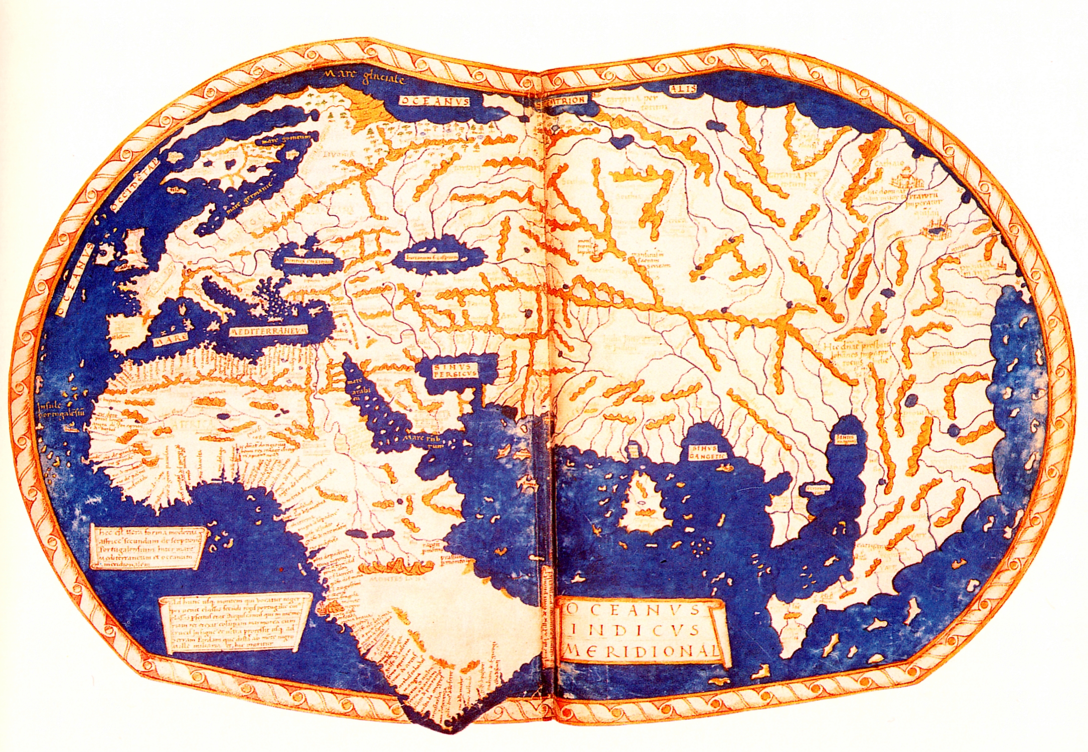
    Through a long history, the "figure of the Earth" was refined from flat-Earth models to spherical models of sufficient accuracy to allow global exploration, navigation and mapping.


    But like with the use of 2D world viewers on the web, if you work in some field that required accurate maps, you would not necessarily find globes in common use.

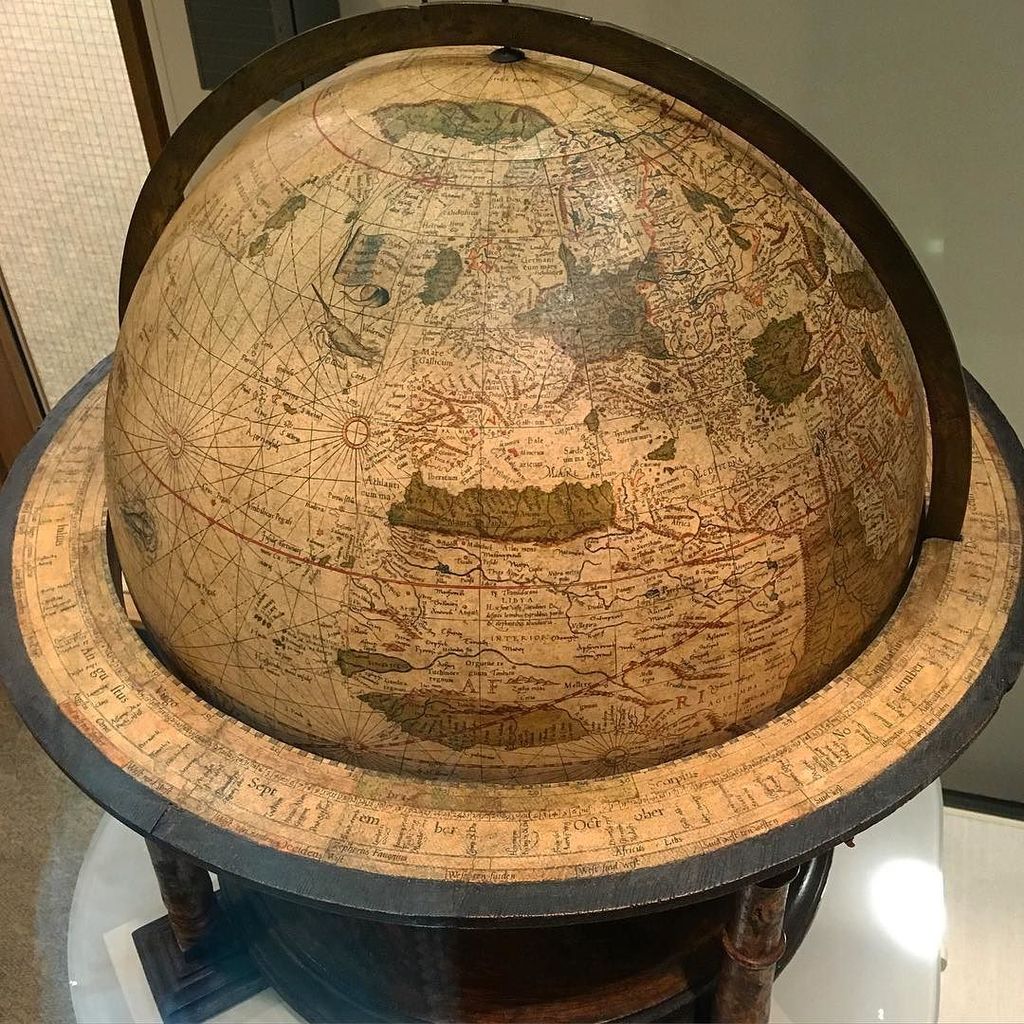
     Gerard Mercator's 1541 terrestrial globe on display in the Harvard Map Collection exhibit hall.
    Along with a 1551 celestial globe, this is one of only 22 surviving matched pairs in the world, and the only matched pair in America.

    The most accurate globe would be a globe the size of earth itself.
    Jorge Luis Borges's "On Exactitude in Science" describes the tragic uselessness of the perfectly accurate, one-to-one map (Map as a Territory):
    In time, those Unconscionable Maps no longer satisfied, and the Cartographers Guild drew a Map of the Empire whose size was that of the Empire, coinciding point for point with it. The following Generations, who were not so fond of the Study of Cartography saw the vast Map to be Useless and permitted it to decay and fray under the Sun and winters.
    In the Deserts of the West, still today, there are Tattered Ruins of the Map, inhabited by Animals and Beggars; and in all the Land there is no other Relic of the Disciplines of Geography.


    Links :

    Sunday, September 14, 2014

    Sea Chair


    Sea Chair from Studio Swine

    Ingenuity at sea knows no limits.
    What should fishermen do with the piles of plastic that come up in their nets?
    These UK mariners invented a furnace to melt down plastic scraps and build stools, all while still at sea.
    They even put the designs online so that anyone can try their hand at making reclaimed plastic furniture.

    Since the discovery of the Pacific Garbage Patch in 1997, which is predicted to measure twice the size of Texas, five more have been found across the world’s oceans with the Atlantic gyre predicted to be even larger.
    This plastic takes thousands of years to degrade, remaining in the environment to be broken up into ever smaller fragments by ocean currents.
    The gyre stretches from the coastlines of California to the shores of Japan.
    Recent studies have estimated 46,000 pieces of plastic per square kilometer of the world’s oceans.
    The number of plastic pieces in the Pacific Ocean has tripled in the last ten years and the size of the accumulation is set to double in the next ten.
    Sea Chair is made entirely from plastic recovered from our oceans.
    Together with local fishermen, Studio Swine collects and processes the marine plastic into a stool at sea.