Saturday, December 16, 2017

Tides breathing


Tides from Dunkerque to Saint Jean de Luz from December 14 to December 20, 2017
Clocks indicate the time and height of water.
The high and low seas follow one another on the Atlantic, Channel and North Sea coasts.
 -see other video -
courtesy of maree.info (see iOS mobile app)

Friday, December 15, 2017

Down the Drain: How 'Pulling the Plug' on Earth's oceans would look


A simulation of draining the world's oceans by pulling a hypothetical "plug" in the Marianas Trench, inspired by the work of Randall Munroe of XKCD
Other oceans aren't necessarily deeper than the Pacific, they just get landlocked and stop draining
Many lakes will likely stick around since they are fed from rivers and direct rainfall.
The continents drift, but not that much, over this time span.
The plug is 10m in diameter (that's metres, for the Americans).
No, there's not actually a plug...

From LiveScience by Mindy Weisberger

What might it look like if you "pulled the plug" in the Mariana Trench — the planet's deepest spot — and drained the water from all the oceans in the world?

A recent time-lapse video portrays that speculative scenario using real data, shown in an animation by Ryan Brideau, a masters candidate in geospatial visualization and analysis at the University of New Brunswick in Canada.

In the animation, posted to Reddit, a flat map of Earth reveals coastlines expanding and land bridges appearing between continents and former islands as the seas shrink. Meanwhile, islands and land masses emerge from the oceans as the water drains away, over a period of nearly 3 million years.

Drainage in the Pacific Ocean where the trench is located continues to the end of the animation — which lasts about 30 seconds — while other large bodies of water quickly become landlocked and cease to drain at all, Brideau wrote on Reddit.

 Drain the Oceans by Randall Munroe

He explained that he first encountered the idea of an imaginary giant "plug" in the deepest part of the ocean — and what might happen if that plug were removed — in the book "What If? Serious Scientific Answers to Absurd Hypothetical Questions" (Houghton Mifflin Harcourt, 2014) by Randall Munroe, the writer and illustrator behind the exquisitely nerdy (and humorous) science comic xkcd.

Munroe, who also wrote about the intriguing question in a blog post, envisioned a plug measuring about 33 feet (10 meters) in diameter, with the water somehow vanishing at the drainage point and materializing on Mars (in case you were wondering where all that liquid would end up).
He estimated in the post that it would take hundreds of thousands of years for significant drainage to happen, with sea levels dropping at "less than a centimeter a day," he wrote.

Brideau was intrigued by the challenge of re-creating an animated version of the model that Munroe used for that scenario, the researcher told Live Science in an email.
He located a visualization of draining oceans created by NASA scientists in 2008, but those researchers took "a major shortcut" by not factoring in the connections between oceans, Brideau explained.
"That makes a big difference in terms of difficulty, and I wanted to see how close I could get to Randall's result myself," Brideau said in the email.


In this draining scenario, California surfers would have to travel a lot farther to catch those gnarly waves.
Credit: Ryan Brideau

Creating a visualization like this requires high-resolution elevation maps of land structures above and below sea level, along with location data for all the major water bodies on Earth, Brideau explained.
"These need to be in 'raster' form, which is simply an image, but instead of each pixel recording color, they record elevation or the presence/absence of water," he said.
The model then estimated drainage in the oceans, adjusting for changes in connections between bodies of water as they become isolated by emerging seafloor structures and cease to drain, Brideau explained.

"The hard part is calculating the remaining water at each iteration," he said.
"You have to figure out which areas of water in the previous step were 'drainable' and subtract them from the remaining water, but leave the water bodies that were untouched in place. You also have to subtract any landforms that have started sticking out of the water.
"The big variable that I didn't take into account is the weather, which might cause some water bodies to start to dry out if their primary source of incoming water is currently the ocean," Brideau told Live Science.
"But in reality, the weather would also be changing, so it's hard to predict," he said.

His model visualized dramatic changes to the continental coastlines in the first 200,000 years.
Toward the end of the animation — nearly 3 million years after the plug was pulled — only the Pacific Ocean is still flowing into the drainage hole in the trench.
At this point, every frame in the animation represents a drop in ocean depths of about 33 feet (10 m) Brideau wrote on Reddit.
"I think the visualization is captivating because it plays out a doomsday scenario at a massive scale, and yet is still relatable. Everyone has drained a bathtub and knows how long that takes, and so it's fun to think of doing that for something the size of the ocean," he told Live Science in an email.
"I distinctly remember as a kid my brother and I pulling on a rope at the beach that we were convinced was connected to a giant plug at the bottom. It's just a fun thing to think about," Brideau said.

Thursday, December 14, 2017

NZ Linz layer update in the GeoGarage platform

4 nautical raster charts updated

These imaginary islands only existed on maps

The island of Hy-Brasil is featured on this 16th-century map but isn't actually real.

From National Geographic by Simon Worall

Some islands, like King Arthur’s Avalon, were pure legend.
Others were mistakes or outright hoaxes.


In the age of GPS and Google Maps, it is hard to believe that maps can include places that don’t exist.
But author Malachy Tallack argues that maps are as much “a cartography of the mind” as they are a way to figure out where we are.


In his new book, The Un-Discovered Islands, Tallack takes readers on a journey to imaginary places—mythic islands, mapmakers’ mistakes, mirages, and outright hoaxes.

When National Geographic caught up with Tallack on a Greek island (a real one), he explained why some islands blur the line between life and death; how others have moved about on the maps; and why we’re living in an era of un-discovery.

You write, “For as long as people have been making stories, they have been inventing islands.” Explain why that is—with some examples.

It is natural for us, standing on the shore looking out to the horizon, to imagine there are places out there we cannot see.
Many cultures have such places that are important parts of their cultural traditions.
One of the best known is Hawaiki, which the Maori people believe to be not just their geographical origin, but also their spiritual origin—the place they were born from and would die into.

These islands that blur the boundaries between life and death seem to have existed in all cultures.
The ancient Greeks imagined a place called the Islands of the Blessed, which in some ways resembled the idea of the Christian heaven, except that this was paradise on Earth where the chosen few would go to when it came time to die.
That idea then migrated into Celtic mythology.
The most famous example is Avalon, where King Arthur supposedly went at the end of his life.

Another category you write about is what you call “ex-isles.” What makes an island disappear?

All of the islands in this book are, I suppose, ex-isles, in that they were places that were believed in at one point, but which are no longer found on the map.
The most common reason was that sailors would make errors.
They would think they were seeing an island whereas, in fact, it was a mirage, they were in the wrong place, or the conditions were so terrible that it wasn’t what they thought it was.
The oceans became populated by islands that, in fact, turned out not to exist.

It’s much easier to discover an island than it is to un-discover one because you have to go back and check it is not actually there.
During the Age of Discovery, explorers were also tempted to invent islands, which they would often name after rich patrons, in the hope of squeezing a bit of extra money for further exploration.

 Insulae Hebrides” (the Hebrides Islands), "Farne" (the Faroes, or perhaps Fair Isle - where Fair Isle sweaters come from), Hetlandia (the Shetlands), and Orcades (the Orkneys).
 Map of the Island of Thule, (spelled “Tile” on this map) in Scotland, by Olaus Magnus, 1539. 
This is a detail of his much larger Carta Marina – a map of the ocean showing the Northern Lands. 
For many years, it was commonly thought that Thule was one of the Hebrides Islands in Scotland. 
Notice the whales (Balena, Orca) in the foreground. 
The Hebrides are still famous for their whales, seals, and sea otters, and there are lots of opportunities for whale-watching boat trips.

Take the island of Thule.
It was supposedly discovered by Greek explorer Pytheas, and became part of the Greek idea of what lay in the north.
Later, it became absorbed by the Romans, who believed that the Shetland Islands were Thule.
Later on, people believed that Iceland or Norway was Thule.
Eventually, the word became not a place but an idea of northern-ness; somewhere that was extreme and far away.
It became part of the cartography of the mind more than the cartography of the map.

 A detail of Septentrionalium Regionum [Region of the Northern Sea] by Abraham Ortelius
from his atlas Theatrum Orbis Terrarum [Theater of the World], Holland, 1570.

Some people argue that it was the Irish, not the Norse, who first set foot in North America.
Is there any truth to that?

In theory, it is possible.
St.Brendan is the person sometimes credited with having done that, though the stories about him vary somewhat in the telling.
The idea is that he set out to sea from Ireland and travelled to numerous places around the north Atlantic.
Some of the stories are obviously fantastical, with demons, dragons, and sea serpents.
But there are other parts that seem realistic.
They talk about islands of smoke and fire, which could be volcanoes.
Other parts seem to refer to icebergs.
But the notion that a monk made it all the way to North America and back seems, to me, extraordinarily unlikely.

Hy-Brasil: Mapping a Mythical Island

You say that the island of Hy-Brasil “begins with cartography and then moves backward into folklore.” Unpack that idea for us.

Hy-Brasil is one of the most famous and, in some ways, complicated of undiscovered islands.
It has nothing whatsoever to do with the country Brazil.
It’s long been thought that this island was part of Irish mythological tradition.
Certainly, there are numerous islands within Celtic and Irish tradition that can sometimes be seen, and sometimes disappear.
Hy-Brasil was thought of be one of those.

More recent studies have shown that Hy-Brasil didn’t appear in Irish mythology until the 19th century, hundreds of years after it was first located on a map.
At that time, there were numerous other places called Brasil.
The name referred to a kind of red dye, which was very valuable and one of the things explorers were looking for.

Hy-Brasil, which appeared on maps off the southwest coast of Ireland, may actually have come from rumors of the North American continent spread amongst European sailors.
It was then later absorbed into the Irish mythological tradition, which is the opposite direction from what you would expect.

My favorite story in the book is of Princess Caraboo and the island of Javasu.
Give us a synopsis.

That is also my favorite.
[Laughs] It is an odd story and a strange island because, unlike most of these places, it never appeared on a map.
The story begins in the south of England, in the early 19th century, when a woman appeared on a doorstep, dressed and behaving slightly oddly.

Nobody knew who she was.
She didn’t speak English and nobody could understand what she said.
She was taken in by the family of the local magistrate, Samuel Worrall, who looked after her and tried to find out who she was.
Eventually, they located a man who said he could understand what she was saying.
He said that the woman, who called herself Caraboo, had come from the island of Javasu, in the Far East, and was a princess.

But it turned out this was not the case.
She was actually a woman called Mary Wilcox, from Devon, who had had a difficult life.
She probably had mental health problems and had essentially retreated from the world.

But she attracted wealthy people from all over England because, at that time, the British were obsessed with the glamour of the Orient.
There were newspaper stories; her portrait was painted.
And that turned out to be her downfall because somebody recognized her in the newspaper and realized she was not who she was thought to be.

She is generally portrayed as a hoaxer.
But the real hoaxer was the man who pretended to understand what she was saying and invented all of these details about Javasu and the life of this supposed princess, Caraboo.

In the end, she was deported to the U.S.
For a time, she managed to make a living off her fame, but eventually she returned to England and lived in poverty.
She is buried in Bristol in an unmarked grave.
But some years ago, they made a movie about her.

In his only novel, The Narrative of Arthur Gordon Pym of Nantucket, Edgar Allan Poe incorporates one of the best-known stories of fictional isles, the Auroras, which you call “among the most inexplicable of phantom islands.” Why?

Most phantom islands were seen once and never seen again.
A sailor thought he saw an island and later was found to be wrong.
The Auroras break that mold because they were seen not just once, but seven or eight times, between the Falkland Islands and South Georgia.
One of the ships that saw the Auroras was a Spanish research vessel, which went there specifically to find and survey the islands.
So it was very strange that, after that time, nobody else could find them.
They seem to have completely disappeared.

The best explanation for it is that all these sailors and ships, including the highly skilled Spanish surveyors, were somehow mistaken by conditions, potentially by icebergs, in that region.
It’s one of several places where none of the explanations seem quite good enough.
Nobody knows exactly what happened to the Auroras.

Some islands are the result not of cartographic error but downright fraud.
Tell us how one phantom island played havoc with the peace treaty between the United States and Britain.

When the Treaty of Paris was drawn up in 1783, a big part of it was finalizing the borders between the new country, the U.S., and its neighbors.
Most of those borders were fairly simple.
But in the north, around the Great Lakes, it was more complicated geographically and politically.
The treaty locates the border as running through Lake Superior, where it goes north of the isles Royale and Philippeaux.

Charlevoix map of the Great Lakes, 1744
Unfortunately, it was found several decades later that Isle Philippeaux did not exist.
So, in the original treaty that created the U.S. as a country, there was a place that did not exist.
Isle Philippeaux, along with several other islands within Lake Superior, was invented by a priest, who named them after a rich French politician, with the intention of getting more money.

The islands known as Los Jardines stubbornly remained on maps for 400 years, even though they never existed.
In that time, they even moved about, didn’t they?

Like the Auroras, it’s hard to explain how Los Jardines, or Los Buenos Jardines, came to exist for such a long time.
They were first reported in 1529 by Alvaro de Saavedra Ceron, in the Western Pacific, not far from New Guinea.
He described 10 low-lying islands or atolls, which he named Los Buenos Jardines, and these islands remained on the map for a long time.

Two hundred or so years later, they moved northwards but there is no good explanation for why that happened.
Perhaps a cartographer made an error or a sailor decided he had seen them elsewhere.
It was not until 1973 that the International Hydrographic Organization finally removed them from the charts.

Deleted islands : once upon a time, Captain Sir Frederick Evans a rigorous ocean surveyor wiped 123 islands off the map

Today, it’s very difficult for us to imagine the lack of knowledge that many explorers had.
They had no accurate way of measuring longitude until the mid-18th century, so they weren’t always sure where they were.
In the Pacific Ocean, particularly, many islands appeared on maps but later had to be removed.

You call the 20th century “a time of un-discovery.” Tell us the story of Sandy Island and why you believe it is important that some places remain mysteries.

Sandy Island is the most recent island to be un-discovered, in late 2012.
An Australian research vessel noticed discrepancies between the navigational chart and the systems they had on board, some of which showed Sandy Island in the region between Australia and New Caledonia, and some of which did not.
They decided to have a look for themselves but found there was no such island, neither above nor beneath the surface.
But Sandy Island still appeared on all kinds of charts and even Google Maps and Google Earth.

We assume digital navigation is perfect, that there are no mistakes, but there can be and this is the most famous example.
It was widely reported around the world and people became quite excited about the idea of an island that both did and did not exist.

The reason, I think, is that, as the Age of Discovery came to a close, we lost some of the sense of mystery about the world that we had always had.
To find a place that broke all the rules, which appeared on a map, yet wasn’t actually there, was an exciting idea.
Sandy Island seems to speak to our deep desire for there to still be mysterious places out there.
What I’ve tried to do is recreate that sense of the mystery of geography.

Links :

Wednesday, December 13, 2017

NASA shows new Tongan Island made of tuff stuff, likely to persist years

Hunga Tonga-Hunga Ha’apai as seen in September 2017
see on Google Maps
Image: 2017 DigitalGlobe

From Earther by Maddie Stone

Hunga Tonga-Hunga Ha’apai wasn’t supposed to last.
The cloud of volcanic ash that became island-shaped in early 2015, about a month after an underwater volcano erupted in the South Pacific Kingdom of Tonga, was expected to be washed away by the ocean in three to four months.

 Hunga Tonga with the GeoGarage platform (Linz chart)

Instead, it’s persisted for years, all the while shapeshifting before our eyes.
And according to new research led by NASA, it could last for decades more.
“We haven’t had an island like this sustain itself in 50 years,” Jim Garvin, chief scientist of NASA’s Goddard Space Flight Center in Greenbelt, Maryland, told reporters at a press conference at the American Geophysical Union meeting in New Orleans yesterday.


In late December 2014 into early 2015, a submarine volcano in the South Pacific Kingdom of Tonga erupted, sending a violent stream of steam, ash and rock into the air.
When the ash finally settled in January 2015, a newborn island with a 400-foot summit nestled between two older islands – visible to satellites in space.
The newly formed Tongan island, unofficially known as Hunga Tonga-Hunga Ha'apai after its neighbors, was initially projected to last a few months.
Now it has a 6- to 30-year lease on life, according to a new NASA study.

As Garvin explained, the shallow submarine eruption that birthed Hunga Tonga-Hunga Ha’apai was special.
Not only did the eruption spew lava, “it also produced some of the explosive magma water interactions that were the hallmark of the eruption that produced Surtsey,” an island off the coast of Iceland that formed in the 1960s and has persisted to this day.


Hunga Tonga-Hunga Ha'apai is the first island of this type to erupt and persist in the modern satellite era, it gives scientists an unprecedented view from space of its early life and evolution.
The new study offers insight into its longevity and the erosion that shapes new islands.
Understanding these processes could also provide insights into similar features in other parts of the solar system, including Mars.

Garvin believes Hunga Tonga-Hunga Ha’apai has outlived its expected lifespan because of chemical interactions between warm seawater and volcanic material, which caused its rocky shorelines to harden shortly after the eruption.
If this hunch is correct, it would make the new island the first long-lived “surtseyan” island of the satellite record.
Scientists are now monitoring the volcanic island closely, using monthly satellite images to track its changing coastlines, and nearshore measurements with research vessels to map the seafloor.
They’ve watched it change dramatically.
Initially, Hunga Tonga-Hunga Ha’apai was fairly oval-shaped, rising 400 feet from its coastlines to a central tuff cone.
Over time, the entire island has become thinner and more stretched out as material erodes off the tuff cone and collects along the coastlines.
The first big change came in April 2015, when satellite images revealed that the cliffs marking the southern rim of the crater had collapsed.
A few weeks later, the last remnants of the crater wall were gone, opening a central lake to the ocean.

A high-resolution satellite image of Hunga Tonga-Hunga Ha’apai right after it formed, in January 2015.
Image: Pleiades-1A ©2015 CNES Distribution Airbus DS

At that time, Garvin explained, there was a risk of ocean waves impacting the tall cliffs on the inside of the crater, accelerating the cone’s collapse.
But within a few more weeks, a sandbar had formed to protect the crater lake.
That feature has persisted until this day.
The other major change has been the growth of a large peninsula to the northeast.
By April 2015, that peninsula connected Hunga Tonga-Hunga Ha’apai to another nearby island.
It has continued to widen over time.
To their surprise, the researchers are finding that the total volume of the island, as estimated using elevation models, has remained fairly stable after the first few months.
Hunga Tonga-Hunga Ha’apai is now expected to survive for anywhere from six years to about three decades, depending on how quickly the tuff cone at its center is destabilized.
“This island is fighting for its life,” Garvin said.
“And our predictions suggest we’ve got potentially another decade [or more] to watch this thing evolve from space.”

Changes to Hunga Tonga-Hunga Ha’apai’s shoreline over time are overlain atop a September 2017 satellite image.
Image: NASA/©DigitalGlobe

In addition to just being cool as hell, tracking this island’s evolution could help us understand the history of other worlds, namely, our friendly neighborhood Red Planet.
As Garvin explained, Mars features fields of small volcanoes “very similar to Hunga Tonga-Hunga Ha’apai in appearance, but we don’t know the context in which they formed.”

 in brown, erosion areas
NASA 2017 Digital Globe

The question now is, are the different stages of the Earthly island’s evolution evident in volcanic features on Mars?
And if so, does that tell us something about when Mars last had water, and how deep and widespread that water was?
“We think [this is] a real opportunity for learning,” Garvin said.

Digital elevation model showing the topography of Iceland’s Surtsey island (left) and Hunga Tonga-Hunga Ha’apai (right).

Image: NASA This has been your periodic reminder that Earth is a dynamic, amazing world, and we’re damn lucky to live on it.

Links :

Tuesday, December 12, 2017

Seven charts that explain the plastic pollution problem


Dr Lucy Quinn from the British Antarctic Survey looks at plastic ingested by albatross.

From BBC by Alison Trowsdale, Tom Housden and Becca Meier.
Design by Sue Bridge and Joy Roxas.

Marine life is facing "irreparable damage" from the millions of tonnes of plastic waste which ends up in the oceans each year, the United Nations has warned.

"This is a planetary crisis... we are ruining the ecosystem of the ocean," UN oceans chief Lisa Svensson told the BBC this week.

But how does this happen, where is most at risk and what damage does this plastic actually do?


Why is plastic problematic?

Plastic as we know it has only really existed for the last 60-70 years, but in that time it has transformed everything from clothing, cooking and catering, to product design, engineering and retailing.
One of the great advantages of many types of plastic is that they're designed to last - for a very long time.
And nearly all the plastic ever created still exists in some form today.

In July a paper published in the journal Science Advances by industrial ecologist Dr Roland Geyer, from the University of California in Santa Barbara, and colleagues, calculated the total volume of all plastic ever produced at 8.3bn tonnes.
Of this, some 6.3bn tonnes is now waste - and 79% of that is in landfill or the natural environment.
This vast amount of waste has been driven by modern life, where plastic is used for many throwaway or "single use" items, from drinks bottles and nappies to cutlery and cotton buds.

Four billion plastic bottles...

Drinks bottles are one the most common types of plastic waste. Some 480bn plastic bottles were sold globally in 2016 - that's a million bottles per minute.
Of these, 110bn were made by drinks giant Coca Cola.


Some countries are considering moves to reduce consumption.

Proposals in the UK include deposit-return schemes, and the improvement of free-drinking water supplies in major cities, including London.
So how much plastic waste ends up in the sea?

It's likely that about 10m tonnes of plastic currently ends up in the oceans each year.

In 2010 scientists from the National Center for Ecological Analysis and Synthesis and the University of Georgia in Athens estimated the figure as 8m tonnes, and forecast that to rise to 9.1m tonnes by 2015.

The same study, published in the journal Science in 2015, surveyed 192 coastal countries contributing to ocean plastic waste, and found that Asian nations were 13 of the 20 biggest contributors.


China was top of the list of countries mismanaging plastic waste, but the US also featured in the top 20 and contributed a higher rate of waste per person.
Plastic waste accumulates in areas of the ocean where winds create swirling circular currents, known as gyres, which suck in any floating debris.
There are five gyres around the globe, but the best known is probably the North Pacific gyre.
It is estimated debris takes about six years to reach the centre of the North Pacific gyre from the coast of the US, and about a year from Japan.
All five gyres have higher concentrations of plastic rubbish than other parts of the oceans.
They are made up of tiny fragments of plastic, which appear to hang suspended below the surface - a phenomenon that has led it to being described as plastic soup.
And the hard-wearing qualities of most plastics means that some items can take hundreds of years to biodegrade.
However, there are moves to clean up the North Pacific gyre.
An operation led by a non-profit organisation Ocean Cleanup is due to begin in 2018.


How bad are things in the UK?

The Marine Conservation Society found 718 pieces of litter for every 100m stretch of beach surveyed during their recent Great British Beach Clean Up.
That was a 10% increase on last year.


Rubbish from food and drink constituted at least 20% of all litter collected, the MCS reported.
The origin of a lot of the litter is difficult to trace, but the public contributes about 30%.
"Sewage-related debris", or items flushed down toilets that should have been put in the bin, amounted to some 8.5%.


Why is plastic so harmful to marine life?
For sea birds and larger marine creatures like turtles, dolphins and seals, the danger comes from being entangled in plastic bags and other debris, or mistaking plastic for food.
Turtles cannot distinguish between plastic bags and jellyfish, which can be part of their diet.
Plastic bags, once consumed, cause internal blockages and usually result in death.
Larger pieces of plastic can also damage the digestive systems of sea birds and whales, and can be potentially fatal.
Over time, plastic waste slowly degrades and breaks down into tiny micro-fragments which are also causing scientists concern.


A recent survey by Plymouth University found that plastic was found in a third of UK-caught fish, including cod, haddock, mackerel and shellfish.
This can result in malnutrition or starvation for the fish, and lead to plastic ingestion in humans too.
The effect on humans of eating fish containing plastic is still largely unknown.
But in 2016 the European Food Safety Authority warned of an increased risk to human health and food safety "given the potential for micro-plastic pollution in edible tissues of commercial fish".

Links :

Monday, December 11, 2017

Canada CHS layer update in the GeoGarage platform

65 nautical raster charts updated

Computer-assisted groundings?

"computer-assisted grounding"

From Panbo by Ben Ellison

Despite incredible advances in chart availability and chart plotting, keels keep banging on reasonably well charted ledges and reefs all over the planet.
Why? I've made far too many navigation errors to play the righteous scold, but I am taken aback by the tendency of boaters to blame technology and especially the recent trend toward castigating chart manufacturers like Navionics as if perfect data is a possibility or even an entitlement...

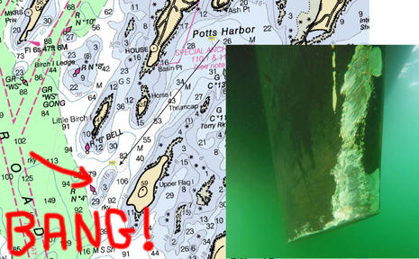
The damaged keel photo above comes from a cruising blog entry titled Navionics Sonar Charts & The Missing Reef, and my apologies in advance to Neil Langford for using his nicely written and illustrated accident analysis as a foil for my arguments about how we should be using electronic charts.
In fact, Neil seems like an especially good debate opponent as he and and his partner Ley are deeply experienced sailors -- 15 years and much of the globe in their wake -- who have also worked hard at sharing information with fellow cruisers.
Their site 
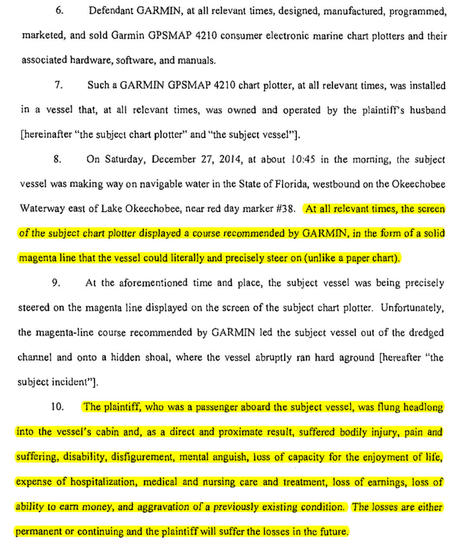
S/V Crystal Blues is enjoyable and valuable reading, and I'm hoping they'll agree that our difference of opinion about their "computer-assisted grounding" is also educational.


Facts are not the issue.
The Navionics errors that Neil reports were 100% true -- I'm using the past tense because Navionics has already corrected them, thanks to Neil's input -- which I was able to verify myself using iPad charts that hadn't been updated yet.

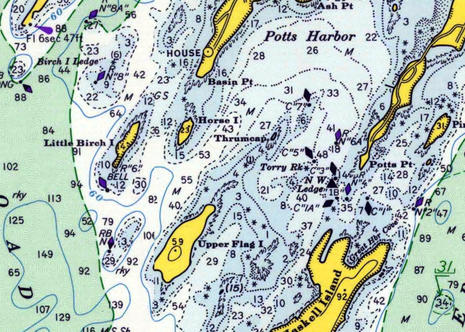
Bad Navionics charts?

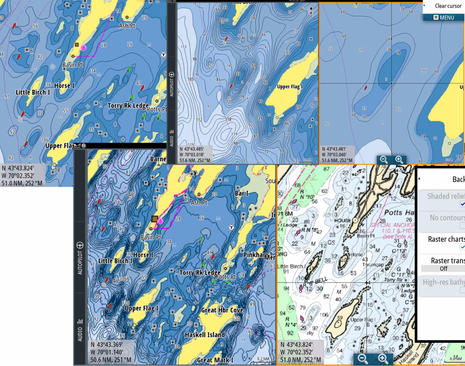
The worst error in my opinion was that the regular Navionics chart (inset lower right above) did not show the 3-foot depth sounding clearly shown on the official NOAA raster chart at top, as well as the NOAA vector chart in the background above, even though Navionics bases its regular charts on the same NOAA data (like all the cartography manufacturers do).
But here's another fact: Every vector chart I've ever used, including NOAA's, sometimes misrepresents significant depth soundings that are prominently marked on the equivalent (paper-like) raster charts (that are largely drawn by human cartographers, not algorithms).

However, Neil's main complaint concerns Navionics SonarCharts, first how the 3-foot ledge was missing and then how many other errors he subsequently found, at least in comparison to official data.
Holy cow, as much as I appreciate SonarCharts, I've never even considered using them for primary navigation!
As discussed here, I love the ability to share depth information with other boaters, but I also regard SonarChart data with what seems like appropriate skepticism.
I expect to see more mistakes on non-official charts like this, and I don't expect perfection on any chart.


I was further surprised when Neil reported that fellow Ocean Cruising Club members "were using the SonarCharts when navigating in harbors, as they valued the extra detail provided, and were shocked to hear of our collision."
Dang, the OCC is an experience-based club largely dedicated to sharing accurate up-to-date cruising information -- why I was proud to become a member -- but "extra detail" is not necessarily extra accurate, or even vaguely correct.
Isn't it obvious that SonarCharts are based on depth data collected from boaters and other non-official sources, and thus best used alongside depth data at least originally vetted by hydrographic offices?

Apparently not, and Neil fairly points out how much Navionics brags about SonarChart detail in its marketing.
But then again, SonarCharts are always packaged along with regular Navionics charts, and the Navionics Boating app he was using also offers a third "Government" chart choice in the U.S. (which did show the 3-foot sounding).
In the app you can flip from one chart type to another with a finger tap, and on a MFD you can window SonarCharts side by side with what Navionics sometimes calls their Nautical Charts.

Neil also points out that his Raymarine chartplotter prominently marks SonarCharts as "Not for Navigation," but then goes on to argue, "If I can't use them for navigation, what will I actually do with these SonarCharts?"
Well, sorry, but that's a sailor oblivious to the fact that a huge segment of chart users are fishermen who are very interested in bathymetry detail for finding spots where fish lurk, a use where data mistakes don't often lead to surprise keel groundings.


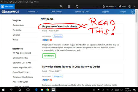
Perhaps ironically, excellent guidance on the proper use of electronics charts can be found on the Navionics blog.
I recommend a thorough reading, but here are some key quotes with my boldfacing:

No single tool replaces the necessary use of sound judgement and proper seamanship.
Most boaters employ the good practice of consulting multiple chart sources and regularly updating cartography, while each has its benefits and limitations.
Proper understanding of an electronic chart is just as important as vessel maintenance and operation. In fact, reliance on electronic charts should never be done blindly since all charts have errors (official hydrographic office, government, private, or other).

The GPS available on boats is equivalent to the GPS on cars and light aircraft: meant to be used for visual orientation while driving, possibly with the aid of other instruments like sonar and radar, and cross checking every possible source of information.
The nautical chart, whether paper or electronic, is not designed and built for instrument navigation, but for orienting visual navigation.
The warnings that go with all charts are not there to protect the chart makers, but rather to protect the chart users from making mistakes in over-reliance on any one tool of navigation.

I like to think that many boaters already use "multiple chart sources," but how about the notion that charts are designed for "orienting visual navigation" instead of just the constant GPS plotting so many of us tend to use exclusively?
For me that's a new way of expressing a concept I've long held, and also a prinicipal that fits neatly into the history of charts.

Ledge Chart & Nav History


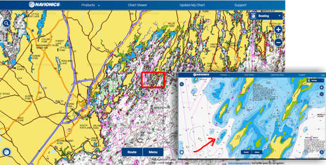
So let's take a look at the chart history of the Crystal Blues ledge, which lurks in the southwest passage to Potts Harbor in Casco Bay.
Again risking irony, the easiest way I know of to first get a good modern chart sense of the place is via this link to Navionics' live and free Web chart.
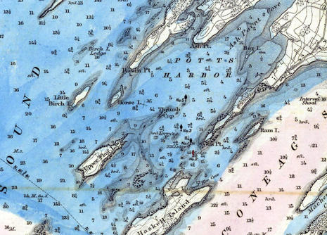

And here, thanks to NOAA's Historical Chart Collection, is how Pott's Harbor was charted on paper in 1870 at 1:40,000 scale (direct chart scan link here).
The ledge northwest of Upper Flag Island was already known and looks very close in position to modern charts, though the survey seems to have gotten the ledge's Mean Low Tide depth wrong at 6 feet instead of 3 (Maine ledges thankfully don't tend to grow).

But I suspect that most 1870 sailors tried to stay well clear of ledges they might not even bump in most conditions, and that was relatively easy to do in this case because the nearby islands provide lots of good visual guidancefor staying in deep water.
By the way, the soundings on this chart are in Feet for depths up to 18 feet and then in Fathoms, which may have been confusing.

Also, note that the blue coloring was not normal in 1870.
Instead, the particular chart scanned for NOAA's Collection was hand colored for a project about the typical extent of winter ice formation.
Unlike the ledges, winter saltwater ice in Maine has changed a lot.


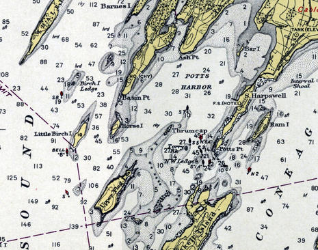
Now here's a snip from the same 1:40,000 Casco Bay chart as printed in 1943 (direct link here).
All soundings are now in feet and the Crystal Bluesledge is not only surveyed as only 3 feet at Mean Low Water but also guarded on its west side by a red and black buoy.

If you check the Navionics web chart viewer or the raster original via NOAA's online viewer, you'll see that red makes sense because the buoy is primarily a starboard hand mark for the main channel up Casco Bay.
And I presume that the secondary black marking was because the same nav aid could be used as a port hand mark for boats headed up to Pott's Harbor, though the USCG eventually changed their mind on that idea.

Besides the buoy as a visual aid, note how the cartographers included lots of onshore detail about further visual orientation.
And, incidentally, this 1943 chart cost 75 cents, same as it did in 1870, even though NOAA had added helpful red and yellow inks to the print process.


The chart makers had even more colors to work with on this 1971 Casco Bay chart (direct link here), though the price had doubled to $1.50 (an ominous sign of the $27 paper chart price to come).
The RB Nun had not been changed to RN "4" yet, but either way a navigator moving southwest out of Pott's Harbor was responsible for figuring out that the dangerous ledge lay between their boat and the nav aid.
Crystal Blues' navigator Neil Langford admits to inattention in that regard, but let's add an exclamation point!

Navigation aids are the visual marks -- by eye or radar, and sometimes audible, too -- that the USCG or similar authorities add to charted natural features as they find necessary for safe navigation. Consider the high cost of establishing and maintaining nav buoys, day beacons and so forth.
So isn't it folly for a navigator not to understand why each aid exists, what it's trying to warn you about?
The answers are often obvious, like marking a channel, but in complex topographies like the coast of Maine it can take some study.
And just because a GPS can accurately and constantly plot your position on a chart doesn't mean that you don't have to "read" the chart carefully.
Isn't that the grounding's lesson?

Modern charts

Casco Bay NOAA raster chart in the GeoGarage platform (Google Maps)
 Casco Bay NOAA vector ENC chart in the GeoGarage platform (ArcGIS JS viewer & Bing Maps)

Now let's review various charts a boat like Crystal Blues could fairly easily have at hand on a tablet or dedicated marine display these days.
In U.S. waters, and many other places -- but with Navionics SonarCharts very much excepted -- almost all charts are based on the same official data.
The fundamental soundings, nav aids, shorelines, shore features, etc. come from the same source, and so the differences involve display nuances, timeliness, and added features.
For instance, I'm a big fan of TimeZero's ability to mix well rendered NOAA raster charts with their PhotoFusion high resolution satellite photos that often improve visual guidance regarding shore features and sometimes even shallow water and mooring detail.
Shown is a screen from the TimeZero TZ app (the Nobeltec and MaxSea brand names are slowly going away), but very similar chart imaging, plus a vector choice, is available with TZ PC software and on various Furuno NavNet displays.


However, TimeZero chart data tends to be dated, at least in part because it's all reprocessed from the original sources so that it zooms, pans and even goes 3D quickly and smoothly.
For instance, if you search the TimeZero Chart Catalog for current NOAA raster charts, you'll see a MWRUSAMAP10.1 Chart List PDF indicating that the last Revision Dates of the current batch are in late 2016 at best.
The raster chart dates for other areas like the Caribbean are often even older, sometimes much older (and the 11.1 date list for TZ NOAA vectors doesn't look good either).

But then again, the TimeZero app with all NOAA raster charts or a big area of Europe costs about $50, the equivalent of about two current NOAA print-on-demand paper charts.
And the TZ vector charts sourced from C-Map that can be purchased for other TZ and Furuno charting engines all seem to have been refreshed last summer.
Also, to my knowledge, only Navionics claims to be constantly updating the charts they make available for download, and Navionics is about the worst at documenting the sources and dates of the specific data sets behind their charts.

For more detail about data sourcing mysteries, please see my 2016 review of Cuba charts, and also note that no chart maker I know of is yet doing much with NOAA's valuable Zones of Confidence (ZOC) initiative.
The bottom line: Digital charts are relatively inexpensive, but it's a good idea to have more than one set.


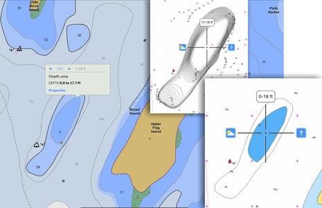
Here's the Pott's Harbor area as seen on a Garmin BlueChart, and I used the inset to show how I had to zoom in deeper before the 3.0 foot sounding that surprised Crystal Blues came on screen.
That's not particularly peculiar to BlueCharts and, as noted earlier, it's not uncommon in my experience for the algorithms that determine vector chart display to miss an important sounding altogether.
On the other hand, Garmin's bold shallow watercolors are a good visual hint at possible issues.

Note that I took this screen in September (when I started this entry), and now the BlueChart Mobile (BCM) app I used has been sadly discontinued.
But then again, if you own a Garmin chart plotter made since 2012, the new ActiveCaptain app I reviewed can put its charts on your tablet or phone at no further cost.


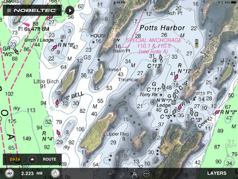
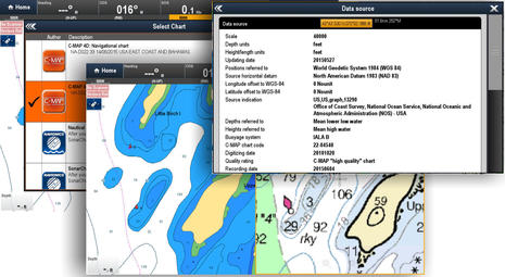
This is how I think Navionics SonarCharts should be used, side by side with the company's regular navigation charts.
So the underwater detail you see on the right is based on (NOAA's) official hydrographic office data -- though vintage and ZOC unknown -- while the "extra detail" on left is derived from crowdsourced sonar logs and other sources completely unspecified but definitely not official.
These charts are on a Navionics+ card that can be updated at any time during the first year of ownership and thereafter, if you renew your subscription. And the card is being displayed on a Raymarine eS Series MFD, though it will also work with MFDs made by Navico and others (maybe why it seems strange that Garmin now owns Navionics).


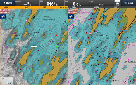
C-Map can offer even more chart types on a single card than Navionics.
Their 4D Max+ bundle -- seen on a Simrad NNS evo2 above, but also available for Raymarine MFDs -- includes a raster chart layer sourced from hydro offices around the world as well as familiar C-Map vector charts, and C-Map "High Resolution Bathy Data" looks a lot like Navionics SonarCharts, though again source unknown plus no crowdsourced data added (yet).
But now that C-Map is a corporate sibling to Navico, the Genesis crowdsourcing technology has become C-Map Genesis, which may well become part of future C-Map cartography bundles.
Perhaps also telling about the future of C-Map -- which has just become the main chart choice besides Garmin/Navionics -- is that they just acquired i-Sea, which has already developed Embark apps that seem to take a very modern approach to route and information sharing.
Maybe we'll see new C-Map apps with the advanced features I recently highlighted in Navionics Boating plus an able alternative to the ActiveCaptain crowdsourcing now also owned by Garmin?


Here's what C-Map 4D Max+ looks like on the Raymarine eS128 running Lighthouse 2, and it's interesting to note that the new Lighthouse 3 currently running only on Axiom Series displays also learned to display C-Map recently.
With Raymarine now the only major brand that doesn't own its own chartmaking operation -- TimeZero for Furuno uses some base data from other companies, but not their advanced features -- one speculation is that C-Map and Garmin/Navionics will compete for their business.
So that great screen of chart choices in the background above may be the future.
Note, too, the source detail that C-Map has long been good about.
And that overall it's pretty easy to have multiple chart choices on your boat right now.

Chart-assisted law suit?


Finally, while I've probably spent too much time giving Crystal Blues a hard time about blaming Navionics SonarCharts for not providing a level of perfection that should not be expected, the misuse of charts can have much graver consequences than a damaged keel.
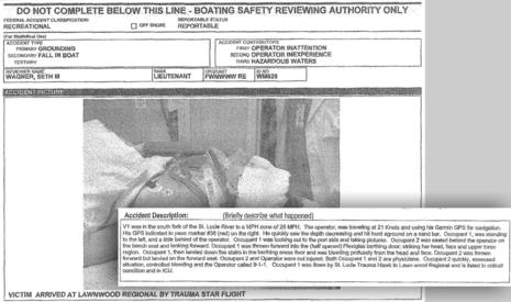
The litigation you can read about in Peter Swanson's Wreck on the Magenta Line illustrates the serious injury possible and also how chartmakers may be financially inhibited from doing things many of us would like them to do, like trying to improve official chart data with other sources, us included.

I don't think the case has been settled yet, but having looked at some public court records and some relevant chart history, it looks to me like Garmin was helping boaters by putting the magenta line on what seemed like the wrong side of a marker.
Navionics did the same thing, and ActiveCaptain had user reports about the shoaling where the channel was supposed to be, all of which was happening in place that NOAA only charts at a fairly useless 1:80,000 scale.

Besides, even if the Magenta Line says so, going fast on the wrong side of a nav aid seems like over reliance on chartplotting to me.
Wasn't it inattention and poor navigation practices that assisted this grounding, not a chart plotter?
But the lawyers may be persuasive the other way, and here we are with evidence that even very experienced navigators can apparently be lulled by the precise look of GPS on an electronic chart. Do we have a real problem here, and if so, what's the remedy?


Links :

Why experts don’t believe this is a rare first map of America


This newly discovered print of Martin Waldseemüller’s 1507 map was to be sold at auction this month until experts raised concerns about its authenticity.
Credit Kirsty Wigglesworth/Associated Press

From NYTimes by Michael Blanding

Is the supposed 6th example of the Waldseemüller globe gores of c.1507 a photographic fake, copied from the example in the James Ford Bell Library at the University of Minnesota ?

The map seemed to be an unbelievable find, an unknown fifth original of the rarest of documents, a vision of the world, circa 1507, by the famed German cartographer Martin Waldseemüller.
It features 12 so-called globe gores — like a world map drawn on an orange peel that has been sectioned and squashed flat.

Designed to be cut out and pasted around a sphere, these creations of Waldseemüller are thought to be the first printed globes ever made, as well as the first maps ever to use the name “America.”

Christie’s, the auction house, estimated the new find would fetch from $800,000 to $1.2 million when it went on the block Dec. 13 at its London salesroom.

But something about the map didn’t seem right to Alex Clausen, a San Diego-based rare-map dealer, who compared it to high-resolution images of the other known copies.
“The printed image was either quite heavy or missing altogether,” he said.
“We were suspicious right from the beginning.”

The Waldseemüller map, of which there are several accepted originals, is considered to be the first to mention America.
Credit
Kirsty Wigglesworth/Associated Press

In recent weeks, he and other experts approached Christie’s with their concerns, and last week the map was withdrawn from auction until questions about its authenticity could be resolved.
“We did a thorough analysis and have found evidence that supports assertions that a photograph was used to create a photomechanical reproduction,” said Julian Wilson, a specialist with the auction house’s Books & Manuscripts Department.

When a map promoted as being extraordinarily rare, like this one, appears on the market, if often attracts wide attention from experts in the field, who use high-resolution images to study the artifact.
In this instance that scrutiny led to the questions.

The experts — including Mr. Clausen’s employer, Barry Ruderman of Barry Lawrence Ruderman Antique Maps, and Michal Peichl, a Houston-based paper restorer — had many concerns about the map.
For a 500-year-old document, they said, the provenance for it supplied before the auction was a bit thin: the estate of a British paper restorer.

The paper, with remnants of glue, seemed old enough.
But in one spot, Mr. Peichl saw, print from the map seemed to be on top of the glue, suggesting that the map’s image was superimposed on the paper after it had been removed from a book.

They also spied irregularities in the printing that could suggest photomechanical reproduction.
An original 16th-century map would have been made by gouging an image into a piece of wood, removing anything not to be printed, and then inking it and pressing a piece of paper onto the relief.
The blocks can degrade over time as they become worn, so subsequent originals can lose detail.
But the Christie’s map seems to have gained detail in several spots when compared to one of the originals, which the experts said gave them pause.

Nick Wilding, a rare-book expert who teaches history at Georgia State University, found more troubling evidence.
Mr. Wilding won fame in rare-book circles in 2012 for exposing a book, promoted as a rare ancient copy of a work by Galileo, as fraudulent.
For Mr. Wilding, the biggest clue that something was off, he said, was a white line in the Christie’s map.
It matched a spot in an authentic print of the map now held at the James Ford Bell Library at the University of Minnesota in Minneapolis, where extra paper had apparently been added to repair a tear.

An original map, one that came directly off the woodblock, would not have replicated that tear, which happened later, Mr. Wilding said.
But this map did and so, he said, he believes the map Christie’s has represents a reproduction of the Bell map.

(A version of the Waldseemüller map in Munich in the Bavarian State Library also includes the white line, while two other copies of the map lack it.
The Bavarian library said that, informed of concerns about the Christie’s map, it is now reviewing the authenticity of its own.)

Experts noted a difference between a section of the map as i appears on prints held in Minneapolis, at Christie's and in Offenburg, Germany.
A white line from a tear is visible on the Minneapolis map (left).
The same line appears in the Christie’s map, (center) which experts said suggested it had been created through photo-reproduction of the Minneapolis map.
The tear line is not visible in an original print in Offenburg.
Credit James Ford Bell Library, University of Minnesota; Associated Press; Museo Galileo

Christie’s made the decision to withdraw the map after Mr.
Wilson traveled to Minnesota in recent days and reviewed the two maps side by side.
“Obviously, it was a bit of a blow,” he said.
“But you never stop learning in this business.”

Three months ago, Mr. Wilson had been overjoyed when a man who identified himself as a descendant of Arthur Bruno Drescher, the paper restorer, brought the Waldseemüller map into Christie’s London office off the street.
The man, who the auction house said preferred to remain anonymous, said he had found the map among his deceased relative’s papers.
As Mr. Wilson held it up to the light against a window, the paper seemed to be authentic.
“My legs began to shake,” he later said.
“I never imagined I would ever have come across this map.”

For additional proof then, he flew to Munich to compare the map to the one in the Bavarian State Library.
That map tucked into a copy of Ptolemy’s Geographia, was thought to have had a provenance dating back to the 1700s.
It later ended up in the hands of the storied collector H.P. Kraus before the library bought it from his estate for about $1.2 million in 1991.

Comparing the two copies, Mr. Wilson found that, while the paper was different, the image printed on them was a perfect match.
Several other experts consulted by Christie’s agreed it appeared authentic.

When Mr. Clausen contacted him in early November with concerns, Mr.
Wilson said in an interview that he had remained confident because, among other things, the paper and the Bavarian map’s long provenance seemed solid evidence that the map he was bringing to market was indeed an original.

Mr. Wilding, however, has since suggested that the provenance of the Bavarian map is also suspect, and said the first time that map was mentioned in any document was in 1960.

One of the experts focused on a spot of glue visible in this detail of the Christie's map as a reddish tint.
The spot is on the globe gore that is fourth from the right.
Credit Kirsty Wigglesworth/Associated Press

The glue on the Christie’s map, magnified 60 times, shows the print of the map on top of the glue, not beneath it, as experts would have expected in an original.
Credit Michal Peichl

For collectors and historians, any Waldseemüller map would be a magnificent find.
In the early 16th century, when the cartographer joined a group of other humanists in the town of Saint-Dié in the mountains of eastern France, Europeans’ view of the world was based almost entirely on Ptolemy, the second-century Roman mathematician.

While Ptolemy’s geography was accurate for Europe, it became increasingly speculative as it ventured farther into Africa and Asia.
Waldseemüller and his partner Matthias Ringmann set out to create a new edition of Ptolemy that would correct some of these errors and incorporate new discoveries filtering in from explorers like Columbus.

Among the sources Waldseemüller and Ringmann perused were letters written by the Florentine explorer Amerigo Vespucci.
They described a “new world,” not depicted on Ptolemy’s map, that lay far to the southwest across the ocean.
The pair rushed out new maps focusing on these exciting discoveries, including the globe gores and a large wall map — the only surviving copy of which was acquired by the Library of Congress in 2003 for $10 million.

With the globe gores, Waldseemüller sought to go beyond Ptolemy, who only covered 270 degrees in his world map and who focused on the three known parts of the world — Europe, Africa, and Asia.
Globe makers had traditionally left the other 90 degrees a blank terra incognita, or marked it as all ocean.

Using Vespucci’s letters along with manuscript maps of Spanish and Portuguese explorers, Waldseemüller created a fourth part of the world — a new landmass surrounded entirely by water.

In naming this new place, Waldseemüller and Ringmann passed over Columbus, who had first reached the New World in 1492, but only set foot on the mainland in 1498, in favor of Vespucci, who said he had landed there in 1497.
They squeezed the word that honored him, America, into the sliver of continent on both maps representing the modern coast of South America.

Scholars later doubted whether Vespucci had actually visited America as early as 1497.
Even Waldseemüller apparently had second thoughts, leaving the name off his later maps.
But the name stuck and was adopted by other mapmakers.

The mapmaker Martin Waldseemüller named America after the explorer Amerigo Vespucci.
Waldseemüller was the first to create a full 360-degree view of the world that included the Pacific Ocean, and the first to use the name ‘America’ to label any part of the world. 
Credit via, Catalog of the Exhibition

For years, only one of the globe gores was known to exist.
Once owned by the Prince of Liechtenstein in the late 19th century, it made its way to the Bell Library in 1954.
A second copy appeared at a Sotheby’s auction in 1960, and was bought by Mr.
Kraus, whose heirs later sold it to the Bavarian library.
More recently, two other copies believed to be authentic have emerged, one from a monastic library in Offenburg, Germany, in 1993 and another discovered in a European collection and sold by Christie’s in 2005 for $1 million.

Of course, it was exciting for many in the trade to think there had been a fifth version of the globe gores in existence.
But if there is a silver lining to such doubts, the experts said it was that today’s technology has made it easier to spot possible fakes and forgeries from afar.
“It proves,” Mr. Ruderman said, “that in modern times, a collector or dealer, with just the technology on their desktops, can identify a forgery that consistently fooled auction houses and experts in the past.”

Links :