Saturday, June 26, 2021

Twenty Eight Feet: life on a little wooden boat

A short documentary about David Welsford, who has given up the luxuries of land in search for happiness and adventure on a 50 year old wooden boat he restored from a scrap heap.

"Twenty years from now you will be more disappointed by the things that you didn't do than the ones you did do. So throw off the bowlines. Sail away from the safe harbor. Catch the trade winds in your sails. Explore. Dream. Discover." Mark Twain

Friday, June 25, 2021

Boston under water : 8 maps that explain Boston's changing shoreline

Boston harbor with the GeoGarage platform (NOAA nautical raster chart)

From Wbur by Garrett Dash Nelson

About one-sixth of Boston sits on landfill.
That’s an astonishing amount, and that history of landmaking is part of what makes Boston so vulnerable to sea level rise today.
People built new land by filling in the spaces between wharves, or building out into marshes and tidal flats, and usually constructed their new land right above the high tide line.
Now that climate change is causing rapid and accelerating sea-level rise around Boston, much of that made land isn’t quite high enough to resist the highest high tides, and the problem will worsen in coming decades.

These eight historical maps, selected by Garrett Dash Nelson, curator of Maps & Director of Geographic Scholarship at the Boston Public Library’s Leventhal Map & Education Center, offer snapshots of Boston’s growth over time, documenting the city's ongoing — and ever-changing — relationship with the sea.

Map of Boston, 1723

The Boston we see in this first map hardly resembles the city we know today.
An English captain named John Bonner originally created the map in 1721, and it was revised many times throughout the 18th century.
This particular version shows the city between 1723 and 1733.

It provides some of the best evidence for what the city looked like in the first century of European colonization, before massive engineering projects dramatically reworked the city’s coastline.
 
 
The John Bonner map of Boston.
(Courtesy Leventhal Map & Education Center at the Boston Public Library)

The Bonner map shows Boston sitting on a peninsula — in technical terms, it’s actually a “tied island” connected to land by a sandy spit called a “tombolo.” Tidal marshes and flats surrounded most of the city; the Common, near the center of the map, backed up onto Roxbury Flats, which stretched from what is now the Public Garden all the way to near Northeastern University.
If you look at the lower right section of the map, you’ll see an arc of docks at the foot of King St.
(now State St.) and Dock Square (where Faneuil Hall stands).
That was the hub of Boston’s maritime traffic.

The Boston peninsula was a good place for defenses, and also a rich intertidal ecosystem.
The Massachusett people knew that the marshes around this peninsula — known as Mashauwomuk (or Shawmut) — held thriving fisheries.
The fish weirs they built were some of the most important and extensive human interventions into the coastal landscape.
Early European communities relied heavily on Indigenous ecological and economic systems for their survival.

Boston Begins “Wharfing Out,” 1708

Colonial Boston depended on the ocean for trade, food, and a constant influx of settlers from England.
But the shallow water surrounding much of the city was a problem for loading and unloading ships.

Wharf builders came up with a solution: they stretched their wharves further and further into the harbor to accommodate large and small craft, even at low tide.

These ever-more elaborate fingers jutting into the harbor eventually led the way towards Bostonians filling in the ocean to facilitate maritime trade.
 
Caleb H. Snow after Jacob Sheafe, Manuscript plan showing wharves of Boston
(ca.1820, original 1708).
(Courtesy Leventhal Map & Education Center at the Boston Public Library)

This color-coded map from the 1820s, redrawn from an original from the early 1700s, might seem a little confusing at first.
The jagged white shapes at bottom are wharves poking into the harbor.
If you look closely, you can see the appropriately-named Long Wharf jutting out into the water from about 5 o’clock to 12 o’clock.
The line running perpendicular to Long Wharf marks the position of a defensive jetty called the “Barricado,” built in 1673 but soon abandoned.
The brown area, labelled “200 feet of flats,” was pierced by two inlets that allowed boats to sail to the smaller wharves and docks.

A notable feature on this map is the thin blue half-circle near the wharves, which indicates an early conflict between private enterprise and public regulation on the shoreline.
The city government at the time feared wharf builders would continue crowding the harbor with their irregularly-shaped shoreline alterations.
To regularize the waterfront, officials drew an imaginary arc and prohibited wharves from extending beyond it.

Bulfinch Triangle, 1807

European colonists wanted to build lumber and grist mills, but they were stymied by the physical geography of Eastern Massachusetts, which has few fast-running rivers, and therefore few good sites for mills.
Colonists adapted to this lack of natural hydropower by creating tidal mills.
To create a tidal mill, engineers first built a dam to enclose a natural cove or inlet.
The cove, now a mill pond, would fill with water as the tide came in, and, when it ran out, the rushing water powered waterwheels.

The faint gray line running nearly parallel to the top of this map shows the mill dam built between the North End and West End along what is today Causeway Street.
 
Charles Bulfinch, Manuscript plan of the Bulfinch Triangle,1807.
(Courtesy Leventhal Map & Education Center at the Boston Public Library)

When white settlers pushed inland, violently removing Native peoples from their ancestral lands, they gained access to swifter rivers for water power, and the tidal dams no longer made economic sense.
But the area behind these dams, the shallow water in the former mill ponds, offered an opportunity: a chance to make new land and develop entirely new neighborhoods.

One of the first of these was the “Bulfinch Triangle,” shown here as the architect Charles Bulfinch laid it out in 1807 behind Causeway Street.
Bulfinch, like many of the land fillers that followed him, laid out streets in a tidy grid to facilitate easy division and sale, a pattern you can still see today in the streets of the triangular area between North Station and Haymarket.
In fact, if you’re standing anywhere in Boston on gridded streets, chances are pretty good that you’re on filled land.

Back Bay, 1855

Filling in land behind tidal dams not only provided room for new neighborhoods, it also solved an urban planning challenge.
Many of the mill dam ponds had become smelly, dirty blights after the dams cut off the natural circulation of water from the ocean, and city residents started using the flats as sewer dumps.

This map shows the first steps towards what became Boston’s most famous fill project, the conversion of the Boston Water Power Company’s Back Bay flats into a neatly gridded neighborhood of the same name.
 
Whitwell & Henck, Plan of lands belonging to the Boston Water Power Company (L.H.Bradford & Co., ca.1855).
(Courtesy Leventhal Map & Education Center at the Boston Public Library)

The company had a mill dam running along what is now Beacon Street from the Public Garden to Kenmore Square, enclosing the Roxbury Flats and the outlet of the Muddy River into mill ponds.
Economically unviable almost from the start, the enclosed flats became much more profitable as the site of a new neighborhood in an otherwise hemmed-in city.

If you look at the center of the map you’ll see two long lines forming an “X.” Those mark another engineering feature that accelerated the filling process: raised berms to carry railroads.
The Worcester Railroad and the Providence Railroad built causeways through the Back Bay flats in the 1840s.
These rail causeways cut off the flats from their former marine ecosystem and also provided a handy route for mechanized earth-moving machines to dump sand and gravel into the flats, the first step in creating new high-end properties.
Boston Harbor, 1852

As speculative fill projects began more aggressively intruding into the water, managing the harbor became more and more difficult.

Beginning in the middle of the 19th century, the city, state, and federal governments began using regulations, informed by new scientific knowledge about hydrology, to try to maintain control of the harbor.
 
Caption: Joint Standing Committee on Boston Harbor, Map of Boston Harbor: showing commissioners’ lines, wharves &c.
(1852).
(Courtesy Leventhal Map & Education Center at the Boston Public Library)

This map shows Boston Harbor in 1852, during the most frantic era of filling and development.
The city’s historic shape is shown in white, with grayed-in areas showing completed or ongoing fill projects.
Look closely and you can see the “commissioner’s lines,” the legal limits established on fill projects.
The lines document an attempt to govern how the formerly common property of tidal flats became transformed into new land for industry, residences, and transportation.

Sewer Drainage, 1875

Boston also began reaching out into the harbor to solve another urban planning problem: the city’s exponentially growing volume of sewage.
This 1875 map shows the routes of Boston’s two main sewers, with the southern line running from the Cottage Farm station (near BU) to a pumping station in Dorchester, and on through a submarine channel to Moon Island.

The northern sewer line ran from Cambridge to Winthrop, where it ended up at Point Shirley, near the site of today’s massive MDC sewer treatment plant on Deer Island.
 
Boston Sewerage Commission, Boston main drainage (1875).
(Courtesy Leventhal Map & Education Center at the Boston Public Library)

The diagram on the bottom of the map shows how sewer lines sloped downward as much as possible, using gravity to avoid the need for costly and unreliable pumping stations.
This meant engineers extended sewer pipes out into the harbor, to the lowest elevation possible.
Dumping the sewage far out in the harbor was also an age-old solution to pollution: put it somewhere else.
 
A Celebration Of Shoreline Change, 1895

This map, printed in 1895, was designed to celebrate a century’s worth of shoreline transformation in Boston.
The gray outline shows the coastline and streets of colonial Boston.
Each subsequent color shows another step of outward growth: pink in 1796, green in 1850, and blue in 1895.
This map dramatizes how the development of Back Bay essentially doubled Boston’s core area, while the margins of the map show parallel transformations in South Boston and Charlestown.

Other parts of the metropolitan area grew at the same time, too — Cambridge, for instance, filled the Charles River estuary where MIT now stands.
 
Charles C.Perkins, Boston for 100 years(1895).
(Courtesy Leventhal Map & Education Center at the Boston Public Library)


For 19th-century Bostonians, landfill seemed like an unambiguous sign of progress, at a time when billowing smokestacks and clear-cut forests also symbolized a proud, enterprising nation.
Only a few dissenters warned of the potential disasters lurking behind the hubristic re-engineering of the natural landscape.

Nobody at this time could foresee the rising sea levels of climate change that now confront the city, but concerns around industrial exploitation of Boston’s environment did lead to projects like the famous Emerald Necklace and, later, the establishment of a metropolitan park system.
The latter offered one of the first opportunities to treat the coastline not only as an economic tool but as a recreational amenity, with bathhouses and beaches built for public enjoyment.

If you zoom in on Copley Square and the BPL on this map, you can get a sense of how much Boston has changed.
Standing in Copley Square today, with the Hancock Tower on one side and the Prudential on the other, it’s hard to imagine that less than 200 years ago this spot was marshy tide lands, with a few high points peeking out of the water.

The Neighborhood That Wasn’t, 1970s

While most of Boston’s major filled neighborhoods were complete by the early twentieth century, the coastline continued to change.
The most important coastline reconfiguration was the development of Logan Airport in the 1940s and 50s.

In a dense city, flats and coastal areas still seemed like promising locations for land-hungry facilities, like the highways that would become I-93 on the Millers River in Somerville and through the South Bay in Dorchester.
 
   
Page from Freedom 75: The United States bicentennial celebration (ca.
1970s).
Boston Public Library Government Documents.
(Courtesy Boston Public Library and Internet Archive)
 
This map shows a plan from the 1970s to continue Boston’s tradition of developing new neighborhoods on made land.
Developers proposed filling tidal flats in Dorchester Bay for an experimental new town, built for a world expo as Boston celebrated the nation’s bicentennial.
The promoters described the project pictured here as a modern-day version of Bulfinch Triangle and Back Bay.
Although city planning agencies seriously considered the plan, it never came to fruition.

Thursday, June 24, 2021

Chasing cyclones from space

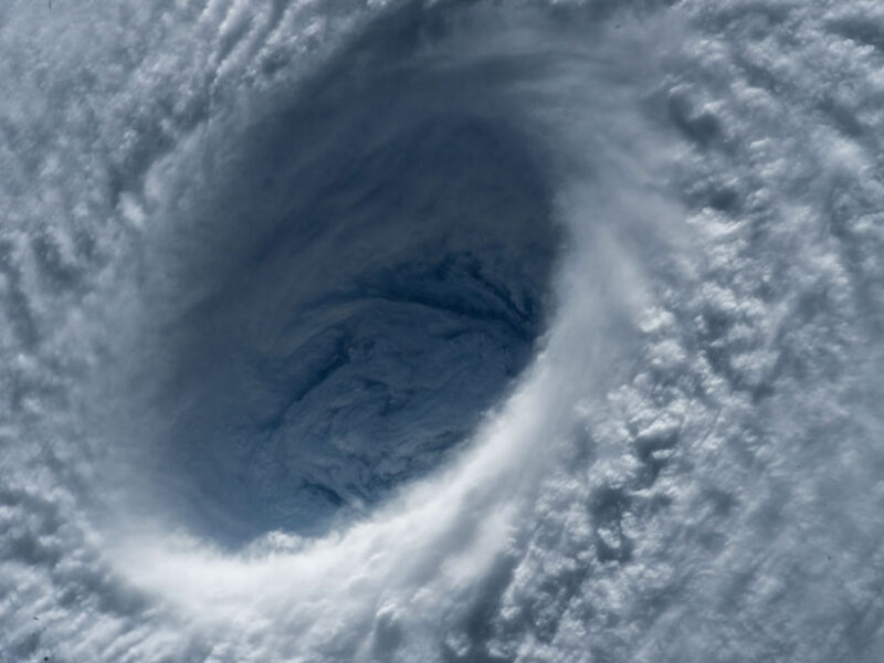
Astronauts aboard the International Space Station provided this close-up view of the eye of category 5 Typhoon Maysak in March 2015. 
Last year marked the first time that tropical cyclone wind data derived from synthetic aperture radar scans were incorporated into forecast products in near-real time. 
 
From EOS by By Christopher R. Jackson, Tyler W. Ruff, John A. Knaff, Alexis Mouche, and Charles R.
Sampson


The pioneering use of satellite-based synthetic aperture radar to characterize tropical cyclones in near-real time has provided a crucial new tool with which to forecast powerful storms. 

Hurricanes, typhoons, and cyclones are beautiful to behold from Earth orbit.
Most of us are familiar with satellite images of these intense storms, with their dark, near-circular eyes surrounded by spirals of whites and grays.
Here on Earth’s surface, however, they are among nature’s most destructive forces.
Cumulatively from 2000 to 2019, these storms accounted for about 30% of all global economic losses caused by natural hazards.Synthetic aperture radar (SAR) provides highly detailed views of wind speed at the ocean surface under the tropical cyclones as they travel and evolve.
Since summer 1961, when Television Infrared Observation Satellite 3 (TIROS-3) captured the first satellite images of hurricanes—namely, storms Anna, Betsy, Carla, Debbie, and Esther—forecasters have been using satellite observations to locate, track, and characterize tropical cyclones.
Today the Joint Typhoon Warning Center (JTWC) operated by the U.S. Air Force and the U.S. Navy in Pearl Harbor, Hawaii, relies heavily on satellite imagery to track and monitor cyclones, focusing especially on a roughly 207-million-square-kilometer area over the western Pacific and Indian oceans.
Approximately 70% of all global annual tropical cyclone activity occurs in this region, and every year JTWC produces an average of nearly 1,000 tropical cyclone warnings to help protect life and property around the world, almost exclusively using satellite reconnaissance.
 

This visualization shows the hurricanes and tropical storms of 2020 as seen by NASA’s Integrated Multi-satellitE Retrievals for GPM (IMERG) which measures rain rates (in mm/hr) overlaid on infrared cloud data from the NOAA Climate Prediction Center (CPC) Cloud Composite dataset together with storm tracks from the NOAA National Hurricane Center (NHC) Automated Tropical Cyclone Forecasting (ATCF) model. Sea surface temperatures (SST) are also shown over the oceans, derived from the NASA Multi-sensor Ultra-high Resolution (MUR) dataset, which combines data from multiple geostationary and orbiting satellites.
 
In 2020, JTWC gained access to a new remote sensing tool, synthetic aperture radar, which provides highly detailed views of wind speed at the ocean surface under the tropical cyclones (depressions, storms, and hurricanes) as they travel and evolve.
Here we discuss how this new set of capabilities is already greatly improving storm characterization and forecasting.

Storms Above and Below the Clouds


Satellite observations of tropical cyclones now regularly include high-resolution visible and infrared imagery—with pixels representing areas less than 1 kilometer across—acquired from geosynchronous orbit, as well as images from moderate- to low-resolution (12- to 40-kilometer pixels) passive radiometers and active microwave scatterometers aboard satellites in polar orbit.
The radiometers measure microwaves, visible light, and infrared radiation reflected by or emitted from Earth, whereas the scatterometers transmit microwave pulses and measure the amount of energy returned via scattering from the planet’s surface.

These traditional satellite observations from visible, infrared, and microwave sources are indispensable to tropical cyclone forecasting, and they provide information about storm characteristics and the surrounding atmospheric and oceanic conditions driving them.
But they also all have limitations.
Visible and infrared imagery of these storms is primarily restricted to features observed at or near cloud tops.
And although microwave sensors can observe features beneath the clouds, they lack sufficient horizontal resolution to capture the steep wind speed gradients around the eye of a storm.
But there is another type of sensor that overcomes these limitations: synthetic aperture radar.

A Uniquely Useful Tool

Synthetic aperture radar (SAR) works by transmitting radar pulses and recording both the amplitude and phase of the reflected return signals.
These return pulses are then coherently combined over a specific time interval to produce a 2D image of radar backscatter.
For a SAR on a polar-orbiting satellite, this imagery can have fine spatial resolution of less than 100 meters over a swath that can be as wide as 500 kilometers.SAR’s unique ability to record the roughness of the ocean surface directly allows for the creation of high-resolution 2D maps that significantly improve estimates of a storm’s eye location.Currently, two SAR missions are being used to study and monitor tropical cyclones.
Sentinel-1, a two-satellite system, was developed and is operated by the European Space Agency (ESA) under the Copernicus Earth Observation Program.
RADARSAT-2 is the result of a collaboration between the Canadian Space Agency and MDA Space, a private company that owns and operates the satellite.

Directly captured in the backscattered signals acquired with SAR are many of the well-known tropical storm features found in visible or infrared images, such as the eyewall, mesovortices (circulations within the eyewall), boundary layer rolls, outflow boundaries, and rainbands (Figure 1).
More important is SAR’s unique ability to record the roughness of the ocean surface directly, which allows for the creation of high-resolution 2D maps of surface wind speed that significantly improve estimates of the eye location.
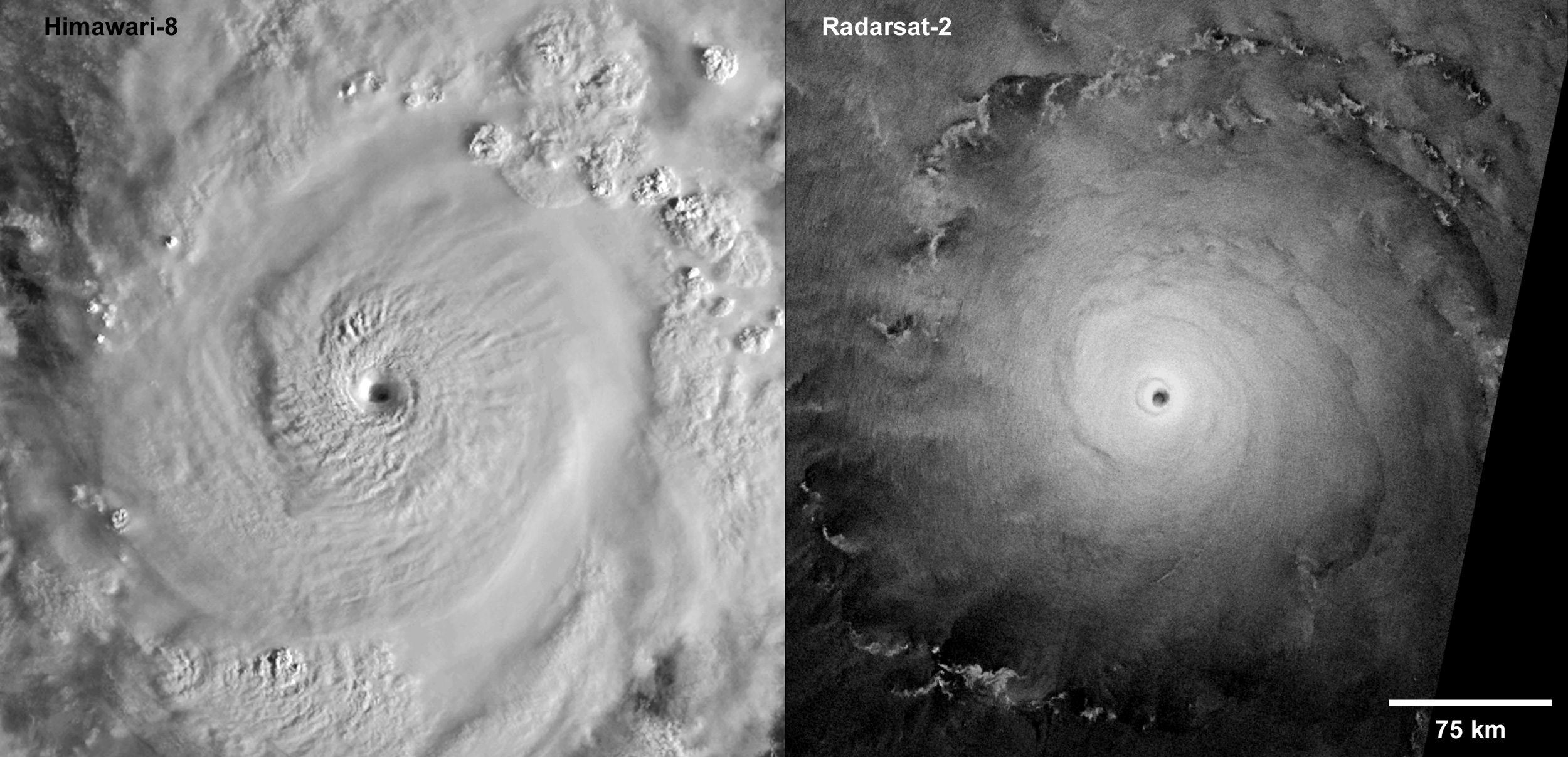
 
 
Fig. 1.
These two satellite images of Super Typhoon Goni over the Pacific Ocean were taken at almost the same time on 30 October 2020, when the storm was close to peak intensity with wind speeds exceeding 155 knots.
The visible-light image from Japan’s Himawari-8 satellite (left; 500-meter resolution) captures the reflection of sunlight from the cloud tops and shows transverse bands in the cirrus clouds, a sloping eyewall, spiral banding features circling more than 360°, and a clear eye (indicative of an intense tropical cyclone).
The wide-swath SAR image acquired by the Radarsat-2 satellite (right; with 100-meter resolution) shows the radar backscatter return from the ocean surface and patterns from convection cells, rainbands, and outflow boundaries, along with spiral wind streaks.
Credit: RADARSAT-2 Data and Products © MDA Geospatial Services Inc.
2020; Himawari-8 image courtesy of the Japan Meteorological Agency.


The maps also improve estimates of other important storm parameters used by forecasters, including maximum wind speed, the radius of maximum winds (the distance between a storm’s eye and the band containing the strongest winds), and the distance and areal extent of winds at critical wind speed thresholds that define tropical depressions, tropical storms, and hurricanes (34, 50, and 64 knots, or 17, 25, and 33 meters per second, respectively).
Collectively, these pieces of information form a “fix” used by operational forecasters to characterize a storm (Figure 2).
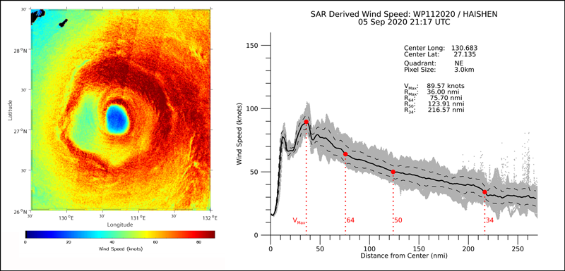
 
Fig. 2.
This SAR-derived wind speed map (left) shows the eye region of Typhoon Haishen on 5 September 2020 at 21:17 UTC based on data from RADARSAT-2.
Two-dimensional wind speed maps like this produce very accurate estimates of eye location and extent and clearly resolve steep wind speed gradients (shown by strong variations in the color scale).
These maps are also used to create wind speed profiles (right) that help determine maximum wind speed, the radius of maximum winds, and the extent of winds at the critical speed thresholds that forecasters use to characterize a storm as a tropical depression, tropical storm, or hurricane.
Gray dots represent SAR-derived wind speeds at each 3- × 3-kilometer pixel in the northeastern quadrant of the map at left, and the solid black curve represents the average wind speed at each distance from the storm’s center (in nautical miles, nmi).
The two peaks in the wind speed profile near 15 and 36 nautical miles (28 and 67 kilometers) from the center indicate that Haishen had a double eyewall.

SAR Capability Comes to Hawaii


Over the past 2 years, forecasters at JTWC, in cooperation with researchers at NOAA, the French Research Institute for Exploitation of the Sea (Ifremer), and the U.S. Naval Research Laboratory (NRL), have been leveraging Sentinel-1 and RADARSAT-2 SAR imagery to gain additional insights into tropical cyclone storm structure and to incorporate this information into JTWC’s operational forecasts and warnings.

The SAR-derived wind information fills an important role at JTWC because, since 1987, there has been no routine aerial reconnaissance in the area that JTWC is responsible for monitoring.
And although satellite microwave radiometers have been providing direct measurements of extreme winds to JTWC since about 2017, SAR is the only satellite sensor with sufficient spatial resolution to measure a storm’s radius of maximum winds.

In 2020, for the first time, near-real-time SAR-based wind speed maps, eye position estimates, and derived wind fixes were incorporated into operational forecasting at JTWC through the center’s Automated Tropical Cyclone Forecasting (ATCF) system [Sampson and Schrader, 2000].
ATCF is the operational workstation used at JTWC, the U.S.
National Hurricane Center, and the Central Pacific Hurricane Center to track, analyze, forecast, and distribute tropical cyclone advisories and warnings worldwide (Figure 3).
 
 
Fig. 3.
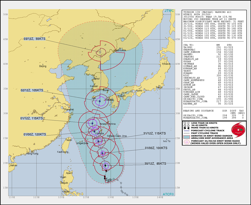
This output graphic from the Joint Typhoon Warning Center’s Automated Tropical Cyclone Forecasting (ATCF) system contains information for 30 August 2020 on Typhoon Maysak’s position (past and forecast), speed and direction of travel, and the predicted areas covered by 34-, 50-, and 64-knot winds in each quadrant of the storm (irregular circle-like outlines).
The dashed red line and the enclosed shaded area highlight the 34-knot-wind danger area.
The ATCF system produces similar reports every 6 hours during the lifetime of a storm.
(Note: Like the 2015 tropical storm in the photo at the beginning of this article, this 2020 storm is also named Maysak.)


During Super Typhoon Goni, which struck the Philippines in October 2020, several timely acquisitions of SAR data over the storm were collected prior to its landfall.
These acquisitions helped JTWC fine-tune its storm wind estimates, according to Cmdr. R. Corey Cherrett, the center’s commanding officer at that time.
He noted that accurate analyses and forecasts helped to drive the evacuation of more than 350,000 people, potentially saving countless lives.

As the frequency of SAR acquisitions increased during the 2020 storm season, JTWC began relying on SAR wind data in real-time tropical cyclone analysis, with great success.
Brian Howell, Best Track Officer at JTWC, and Typhoon Duty Officer Caitlin Fine compiled a 2019 and 2020 data set of subjective wind intensity estimates made by forecasters at the center along with concurrent SAR acquisition passes over storms.
From this compilation, they found that the information provided by the SAR passes either reinforced or prompted adjustments to forecasters’ subjective determinations.
In all cases, however, the SAR data have proved invaluable in both real-time and postseason analyses.
From Data to Forecasts

Obtaining SAR observations over the eye of a tropical cyclone using the Sentinel-1 and RADARSAT-2 systems requires some luck.
Unlike weather satellites in geostationary orbit (e.g., GOES (Geostationary Operational Environmental Satellite), Himawari, and Meteosat), which can image an entire hemisphere continuously every 10–15 minutes, satellite-based SAR instruments acquire data with a limited footprint.
Also, they acquire data during only about 30% of every orbit because of the radar’s power requirements and because of the large data volume that must be downlinked.
Further, SAR data collections must be programmed 3–5 days in advance.
Collection opportunities are identified by comparing forecast storm tracks against possible SAR time or spatial footprints.
In addition, Sentinel-1, as part of its daily standard collection pattern, sometimes fortuitously acquires imagery over tropical systems before explicit planning is enacted.

Planning collection opportunities and obtaining data are only the first steps in getting the information derived from the SAR imagery into the hands of the forecasters, however.
The NOAA Center for Satellite Applications and Research’s (STAR) Tropical Cyclone Wind System continuously monitors the advisories on active storms released by JTWC and other forecast centers to identify any imagery from Sentinel-1 passes that contains information about a tropical cyclone.
The system processes this imagery, or the preprogrammed acquisitions from Sentinel-1 and RADARSAT-2, in near-real time to determine an accurate eye location for a storm.

Next, the NOAA system creates 2D wind speed maps along with estimates of maximum wind speed, the radius of maximum winds, and the profiles detailing the distances to the three critical wind speed thresholds.
This information is sent to NRL, repackaged, and then ingested into JTWC’s ATCF system.
It is also posted to the STAR Cyclone Winds website.

At the same time, the Copernicus Cyclone Monitoring Service (CYMS) team gets the Sentinel-1 data through Copernicus’s dedicated near-real-time data hub, where targeted processing and distribution of Sentinel-1 imagery is typically done in less than 3 hours.
From there, the CYMS team converts the imagery into ocean surface wind data, which it makes publicly available through the Earth Observation Data Access website.

Twenty-Twenty Eyesight
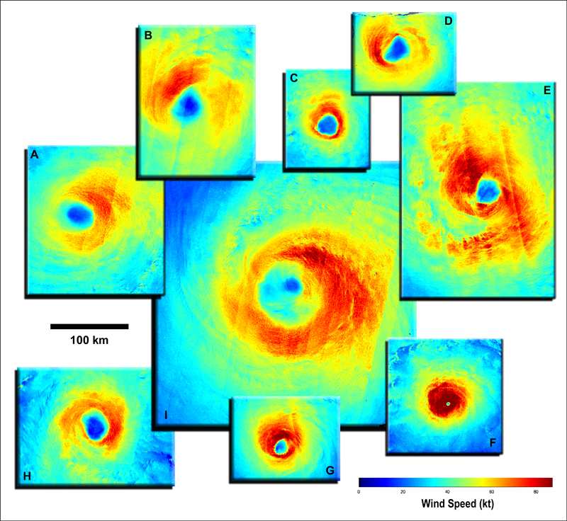
 
 
Fig. 4.
Ocean surface wind speed maps (color scale shows speed in knots) from a selection of tropical cyclones of various sizes and intensities from the 2020 season.
Categories represent intensities at the times of the SAR observations.
The colors highlight azimuthal variations in wind speed and differences in eye shapes.
(a) Category 1 Typhoon Bavi (observed by RADARSAT-2, 25 August).
(b) Category 1 Hurricane Marie (Sentinel-1B, 4 October).
(c) Category 1 Hurricane Delta (Sentinel-1B, 8 October).
(d) Category 1 Hurricane Sally (Sentinel-1B, 15 September).
(e) Category 2 Typhoon Molave (Sentinel-1A, 27 September).
(f) Category 4 Typhoon Goni (RADARSAT-2, 30 October).
(g) Category 2 Hurricane Douglas (Sentinel-1A, 25 July).
(h) Category 1 Cyclone Herold (Sentinel-1A, 16 March).
(i) Category 2 Typhoon Maysak (RADARSAT-2 and Sentinel-1A, 1 September).
This figure contains modified Copernicus Sentinel data 2020.


In 2020, 45 tropical cyclones with sustained winds stronger than 64 knots were observed: 13 over the Atlantic, 14 over the western Pacific, 4 over the eastern Pacific, and 14 in the Southern Hemisphere.
In total, 92 SAR collections were made during 31 of these cyclones (Figure 4), with observations over the eye of the storm in about two thirds of the cases (including 51 in which complete coverage of the eye was achieved and 9 with partial coverage).
In several instances, eye-centered SAR imagery was captured when major storms were near their peak intensity.
These storms include Laura (over the Atlantic, with maximum sustained winds of 145 knots), Goni (western Pacific, 155 knots), Marie (eastern Pacific, 130 knots), and Harold (Southern Hemisphere, 145 knots).

SAR collections in 2020 also included several standout accomplishments.
Daily SAR images of several storms, including Hurricane Marie (five eye-centered acquisitions, collected in 4 days) and Typhoon Goni (four eye-centered acquisitions in 3 days), produced unprecedented high-resolution looks into the time evolution of these storms’ surface wind structures.
In addition, Sentinel-1 and RADARSAT-2 obtained nearly simultaneous (within 10 minutes) and spatially overlapping data collections over Typhoons Bavi, Chan-hom, and Maysak and Hurricanes Epsilon, Eta, and Zeta.
The combined coverage passes from the two satellites produced more complete pictures of the spatial extent of the storms’ winds than would have been available with coverage from a single satellite collection.

The passes also provided opportunities to compare SAR wind speeds derived from Sentinel-1 and RADARSAT-2 under extreme wind conditions.

 
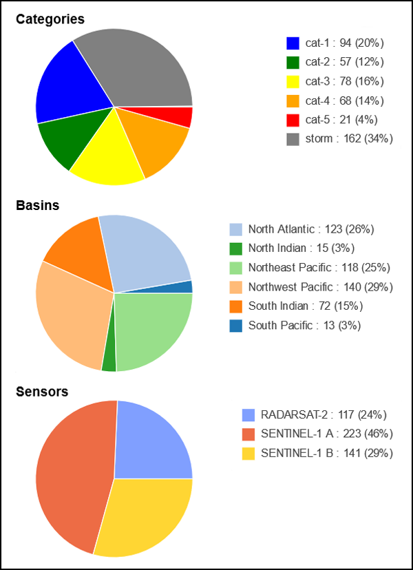
Fig. 5. These pie charts provide an overview of the SAR-based tropical cyclone collections acquired since 2015 that are available in the CyclObs archive. 
From top to bottom, the charts show the percentage of SAR acquisitions available for each tropical cyclone category according to the Saffir–Simpson scale, the percentage of SAR acquisitions available for each ocean basin, and the percentage of acquisitions available from Sentinel-1A, Sentinel-1B, and RADARSAT-2. 
 
These 2020 collections added to the already substantial archive of RADARSAT-2 and Sentinel-1 tropical cyclone imagery acquired under the Satellite Hurricane Observation Campaign (SHOC).

Between 2015 and 2018, SHOC collected SAR imagery over 72 different tropical systems, with 161 data collections covering the eye of a storm (Figure 5).

A recent analysis using 29 of these collections demonstrated close agreement between wind data derived from SAR and data from in situ airborne measurements [Combot et al., 2020].
Just as new SAR data provide input to support near-real-time observations for current storms, the SHOC SAR collections have been invaluable in post-storm reanalysis efforts to refine final estimates of tropical cyclone parameters for past storms in the historical archive at JTWC.
Such refinements are necessary because researchers use the JTWC archive extensively for seasonal verification and analysis studies, and their work must be based on the best available information.

Ongoing Advances in Cyclone Science

Last year was clearly a notable time in the development and use of SAR in characterizing tropical cyclones.
JTWC, in collaboration with Ifremer, NRL, and NOAA, pioneered the incorporation of SAR-derived tropical cyclone wind data into forecast products in near-real time.
The ability of SAR to produce quantitative, fine-resolution information about cyclone winds, eye locations, and other characteristics represents a significant new tool that can assist in the forecasting of tropical storms.

In 2021, ESA and NOAA will continue to acquire and analyze Sentinel-1 and RADARSAT-2 imagery over as many tropical cyclones worldwide as possible (and as often as possible) to support operational forecasters.
Both the National Hurricane Center and the Central Pacific Hurricane Center are working on ways to incorporate the SAR-derived tropical cyclone wind information into their forecasting systems.
The current season is off to a strong start with SAR collections over 12 Southern Hemisphere storms (including 20 eye/partial-eye acquisitions achieved for nine of them) and in the western Pacific over Super Typhoon Surigae, with five eye acquisitions in one 60-hour period.
On 17 May, SAR data captured the eye of Tropical Cyclone Tauktae in the Indian Ocean.

Moving forward, data collection is expected to be augmented by acquisitions from the Canadian Space Agency’s RADARSAT Constellation Mission and from upcoming missions, including ESA’s Sentinel-1C and NASA’s NISAR, both expected to launch in 2022 or 2023.

With the new capabilities provided by SAR and growing data streams from current and planned satellites, JTWC and other agencies tasked with forecasting tropical cyclones are better positioned than ever to help people and countries around the world prepare for these beautiful but destructive natural forces.

Wednesday, June 23, 2021

The largest wave in History

The Area of Damage by the Lituya Bay Tsunami
 
From Medium by Daniel Ganninger with sources: Geology.com, NOAA, USC, UWGB

During the night of July 9, 1958, the largest recorded wave in history occurred in Lituya Bay, Alaska.
It reached an astonishing height of 1,720 feet.
As a frame of reference, the Empire State Building is 1,250 feet tall.

 Lituya Bay with the GeoGarage platform, NOAA nuatical raster chart
 
The wave was caused by a massive earthquake along the Fairweather Fault, which runs west of Juneau along the Alaska Panhandle.

The earthquake measured 7.9 on the Richter scale.
Rock that was 3,000 feet above the Gilbert Inlet of Lituya Bay loosened and fell into the water.
The estimated amount of rock was around 30.6 million cubic meters or 1.08 billion cubic feet of material.
That equals about 2.85 million dump truck loads of rock.
 
Trimlines carved by tsunami in 1958: (a) NE-view of Lituya Bay from Cenotaph Island to Gilbert Inlet with landslide scar at the head of the bay and trimlines of destructed forest with 524 m runup on spur ridge. (b) NW-view of Gilbert Inlet with landslide scar, post-event Lituya Glacier front, forest destruction and soil erosion down to bedrock. (c) N-view of spur ridge. (d) S-view of trimline in the Mudslide Creek area on the south shore of Lituya Bay with wiped out trees to an elevation of 208 m. (Photos: courtesy of USGS).

When the impact occurred, it generated a tsunami that spread along Lituya Bay and even traveled over land that separated Gilbert Inlet from the bay.
When the tsunami finally exited into the Gulf of Alaska over the La Chaussee Spit, the land had been scoured clean up to a height of 1,720 feet.
Millions of trees were swept into the Gulf of Alaska.
 
The 1958 Lituya Bay tsunami event in Alaska showing the maximum recorded tsunami runup of 524 m in the direction of landslide prolongation inside Gilbert Inlet (Fritz et al., 2001).

The largest area of settlement at the time of the earthquake was Yakutat.
The area saw only moderate damage from such a large earthquake.
Damage was also noted in Juneau, the capital of Alaska.


 Simulation of the Lituya Bay tsunami generated by the 1958 Alaska earthquake.
 
Three people died in Yakutat on Khantaak Island, about 105 miles north of Lituya Bay, when part of the island fell into the sea, and two other people on a fishing boat in Lituya Bay were swept away while it was anchored near the mouth of the bay
 Eyewitness accounts from other boaters who survived the tsunami reported that it was 100 feet in height by the time it got to the mouth of the bay.

Lituya Bay, Alaska Today

This wasn’t the first time a tsunami had hit this area.
Four other large waves in 1853, 1874, 1899, and 1936 had been documented, but the 1958 slide removed any traces of these previous waves.
 
 
The Area of the 1958 Earthquake USGS(Full)
 
Links :

Tuesday, June 22, 2021

The Messy Mediterranean

The Hypothetical 200n.m. limit in the Mediterranean Sea
in the GeoGarage platform

From Soverign Limits by Marissa Wood

Or, Why is Mediterranean Maritime Sovereignty So Complicated?

The Mediterranean Sea could almost be considered an inland body of water, except for a small connection to the Atlantic Ocean (only 16 km or 10 miles) between the coasts of Spain and Morocco at the Strait of Gibraltar.
The waters of the Mediterranean can be further divided into the Alboran, Libyan, Levantine, Aegean, Ionian, Adriatic, Tyrrhenian, and Balearic Seas.
Twenty-three separate States lay claim to the waters of the Mediterranean Sea, and many of these are overlapping or disputed leading to an incredibly complex picture of maritime sovereignty.

The Established Boundaries

There are, however, twenty-two established maritime boundaries between the various Mediterranean States.
The oldest is between Cyprus and the UK on behalf of its Sovereign Base Areas (SBAs) of Akrotiri and Dhekelia located in the south of the island.
Both the land and maritime boundaries between the SBAs and Cyprus were established by the same agreement from which Cyprus gained its independence from the UK on 16 August 1960.
The maritime boundary extends in four separate parts from the various land boundary termini on the coast and delimits the UK’s claimed three nautical mile territorial sea and Cyprus’s 12.
The UK ceded all exclusive economic zone (EEZ) claims to Cyprus.
 
The four-part Cyprus–UK maritime boundaries.

The four-part Cyprus–UK maritime boundaries.

The most recent (as of late July 2020) Mediterranean maritime boundary is between Greece and Italy, signed on 9 June 2020.
This new agreement updates a 24 May 1977 Treaty, transforming the already-established 16 point maritime boundary into WGS-84 and confirming its application for the EEZ, in addition to the continental shelf (CS).
The 2020 update left the tripoints, with Albania in the north and Libya in the south, undefined.
The Italy–Greece boundary is arguably less interesting than the second most recent Mediterranean maritime boundary between Turkey and Libya (signed 27 November 2019).
That will be covered in greater depth below.Greece and Italy’s original 1977 maritime boundary was updated to WGS-84 in 2020.

Greece and Italy’s original 1977 maritime boundary was updated to WGS-84 in 2020.
 
If you’re interested in learning more about the maritime boundary between Greece and Italy, check out our Boundaries page.

Surprise! Greece and Egypt signed a new EEZ boundary Agreement on Thursday, August 6.
The details have not yet been released to the public, but both Turkey and Libya have already protested the new boundary.

The shortest established Mediterranean maritime boundary is between Italy and Slovenia at 15 M and the longest is between Italy and Tunisia, which runs for 528 M.

That leaves about 30 maritime boundaries to be established, some of which are currently being negotiated (Greece and Albania) and some of which have 300 plus years of dispute that will need to be resolved before maritime boundary delimitation can begin (Spain and the UK on behalf of Gibraltar).

Disputed Maritime Space

When looking at disputed maritime areas in the Mediterranean, Turkey is the shadow over all of the eastern Sea.
Its role in the Cyprus–Northern Cyprus conflict as well as the full extent of maritime disputes with Greece will be discussed in greater detail below.
This section is to delve into Turkey’s full set of unilateral maritime claims which were updated in 2019.
 
Unilateral maritime boundary claims and provisional equidistance divisions create a messy picture of potential sovereignty in the eastern Mediterranean.
The full extension of Turkey’s EEZ claims is based on a 2019 map published by this news source.
 
This map depicting extensions of Turkey’s EEZ claims was released by a Turkish diplomat in December 2019 (the map source and more information is from this article).
To capture the complicated nature of all of the other claims and established maritime boundaries, we’ve overlaid Sovereign Limits maritime data over top.
Between points A and B is the established maritime boundary with Northern Cyprus and between points E and F the new line with Libya.

Additionally, on 27 November 2019, Turkey and the UN-backed government of Libya (Libya is in the midst of a civil war, so yes, there are two entirely separate governments) signed a short, two-point maritime boundary agreement that dangles in the middle of Greek-claimed sea.
This new boundary enraged neighboring Greece and Egypt as well as the entire EU.
Its location deviates from the equidistance default stipulated by UNCLOS.
Turkey and Libya note that the bilaterally negotiated boundary has nothing to do with third states, but as Greece claims the waters surrounding this new delimitation, it has caused quite a stir.
The new August 2020 Egypt–Greece maritime boundary likely overlaps with the Libya–Turkey boundary in some capacity.

The conflict between Cyprus and Northern Cyprus would not have reached its modern outcome without Turkish involvement.
Disagreements between Turkish Cypriots and Greek Cypriots on the island of Cyprus have been ongoing since even before Ottoman control of the island, and the modern conflict began shortly after independence from the United Kingdom.
Turkey moved to occupy northern Cyprus in 1974 and the Turkish Republic of Northern Cyprus declared independence in 1983.
Today, Turkey is the only country who recognizes Northern Cyprus’s statehood.

The island of Cyprus is now divided by a UN mandated and monitored buffer zone that snakes its way through hilly territory and divides the capital city (for both Cypruses) of Nicosia.
The southern Greek Republic of Cyprus is an EU member and is recognized by the UN as the sole sovereign power of the island.

Related to the Cyprus dispute, the maritime picture off the coast of the island is quite complicated.
The Republic of Cyprus has established maritime boundaries with Egypt, Israel, and Lebanon, in addition to the short UK boundaries already mentioned.
Northern Cyprus agreed to a maritime boundary with Turkey, that the southern Republic of Cyprus disputes.
Due to the nature of the dispute, the maritime boundaries between Cyprus and Northern Cyprus are also unresolved (and unlikely to become so in the foreseeable future).

Turning to the maritime disputes between Turkey and neighboring Greece offers an even more complicated picture (at least delimitation wise) due to the multitude of Greek Islands that lay just off the Turkish coast.
Relations between Turkey and Greece have been historically complicated and often quite problematic, negativity driven by both the conflict in Cyprus and unresolved maritime issues in the Aegean Sea.
Oil was discovered in the continental shelf in 1973, adding [literal] fuel to the fire.
 
This series depicts the intricacies of constructing a strict equidistance line between Greek Islands and the Turkish coast in the Aegean.
Turkey’s proposed maritime boundary lies to the west of equidistance.


Greece and Turkey have two extremely different perspectives on the possible delimitations of the maritime boundary through the Aegean Sea.
Turkey is not a signatory of UNCLOS and claims that Greece’s Aegean Islands are not entitled to full continental shelf claims and would seek to have a mainland coast equidistance boundary through the middle of the Aegean Sea, while enclaving the Greek islands on the Turkish side of the maritime boundary line.
Greece, a signatory of UNCLOS, meanwhile proposes a strict equidistance-based maritime boundary utilizing all of its islands, pushing the maritime boundary far to the east, just off the Turkish coast.
Turkey’s position on the Greek claim is that this would create a “Greek Lake” of the Aegean Sea and severely limit Turkey’s freedom of navigation from the Black Sea to the Mediterranean.

There is also at least one officially disputed island between Turkey and Greece known as Imia by the Greeks and Kardak by the Turks.
Turkish claims to additional islands have been made and redacted over the years.

Conflict over Greek and Turkish maritime claims is common.
During the summer of 2020, Turkey has been conducting seismic surveys in Greek-claimed waters.
And Greece is working on increasing its military power in response to Turkish aggression.
Meanwhile, diplomats from the two states also sat down for a round of negotiations.
In August, Greece called for talks to continue or a referral of the dispute to the ICJ.
To read more, check out this article.

Looking beyond Turkey-centered disputes, there is a handful of interesting and impossible to resolve conflicts that speckle the entire Mediterranean Sea and neighboring bodies of water.
Israel and Lebanon seem to be constantly in conflict over both their unresolved land boundary and maritime frontier.
Natural gas reserves have been discovered in maritime space that both states claim, and in 2018 Lebanon auctioned off several disputed oil blocks.
Israel is currently working on its own oil exploration in the disputed area.

The Palestinian territory of Gaza set forth maritime claims in 2015 and 2019 in which they proposed lateral boundaries with Egypt and Israel, creating a corridor of Palestinian maritime space before reaching the boundary with Cyprus.
Both Israel and Egypt have submitted protests to the UN over Palestine’s unilateral maritime claims.Palestine’s unilateral maritime claims extend from the Gaza Strip out to the already established boundaries with Cyprus.

Palestine’s unilateral maritime claims extend from the Gaza Strip out to the already established boundaries with Cyprus.

The former Yugoslav States of Croatia and Slovenia also have disputed maritime space in the northern Adriatic Sea despite a 2017 Permanent Court of Arbitration Award delimiting the boundary (Croatia had unilaterally withdrawn from the case in 2015 following a scandal).
Slovenia accepts the Tribunal’s delimitation, but Croatia does not.

Some similarities can be drawn to the maritime boundary between Greece and Albania in the southern reaches of the Adriatic Sea.
The two States signed a maritime boundary agreement in 2009, but this document was annulled shortly thereafter by Albania.
Negotiations over the maritime boundary began again in 2018 and are ongoing.
And with Greece’s current dedication to maritime boundary delimitation with its neighbors it is plausible that a new Greece–Albania maritime boundary Agreement could be signed in the coming months.

The remaining maritime disputes in the western Mediterranean, which stem from disputed land boundaries and sovereignty claims, are quite similar (although Spain wouldn’t have you think so).
I’ve briefly discussed the UK–Spain conflict over Gibraltar in this blog, and Kevin went into great depth on the dispute between Spain and Morocco over the Plazas de Soberanía, Spanish controlled enclaves claimed by Morocco.
Each island or small territory, Perejil Island, Ceuta, Peñón de Velez de la Gomera, Islas Alhucaimas, Melilla, and Islas Chafarinas, all yield a strange smattering of Spanish maritime enclaves within Moroccan-claimed waters, making for quite the sovereignty mess in the western Mediterranean.

The possibilities of maritime sovereignty in the Mediterranean Sea are incredibly complicated with many neighboring states diametrically opposed to compromise.
The potential for oil and natural gas in the eastern Mediterranean has created a high stakes scenario that could spark conflict between interested parties.
While some states are actively involved in negotiations, it seems more likely that the potential maritime boundaries of the Mediterranean will get messier before a coherent picture of sovereignty is established.
 
Links :

Monday, June 21, 2021

World Hydrography Day : 100th anniversary of IHO

Latest 21st June was the 100th anniversary of International Hydrographic Organization.
A century of global cooperation between nations, ensuring safety on navigation, but hydrography was born altogether with the very first steps of sailors in ancient ages.
Without hydrography, neither worldwide navigation nor most maritime activities wouldn't be just possible.
 
 
Today we celebrate World Hydrography Day.
Held every year on 21 June, it highlights the importance of hydrography and why it is still relevant.
This year, it coincides with the 100th anniversary of the IHO, which marks a century of international cooperation in hydrography – which also is the theme of this year’s edition.

The IHO was established in 1921 as the International Hydrographic Bureau (IHB) and began its activities with 18 nations as members.
The Principality of Monaco was selected as the seat of the organization as a result of the offer of Albert I of Monaco to provide suitable accommodation for the Bureau in the Principality.

World Hydrography Day is an opportunity for the IHO and its current 94 Member States to reaffirm their commitment to raising awareness of the importance of hydrography and to continue to coordinate their activities.

On 29 November 2005, the United Nations adopted Resolution A/60/30, which: “welcomes the adoption by the International Hydrographic Organization of the World Hydrography Day […] with the aim of increasing the coverage of hydrographic information on a global basis, and urges all States to work with that organization to promote safe navigation, especially in the areas of international navigation, ports and where there are vulnerable or protected marine areas.”

Over the past century, hydrographic surveying and nautical charting has come a long way.

Rescheming and improving Electronic Navigational Charts


From NOAA

The arrangement or layout of a set of charts is called a scheme – a systematic configuration of chart “footprints.” NOAA is creating a new gridded layout of rectangularly shaped charts for its electronic navigational chart (NOAA ENC®) product suite.
A number of improvements to NOAA ENCs are being made in conjunction with the rescheming project.

In the early 1990s, NOAA began digitizing paper nautical charts to create a new digital chart product, the electronic navigational chart.
The scale and limits of each ENC chart (called a cell) were inherited directly from its corresponding paper chart.
The resulting ENC product suite consisted of over 1200 irregularly shaped ENC cells, compiled in over 100 scales.

Below, the original layout of the “approach scale” ENCs in the Great Lakes is shown in red.
The new gridded scheme for the same coverage is shown in blue.

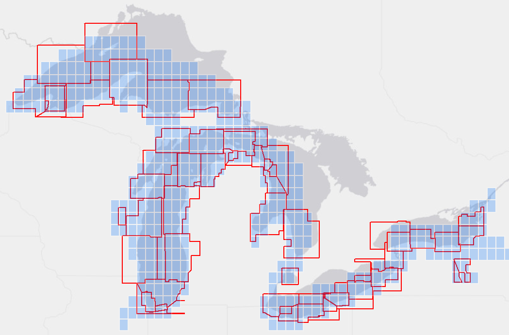
Comparison of old and reschemed ENC coverage over the Great Lakes

The new scheme for all NOAA ENCs may be seen on the Status of New NOAA ENCs webmap, which also shows the ongoing progress of creating reschemed ENCs.

Why NOAA is focusing efforts on improving the ENC?


There is a growing need for ever more detailed nautical charts.
This is driven by several factors, including larger ships now entering ports and transiting channels with the tightest of under keel clearances – requiring more precise depth information, the greater adoption of (in some cases, the requirement for) use of digital charts, electronic navigational systems, and GPS – requiring greater positional accuracy.

Since July 2018, the International Maritime Organization (IMO) has required nearly all commercial ships on international voyages to use an Electronic Chart Display and Information System (ECDIS) and ENCs (as specified in the International Convention for the Safety of Life at Sea (SOLAS), Chapter V, Regulation 19, "Carriage requirements for shipborne navigational systems and equipment").
ECDIS is a sophisticated navigation system that is integrated with other ship equipment and sensors, such as GPS, gyroscopes, and sometimes radar.

In 2016, the U.S. Coast Guard (USCG) published Vessel Inspection Circular No. 01-16 (NVIC 01-16).
This announced that commercial ships on domestic voyages within U.S. waters may now use ENCs in lieu of paper nautical charts.

Recreational boaters are also making greater use of ENCs and developers of navigation and chart display systems have responded by making ENC compatible equipment available to a broader community of users.

Reschemed ENC design

ENC usage bands and standard scales :
Paper nautical charts and ENCs are created at various scales for different navigational purposes.
The smallest scale (least detailed) “Overview” charts are used for basic voyage planning.
The largest scale (most detailed) “Harbor” and “Berthing” charts are used for navigating into harbor and maneuvering to a pier or wharf.
ENCs are categorized into six usage bands, sometimes called scale bands.

The new ENC scheme uses only 11 scales, two each for bands 1 through 5 and one for band 6.
The table below compares the scale ranges of the old ENC scheme to the new standard scales for reschemed ENCs.

New Standard ENC Compilation ScalesStandard ENC cell shape and size

The new ENC layout consists of nested cells whose boundaries follow lines of longitude and latitude.
Sixteen larger scale ENC cells fit inside one cell of the next smaller scale band.
The figure below shows how 16 band 3 cells (green squares) fit inside one band 2 cell (brown) and the relative sizes of the other bands.

 
Nesting of reschemed ENC cellsLatitude-based ENC cell width

On the globe, lines of longitude – also called meridians – converge at the Poles.
Thus, the area of the Earth covered by ENC cells defined by equal extents of latitude and longitude will be narrower for ENCs further away from the Equator.
Reschemed ENC cells take this narrowing into account.
Cells closer to the poles are widened by increasing their longitudinal extent as a multiple of their height.

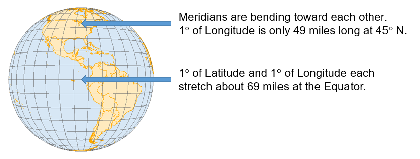
Distance between meridians decreases as they converge at the poles

Thus, ENCs are wider longitudinally as they get further from the poles, so the extent of the coverage “on the ground” doesn’t get too narrow.

The width of reschemed ENCs is determined by its location within three zones of latitude.
There are three standard widths that apply to bands 3 through 6, detailed below.
The zones for bands 1 and 2 are determined by a different method.


Width of an ENC cell is a multiple of its height (H), depending on the latitude of the cell

The table below shows cell widths, for each zone, for each usage band, in decimal degrees of longitude.
Cell dimensions are the same for both of the two standard scales in each usage band.
For example, the height of all band 3 ENC cells is 1.2˚ in latitude.
Band 3 cells below 49˚ 12’ N fall into Zone I and have a cell width equal to their height.
Thus, band 3 cells in Zone I have a width of 1.2˚ in longitude.
Band 3 cells falling between 49˚ 12’ N and 69˚ 12’ N are in Zone II and have a width of twice their height, or 2.4˚ in longitude.
The width of cells falling in Zone III is four times their height, or 4.8˚ in longitude.

New Standard ENC Compilation Scales

For band 2 ENCs, all cells with the contiguous 48 states are considered to be in zone I.
Band 2 ENCs west of Washington State in the North Pacific are considered to be in zone II, except for ENCs in Alaska covering Point Hope, the North Slope and the Artic Sea, which are considered Zone III.
Band 1 ENCs will be some of the last cells created as part of the rescheming effort.
The placement of individual band 1 cells within specific width zones has not yet been established.

Enhancements implemented in new ENCs

As new gridded ENCs are created, a number of improvements to the quality and consistency of the data are being implemented.Larger, standard scale coverage

Many charts and the associated ENCs were compiled at scales that happen to match one of the standard scales used for reschemed ENCs, such as 1:80,000, 1:40,000, 1:20,000, and 1:10,000.
In these cases the new, reschemed cells generally retain the scale used in the old scheme.

If coverage in the original ENC scheme was not compiled at a standard reschemed scale, then the reschemed cells are usually “bumped up” to the next larger scale.
An example of this is the new band 4 coverage in Lake Superior, in which the 1:120,000 scale ENC coverage was replaced by more detailed 1:80,000 cells.

The use of fewer chart scales for reschemed ENCs also facilitates resolving discontinuities and properly “edge-matching” data between adjacent ENC cells.Standardized metric depth contours

When NOAA digitized paper charts to create the first NOAA ENCs, depth values for soundings, depth curves, and other features with depths were converted from the fathoms and feet shown on the charts to meters to populate the ENC database.
The ENC product specification established by the International Hydrographic Organization requires depths to be stored as metric values.
However, the depth contours continued to reflect the intervals in which they were compiled.
Thus, depth contours of older ENC data displayed in meters will show fractional metric values resulting from the unit conversion from feet to meters, as shown in the image below.


When the ENC rescheming project is completed, all depth contours will be compiled in whole metric units.
However, some newly reschemed ENC cells will not be recompiled in their initial release (first edition) of the cell.
The image below shows examples of whole 2, 5, 10, 20, and 50 meter depth contours.
The depth value of soundings will also be stored and displayed with a higher degree of precision than available on paper charts.
Soundings less than 30 meters deep are stored and displayed as meters with subscripts in tenths of meters (decimeters) – a granularity smaller than 4 inches.

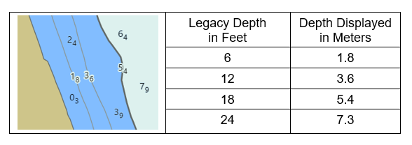
Depiction of metric ENC depth contours

The table below shows the standard depth contour intervals that will be used in reschemed ENCs for each usage band.
These are based on depth intervals specified in the IHO S-101 ENC Product Specification (in the "Depth area" section of the IHO S-101, Electronic Navigational Chart Product Specification, Annex A, Data Classification and Encoding Guide).
Areas that have extremely flat or steep bathymetry may use a modified set of depth contours, especially for bands 5 and 6.

 
New Standard Metric Depth Contour IntervalsResolution of discontinuities in adjacent ENCs

The legacy of the original paper charts from which ENC data was digitized lives on in the current suite of ENCs.
Adjacent paper charts, even those having the same navigational purpose (harbor, approach, coastal, etc.) are often compiled at different scales to accommodate different paper orientations and sizes, or a desire to "stretch" coverage to include harbors or other features at either side of a chart.
Different depth contour intervals are often used on different scale charts, and the techniques for "edge matching" adjacent ENC cells of different scales can be challenging.
The figure below highlights discontinuities on three adjacent ENC cells.
Not only do depth contour intervals sometimes change between adjacent cells, depth contours of the same value, compiled separately, and at a different scale, sometimes do not match.


As new ENC cells are created for the gridded layout they will be recompiled with standard depth contour intervals that match across ENC cell boundaries within the same standard scale.
Similar alignment errors among other features, such as shoreline, will also be resolved as new ENC cells are created.


Examples of discontinuities in three adjacent approach usage band 4 ENC cells

ENC rescheming schedule

When compiling data for several different scale charts, best cartographic practices include compiling source data through the scales, beginning with the largest.
This large scale compilation is then generalized for the next smaller scale map or chart and the generalization process is repeated for successively smaller scale coverage.
This technique is applicable to both traditional paper and raster chart compilations as well as for ENCs.
Thus, the general plan for the ENC rescheming schedule is focused on creating band 5 ENCs along the coasts first, followed by the next smaller scale, band 4 cells, then band 3, etc.
There may be exceptions to this general strategy, based on the scale of the existing ENC coverage, the availability of source data, and other factors.

The progress of ENC rescheming can be tracked on the Status of New NOAA ENCs webmap.
Blue rectangles show planned ENC footprints, red show ENCs in work, yellow indicates cells in review, and green are completed ENCs that are available to the public.

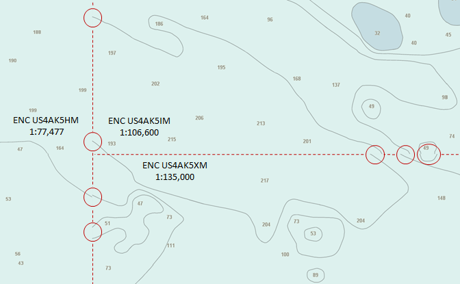
Status of reschemed band 5 ENCs in the New York Harbor area in March 2021


A clever robot spies on creatures in the ocean's ‘Twilight Zone’

Photograph: Evan Kovacs/Woods Hole Oceanographic Institution

From Wired by Matt Simon

Mesobot looks like a giant AirPods case, but it's in fact a sophisticated machine that tracks animals making the most epic migration on Earth.

Thegrandest migration on Earth isn’t the journey of some herbivore in Africa or a bird in the sky, but the vertical movement of whole ecosystems in the open ocean.
All kinds of animals, from fish to crustaceans, hang out in the depths during the day, where the darkness provides protection from predators.
At night, they migrate up to the shallows to forage.
Then they swim back down again when the sun rises—a great big conveyor belt of biomass.
 
An innovative underwater robot known as Mesobot is providing researchers with deeper insight into the vast mid-ocean region known as the “twilight zone.”
Capable of tracking and recording high-resolution images of slow-moving and fragile zooplankton, gelatinous animals, and particles, Mesobot greatly expands scientists’ ability to observe creatures in their mesopelagic habitat with minimal disturbance.
This advance in engineering will enable a greater understanding of the role these creatures play in transporting carbon dioxide from the atmosphere to the deep sea, as well as how commercial exploitation of twilight zone fisheries might affect the marine ecosystem.

But now a spy swims among them: Mesobot.
Today in the journal Science Robotics, a team of engineers and oceanographers describes how they got a new autonomous underwater vehicle to lock onto movements of organisms and follow them around the ocean’s “twilight zone,” a chronically understudied band between 650 feet and 3,200 feet deep, which scientists also refer to as mid-water.
Thanks to some clever engineering, the researchers did so without flustering these highly sensitive animals, making Mesobot a groundbreaking new tool for oceanographers.

“It’s super cool from an engineering standpoint,” says Northeastern University roboticist Hanumant Singh, who develops ocean robots but wasn’t involved in this research.
“It's really an amazing piece of work, in terms of looking at an area that's unexplored in the ocean.”

Mesobot looks like a giant yellow-and-black AirPods case, only it’s rather more waterproof and weighs 550 pounds.
It can operate with a fiber-optic tether attached to a research vessel at the surface, or it can swim around freely.

video : Erk Olsen WHOI

Mesobot’s first bit of clever engineering is its propulsion system—large, slow-moving propellers that create low-velocity jets.
“Why are we so concerned about disturbing the water?” asks Dana Yoerger, a senior scientist at the Woods Hole Oceanographic Institution and lead author on the paper.
“Most mid-water animals are extremely sensitive to any hydrodynamic disturbance.
Because usually, that's something coming to eat them.” If you’re disturbing these animals, you’re not observing their natural behaviors.
(Unless you’re curious about what annoys them.)

The second clever trick ensures that Mesobot doesn’t bother its subjects by blasting them with light.
Well, at least not white light.
Yoerger and his team opted for a red beam, because it doesn’t penetrate seawater well.
“Evolution doesn't waste a lot of capability on stuff that doesn't work very well, so most animals are blind to red light,” says Yoerger.
That’s why when you see bioluminescent critters popping off in the deep sea, they’re blue or green.
“We use red,” Yoerger continues, “even though red is pretty lousy, because it doesn't go very far.
But it doesn't spook the animals as much.
And that's pretty well documented.
So it's a trade-off: You need a lot of light, you need a sensitive camera, and then you can work in the red.”


The tadpole-like larvacean
Courtesy of Mesobot

Using stereo cameras and detection algorithms, Mesobot parses its subjects’ movements and follows them.
Yoerger and his colleagues demonstrated the robot’s capabilities in California's Monterey Bay at 650 feet deep, as it detected and then pursued a hunting jellyfish.
Even more impressive, for a half hour it surreptitiously followed a fragile animal called a larvacean, which resembles a tadpole and builds a giant mucus “house” to filter its food.
(The robot did eventually disturb the extremely sensitive outer structure of the house, but the house's inner structure and the animal itself remained undisturbed.) Based on their testing, the team reckons the robot might be able to operate for more than 24 hours and reach depths of 3,200 feet.

For now, Mesobot can’t collect animals, but in the future it could employ a suction system to nab them.
Just observing sea creatures with a camera won’t tell you what they’ve been eating, for instance, and therefore where they fit into the food web—you’d need a dissection for that.
If you want to study their physiology, you need a physical specimen too.
“The idea would be you'd follow an animal for a while, and then you'd grab it.
I think that's very doable,” says Yoerger.

Mesobot may look like a big AirPods case, but compared to other crewed submersibles and ocean robots it’s actually quite compact.
Perhaps the most famous of all is Alvin, which the Woods Hole Oceanographic Institution also operates.
It weighs 45,000 pounds and can launch from just one specific ship.
Mesobot’s smaller size means it’s cheaper to build and more easily deployable, which will likely open the platform to more researchers.
“That's another big win,” says Singh, of Northeastern University.
“It doesn't need all this extra stuff—large winches, large ships.”

Scientists have long known that species are conducting a daily vertical migration, but up until now they’ve had to study it by catching them at different depths, or by using sonar to pinpoint where they are congregating at a given time.
After all, it’s not like you can slap a tracker on a jellyfish or larvacean to monitor its movements in fine detail.
“We have so few observations about a lot of fish,” says Luiz Rocha, curator of fishes at the California Academy of Sciences, who studies reefs in the twilight zone but wasn’t involved in this new work.
“We don’t even know how they swim, let alone how they eat or how they reproduce.”

Mesobot tracks a jellyfish
Cortesy of Mesobot

And scientists don’t have a great idea of how different species that travel through mid-water are interacting; for instance, which predators follow their prey up and down the water column? Are the animals migrating in tight schools or in a more dispersed fashion? Or, how might climbing ocean temperatures influence how a given species migrates, and might that in turn influence others in its food chain? Oceanographers could try to track them with submersibles, but anything less stealthy than Mesobot would probably scare all the subjects away.
“But if you have a robot that can stay submerged up to 24 hours and follow a fish or a group of fish for all that time, then you can think about studying those phenomena,” says Rocha.