Saturday, October 6, 2012

Image of the week : Patagonia

>>> geolocalization with the Marine GeoGarage <<<

From NASA

Clouds hovered off the coasts of Patagonia near dawn on a beautiful early spring day 2012, allowing a rare cloudless view of the dramatic landscape of the region.
The Moderate Resolution Imaging Spectroradiometer (MODIS) aboard the Terra satellite captured this striking image on September 24, 2012 at 19:05 UTC (6:05 a.m. Chile Summer Time).

Patagonia is a term used for the rugged region that comprises the southern end of South America, and includes parts of Chile (west) and Argentina (east).
Although black borderlines have not been overlaid on this image, the border between the two countries is roughly delineated by the western side of the Andes Mountains, which run from north to south and are snow-capped in this image.

One of the most striking features along the Chilean-Andean border is a series of bright blue glacial lakes.
From north to south these are Lake O’Higgins/San Martín, Viedma Lake and Argentino Lake.
The southernmost portion of this mountain range remains quite cold year round, and gives a home to the largest ice fields in the Southern hemisphere outside of Antarctica.
Moving east from the tower Andes the land gives way to vast steppe-like plains, while in the west the foliage is strikingly verdant, even in early spring.

Springtime in Patagonia, like spring in most places, in a time of change and rebirth.
The wildflowers bloom in abundance, including a stark red, dramatic plant known as the Chilean firebush.
Birds are on the move, with migration well underway.
By November, about 150,000 Magellanic penguins will return to the Chilean coast to raise their young.
It is also springtime which brings the birth of baby guanacos, a lama-like species found most commonly in Patagonia.

Friday, October 5, 2012

Canada CHS update in the Marine GeoGarage


52 charts have been updated (September 29, 2012) :

    • 1230    PLANS PENINSULE DE LA GASPESIE
    • 1233    CAP AUX OIES TO SAULT-AU-COCHON
    • 1313    BATISCAN TO LAC SAINT-PIERRE
    • 1314    DONNACONA TO BATISCAN
    • 1315    QUEBEC TO DONNACONA
    • 1317    SAULT-AU-COCHON TO QUEBEC
    • 1439    CARLETON ISLAND TO CHARITY SHOAL
    • 1510A    LAC DES DEUX MONTAGNES
    • 1510B    LAC DES DEUX MONTAGNES
    • 1515A    PAPINEAUVILLE TO OTTAWA
    • 1515B    BECKETTS CREEK
    • 2000    LAKE ONTARIO
    • 2017    KINGSTON HARBOUR AND APPROACHES
    • 2042    WELLAND CANAL ST.CATHERINES TO PORT COLBORNE
    • 2048    PORT CREDIT
    • 2064    KINGSTON TO FALSE DUCKS ISLANDS
    • 2077    LAKE ONTARIO - WESTERN PORTION
    • 3002    QUEEN CHARLOTTE SOUND TO DIXON ENTRANCE
    • 3410    SOOKE INLET TO PARRY BAY
    • 3411    SOOKE
    • 3440    RACE ROCKS TO D'ARCY ISLAND
    • 3461    JUAN DE FUCA STRAIT EASTERN PORTION
    • 3462    JUAN DE FUCA STRAIT TO STRAIT OF GEORGIA
    • 3479    APPROACHES TO SIDNEY
    • 3513    STRAIT OF GEORGIA NORTHERN PORTION
    • 3527    BAYNES SOUND
    • 3673    CLAYOQUOT SOUND TOFINO INLET TO MILLAR CHANNEL
    • 3685    TOFINO
    • 3724    CAAMANO SOUND AND APPROACHES
    • 3744    QUEEN CHARLOTTE SOUND
    • 3808    JUAN PEREZ SOUND
    • 3809    CARPENTER BAY TO BURNABY ISLAND
    • 3902    HECATE STRAIT
    • 3943    FINLAYSON CHANNEL AND TOLMIE CHANNEL
    • 3948    GARDNER CANAL
    • 3986    BROWNING ENTRANCE
    • 4023    NORTHUMBERLAND STRAIT
    • 4115    PASSAMAQUODDY BAY AND ST CROIX RIVER
    • 4211    CAPE LAHAVE TO LIVERPOOL BAY
    • 4240    LIVERPOOL HARBOUR TO LOCKEPORT HARBOUR
    • 4306    STRAIT OF CANSO AND SOUTHERN APPROACHES
    • 4335    STRAIT OF CANSO AND APPROACHES
    • 4379    LIVERPOOL HARBOUR
    • 4381    MAHONE BAY
    • 4386    ST MARGARET'S BAY
    • 4405    PICTOU ISLAND TO TRYON SHOALS
    • 4422    CARDIGAN BAY
    • 4425    HARBOURS ON THE NORTH SHORE
    • 4466    HILLSBOROUGH BAY
    • 4644    BAY D'ESPOIR AND HERMITAGE BAY
    • 4824    GARIA BAY TO BURGEO
    • 4825    BURGEO AND RAMEA ISLANDS
    • 4826    BURGEO TO FRANCOIS
    • 4827    HARE BAY TO FORTUNE HEAD
    • 5055    CAPE KIGLAPAIT TO KHIKKERTARSOAK NORTH ISLAND

    So 688 charts (1659 including sub-charts) are available in the Canada CHS layer. (see coverage)

    Note : don't forget to visit 'Notices to Mariners' published monthly and available from the Canadian Coast Guard both online or through a free hardcopy subscription service.
    This essential publication provides the latest information on changes to the aids to navigation system, as well as updates from CHS regarding CHS charts and publications.
    See also written Notices to Shipping and Navarea warnings : NOTSHIP

    Alaskan cartography influenced by Native mapmakers

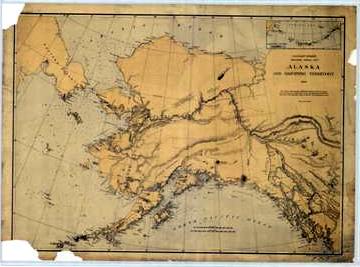
    The map the Coast Survey prepared in 1867 still referred to Alaska as “Northwestern America.” (NOAA/National Archives)

    From KCAW

    “Aha moments” probably come more often in the sciences than in social studies, but every once in a while an historian makes a find that changes everything.

    Recently, a researcher combing through the National Archives made just such a discovery.
    In this case, while working on a project to scan some of the very first maps of Alaska, he learned how early cartographers so accurately depicted places they had never been.

    John Cloud works for the National Oceanic and Atmospheric Administration in Washington DC and – despite his made-to-order name – is not in the National Weather Service.
    He’s a contract historian who says the luckiest assignment he ever took was digging into the National Archives seven years ago to retrieve early maps of Alaska made by the Coast Survey, the progenitor of NOAA.
    “There was all these patterns that emerged about Alaska mapping. The Coast Survey was really critical to the invention of Alaska, and the purchase of Russian America.”

    The patterns Cloud’s talking about refer to the level of detail in the Coast Survey maps of a place Americans really didn’t know that much about.
    In fact, those first maps don’t even call it “Alaska.”
    They’re labeled “Northwestern America.”

    Then he found it.
    “I had no idea what it was, but it was nothing like anything I’d ever seen in the archives.”
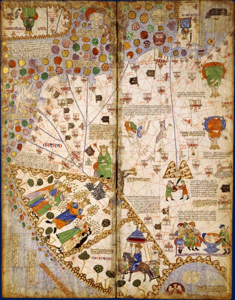
    It was a set of pencil-and-paper drawings – a mosaic, of sorts – that together formed a map, drawn by a Klukwan Tlingit.

    At the time, Cloud did not understand his luck.
    “I will say I have a good eye, and I scanned a lot of things that I didn’t know anything about, but as soon as I saw them I thought they were interesting.
    And these included stumbling upon the incredible map done by Shotridge and his two wives for George Davidson in 1869 in Klukwan up the Chilkat River, and the five maps drawn by the Inupiat Joe Kokaryuk in 1898 for the Coast and Geodetic Survey in the lower Yukon Delta.”

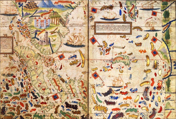
    This close-up of the Kohklux map shows how Davidson used English spelling to “sound out” the Native names of features.
    (See the full map in Coast Survey’s Historical Map and Chart Collection.)

    Two Native mapmakers, a generation apart, provided the Coast Survey with information on thousands of miles of river and coastline.
    The Tlingit Kohklux, better-known as Shotridge, and the Inupiat Joe Kokaryuk. Their stories have some parallels, so to speak.
    In 1867 George Davidson ran the Coast Survey on the west coast out of an office in San Francisco.
    If you compare the map his agency produced for the transfer of Alaska in 1867, against the map made by the same office only two years later, the new detail in the northern panhandle is extraordinary. John Cloud says the cartographers of the Coast Survey were scientists first and foremost, and that they often sought out indigenous sources to fill in critical detail in their maps.

    The Tlingit, however, are characterized by a rich protocol surrounding intellectual property rights. The kind of information Davidson needed was really not available for the asking – but it could be exchanged.
    By coincidence, Davidson learned that a solar eclipse would be visible in Southeast Alaska in 1869, with the track of the full eclipse plotted right through Klukwan.
    Davidson steamed north to await the eclipse, and observed it through a modified telescope with Shotridge.
    This was the breakthrough that cartographers were waiting for.

    “And in the aftermath of that eclipse, there was this intellectual potlatch, where Davidson made a painting of the eclipse in its totality as he’d seen it in his special telescope. Shotridge and his two wives made a series of maps of the geography up and over the mountains – the ancient trade routes of the Tlingit – all the way over and down to the main stem of the Yukon River. And then, the two parties exchanged the painting of the eclipse and the map."

    Kohklux map drawn by Kohklux (Shotridge) and two wives in 1869

    So the 1869 Shotridge map was one of Cloud’s discoveries in the archives, as was the map of Alaska’s far north coast drawn 30 years later by Joe Kokaryuk.
    Cloud wondered – and you may be thinking by now – how did they do it?
    How does someone with no training in cartography – no training in using pencil and paper, for that matter – produce a map so accurate that is incorporated to the official record of a nation?

    Cloud says we’ve got to think beyond the paper.
    “That’s the whole question: Where is the Map? Is the map the thing that’s put down on paper, or is the map the thing that’s put down on your head in the first place, that’s then presented on paper? Or is sketched in a mudbank? In the case of Joe Kokaryuk, that’s how they noticed: He was making little sketches on a mud bank for other Eskimos. He was the interpreter and the expediter of the Coast Survey party on the lower Yukon delta, and they could see that he was good at it. They said, Hey, how about we give you some paper and a pencil? Literally. Very much the same situation – a generation later – as Shotridge and his wives. But, again, the map – in both cases – if it hadn’t been in their heads in the first place, how could they possibly have put it down on paper?”

    Locating the original map sets by Shotridge and Joe Kokaryuk was a great find – of many – John Cloud made while searching the national archives.
    But one mystery remains.
    So much of Alaska was opened to view because an early mapmaker, George Davidson, followed an eclipse and made a painting of it, which he mounted on the back of a Chilkat blanket pattern board.
    A copy survives in San Francisco, but the original has never been found.

     The 1869 Coast Survey map of Alaska, which incorporated detail provided by Shotridge. (NOAA/National Archive)

    John Cloud is not discouraged.
    “All you have to do is go around the world to wherever there are Chilkat Indian pattern boards and turn them over, because they only used one side. If you turn over enough of them, you’ll finally turn one over and there will be the eclipse painting.”


    Rare map of Alaska, based upon the explorations of Dall, from Augustus Herman Petermann's Geographische Mitteilungen. (1869)
    One of the earliest obtainable maps of the region after the territory was ceded by Russia to America, and still including many Russian place names.

    Alaska Base Map, 1895

    Links :
    • NOAACoastSurvey : the Tlingit map of 1869, a masterwork of indigenous cartography, (explains how Davidson set the tone for Coast Survey’s early sensitivity to the importance of preserving Indian names on maps ‒ especially, in this case, of a map drawn by Tlingit clan leader Kohklux and his wives.)

    Thursday, October 4, 2012

    100% Pure? New Zealand’s green image shows cracks in Antarctic Fishing


    The Ross Sea, Antarctica is the world's most untouched and intact marine ecosystem.
    >>> geolocalization with the Marine GeoGarage <<<
    Scientists describe it as a 'living laboratory', a place that can teach us about the workings of all marine ecosystems.
    But the fishing industry has now found its way to the Ross Sea, targeting Antarctic toothfish and unless fishing is stopped the natural balance of this unique ecosystem will be lost forever.

    From NationalGeographic

    New Zealand enjoys its green image, branding itself as “100% pure.”
    Yet when it was given an opportunity to make a truly bold move to protect a uniquely undisturbed marine ecosystem, it balked.

    Last month, the NZ cabinet rejected a proposed U.S.-NZ plan to turn a large swath of the Ross Sea, which is part of the Southern Ocean around Antarctica, into a no-take marine reserve.
    The decision came after years of work — both from New Zealand and from the U.S., whose scientists and officials are also interested in protecting the Ross Sea.
    The reason? The compromise plan displaced more fishing than NZ was willing to accept.


    (See our new fun explainer video on marine reserves, and how they can benefit fishermen.)

    The Ross Sea has long been recognized as a place of special scientific and environmental interest.
    In 2008, a team of scientists analyzed human impacts on the world’s oceans and found that the Ross Sea was one of the least impacted large marine ecosystems remaining on Earth.
    The importance of this finding cannot be underestimated.
    While the Ross Sea is not entirely untouched, it does boast a foodweb that is in much the same state as it has been for centuries.
    Despite being only 2% of the Southern Ocean, the Ross Sea has more than a quarter of the world’s emperor penguins, almost one third of the world’s Adelie penguins, and almost half of the South Pacific Weddell seal population.
    There are not many places left where scientists can study these kinds of intact, thriving marine ecosystems, making the Ross Sea extremely valuable for science.
    Over 500 scientists have agreed that the Ross Sea’s continental shelf and slope should be made a marine reserve.

    Unfortunately, there’s a catch.
    The Ross Sea isn’t only populated by the kind of cute animals that people love to protect.
    It also is home to the Antarctic toothfish, the Ross Sea’s top fish predator, which is better known as Chilean sea bass.
    Chilean sea bass sells for very high prices, and as a result several countries have established a fishery in the Ross Sea.
    The fishery plans to reduce the spawning biomass of Antarctic toothfish by half over the next several decades.
    If you know anything about how most fisheries are managed, this might not sound like a big deal.
    But this level of fishing will likely change the Ross Sea ecosystem, harming the very quality that makes it unique.

    The Ross Sea fishery falls under the auspices of the Commission on the Conservation of Antarctic Marine Living Resources (CCAMLR), which manages all the fisheries in the Southern Ocean. CCAMLR was an early adopter of the ecosystem approach to management and has a reputation for making responsible, science-based decisions. Additionally, CCAMLR is in charge of designating marine protected areas (MPAs)  in the region. The 25 countries that are members of CCAMLR have collectively agreed to put in place a system of MPAs to protect key parts of the Southern Ocean. As seen by NZ’s recent actions, however, not all countries agree on what the balance between MPAs and fishing should be. New Zealand is one of the main countries fishing in the Ross Sea.

    While it’s not exactly breaking news that countries like to protect lucrative industries, the Ross Sea fishery is a small portion of New Zealand’s overall fishing industry.
    Moreover, officials and scientists from both sides had worked very hard to come up with a joint proposal, and both had made significant compromises.
    Without a united proposal, it will be difficult for CCAMLR’s member countries to make any decisions about protecting the Ross Sea.

    On the bright side, thanks in part to a documentary on the fight for the Ross Sea titled “The Last Ocean,” (see trailer at the top of this post) the issue has been garnering public attention in New Zealand.
    Usually, the workings of CCAMLR aren’t very interesting  – lots of dry information about the results of fish-tagging experiments.
    Creating MPAs and marine reserves are a more hot-button issue, particularly for New Zealand, with its strong stake in the fishery and an equally strong interest in maintaining the green image that draws many tourists.
    With any luck, it won’t just be Kiwis who get involved in this debate, though.

    Antarctica and the Southern Ocean don’t belong to any single country, and decisions made about marine protection there should be in the best interests of all humankind.
    Scientists who have worked in the Ross Sea have said they think it’s one of the last places where they can learn about healthy marine ecosystems and therefore understand how to restore other less healthy areas of the oceans.
    It’s hard to put a price on those kinds of benefits.

    Real protection for the Ross Sea might not happen this year.
    But there’s still time for Kiwis and others around the world to get involved.
    All too often, decisions about marine issues are made by relatively small numbers of people.
    What happens to the oceans affects everyone, however.
    It’s up to all of us to make sure that our governments make decisions that consider the long-term interests of the planet as well as the short-term gain of a few.

    Wednesday, October 3, 2012

    Great Barrier Reef has lost half its corals since 1985, new study says


    From WashingtonPost

    Australia’s Great Barrier Reef has lost more than half its coral cover since 1985, according to a new study published Monday.


    The loss has been spurred by a combination of factors including hurricanes, coral-eating starfish and coral bleaching.

    Helicopter flight from Knuckle Reef   
    by Tanya Puntti (SLR Photography Guide)

    The paper, in the Proceedings of the National Academy of Sciences, is the most comprehensive survey of a reef system over such a long period.
    The researchers from the Australian Institute of Marine Science found that reef cover fell from 28 percent to 13.8 percent over the past 27 years, with two-thirds of the decline occurring since 1998.

    Coral on Australia's Great Barrier Reef can be seen suffering from bleaching in this file handout photo.
    Image by: HANDOUT / Reuters

    The sobering findings highlighted how even the world’s most protected marine areas are under assault from natural forces and causes linked to the human activity that is resulting in climate change.
    The Great Barrier Reef is the world’s largest coral reef ecosystem, featuring nearly 3,000 individual reefs within 133,205 square miles.
    A third of the Great Barrier Reef Marine Park is off-limits to fishing and collecting.

    “We are basically losing an ecosystem that is so iconic for Australia and the rest of the world,” said institute scientist Katharina E. Fabricius, one of the paper’s authors.

    Storm damage accounted for 48 percent of the decline, scientists said, while crown-of-horns starfish contributed 42 percent.
    Coral bleaching, caused by warmer water, accounted for 10 percent of coral loss.

    The population outbreak of the coral eating starfish Acanthaster planci on the Great Barrier Reef is seen in this undated handout photo released on October 2.
    The world's largest coral reef - under threat from Australia's surging coal and gas shipments, climate change and a destructive starfish - is declining faster than ever and coral cover could fall to just 5 percent in the next decade, a study shows.
    Katharina Fabricius/Australian Institute of Marine Science/Reuters

    Researchers warned that Australian officials will have to step up efforts to curb controllable threats, such as coral-eating starfish, because they are easier to target than intense storms and rising ocean temperatures.

    John Gunn, chief executive of the Australian Institute of Marine Science, said scientists need to learn about the periodic population explosions of crown-of-thorns starfish, a native pest.
    “The study shows that in the absence of crown-of-thorns, coral cover would increase at 0.89 percent per year, so even with losses due to cyclones and bleaching there should be slow recovery,” Gunn said in a statement.
    Nutrient runoff appears to be fueling the crown-of-thorns starfish boom: The authors note that these outbreaks occurred once in every 50 to 80 years before European agricultural runoff began.
    They now average once every 15 years.


    Crown-of-thorns starfish can have a significant impact on the Great Barrier Reef. AIMS conducts a long-term monitoring program aimed at tracking the number and distribution of these animals.

    Nancy Knowlton, a coral reef biologist at the Smithsonian Institution National Museum of Natural History, said the finding will be “a shock to the system” that could force Australians to focus on improving their water quality.
    “If anyone’s going to do it, it’s going to be the Australians, because they really care about the Great Barrier Reef,” she said in an interview.
    She added that these measures will “buy you real time but not infinite time,” at which point countries will have to cut the carbon emissions that are raising sea temperatures and making the ocean more acidic.

     A handout photograph shows an island of the Great Barrier Reef in Whitsundays, Queensland, Australia.
    Photographer: Natalie McComas/Tourism Queensland

    At a conference on ocean acidification in Monterey, Calif., last week, Fabricius told reporters that tourists often get a distorted view of the reef because they visit the more pristine areas.

    “But if you’re a research vessel and you go to the areas which are not prescribed, you see a very different picture,” she said, adding that corals will face an even greater challenge in the years ahead because carbon emissions are lowering the water’s pH. That, in turn, makes it harder for corals to form their skeletons.

    At the current rate of loss, researchers said, the Great Barrier Reef will lose half of its coral cover again by 2022, putting it on par with the Caribbean.
    “It will be really very low in 10 to 15 years,” Fabricius said.

    Links :
    • BBC :  Half of Great Barrier Reef coral lost in last 27 years
    • TheGuardian : Great Barrier Reef loses more than half its coral cover

    Tuesday, October 2, 2012

    Satellites trace sea level change

    The animation shows regional mean sea level trends 1993-2010 as measured by radar altimeters.
    Some regions experience a rise of up to 12 mm per year (dark red), while others see a decrease of about 12 mm per year (dark blue).
    On average, the global sea level rises about 3 mm

    From BBC

    A major reassessment of 18 years of satellite observations has provided a new, more detailed view of sea-level change around the world.

    Incorporating the data from a number of spacecraft, the study re-affirms that ocean waters globally are rising by just over 3mm/yr.
    But that figure, according to the reassessment, hides some very big regional differences - up and down.
    The Philippine Sea, for example, has seen increases in excess of 10mm/yr. 

    Part of that signal reflects the great fluctuation in winds and sea-surface temperature across the Pacific Ocean known as the El Nino/La Nina-Southern Oscillation.

    "The trend map is really a way of looking at average field changes over the 20 years," explained Steven Nerem of the University of Colorado, US.
    "The places where you see high trends probably won't have high trends in another 20 years. "A lot of this is decadal variability that will average out over the longer time series, which is why we need more missions to understand where this variability is."

    Paolo Cipollini from the UK's National Oceanography Centre added:
    "Many of the features in the trend map indicate changes in heat storage and correspond to long-term variations in the ocean currents."

    This is evident if you look for some of the well-established mass movements of water - such as the Gulf Stream arching across the North Atlantic from the eastern US, or the Kuroshio Extension reaching out from Japan into the Pacific

    Scientists have reviewed almost two decades of satellite data to build a new map showing the trend in sea levels.
    Globally, the oceans are rising, but there have been major regional differences over the period.


    Surface bounce

    The map was unveiled in Venice, Italy, at a symposium marking "20 Years of Progress in Radar Altimetry".

    The research will help scientists to tease out the scale of the various contributions to long-term sea-level rise and understand better the annual and inter-annual changes that can occur.

    Currently, the most significant contributions are identified as being the expansion of the world's oceans due to their absorbing more heat, and the melt water coming from eroded glaciers and ice sheets.

    A key quest is to identify to what extent sea-level rise may be accelerating and to pull out any long-term oscillations in ocean behaviour that could confuse that signal.

      Jason-2
       The Jason satellite series is a benchmark for this field of study
     
    The study was completed as part of the Climate Change Initiative (CCI) agreed by European Space Agency (Esa) member states at their ministerial meeting in 2008.

    The CCI seeks to deliver long-term observations on a large set of "essential climate variables" - sea-level change being one of the most important indicators of global change.

    Measuring ocean surface shape from satellites has a relatively short history.
    Routine observations began with Europe's ERS-1 spacecraft in 1991, and this has subsequently been followed up by a series of international missions.
    The benchmark today is arguably Jason/Poseidon - a cooperative venture between the US and Europe (principally France).
    Now in its third incarnation, the Jason satellite circles the globe making a topographic map of 95% of the Earth's ice-free oceans every 10 days.

    To do this, it uses a radar altimeter, which constantly bounces microwave pulses off the sea surface.
    By timing how long the signal takes to make the return trip, the instrument can determine sea-surface height.But to get a full picture, Jason's data needs to be tied into that from satellites which view parts of the world it cannot see, and also mapped on to tide gauge information.
    Although these coastal stations cannot provide the same global view as space-borne instruments, they capture much longer trends.
    Some gauge stations have unbroken records going back more than 200 years.

    More detail

    Another important tool introduced recently is the gravity satellite - specifically, the two US Grace spacecraft.
    This duo can weigh the amount of ice held in Antarctica and Greenland, and the quantity of water stored on the continents.
    They have provided new insights into the scale of melting at the poles, and the impact of changes in precipitation that can move huge volumes of water from the ocean to the land.

    Esa recently lost its flagship Earth observation satellite, Envisat, after 10 years of unbroken data-gathering. 

    The spacecraft and its altimeter stopped operating without warning in April, underlining the need for several instruments to be maintained in orbit at the same time.
    A replacement altimeter should launch on the Sentinel-3 spacecraft at the end of 2014.
    A continuity satellite for the present Jason is also expected to go up within months of the Sentinel.

    Other types of altimeter are being built, as well.
    In December this year, France and India should launch their Saral platform.
    This will carry a high frequency (Ka band) altimeter that should capture better the changes occurring very close to coastlines - detail which is beyond the reach of microwave observations.

    "The key challenge in the coming years is to ensure we keep acquiring altimetry data, that we are able to calibrate it and that we can ensure its quality," said Maurice Borgeaud from Esa's Earth Observation Science, Applications and Future Technologies Department.

    "Also, we need to tackle the new domains of radar altimetry.
    Coastal altimetry has been mentioned - also what you can do to measure water levels in rivers and lakes.
    Again, the old generation of radar altimeters were not designed to do this; the latest generation will be."  

      Modern sea level monitoring station
    The modern tide gauge is now a highly sophisticated tool.
    Coastal instruments have recorded sea level change at some locations for more than 200 years
     

    Monday, October 1, 2012

    The golden age of nautical charts - When Europeans discovered the rest of the world (BNF exhibition)


    From BNF


    The Bibliothèque nationale de France holds such treasures as scientific documents that take us back to the time of great discoveries

    Reconstitution du planisphère de la géographie d'al-Idrîsî
    Sicile, 1154. Copie du XIIIe siècle, Maghreb.
    Arabs take up the work of the Greeks and revive the scientific tradition of cartography.
    In the 12th century, the Arab geographer al-Idrîsî draws up a map of the world, bringing together most of the geographic knowledge of his time.

    As the most extraordinary pieces, one can find the parchment and often enriched with gold illuminated nautical charts, called ‘portulans charts’ (from the Italian term ‘portolano’, book of nautical instructions).
    These maps show the succession of harbours along the coasts; the rhumb lines dotted on the maps correspond to bearings as measured to relative north.
    Thanks to this graphic system, navigators could find their way by writing down on the chart the distance they thought they had covered.


    Atlas Miller
    Carte de l'Insulinde et des Moluques
    In contrast to the theological image of the world that the globe or map of the world provided, a new cartographic representation, developed as of the 13th century n the context of the expansion of maritime trade.

    The oldest portulan chart would date from the late 13th century: it is the famous ‘Carta pisana’, housed at the Department of maps and plans.
    Only a few portulans charts among the oldest ones have survived to this day. (ex.: Portolan chart of Guillem Soler (c.1380) / Portolan chart of Gabriel de Vallseca (1447)) : see BNF Gallica catalogue


    Partie orientale du monde
    Altas catalan, vers 1375
    These are the "portulans" which, just as the Catalan Atlas, describe coast and harbour.

    The BnF’s collection is the biggest in the world as it gathers five hundred portulans charts.
    Both technical innovations and scientific objects, ‘portulans charts’ also represent the quest for faraway lands
     These often impressive polychrome works of art are spectacular; furthermore, they conjure up some sort of exotic universe.

     Globe terrestre, dit "Globe vert"
    Martin Waldseemüller (1507)

    The exhibition presents a selection of 200 main pieces: charts, globes, astronomy tools, objets d’art and ethnographic objects, stuffed animals, drawings, prints, paintings and manuscripts.

    Research on projection, which allows representing the entire globe on a flat map, increases.
    In particular, Mercator’s research, very useful for the sailors, comes to mind.
    This Flemish geographer is one of the leading figures of the golden age of Dutch cartography.

    These items belong to the BnF’s collections or are exceptional loans from the musée du Quai Branly, musée Guimet, musée du Louvre, Arts et métiers, Mobilier national, musée de la marine, Service historique de la Défense, British Library, Italian and French regional institutions.


    L'Amérique septentrionale
    Détail du globe terrestre (1681-1683)

    Of both economic and political interest, cartography is important to states, particularly for military reasons.
    The large globes of Coronelli, which allow contemplating the world such as it was seen in the 1680s by the Sun-King at the height of his glory, bear witness to the links which connect Prince and cartographer.

    The exhibition focuses on various issues: sailing conditions and use of charts; discovery of Africa, Asia, Americas and the Pacific; rivalry of maritime powers; geographical knowledge transmission between the Indian Ocean and the Mediterranean sea; creation and dissemination of the iconography of the new worlds, its landscapes, peoples, customs, fauna and flora.

    Battista Agnese, Atlas nautique
    At the end of the 15th and the beginning of the 16th century, the great Spanish and Portuguese navigators broaden considerably geographic knowledge.
    America appears for the first time on the world map

    Links :

    Sunday, September 30, 2012

    Image of the week : Tahiti, French Polynesia

    >>> geolocalization with the Marine GeoGarage <<<

    From NASA

    In August 1768, Captain James Cook, naturalist Joseph Banks, and a shipload of sailors set sail from England to Tahiti to observe the Transit of Venus.
    Camped out on Point Venus, they witnessed the event on June 3, 1769.
    Cook sketched the transit, but Banks had surprisingly little to say about it.
    Perhaps he was distracted by the wonders of the island itself.

    The Enhanced Thematic Mapper Plus on the Landsat 7 satellite captured this natural-color image of Tahiti on July 11, 2001.

    This island is part of a volcanic chain formed by the northwestward movement of the Pacific Plate over a fixed hotspot.
    Tahiti consists of two old volcanoes—Tahiti-Nui in the northwest and Tahiti-Iti in the southeast—linked by an isthmus.
    Through studies of its rock layers, geologists have figured out the likely history of Tahiti-Nui.
    Today it is roughly round, and it was roughly round when it first formed as a volcanic shield between 1.4 million and 870,000 years ago.
    But between then and now, it had a different contour.
    Both the northern and southern flanks of Tahiti-Nui collapsed sometime around 860,000 years ago, gouging massive arcs out of the island’s perimeter
     Soon after the northern flank collapse, a second shield volcano began forming.
    Volcanic material on the northern side of Tahiti-Nui eventually overtopped the original volcanic structure and started filling in the southern depression.
    Although Tahiti-Nui now has a fairly symmetrical contour, it has an asymmetrical three-dimensional shape.
    Mountains are taller on the northern half of the island.

    Yet something else besides volcanic activity has shaped Tahiti: rain.
    Heavy tropical rains have carved deep valleys, some with nearly vertical walls up to 1,000 meters (3,000 feet) tall.
    The angled sunlight in this image brightens some slopes, while leaving others in shadow.
    Tahiti’s sharp relief has complicated the geological surveys because they cause so much erosion.
    But the same rains have also promoted the growth of the lush plants that carpet both Tahiti-Nui and Tahiti-Iti.

    Though the Transit of Venus was the stated objective of the British expedition, Banks was likely more interested in Tahiti’s plants.
    Specimens he collected from Tahiti, New Zealand, South America, Australia, and Java accounted for roughly 1,300 new species, and his famed collected is now stored at the Natural History Museum in London.
    Complementing the rich life on land is marine life around Tahiti’s perimeter.
    Coral reefs fringe the island, and the reefs are thickest on the southern and western sides.
    Reefs frequently form along the submerged slopes of volcanic islands.