Knowing how incredible our deep seas are, famous French freediver Guillaume Nery is showcasing not one but three Philippine dive sites in a 12-minute video that compiles the most jaw-dropping underwater locations around the world. Some of the most amazing parts of the video include the limestone formations under Barracuda Lake in Coron, Palawan (2:16), an underwater shot in Coron filmed using an upside-down camera trick (5:50), and shots of Davao del Norte’s Sama-Bajau people, who can hunt underwater for as long as 13 minutes at depths of around 200 feet (6:14 mark). Filming started in April 2017 when Nery, along with his wife-slash-videographer Julie Gautier and photographer Franck Seguin, flew to some of the world’s under-the-radar dive spots.
They also filmed the Yonaguni Monument off the coast of Japan (0:44); the frozen Sonnanen Lake in Finland (3:59); and Cenote Angelita in Yucatán, Mexico (4:41). Freedivers hold their breath and go underwater for as long as they can without equipment.
Nery, who has broken the freediving world record four times, can dive to 125 meters (410 feet) below sea level.
Lowest Paris agreement target may temporarily be surpassed for first time between now and 2023
Global warming could temporarily hit 1.5C above pre-industrial levels for the first time between now and 2023, according to a long-term forecast by the Met Office.
Meteorologists said there was a 10% chance of a year in which the average temperature rise exceeds 1.5C, which is the lowest of the two Paris agreement targets set for the end of the century.
Until now, the hottest year on record was 2016, when the planet warmed 1.11C above pre-industrial levels, but the long-term trend is upward.
Man-made greenhouse gases in the atmosphere are adding 0.2C of warming each decade but the incline of temperature charts is jagged due to natural variation: hotter El Niño years zig above the average, while cooler La Ninã years zag below.
In the five-year forecast released on Wednesday, the Met Office highlights the first possibility of a natural El Niño combining with global warming to exceed the 1.5C mark.
Dr Doug Smith, Met Office research fellow, said: “A run of temperatures of 1C or above would increase the risk of a temporary excursion above the threshold of 1.5C above pre-industrial levels.
Predictions now suggest around a 10% chance of at least one year between 2019 and 2023 temporarily exceeding 1.5C.”
Climatologists stressed this did not mean the world had broken the Paris agreement 80 years ahead of schedule because international temperature targets are based on 30-year averages.
“Exceeding 1.5C in one given year does not mean that the 1.5C goal has been breached and can be redirected towards the bin,” said Joeri Rogelj, a lecturer at the Grantham Institute.
“The noise in the annual temperatures should not distract from the long-term trend.”
Although it would be an outlier, scientists said the first appearance in their long-term forecasts of such a “temporary excursion” was worrying, particularly for regions that are usually hard hit by extreme weather related to El Niño.
This includes western Australia, South America, south and west Africa, and the Indian monsoon belt.
NASA: the Global temperature anomalies from 1880 to 2017
They also noted that the probability of 1.5C years would steadily increase unless emissions were rapidly scaled back.
“It’s a warning that we’re getting close to that level,” Prof Adam Scaife, the head of long-range prediction at the Met Office, told the Guardian.
“We’re not saying there is a current risk of breaching the Paris agreement.
What we are saying is that for the first time, we are seeing a chance of a temporary rise of 1.5C due to a combination of global warming and natural climate variation.”
The Met Office said previous results had demonstrated the accuracy of such “decadal reports”, which cover the ground between short-term weather forecasts and long-range climate models.
Since 2014, the world has experienced the four hottest years since records began in 1850, but these highs are likely to be exceeded soon.
From now until 2023, the Met has 90% confidence that mean annual temperatures will range between 1.03C and 1.57C above pre-industrial levels.
The recent United Nations Intergovernmental Panel on Climate Change report on warming of 1.5C, highlighted the calamitous difference even a fraction of a degree above could make to coral reefs, Arctic ecosystems and hundreds of millions of lives.
Starting now, the report said emissions would have to be cut by 45% by 2030 to have any chance of holding to that level.
“Breaching 1.5C of global warming does indeed mean that we failed to limit warming to that ‘safe’ level, but not that our understanding of a safe level of climate change has suddenly changed and climate change should go unchecked,” said Rogelj, who was was a coordinating lead author on the UN report.
“Every tenth of a degree matters. So if 1.5C of global warming would be exceeded for whatever reason, this would be a call for steeper emissions reductions.”
NOAA’s Office of Coast Survey recently announced plans to change the U.S.
Army Corps of Engineers (USACE) maintained channel depth values on raster nautical chart products, which include paper nautical charts and the corresponding digital raster navigational charts (NOAA RNC®).
Minimum depths (also called controlling depths) are collected during periodic USACE sonar surveys of channels.
In the past, these depths were provided on raster charts, but controlling depths will now be replaced with the original channel design dredging depths used by the USACE (called project depths).
Standardizing depth presentation on these products will improve data consistency and overall safety.
Implementation begins in early 2019.
NOAA’s suite of electronic navigational charts (NOAA ENC®) are not affected by these changes.
Mariners are encouraged to use NOAA ENCs for critical safety information as these products are typically updated up to one month ahead of raster products.
Why the change?
The USACE makes the depth information from recent surveys publicly available on their website before NOAA nautical products are updated and published.
NOAA prioritizes making updates to ENC over RNC products.
This often results in RNC products not accurately reflecting the most current controlling depth values (as represented on NOAA ENC and the USACE website).
To eliminate inconsistencies among controlling depths, NOAA will only show project depths on raster chart products in the future.
The Initial implementation of this change will focus on deep draft shipping channels where the primary product used for navigation is the ENC. How will mariners be notified?
NOAA first publicized the concept of charting project depths in the National Charting Plan released in February 2017.
As the changes are made on individual charts, NOAA will include a note on each chart directing mariners to review the USACE website and use NOAA ENC to access the latest controlling depths.
Additionally, a statement drafted jointly by Coast Survey and the U.S.
Coast Guard (shown below) is being published weekly in the Coast Guard’s Local Notice to Mariners
NOAA recommends that mariners take advantage of the most recent chart updates by using the NOAA Electronic Navigational Chart (ENC) for navigation in U.S. waters. ENCs provide the most up to date information, whereas paper and raster nautical chart updates may be up to one month behind the corresponding ENC coverage. Over the next few years, mariners will see continued improvement in the extent and detail of ENC coverage, while there will be a reduction in RNC and paper chart coverage and service. ENCs will include routine changes between editions that are not published through notices to mariners. One significant change to the RNC and paper charts will be the removal of controlling (minimum) depth information from many maintained channels. Controlling channel depths will still be provided on ENCs.Comments or concerns can be addressed through ASSIST, NOAA’s Nautical Inquiry and Comment System. https://www.nauticalcharts.noaa.gov/customer-service/assist/
Project depths and controlling depths defined
Federally maintained channels are broken into a series of individually named sections called “reaches.” There are two different depths associated with each reach that are reported by the USACE, the project depth and the controlling depth.
Project depths are the original design dredging depths of a channel reach constructed by the USACE.
They may or may not be maintained by dredging after completion of the channel.
In other words, the actual depth of the channel may be shoaler than the project depth (for example, Reach B in image below).
Controlling depths, or minimum depths, are the least depths within the limits of a channel reach.
These depths are updated with each new USACE survey.
Minimum depths restrict the safe use of a channel to ships with drafts less than the minimum.
Example of a federally maintained channel with a project depth of 30 feet.
Reach A has a controlling depth of 32 feet and Reach B has a controlling depth of 28 feet.
Displaying project depths on raster charts
Controlling depths are depicted on raster chart products by channel tabulations, depth legends, and hydrography (individual depth soundings).
Here are a few examples of how depiction of channel depths will change on raster charts:
Channel tabulation to project depth legend:
Depth legend to project depth legend:
Hydrography to project depth legend:
Controlling depth channel tabulation to project tabulation:
Project Depth Note:
The following note will be added to raster charts as controlling depths are replaced with project depths:
PROJECT DEPTHS
Channel legends and tabulations, where indicated, reflect the U.S. Army Corps of Engineers (USACE) project depths. The channel may be significantly shoaler, particularly at the edges. For detailed channel information and minimum depths as reported by USACE, use NOAA Electronic Navigational Charts. USACE surveys and channel condition reports are available at http://navigation.usace.army.mil/Survey/Hydro.
The change from showing – often outdated – controlling depths to showing channel project depths on raster nautical chart products, such as paper nautical charts and RNCs, will provide greater clarity and safety for mariners.
The project depths shown on raster charts will give users an idea of the original channel design dimensions.
The up-to-date controlling (minimum) depths provided on NOAA ENCs and on the USACE website (referenced on raster chart products) will give users the latest information on the safe depth in which ships may transit through federally maintained channels.
Comments or concerns about these changes can be addressed through NOAA ASSIST.
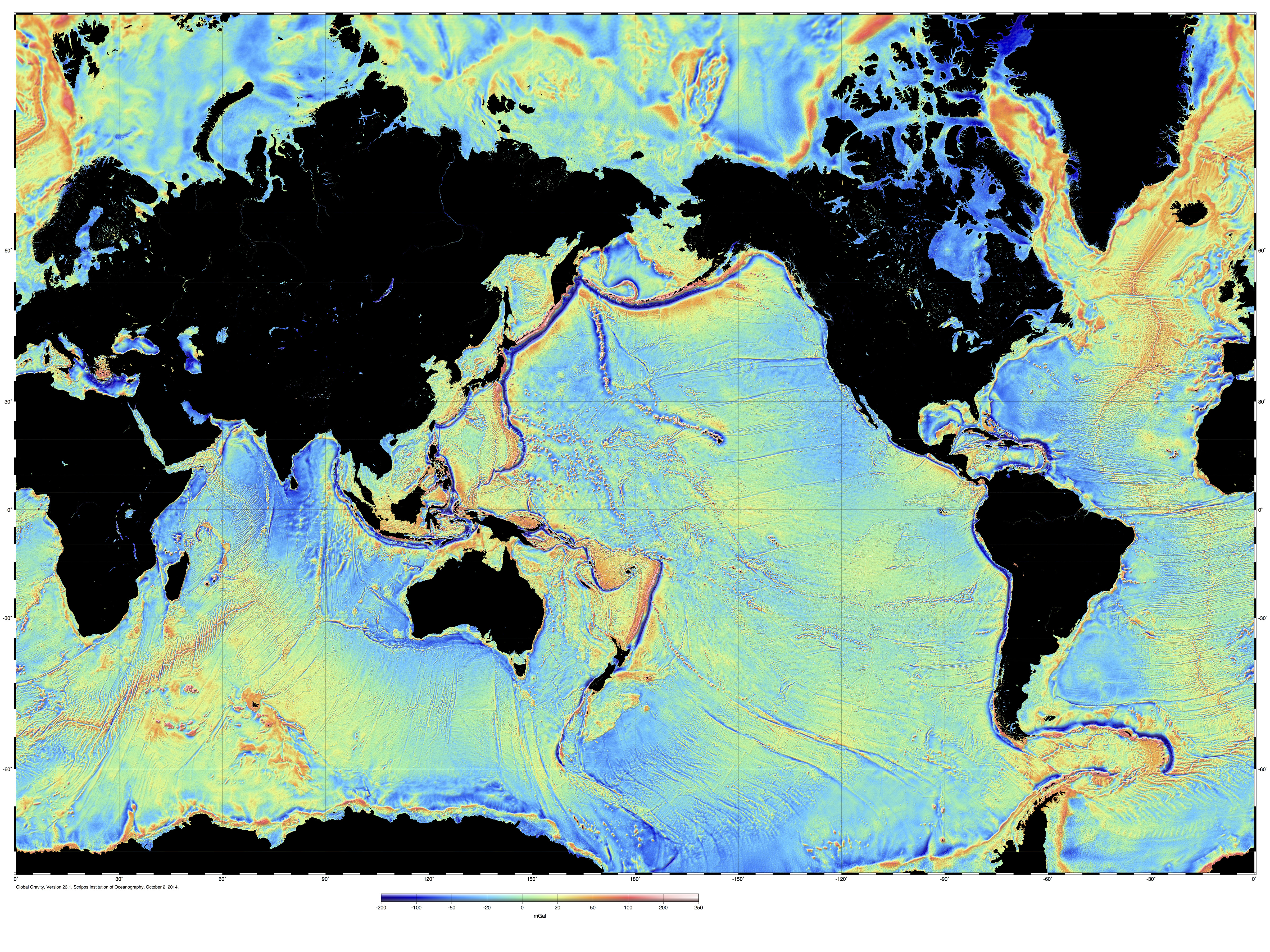
Publicly available multibeam data included in the Global Multi-Resolution Topography Synthesis covers only about 8 percent of the seafloor, (unshaded areas), although coverage is higher over continental margins and plate boundaries.
Credit: image from the Global Multi-Resolution Topography Synthesis,
For creating the most comprehensive global map of the ocean floor, Dr.David Sandwell received the Charles A. Whitten Medal, sponsored by the American Geophysical Union (AGU).
Sandwell, a geophysicist at Scripps Institution of Oceanography, accepted the award at the AGU Fall Meeting in December 2018.
Named after scientist Charles A. Whitten, the medal is given to honor "outstanding achievement in research on the form and dynamics of the Earth and planets."
Since the 1990s, sponsored by the Office of Naval Research (ONR), Sandwell has combined satellite data with acoustic depth measurements to develop a detailed, accurate map of the sea floor--painting a vivid tapestry of the deepest, least explored parts of the ocean.
The map catalogues thousands of previously unidentified underwater mountains, trenches, physical undersea connections between South America and Africa, and extinct ridges that spread the sea floor in the Gulf of Mexico.
"Dr. Sandwell's groundbreaking work provides the first high-resolution map of the ocean floor," said Dr. Tom Drake, head of ONR's Ocean Battlespace and Expeditionary Access Department.
"This has opened new research areas for oceanography, marine geology and geophysics--critical topics for the U.S. Navy."
About 8 percent of the seafloor has been mapped to 100-meter resolution like this.
Source: GeoMapApp
Sandwell's work relies on satellite altimetry (radar) to measure small bumps and dips on the ocean surface, which point to large-scale features on the ocean floor.
For example, undersea mountains are huge enough to exert gravitational pulls that gather water in a bump on the sea surface.
In contrast, massive cracks and rifts on the ocean floor have less gravitational attraction, resulting in a dip on the surface.
For utmost accuracy, Sandwell blends satellite measurements with traditional sonar soundings from manned research ships.
This enables him to compare the topography of the sea surface with that of the sea floor and form a complete map of the bottom.
Sandwell created multiple versions of his map over the last two decades.
He unveiled the first in 1997, based on marine gravitational data gathered by the Navy's GEOSAT Earth-observation satellite.
In 2014, he improved the original map by adding data from additional satellites operated by the National Aeronautics and Space Administration (NASA) and the European Space Agency.
"Dr. Sandwell's map is like a smart phone that improves with each new model," said Dr.
Reginald Beach, who sponsors Sandwell's work for ONR's Ocean Battlespace and Expeditionary Access Department.
"Each version teaches us more about the topography of the ocean bottom, which is crucial to safe navigation for the Navy."
Sandwell is now updating the 2014 map with information gathered by another pair of satellites run by NASA and the French space agency, CNES.
Other data comes from sonar soundings compiled by Australia, during that nation's participation in an international effort to scour the southern Indian Ocean in search of the wreckage of Malaysian Airways Flight 370--which disappeared in 2014.
Australia made the sonar data publicly available in 2017.
In the search for MH370, Geoscience Australia applied a GIS solution to support the world’s largest marine survey, mapping the seafloor in greater detail than ever to provide scientific insights.
"Thanks to this new data, our map can provide greater information about the world's oceans," said Sandwell, "particularly the Southern Hemisphere, which includes the Indian Ocean and south Atlantic Ocean.
I'm grateful to ONR for its valuable support over the years, which has been crucial to creating the most accurate sea floor map possible."
AGU is a not-for-profit, scientific organization with nearly 60,000 members in 139 countries.
A new MIT study finds that over the coming decades climate change will affect the ocean’s color, intensifying its blue regions and its green ones.
Image: NASA Earth Observatory
Climate-driven changes in phytoplankton communities will intensify the blue and green regions of the world’s oceans.
Climate change is causing significant changes to phytoplankton in the world’s oceans, and a new MIT study finds that over the coming decades these changes will affect the ocean’s color, intensifying its blue regions and its green ones.
Satellites should detect these changes in hue, providing early warning of wide-scale changes to marine ecosystems.
Writing in Nature Communications, researchers report that they have developed a global model that simulates the growth and interaction of different species of phytoplankton, or algae, and how the mix of species in various locations will change as temperatures rise around the world.
The researchers also simulated the way phytoplankton absorb and reflect light, and how the ocean’s color changes as global warming affects the makeup of phytoplankton communities.
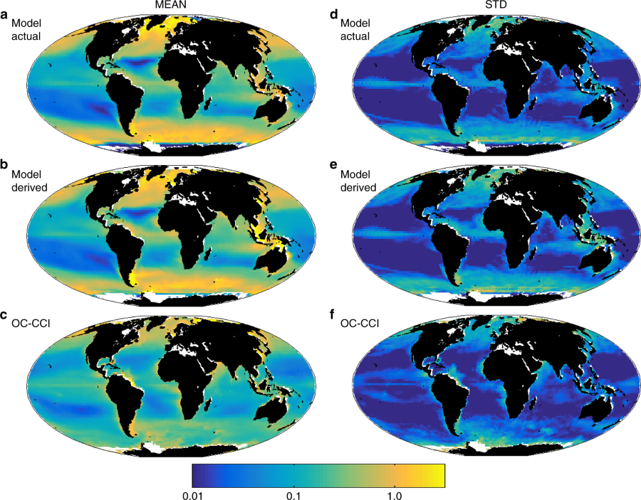
Current day Chl-a and its interannual variability.
Composite mean Chl-a (mg Chl m−3) for 1998–2015:
a model actual;
b model satellite-like derived (using an algorithm and the model RRS,);
c Ocean Colour Climate Change Initiative project (OC-CCI, v2) satellite derived. Interannual variability defined as the standard deviation of the annual mean composites (1998–2015):
d model actual;
e model satellite-like derived; f OC-CCI, v2 satellite derived. White areas are regions where model resolution is too coarse to capture the smaller seas, or where there is persistent ice cover.
Model actual Chl-a is the sum of the dynamic Chl-a for each phytoplankton type that is explicitly resolved in the model.
It is equivalent to the Chl-a that would be measured in situ.
This is distinct to satellite-derived Chl-a which is calculated via an algorithm derived from the reflected light measured by ocean colour satellite instruments
The researchers ran the model through the end of the 21st century and found that, by the year 2100, more than 50 percent of the world’s oceans will shift in color, due to climate change.
The study suggests that blue regions, such as the subtropics, will become even more blue, reflecting even less phytoplankton — and life in general — in those waters, compared with today.
Some regions that are greener today, such as near the poles, may turn even deeper green, as warmer temperatures brew up larger blooms of more diverse phytoplankton.
“The model suggests the changes won’t appear huge to the naked eye, and the ocean will still look like it has blue regions in the subtropics and greener regions near the equator and poles,” says lead author Stephanie Dutkiewicz, a principal research scientist at MIT’s Department of Earth, Atmospheric, and Planetary Sciences and the Joint Program on the Science and Policy of Global Change.
“That basic pattern will still be there. But it’ll be enough different that it will affect the rest of the food web that phytoplankton supports.”
Dutkiewicz’s co-authors include Oliver Jahn of MIT, Anna Hickman of the University of Southhampton, Stephanie Henson of the National Oceanography Centre Southampton, Claudie Beaulieu of the University of California at Santa Cruz, and Erwan Monier, former principal research scientist at the MIT Center for Global Change Science, and currently assistant professor at the University of California at Davis, in the Department of Land, Air and Water Resources. This research was supported, in part, by NASA and the Department of Energy.
The story of oceans and climate would not be complete until we explore the impact of weather and climate on marine life.
We also need to understand how ocean life, notably phytoplankton might modulate oceanic weather and climate, through their role in the global carbon cycle, and on the ocean heat budget. One way that phytoplankton influence the oceans is through heating.
Photosynthesis is quite inefficient, so much of the light absorbed by phytoplankton cells is released as heat.
Chlorophyll count
The ocean’s color depends on how sunlight interacts with whatever is in the water.
Water molecules alone absorb almost all sunlight except for the blue part of the spectrum, which is reflected back out.
Hence, relatively barren open-ocean regions appear as deep blue from space.
If there are any organisms in the ocean, they can absorb and reflect different wavelengths of light, depending on their individual properties.
Phytoplankton, for instance, contain chlorophyll, a pigment which absorbs mostly in the blue portions of sunlight to produce carbon for photosynthesis, and less in the green portions.
As a result, more green light is reflected back out of the ocean, giving algae-rich regions a greenish hue.
Since the late 1990s, satellites have taken continuous measurements of the ocean’s color.
Scientists have used these measurements to derive the amount of chlorophyll, and by extension, phytoplankton, in a given ocean region.
But Dutkiewicz says chlorophyll doesn’t necessarily reflect the sensitive signal of climate change.
Any significant swings in chlorophyll could very well be due to global warming, but they could also be due to “natural variability” — normal, periodic upticks in chlorophyll due to natural, weather-related phenomena.
“An El Niño or La Niña event will throw up a very large change in chlorophyll because it’s changing the amount of nutrients that are coming into the system,” Dutkiewicz says.
“Because of these big, natural changes that happen every few years, it’s hard to see if things are changing due to climate change, if you’re just looking at chlorophyll.”
In this extra video, Dr Michelle Gierach from NASA JPL outlines how models can be used to assess phytoplankton biodiversity, and how future satellite missions will lead to better monitoring of coral health, biodiversity and potentially even phytoplankton species.
Modeling ocean light
Instead of looking to derived estimates of chlorophyll, the team wondered whether they could see a clear signal of climate change’s effect on phytoplankton by looking at satellite measurements of reflected light alone.
The group tweaked a computer model that it has used in the past to predict phytoplankton changes with rising temperatures and ocean acidification.
This model takes information about phytoplankton, such as what they consume and how they grow, and incorporates this information into a physical model that simulates the ocean’s currents and mixing.
This time around, the researchers added a new element to the model, that has not been included in other ocean modeling techniques: the ability to estimate the specific wavelengths of light that are absorbed and reflected by the ocean, depending on the amount and type of organisms in a given region.
“Sunlight will come into the ocean, and anything that’s in the ocean will absorb it, like chlorophyll,” Dutkiewicz says.
“Other things will absorb or scatter it, like something with a hard shell. So it’s a complicated process, how light is reflected back out of the ocean to give it its color.”
When the group compared results of their model to actual measurements of reflected light that satellites had taken in the past, they found the two agreed well enough that the model could be used to predict the ocean’s color as environmental conditions change in the future.
“The nice thing about this model is, we can use it as a laboratory, a place where we can experiment, to see how our planet is going to change,” Dutkiewicz says.
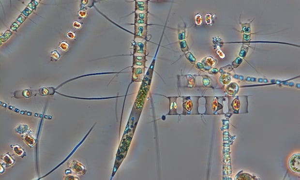
Marine diatom cells (Rhizosolenia setigera), which are an important group of phytoplankton.
Photograph: Karl Bruun/AP
A signal in blues and greens
As the researchers cranked up global temperatures in the model, by up to 3 degrees Celsius by 2100 — what most scientists predict will occur under a business-as-usual scenario of relatively no action to reduce greenhouse gases — they found that wavelengths of light in the blue/green waveband responded the fastest.
What’s more, Dutkiewicz observed that this blue/green waveband showed a very clear signal, or shift, due specifically to climate change, taking place much earlier than what scientists have previously found when they looked to chlorophyll, which they projected would exhibit a climate-driven change by 2055.
“Chlorophyll is changing, but you can’t really see it because of its incredible natural variability,” Dutkiewicz says.
“But you can see a significant, climate-related shift in some of these wavebands, in the signal being sent out to the satellites.
So that’s where we should be looking in satellite measurements, for a real signal of change.”
Though plankton can't be seen from space, NASA's SeaWIFS satellite can image the chlorophyll found in phytoplankton. Since the fall of 1997, NASA satellites have continuously and globally observed all plant life at the surface of the land and ocean. Satellites measured land and ocean life from space as early as the 1970s. But it wasn't until the launch of the Sea-viewing Wide Field-of-view Sensor (SeaWiFS) in 1997 that the space agency began what is now a continuous, global view of both land and ocean life. This video was created with data from satellites including SeaWiFS, and instruments including the NASA/NOAA Visible Infrared Imaging Radiometer Suite and the Moderate Resolution Imaging Spectroradiometer. On land, vegetation appears on a scale from brown (low vegetation) to dark green (lots of vegetation); at the ocean surface, phytoplankton are indicated on a scale from purple (low) to yellow (high). In the Northern Hemisphere, ecosystems wake up in the spring, taking in carbon dioxide and exhaling oxygen as they sprout leaves — and a fleet of Earth-observing satellites tracks the spread of the newly green vegetation. Meanwhile, in the oceans, microscopic plants drift through the sunlit surface waters and bloom into billions of carbon dioxide-absorbing organisms — and light-detecting instruments on satellites map the swirls of their color. The space-based view of life allows scientists to monitor crop, forest and fisheries health around the globe. Observations from space help determine agricultural production globally, and are used in famine early warning detection. But the space agency's scientists have also discovered long-term changes across continents and ocean basins. As NASA begins its third decade of global ocean and land measurements, these discoveries point to important questions about how ecosystems will respond to a changing climate and broad-scale changes in human interaction with the land. The climate is warming fastest in Arctic regions, and the impacts on land are visible from space as well. The tundra of Western Alaska, Quebec and elsewhere is turning greener as shrubs extend their reach northwards. And as concentrations of carbon dioxide in the atmosphere continue to rise and warm the climate, NASA's global understanding of plant life will play a critical role in monitoring carbon as it moves through the Earth system. Expanding these observations to the rest of the globe, the scientists could track the impact on plants of rainy and dry seasons in Africa, see the springtime blooms in North America, and the after-effects of wildfires in forests worldwide. The grasslands of Senegal, for example, undergo drastic seasonal changes. Grasses and shrubs flourish during the rainy season from June to November, then dry up when the rain stops. With early weather satellite data in the 1970s and '80s, NASA Goddard scientist Compton Tucker was able to see that greening and die-back from space, measuring the chlorophyll in the plants below. He developed a way of comparing satellite data from two wavelengths, which gives a quantitative measurement of this greenness called the Normalized Difference Vegetation Index. But land is only part of the story. At the base of the ocean’s food web are phytoplankton — tiny organisms that, like land plants, turn water and carbon dioxide into sugar and oxygen, aided by the right combination of nutrients and sunlight. Recent studies of ocean life have shown that a long-term trend of rising sea surface temperatures is causing ocean regions known as “biological deserts” to expand. These regions of low phytoplankton growth occur in the center of large, slow-moving currents called gyres. The next step for NASA scientists is actually looking at the process of photosynthesis from space. When plants undergo that chemical process, some of the absorbed energy fluoresces faintly back, notes Joanna Joiner, a NASA Goddard research scientist. With satellites that detect signals in the very specific wavelengths of this fluorescence, and a fine-tuned analysis technique that blocks out background signals, Joiner and her colleagues can see where and when plants start converting sunlight into sugars. Earth is still the only planet we know of with life - the one thing that, so far, makes Earth unique among the thousands of other planets we've discovered. With that in mind, our habitable home world seems evermore fragile and beautiful when considering the vastness of unlivable space.
According to their model, climate change is already changing the makeup of phytoplankton, and by extension, the color of the oceans.
By the end of the century, our blue planet may look visibly altered.
“There will be a noticeable difference in the color of 50 percent of the ocean by the end of the 21st century,” Dutkiewicz says.
“It could be potentially quite serious. Different types of phytoplankton absorb light differently, and if climate change shifts one community of phytoplankton to another, that will also change the types of food webs they can support.“
Satellite company Telesat will use Loon’s networking software to manage low Earth orbit constellations
Since its secret beginning in 2011, Loon has been pursuing the seemingly quixotic task of bringing internet to the world’s most remote corners via stratospheric helium balloons.
Now, after nearly a decade, the Alphabet-owned company is embarking on a new chapter, and it involves acknowledging it cannot accomplish the immense task of bringing billions of people online on its own.
Today, Loon is announcing a partnership with Canadian telecommunications company Telesat in a deal that will see Loon’s custom software service for managing its LTE balloon fleet be put to use controlling Telesat’s new constellation of low Earth orbit satellites.
It’s part of Loon’s realization that no one solution will get internet everywhere across the globe and that its technology can benefit a major player in an industry it once viewed as a potential competitor.
Telesat is launching a state-of-the-art satellite constellation of highly advanced satellites in low-earth-orbit (~1,000 km from earth; ~35 times closer than traditional satellites) that will seamlessly integrate with terrestrial networks.
The global network will deliver fiber quality throughput (Gbps links; low latency) anywhere on earth.
This is a highly flexible system that dynamically allocates capacity where there’s demand, thus maximizing system efficiency.
“The opportunity is bigger than any one of us,” says Loon CEO Alastair Westgarth, who explains that Loon came to learn that the solutions to some of its biggest hurdles were not just about developing better technology, but also about finding the right partners.
“During that learning process, we decided that we needed to seek collaboration.” While Loon has worked closely with telecoms to source internet access for its balloon networks in foreign countries, the company has never before licensed out proprietary technology as a packaged software service.
The partnership will bring Loon a new line of revenue, turning its software for controlling non-stationary aerial networks into a viable product for the satellite industry, which is now eyeing the lower portion of Earth’s atmosphere as a lucrative and untapped market.
Loon has spent a majority of its existence as an Alphabet-funded project developing this software, and it’s become an instrumental system for controlling the network traffic for Loon’s LTE service in areas like Brazil, Peru, and elsewhere around the globe where the company has performed field tests.
As a result of its successful work around the globe, and in helping bring Puerto Rico back online after Hurricane Maria, Loon has become increasingly focused on becoming a proper business, too.
Loon started life as one of Google’s moonshot projects, like the Waymo self-driving car program, but it was spun out into a standalone company under Alphabet last year, roughly a year and a half after Westgarth, a telecom industry veteran, took over as CEO.
Yet, Alphabet’s more experimental businesses cost it billions of dollars per year, and as a result, the companies that get spun out come under pressure to prove their worth and turn a profit.
At Access, the telecom unit that encompasses Google Fiber, and drone delivery outfit Project Wing, executive turnover has been frequent, while smart home company Nest has lost both its co-founders and was folded back into Google last year.
Alphabet’s solar-powered internet drone division, once a kind of sister project to Loon, was shut down in 2017.
Loon, however, remains one of the rare Alphabet companies now plotting a clear path toward becoming a viable, self-sustaining venture.
source : Alphabet
The Telesat partnership is the second commercial deal for Loon, after the company announced plans to help expand mobile networks for smartphone users in Kenya earlier this year.
Broadly speaking, these are Loon’s first steps in commercially addressing what it sees as a global hurdle for connecting the planet.
Around 3.5 billion people, or a bit under half the world’s population, don’t have access to the internet, according to the 2018 Global Digital report.
As it stands today, current options for bringing remote areas online, like geostationary satellites that sit more than 20,000 miles above the surface, provide ample coverage area, but suffer from high-latency and sluggish connection speeds.
They’re also immensely difficult and expensive to maintain.
For companies like Loon and Telesat, newer solutions ranging from satellites in low Earth orbit — a more cost-effective and lower latency portion of space — to stratospheric balloons and airships are necessary to begin bridging the gap.
And it’s no longer about providing a single, one-size-fits-all solution, but a patchwork of different approaches all targeting different segments of the connectivity problem.
Not only is internet access critical to upward mobility in developing countries, but its lack of availability is also an impediment to the future success of a Silicon Valley giant like Google.
While Google is technically another Alphabet subsidiary, many of the companies outside the Google bubble can be seen as pursuing goals that the search giant stands to benefit from.
And Alphabet as a whole can only grow and continue thriving — and writing the healthy paychecks that keep the lights on at companies like Loon — if more internet users come online and start using ad-supported web services like Google search and Gmail.
Going forward, Westgarth says Loon will continue to push more of its technology into the commercial space and telecom sectors, as it sees fit.
“As we develop a capability — some intellectual property or some tech applicable outside Loon — we will make a determination,” he says.
“Do we commercialize it? If yes, how do we find a partner and license it?”
Because balloons move, the network of links between them must change constantly in order to deliver sustained connectivity below.
The tech being licensed to Telesat is what Loon is calling a “temporal-spatial” SDN, short for software-defined network.
It was developed to manage Loon’s fleet of LTE balloons using learnings from Google’s years of experience building custom data center architectures and management tools.
Such a technology was needed because Loon’s balloons shift in the sky depending on weather conditions, the locations of other balloons, the direction each balloon is facing, and a number of other factors that influence the stability of the network and its connection to people’s smartphones on the ground.
At any given moment, Loon’s software is automatically adjusting the shape of the network to manage the data passing between each node and ultimately beaming down to and up from the surface of the Earth.
In a normal cell network, the cell towers are stationary, and “you’re the only thing moving around,” explains Sal Candido, Loon’s head of engineering.
With Loon, however, “it was pretty apparent early on that our towers would be moving around.” According to Candido, there didn’t exist a technology that could manage such a complex task.
So Loon decided to build it.
The task was not easy — Loon’s LTE balloons operate at around 20 kilometers, or more than 65,000 feet, in the sky.
They cannot be adjusted on the fly; you can’t send a technician into the stratosphere to fiddle with the balloon’s antennas.
So the team began researching the way aerospace networks were first set up by organizations like NASA.
It’s something Loon’s Brian Barritt, a networking expert and former consultant for the NASA Glenn Research Center, had unique insight into.
“A lot of this started off with a general solution trying to support many different types of aerospace networks.
We looked at a lot of things...
planes, satellites,” says Barritt, who joined Google in 2014 and now acts as the technical lead for the temporal-spatial SDN product.
“From the start, we were trying to build something that would solve this class of problem: a high-throughput network where people are moving and the network is moving.”
The result was an unprecedented network architecture, or what the Loon team nicknamed “Minkowski,” after the German mathematician Hermann Minkowski that translated Albert Einstein’s theory of relativity into a geometric representation of space-time.
Its unique characteristic is that it uses software to virtually control a network that shifts both in its physical orientation and across time simultaneously, all while the physical recipients of the connection are also moving on the ground, on a ship at sea, or even on an airplane traveling 550 mph.
To connect the balloons together in any given deployment area, Loon needs to set up a communication link between a ground station and one of its vehicles.
The custom software system then transfers that link to other balloons using a set of three antennas affixed to rotating gimbals on each balloon’s payload.
That payload also holds the networking hardware, helium source, and the means by which the balloon can stay powered in the air using a mix of solar energy and batteries.
The SDN manages that whole process by predicting which balloons will handle which requests and how best to send that data across the network.
It then automates the morphing of the “topology” of the network, essentially its physical arrangement, as well as scheduling those changes multiple minutes out and predicting how it will need to adjust going forward.
In that way, a Loon network can reliably mimic a terrestrial LTE one, even as it floats in the sky. Back in September of last year, Loon announced it was able to string one such connection across seven balloons spanning 621 miles, a feat that would have been impossible without the aid of Minkowski.
The visual interface of Loon’s temporal-spatial SDN software that Telesat will use to manage low Earth orbit satellites.
In developing the software, Loon discovered that the product could be especially useful to satellite companies that are expanding into low Earth orbit, where satellites shift around in space.
Because they’re closer to the surface of the planet, these satellites can provide faster connections, and they’re also cheaper to launch.
But that area of the atmosphere requires that the satellites, like the International Space Station, constantly orbit the Earth to avoid reentry.
In that way, LEO satellites start to resemble Loon balloons, although they’re much, much higher in the sky.
(An LEO satellite sits approximately 35 times closer to the Earth than a standard geostationary one, but roughly 50 to 100 times higher than a Loon balloon.) “The same type of technology we used to manage the mobility of the balloon makes a ton of sense for these non-geostationary satellite constellations,” explains Candido.
Telesat doesn’t plan to beam down LTE to your average smartphone user, at least not in the near-term.
Instead, the company plans to use its LEO satellites primarily to provide connections to remote areas of Earth, such as research vessels in the ocean and cruise ships as well as for in-flight Wi-Fi and other forms of midflight satellite connections.
(Interestingly, Telesat is partnering with Amazon’s Blue Origin to launch its LEO satellites, whereas Alphabet is an investor in SpaceX, both a Blue Origin competitor for space travel and Telesat competitor due to SpaceX’s planned Starlink constellation.)
But for Loon, this is a first step in helping position its technology to bring universal, global connectivity closer to reality.
One day in the future, Barritt envisions these stratospheric internet stations could become the backbone of a new kind of aerial internet infrastructure.
“They could be used to handle urban densification, to work with satellites and different generation of Loon balloons, high-altitude solar gliders or airships,” he says.
“All interoperable.”
Of course, in that vision of the future, it’s Loon software that becomes the glue that holds it all together.
It’s a fittingly optimistic dream for a former moonshot project of Alphabet’s X lab that, all these years later, looks like it’s finally gotten off the ground.
In early January, a team of Cambridge scientists set out on an
expedition to study and map the Larsen C ice shelf in western
Antarctica, and – ice conditions permitting – search for the wreckage of
Sir Ernest Shackleton’s Endurance.
Professor Julian Dowdeswell, Director of the Scott Polar Research
Institute, is chief scientist on the ambitious expedition, which will
use drones, satellites and autonomous underwater vehicles to study ice
conditions in the Weddell Sea in unprecedented detail.
The Weddell Sea is also the site of one of the most famous stories from
the ‘Heroic Age’ of polar exploration.
The Imperial Trans-Antarctic Expedition 1914-17 set out to cross
Antarctica via the South Pole.
However, in November 1915, Shackleton and
his 28-man crew were confronted with one of the worst disasters in
Antarctic history when Endurance was trapped, crushed and sunk by pack
ice.
The outside world was unaware of their predicament or location,
food was scarce and the chance of survival was remote.
In this film, Professor Dowdeswell tells the incredible story of
Endurance, and how he and the other members of the Weddell Sea
expedition hope to locate the wreckage of one of the most iconic vessels
in polar exploration.
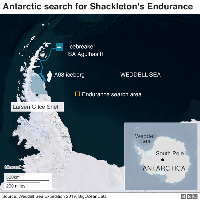
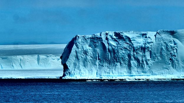
A scientific expedition in the Antarctic has set out on a quest to find Sir Ernest Shackleton's lost ship.
The team has spent the past two weeks investigating the Larsen C Ice Shelf and the continent's biggest iceberg, known as A68.
And this puts it just a few hundred km from the last recorded position of the famous British explorer's vessel, the Endurance.
The polar steam-yacht was crushed in sea-ice and sank in November 1915.
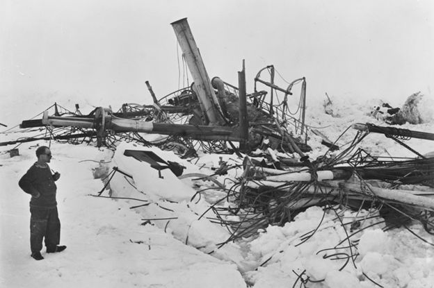
Endurance just before it sank: Crushed at the stern, it went down bow first
Shackleton's extraordinary escape from this loss, saving his crew, means there is considerable interest in finding the wreck.
Endurance should be resting on the ocean floor, some 3,000m down.
The Weddell Sea Expedition 2019 team wants to grab the chance of making the discovery, using robotic submersibles.
On Sunday, the researchers announced that their work at Larsen and A68 was complete, and that they would now concentrate on finding the wreck.
But the group will have a tough job reaching its presumed location, concedes chief scientist Prof Julian Dowdeswell.
"We've got a journey of several hundred km from where we are now through really heavy and quite difficult sea-ice," he told BBC Radio 4's Inside Science programme last Thursday.
"We shall do our best to get there with the excellent ice-breaker that we have, but in any given year it will be very difficult to judge whether you will be able to penetrate the sea-ice."
Antarctica is one of the most remote and unforgiving places on our planet. This week, one of our AUVs got stuck underneath an ice floe! With perseverance, a lot of ice breaking and team work we successfully recovered Ocean Infinity’s new under ice AUV! #weddellseaexpedition2019pic.twitter.com/JNC1ZCLDtJ
— Weddell Sea Expedition 2019 (@WeddellSeaExped) January 24, 2019
The team has a very good idea of where the Endurance should be.
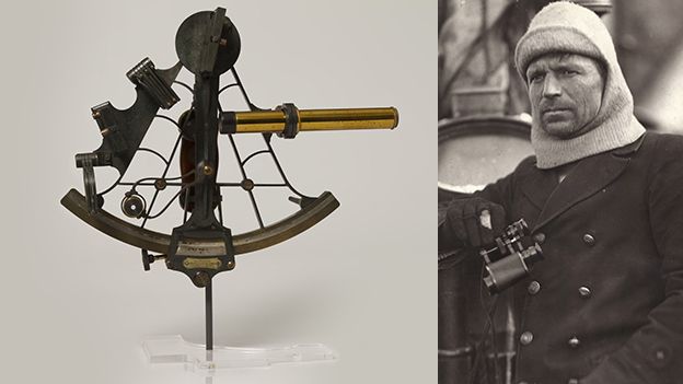
Shackleton's skipper on the vessel, Frank Worsley, was a highly skilled navigator, and used a sextant and chronometer to calculate the sinking's co-ordinates - 68°39'30.0" South and 52°26'30.0" West.
Estimated position with the GeoGarage platform (NGA nautical chart)
The ship is almost certainly within a few nautical miles of this point.
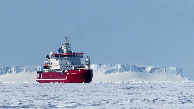
If Prof Dowdeswell's ice-breaker, the SA Agulhas II, can get reasonably close - it will be game-on.
Frank Worsley used his sextant to record the position of the sinking
Scott Polar Research Institute, Cambridge Uni
The American geophysical survey company Ocean Infinity is part of the Weddell Sea Expedition group.
It has a Kongsberg Hugin autonomous underwater vehicle that it will deploy to map a 20km by 20km grid square on the ocean floor.
If it succeeds in locating the Endurance, a remotely operated vehicle will then be sent down to photograph the wreck site.
The organisms that normally consume sunken wooden ships do not thrive in the cold waters of the Antarctic, so there is optimism that Endurance's timbers are well preserved.
That said, crushing forces had done quite a bit of damage to the vessel before she slipped below the floes.
"I think that if we locate the Endurance, the greater likelihood will be that her hull is semi-upright and still in a semi-coherent state," commented marine archaeologist Mensun Bound.
"However, on the evidence of the only deep-water wooden wreck I have been privileged to study, I must concede that there is every possibility that she could have been wrenched wide open by impact (with the seafloor), thus exposing her contents like a box of chocolates," he wrote on his expedition blog.
The SA Agulhas II needs the sea-ice conditions to be favourable
Luck has been with the Weddell cruise so far.
Attempts to get to Larsen C in recent years by other expeditions were thwarted by the sea-ice conditions, but the SA Agulhas II made the most of favourable circumstances to reach Larsen and complete an extensive range of studies.
The ice shelf is the fourth largest such structure in the Antarctic.
It is an amalgam of glacier fronts that have flowed off land and lifted up to form a floating platform.
Larsen C is the fourth largest ice shelf in the Antarctic
Similar shelves to the north have collapsed in past decades and researchers want to understand the current status and likely future prospects of Larsen C.
Was the calving from the shelf of the monster berg A68 in July 2017 just part of a natural cycle, or an indication that changes are coming?
"We have acquired detailed observations on the glaciology, oceanography, biology, and geology of the little known area around the Larsen C Ice shelf and the huge A68 iceberg," said Prof Dowdeswell, who is also the director of the Scott Polar Research Institute in Cambridge, UK.
"Analysis of this data will allow us to better understand the contemporary stability and past behaviour of Larsen C, with its wider implications for ice sheet stability more generally."
This animated map shows the history of temperature changes around the world from 1850 to 2018. Each frame is a 12-month moving average and shows the difference the temperature then observed and the average climate from 1951 to 1980. The long-term history of global warming is clearly represented. One can also see a variety of short-term fluctuations associated with variations in weather patterns and internal variability, such as the El Nino/La Nina pattern in the Equatorial Pacific. This animation is based on the work of Berkeley Earth.
This animation shows how annual average temperatures have changed for countries and regions around the world from 1850 to 2018.
Each frame of the animation indicates a 12-month moving average of national or regional temperature and how much higher or lower that average was compared to the average climate during the period 1951 to 1980.
Countries are organized into regional groups.
The size and color of the circle at each time indicates the temperature difference.
This animation is based on the data produced by Berkeley Earth.
The design of this animation was inspired by a previous animation by Antti Lipponen.


:format(webp):no_upscale()/cdn.vox-cdn.com/uploads/chorus_asset/file/9645521/alphabet_project_loon_puerto_rico_1.jpg)
/cdn.vox-cdn.com/uploads/chorus_asset/file/13724462/Loon_SDN_Balloons.gif)
:format(webp):no_upscale()/cdn.vox-cdn.com/uploads/chorus_asset/file/13724806/Loon_SDN_Interface.png)