Today, SpaceX made history. It is the first company—the first anybody to send a rocket to space and then land it on a floating barge. Sixth time is the charm, apparently. Persistence pays off. Or at least, anyone with an interest in low cost access to space hopes it will. The launch was flawless. At 4:43pm ET, the nine engines on board the Falcon 9’s stage 1 rocket began pushing 1.53 million pounds of thrust against Earth. After about two and a half minutes, and several hundred thousand feet of elevation gain, the first stage detached and began a controlled fall back to Earth, arcing towards the football field-sized barge (charmingly-named “Of Course I Still Love You”) in the Atlantic Ocean.
This is the second time SpaceX has successfully landed one of its rockets post-launch; the first time was in December, when the company's Falcon 9 rocket touched down at a ground-based landing site in Cape Canaveral, Florida, after putting a satellite into space.
Now that SpaceX has demonstrated it can do both types of landings, the company can potentially recover and reuse even more rockets in the future.
And that could mean much greater cost savings for SpaceX.
Mastering the ocean landing is going to be important, since that’s the type of landing SpaceX will probably conduct more often.
At a recent NASA press conference, Hans Koenigsmann, vice president of mission assurance for SpaceX, said the next two to three flights will involve drone ship landings.
Ultimately, the company expects to land one-third of its rockets on land, and the rest at sea.
Rocket landing 'Another step toward the stars,' Elon Musk says
Why does SpaceX keep focusing on these ocean landings?
A drone ship floating on the ocean is a harder target to hit than a large expanse of ground, since it is smaller and floating on moving water.
Still, landing at sea can be less tricky than ground landings, and the main reason has to do with fuel.
To return back to Earth, the Falcon 9 has to use the fuel leftover from takeoff to reignite its engines in a series of burns.
These burns help to adjust the rocket's speed and reorient the vehicle into the right position for entering Earth's atmosphere and then landing.
Different types of landing techniques require different amounts of fuel, though, and that revolves around how the Falcon 9 launches.
The rocket doesn't travel straight upward into space but follows a parabolic arc up and away from the launch pad.
Onboard view of SpaceX Falcon 9 rocket landing in high winds
Because of this, the rocket has to go through a lot to conduct a ground landing.
The vehicle has to slow down in the direction it's heading, completely turn around, and then retread the vertical and horizontal distance it's covered to get back to the landing site.
That requires a lot of extra fuel.
Ocean landings aren't as complicated as that. SpaceX's drone ship can position itself in an ideal place to "catch" the vehicle on its more natural path back to Earth.
That decreases the distance the rocket needs to travel, as well as the amount of fuel needed to maneuver the Falcon 9 for landing.
For SpaceX missions that use up lots of fuel, performing a ground landing may not even be possible.
Rockets that launch heavy payloads or go to a high orbit need extra speed during the initial ascent, and extra speed needs more fuel.
Those Falcon 9s that have to reach extra high velocities don't have as much fuel leftover for the landing.
That’s when the drone ship is the best — if not only — option for recovery.
The whole point of landing these rockets is to help save SpaceX money on launch costs.
Right now, most rockets are destroyed or lost after they launch into space, meaning entirely new rockets must be built for each mission.
SpaceX hopes to recover as many rockets as possible to cut down on cost of creating new vehicles. The Falcon 9 costs $60 million to make and only $200,000 to fuel.
iBubble, is the first autonomous and wireless underwater camera.
The iBubble
drone camera follows your underwater outings, autonomously and in
high-definition.
You become your own director, creating professional
pictures.
iBubble is the brainchild of diver Kevin Delfour and tech enthusiast
Xavier Spengler.
As they looked for a way to create quality submarine
videos with minimal equipment, the idea of an autonomous camera that was
able to follow and film divers underwater became evident.
The pair
turned to Startup Maker to create the product (Startup Maker is the
French startup studio behind Hexo+, the follow drone that raised $1.3M last year on Kickstarter). iBubble is currently being developed in France.
Early on in the development of the product, Guillaume Néry was pulled
into the project.
Guillaume is a freediving champion (126m vertical
depth), and filmmaker.
He currently is the company’s ambassador.
Free from heavy video equipment, you simply enjoy your dive.
The
wireless iBubble follows divers and swimmers in the deep, thanks to its
intelligent onboard software.
While silently capturing your submarine journey, it understands your
way of diving.
Gliding with you, analyzing your moves, sharing with your
friends what you see and where you are.
Guillaume Néry : "Intelligent, it silently captures your submarine journey. It understands your way of diving. Gliding with you, analyzing your moves, sharing with your team what you see and where you are."
iBubble shadows you via a connected bracelet.
Smart and wireless, you
can let it follow you while you focus on your diving.
Features on the
iBubble include Follow me, 360° selfie, zoom in, zoom out and several
filming mode.
Switch between them with a touch of your bracelet.
Connect your camera to iBubble for instant 2D or 3D video capability.
The camera comes to life when the drone touches the water and withstands
depths of up to 230ft. Thanks to integrated LED lights that adapt to
the ambient light level, iBubble captures quality video, always.
iBubble will follow you for 1 hour on one battery. Simply swap
batteries for a longer outing.
Once the battery is empty, the drone
automatically resurfaces.
LED lights make it easy to locate.
iBubble works with most action sports cameras, including GoPro®
Hero.
No more bulky camera housing cases! iBubble keeps your equipment
safe, in style.
With convenient handles, the drone is a breeze to
transport on land.
Pre-sales for the iBubble start in February 2016, with working
prototypes being shipped to testers in September 2016.
General sales
will start in January 2017.
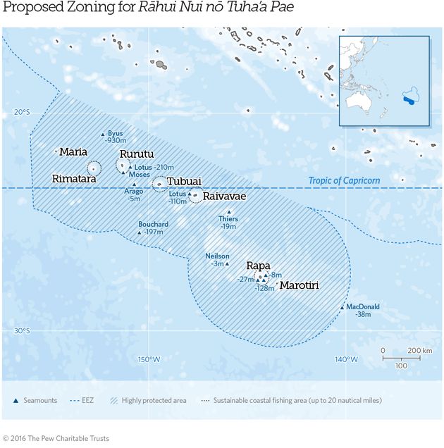
The Austral Islands reserve, if approved, would be roughly the size of California, Nevada and Arizona combined.
In an effort to protect fisheries and preserve one of the planet’s healthiest marine ecosystems,
communities in a remote archipelago south of Tahiti are working to
establish the largest fully protected marine reserve on the planet.
Austral islands with the GeoGarage platform (SHOM chart)
The proposal, which municipalities in the Austral Islands presented
to the French Polynesian government on Monday, would ban fishing in more
than 385,000 square miles of ocean surrounding the island chain and
establish sustainable coastal fishing areas around each of its five
inhabited islands. The Pew Charitable Trusts,
which helped the communities draft their proposal, said in an
announcement on Tuesday that islanders hope the reserve will “help
maintain healthy fish stocks to feed their families and support local
fishermen while maintaining Polynesian customs that date back hundreds
of years.”
The reserve, if approved, would be roughly the size of California, Nevada and Arizona combined.
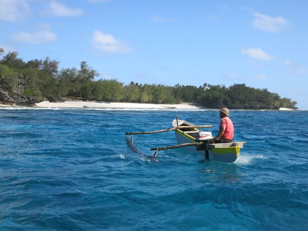
A fisherman off the coast of the Austral Islands.
The Pew Charitable Trusts
Jérôme Petit, director of Pew’s Global Ocean Legacy campaign in French Polynesia, told The Huffington Post that the 6,000-plus residents of Rimatara, Rurutu, Tubuai, Raivavae and Rapa are concerned about the environmental damage affecting the world’s fisheries.
“They say, ‘We fish now in one day what we could fish 20 years ago in one hour,’” Petit said.
The reserve would extend roughly 200 nautical miles around each island, with the exception of the islands’ northern coasts.
Sustainable coastal fishing areas extending 20 miles from each island would allow local anglers to fish from boats that are less than 25 feet long, according to the proposal.
Petit told HuffPost that the “whole community is really on board” with the idea.
The only opposition, he said, came from large fishing operations in Tahiti, which rarely fish in the area but voiced concerns that the reserve would prevent them from doing so in the future.
According to the proposal, fish from Austral waters account for less than 2 percent of French Polynesia’s overall catch, so the reserve wouldn’t have much of an impact on commercial fishing operations.
“We are pretty confident it will go through,” Petit said by email.
“The only question is when. But since there is such as strong public support, the government will probably move forward rather quickly.”
This map shows the extent of the proposed protected area around the Austral Islands.
The sanctuary’s proposed name, Rāhui Nui Nō Tuhaa Pae, or “the big rāhui of the Austral Islands,” is a reference to the traditional Polynesian practice of rāhui, which involves conserving a resource by restricting access to it.
“In the 1980s, we witnessed overfishing along our coastlines as
modern fishing techniques and freezers arrived to our island,” Tuanainai
Narii, the mayor of Rapa, said in a statement.
“We brought our fish
stocks back to healthy levels by reinstating a coastal rāhui.”
Now, Narii added, the island communities have seen the threat facing
the world’s oceans and “recognize that more must be done to conserve
pelagic fish stocks.”
Global populations of scombridae, the family of
fish that includes tuna and mackerel, declined 74 percent between 1970 and 2010.
According to Pew, the Austral Islands are a “hot spot of marine biodiversity.”
Of the 455 species of mollusks found there, 98 are endemic.
The islands
are also home to numerous species of sharks, rays, corals and fish.
The Austral Islands’ proposal would establish sustainable fishing areas
extending 20 miles from each of the chain’s five inhabited islands.
By designating the marine reserve, French Polynesia would fulfill a commitment it made in 2013 to protect at least 20 percent of its surrounding waters by 2020.
The overseas collectivity of France is already home to the largest
marine mammal and shark sanctuaries in the world.
The latest proposal
simply confirms the islands are serious about leading the way in ocean
conservation, Petit said in a release.
“A marine reserve of this magnitude would add to the growing movement
by Pacific island governments to protect their waters to improve the
health of the ocean,” he said.
Last year, New Zealand established Kermadec Ocean Sanctuary,
the world’s third-largest fully protected marine area.
Currently, the
world’s largest sanctuary is the United Kingdom’s Pitcairn Islands in
the Pacific Ocean, which measures 322,000 square miles.
The Austral
Islands’ reserve would be 63,000 square miles larger.
Strong El Nino events have a big impact on
phytoplankton (in green), especially when the warm water pushes far to
the east of the Pacific Ocean, as in 1997.
El Niño years can have a big impact on the littlest plants in the ocean, and NASA scientists are studying the relationship between the two.
In El Niño years, huge masses of warm water – equivalent to about half of the volume of the Mediterranean Sea – slosh east across the Pacific Ocean towards South America.
While this warm water changes storm systems in the atmosphere, it also has an impact below the ocean’s surface.
These impacts, which researchers can visualize with satellite data, can ripple up the food chain to fisheries and the livelihoods of fishermen.
El Niño’s mass of warm water puts a lid on the normal currents of cold, deep water that typically rise to the surface along the equator and off the coast of Chile and Peru, said Stephanie Uz, ocean scientist at Goddard Space Flight Center in Greenbelt, Maryland.
In a process called upwelling, those cold waters normally bring up the nutrients that feed the tiny organisms, which form the base of the food chain.
"An El Niño basically stops the normal upwelling," Uz said.
"There’s a lot of starvation that happens to the marine food web."
These tiny plants, called phytoplankton, are fish food – without them, fish populations drop, and the fishing industries that many coastal regions depend on can collapse.
El Niño years can have a big impact on the littlest plants in the ocean, and NASA scientists are studying the relationship between the two. Ocean color maps, based on a month's worth of satellite data, show El Niño's impact on phytoplankton.
With NASA satellite data, and ocean color software called SeaDAS,
developed at the Ocean Biology Processing Group at Goddard, Uz has been
mapping where these important phytoplankton appear. Orbiting instruments
like the Moderate Resolution Imaging Spectrometer on the Aqua
satellite, and the Visible Infrared Imaging Radiometer Suite on the
Suomi NPP satellite collect data on the color of the ocean.
From shades
of blue and green, scientists can calculate the amount of green
chlorophyll – and therefore the amount of phytoplankton present.
The ocean color maps, based on a month’s worth of satellite data, can
show that El Niño impact on phytoplankton.
In December 2015, at the
peak of the current El Niño event, there was more blue – and less green
chlorophyll – in the Pacific Ocean off of Peru and Chile, compared to
the previous year.
Uz and her colleagues are also watching as the El
Niño weakens this spring, to see when and where the phytoplankton
reappear as the upwelling cold water brings nutrients back to the
region.
"They can pop back up pretty quickly, once they have a source of nutrients," Uz said.
Researchers can also examine the differences in ocean color between
two different El Niño events.
During the large 1997-1998 El Niño event,
the green chlorophyll virtually disappeared from the coast of Chile.
This year’s event, while it caused a drop in chlorophyll primarily along
the equator, was much less severe for the coastal phytoplankton
population.
The reason – the warmer-than-normal waters associated with
the two El Niño events were centered in different geographical
locations.
In 1997-1998, the biggest ocean temperature abnormalities
were in the eastern Pacific Ocean; this year the focus was in the
central ocean.
This difference impacts where the phytoplankton can feed
on nutrients, and where the fish can feed on phytoplankton.
"When you have an East Pacific El Niño, like 1997-1998, it has a much
bigger impact on the fisheries off of South America," Uz said.
But
Central Pacific El Niño events, like this year’s, still have an impact
on ocean ecosystems, just with a shift in location.
Researchers are
noting reduced food available along the food chain around the Galapagos
Islands, for example.
And there has been a drop in phytoplankton off the
coast of South America, just not as dramatically as before.
Differences in December phytoplankton abundances
are visualized for three years: during the strong East Pacific El Nino
of 1997 (using SeaWiFS satellite data), during a normal year in 2013
(using data from MODIS on the Aqua satellite), and during the strong
Central Pacific El Nino of 2015 (MODIS/Aqua).
Credits: Uz/NASA Goddard
Scientists have more tools on hand to study this El Niño, and can
study more elements of the event, Uz said.
They’re putting these tools
to use to ask questions not just about ocean ecology, but about the
carbon cycle as well.
"We know how important phytoplankton are for the marine food web, and
we’re trying to understand their role as a carbon pump," Uz said.
The
carbon pump refers to one of the ways the Earth system removes carbon
dioxide from the atmosphere.
When phytoplankton die, their carbon-based
bodies sink to the ocean floor, where they can remain for millions of
years.
El Niño is a naturally occurring disruption to the typical ocean
currents, she said – so it’s important to understand the phenomenon to
better attribute what occurs naturally, and what occurs due to
human-caused disruptions to the system.
Other scientists at Goddard are investigating ways to forecast the
ebbs and flows of nutrients using the center’s supercomputers,
incorporating data like winds, sea surface temperatures, air pressures
and more.
"It’s like weather forecasts, but for bionutrients and phytoplankton
in the ocean," said Cecile Rousseaux, an ocean modeler with Goddard’s
Global Modeling and Assimilation Office.
The forecasts could help
fisheries managers estimate how good the catch could be in a particular
year, she said, since fish populations depend on phytoplankton
populations.
The 1997-1998 El Niño led to a major collapse in the
anchovy fishery off of Chile, which caused economic hardships for
fishermen along the coast.
So far, Rousseaux said, the phytoplankton forecast models haven’t
shown any collapses for the 2015-2016 El Niño, possibly because the warm
water isn’t reaching as far east in the Pacific this time around.
The
forecast of phytoplankton populations effort is a relatively new effort,
she said, so it’s too soon to make definite forecasts.
But the data so
far, from the modeling group and others, show conditions returning to a
more normal state this spring.
The next step for the model, she said, is to try to determine which
individual species of phytoplankton will bloom where, based on nutrient
amounts, temperatures and other factors – using satellites and other
tools to determine which kind of microscopic plant is where.
"We rely on satellite data, but this will go one step further and give us even more information," Rousseaux said.
If you jumped in the ocean at Atlantic City, N.J., and started
swimming in a straight line, where in the world do you think you would
end up?
The answer, surprisingly, is South America, according to a new map project by cartographer Andy Woodruff. If you start swimming now, you just might end up in Rio in time for the summer Olympics.
These earlier maps, like the one above, showed what is due east or
west of you when you are standing on any given beach around the world.
As those maps indicate, what's directly east of Atlantic City is
actually Portugal.
But as Woodruff points out, when you're
standing on a beach, you're rarely facing directly east or west.
Most of
the time you're facing perpendicular to the shore and staring out at
the water.
Since coastlines around the world twist and turn in extreme
directions, you could be facing any direction, not just east or west.
So
Woodruff created the beautiful series of maps below, which highlight
the beaches around the world that face a particular continent.
He used medium scale Natural Earth data to calculate the angle of the coast at regular intervals, then drew a line directly out to sea to see where it would end up.
In
this image, lines are drawn from the beaches where you would hit
Australia or Oceania if you went straight ahead and didn't turn.
Here is what Woodruff's maps look like for other continents:
If you're wondering why the lines on these maps look like they do,
the short answer is that the earth is round.
Woodruff's lines follow a
great circle arc, which look curved on flat maps but are the shortest
and straightest lines between two points on a sphere.
This is why, if
you've ever traveled long distances on an airplane, you might have
noticed that it looks like the plane is making an arc on the map -- it's
a two-dimensional representation of the shortest path in a
three-dimensional space.
You can read more about this and Woodruff's maps here.
The United Kingdom Hydrographic Office (UKHO) has reported a rising
number of counterfeit copies of charts and publications, and has issued a
reminder that the use of unauthorized, unvalidated information may be
unlawful and dangerous.
The counterfeit Admiralty products haven't been reviewed by UKHO's
staff, who ensure the quality of charts and publications widely used for
navigation around the world, and the content doesn't necessarily come
from any relevant government source or hydrographic office.
Its use for
navigation could be hazardous, UKHO says.
In addition, fake charts do not satisfy SOLAS carriage requirements,
and may violate the laws of flag and port state authorities, plus
international copyright laws.
In nations which are signatory to the
Berne Convention on intellectual property rights, authorities have the
ability to seize counterfeit documents.
UKHO has issued a guide
to identifying counterfeit products, including photos of the originals
displayed adjacent to photos of the fakes.
The office suggests that
mariners with suspicions about the authenticity of their sailing
directions or charts to contact UKHO directly.
Damian Bowler, chief commercial officer of the UKHO, said that “while
some of the counterfeits are very easy to spot, others are more
difficult to detect.
The UKHO continues to urge all purchasers, users,
inspectors and regulators to look out for counterfeit ADMIRALTY charts
and publications.
Counterfeit versions . . . cannot be trusted for
voyage planning or navigational purposes.
They are unsafe, unofficial,
non-compliant with SOLAS and illegal to carry or sell.
Buyers also carry
the considerable risk of failing port state inspections.”
“We are continuing to seek and stop the production and sale of
counterfeit copies of ADMIRALTY products and have raised our concerns
with the International Maritime Organization, the International
Hydrographic Organisation and Flag States. We also encourage anyone that
suspects they may be in possession of counterfeit products to get in
touch with us,” he said.
We are asking users of ADMIRALTY Maritime Products & Services to be aware of counterfeit products that are currently in circulation.
These products have not been issued officially by or on the authority of a Government, authorized Hydrographic Office or other relevant Government institution and do not satisfy the carriage requirements of the International Convention on the Safety of Life at Sea (see Chapter V, Regulations 2.2 and 19.2.1.4 of the Convention).
Furthermore, these counterfeit ADMIRALTY products have not undergone the rigorous checking procedures which take place for official versions; posing a significant safety risk to vessels, crews and cargo.
This simple guide has been provided to help you identify genuine ADMIRALTY products and reduce the risk of counterfeits being used for navigation.
If you do find a counterfeit product, please inform the UKHO by contacting our customer services team.
Details of where and when the product was purchased, photographs and ideally the product itself should be provided to help us identify the source.
Publications
Publications published since October 2014 include a certificate of authenticity.
This can be found inside the rear cover of the publication or within the opening pages.
The certificate should be stamped and dated by the issuing Chart Agent to certify it is a genuine ADMIRALTY product.
Publications published since October 2014 include a grey graphic showing the UKHO crest across random pages.
If photocopied, the words ‘ILLEGAL COPY’ will be visible.
Counterfeiters have been known to try
and overcome this by removing the graphic completely, resulting in pages not being numbered.
They may also remove the entire graphic except that part that covers the page number.
In this instance some of the graphic can still be seen, resulting in the page number having a grey background rather than plain white.
Charts
ADMIRALTY Charts contain branded watermarks
Genuine charts bear the ADMIRALTY “Flying A” watermark or the new ‘ADMIRALTY’ watermark within the paper. This watermark can be seen by holding the chart up to the light. Once you have identified the watermark on official ADMIRALTY charts, this stock can be compared to any suspicious charts.
Every paper chart contains a thumb label
Every ADMIRALTY chart carries a ‘thumb label’ strip on the reverse of the chart that contains the ADMIRALTY logo, the chart number, the geographic area featured, a barcode and date.
Your ADMIRALTY Chart Agent should have also stamped the chart.
Inconsistent use of colours and paper weights
The ‘look and feel’ of a suspicious chart can be compared to a genuine ADMIRALTY chart.
If the ink on a chart looks to be a different colour tone, weight or feel then it is probably a counterfeit copy (see example above).
For many scientists studying Antarctica, and particularly the vulnerable West Antarctic ice sheet, a major new study significantly
increasing expectations for sea-level rise is the culmination of a
large body of prior research — combined with alarming recent
observations.
The study, just published in Nature, is based on an
improved understanding of past warm eras in Earth’s history that
featured much higher seas.
By creating advanced computer simulations of
how Antarctica’s ice melts and flows — ones that can accurately capture
sea level during these eras — the current study was also able to project
considerable sea-level rise in the relatively near future.
In effect, it found that we’re about to start repeating the past.
The
research stated that for a very high-carbon-emissions scenario, melting
ice from Antarctica alone could cause seas to rise 1.14 meters (3.74
feet), give or take 36 centimeters, by 2100 — and vastly more, more than
15 meters (over 50 feet), by 2500.
The world has recently taken steps
to try to avoid such a high-emissions pathway — steps whose
effectiveness remains to be seen — but even in a more moderate emissions
scenario, the study found the Antarctic contribution could be 58
centimeters (nearly two feet), give or take 28 centimeters, and close to
six meters (nearly 20 feet) by 2500.
According to a new study, high levels of
greenhouse gas emissions could cause oceans to rise by close to two
meters in total (over six feet) by the end of the century, and more than
13 meters (42 feet) from Antarctica alone by 2500. (Nature, Rob
DeConto, David Pollard)
That would be in addition to contributions from melting mountain
glaciers, swelling seas caused by warming itself, and losses from
Greenland.
The smaller ice sheet in Greenland is melting even faster
than Antarctica and contains up to six meters (20 feet) of potential
sea-level rise, including about two meters in vulnerable areas where marine-based ice is in contact with the ocean.
So
how did scientists reach this conclusion?
Through a series of key steps
that weave together modern observations and a better understanding of
the ancient Earth.
The Thwaites Glacier in West Antarctica. (AFP via NASA)
Alarm about West Antarctica.
The first major sign
that consensus projections about sea-level rise might be too
conservative came in 2014, when two groups of scientists published
research suggesting that the marine-based glaciers of West Antarctica
had begun an irreversible retreat, as a result of warm water reaching
the bases of glaciers such as the enormous Thwaites (which is larger
than Pennsylvania, and over a mile thick in places) and melting them
from below.
Thwaites and other West Antarctic glaciers not only
are perched deep below the sea surface but also rest on seabeds that get
deeper as you move inland, meaning that as they move downhill, they
will present taller and thicker fronts to the ocean, and ice could flow
out of them still faster.
Researchers have dubbed this condition a
“Marine Ice Sheet Instability,” and other recent research has suggested
that similar alignments exist in the far-larger ice sheet of East
Antarctica, as well.
In light of these observations, the community of West Antarctic scientists has recently called for an urgent international research mission
to the remote region to gather new data about the Thwaites Glacier, in
particular.
The reason is that there is still a lack of understanding of
much about Thwaites, including the precise topography of the seafloor
beneath it.
Better mapping of this terrain could validate, or
potentially refute, some of the results of the most recent computer
modeling study, in which a major retreat of Thwaites drives a key part
of the result.
The new study, said Robin Bell, an Antarctic
expert at Columbia University’s Lamont-Doherty Earth Observatory,
“points a laser pointer at where we need to go” to do more research.
“Right
now we do not know if the topography under the Thwaites Glacier is a
smooth ramp sloping back to some of the thickest ice in West Antarctica
or if it is a lumpy terrain,” Bell said.
“We just do not know, and it
matters for models like this.”
The giant boulders of Eleuthera in the Bahamas
have sparked debate
among scientists about their origin.
(Charles
Ommanney/The Washington Post)
The troubling message from the Earth’s past.
At the
same time, eyeing places such as Thwaites and fearing the potential for
far greater sea-level rise than currently forecast by groups such as the
United Nations’ Intergovernmental Panel on Climate Change, scientists
have been closely examining the ancient past for clues about what Earth,
and its ice sheets, are actually capable of.
For instance, the
last interglacial period (sometimes called the Eemian), between 130,000
and 115,000 years ago, featured a sea-level high stand that is believed
to have been 6 to 9 meters above current levels.
The Eemian has drawn
major attention lately because events at that time, including claims of
enormous waves moving very large boulders in the Bahamas, have fueled
the prominent climate researcher James Hansen’s particularly dire ideas
about polar melt, rising seas, the shutdown of ocean circulations and
worsening storms.
In other words, scientists are looking more and more
at this particular period, not all that long ago in geologic time, as a
possible analogue for our own.
The problem has been that computer
models that simulate Antarctica in different climates have, until
lately, been unable to capture these past sea-level high stands.
“We
were not [able] to get more than a meter of sea-level rise out of the
ice sheet in the last interglacial,” said the University of
Massachusetts at Amherst’s Rob DeConto, who authored the new study with
David Pollard of Pennsylvania State University.
But what about the way ice moves and changes was missing from models?
The calving front of Jakobshavn Glacier in Greenland. (Brennan Linsley/AP)
The key message from Greenland.
Even as the scientists were struggling to get the equations to work, real world events were hinting at a possible solution.
Take, for instance, the Jakobshavn Glacier of Greenland, which may be the fastest retreating major glacier in
the world and one that holds the potential for 0.6 meters (nearly two
feet) of sea-level rise, according to University of California at Irvine
glaciologist Eric Rignot. Jakobshavn’s flow speed increased greatly
after the loss of its floating ice shelf, an extension of the glacier out over open water in the fjord where it lies, in the early 2000s.
Ice
shelves provide stability because they tend to freeze onto landscape
features, such as islands, the sides of fjords or the seafloor — and
thus provide back-pressure on glaciers, holding them in place.
However,
at Jakobshavn, and at the Larsen B ice shelf
on the Antarctic peninsula — part of which dramatically disintegrated
in 2002 — ice shelves are vulnerable.
Warm waters can eat into them from
below, and at the same time, surface melting can lead to pools of water that fill crevasses on these shelves and weaken them, widening surface cracks.
After
losing its ice shelf, Jakobshavn now terminates in a tall, sheer ice
cliff extending above the surface of the water, with the vast bulk of
the glacier below the water.
There is no stabilizing shelf any longer.
Another Greenland glacier, Helheim, is in a similar state (see the image
at the top of this post).
And Antarctica’s Crane Glacier, which was
previously held back by the Larsen B ice shelf, is as well.
But
this presents a problem.
What these glaciers have in common is that they
have quite tall cliffs above the water, approaching 100 meters in
height.
In each case, below the water is much more ice — potentially
nine times as much.
But that ice is partly held in place by the ocean
itself.
It’s the part above the water that matters, because there are
reasons to believe that ice, not being very strong as a material, can’t
maintain a cliff above around 100 meters in height, about 330 feet,
without collapse.
“With the fantastic observations of Jakobshavn, Helheim and other
Greenland cliffs, the whole picture started coming together,” Richard
Alley, a glaciologist at Penn State who has published with DeConto and
Pollard, said of the revelations regarding ice-cliff collapse.
Indeed,
one key implication of the research is that, as more major glaciers
lose ice shelves, we could be moving into a new world where the dynamics
of ice cliffs matter more and more.
Another major Greenland glacier, Zachariae Isstrom
in the northeast, has also now lost the vast majority of its ice shelf
and features a 75-meter-high cliff, scientists reported last year.
As
the glacier retreats further, “the height of the calving cliff will
increase from its current 75 m to enhance the risk of ice fracture,” the
researchers noted.
West Antarctica’s glaciers could create much bigger cliffs.
Greenland
may seem vast, but it’s actually far smaller than Antarctica and
contains much less ice. The reason this matters is that in Antarctica,
and most immediately West Antarctica, there is the possibility to create
ice cliffs much taller than 100 meters high (above sea level), because
we are talking about marine-based glaciers with far more than 1,000
meters (or one kilometer) of thickness overall in their bulkiest parts.
“For
this effect to be important, the ice would have to be about a kilometer
thick,” said Knut Christianson, a glaciologist at the University of
Washington in Seattle.
“In some places, it gets to be significantly
deeper than that. The interior of West Antarctica, some areas are more
than two kilometers below sea level, more than three kilometers thick.”
Thus, in the new ice-sheet model, two new processes are included —
“hydrofracture,” in which ice shelves collapse because of meltwater on
their surfaces, and “cliff collapse,” in which too-tall ice cliffs also
fail and crumble. Meanwhile, the model also runs “ensembles,” in which
large numbers of simulations with slightly altered physics are tested
out — but only model runs capable of accurately simulating sea-level
rise for past eras such as the Eemian are ultimately included.
Add it all together — the past, and the alarming present — and sure
enough, scientific understanding produces the possibility of major ice
retreat from Antarctica, in this century and beyond.
And it’s important
to emphasize that there are reasons to think that the real world could
possibly outstrip even this study.
“Their model is not a worst
case, as they do place a limit on the rate of retreat in the model that
does not come directly from the physics,” Alley said.
In an interview,
DeConto explained that the model does not allow Antarctica’s ice to
retreat as quickly as Jakobshavn’s ice currently is retreating, for
instance.
A feedback with the ocean?
And there’s another
potentially missing factor. Large ice loss from Antarctica would pour
enormous amounts of fresh water into the Southern Ocean, in the form of
water and also vast icebergs that will begin to melt.
A much noted but
controversial climate-change catastrophe study by former NASA researcher
James Hansen used the concept of large meltwater injections like this
to outline a feedback mechanism that leads to still more ice loss —
meltwater stratifies the polar ocean with cold water on top and warmer
water below.
The warmer water then causes more melting of ice sheets.
The
two studies intersect: The new research finds that the ocean would be
gaining, in some extreme scenarios, more than a sverdrup of fresh water
as melting really advances, which translates into a flow of about 84 billion tons daily.
“The amount of meltwater going into the Southern Ocean in these
scenarios is more than ocean modelers even think about when they think
about doing a crazy freshwater forcing experiment,” DeConto said.
In
this scenario, not only would seas rise rapidly, but there could be
other major effects.
No wonder, then, that the new research, by squaring
the past with the present, raises deep and troubling new questions.
The High Definition Earth Viewing (HDEV) experiment aboard the ISS was
activated April 30, 2014.
It is mounted on the External Payload Facility
of the European Space Agency’s Columbus module.
This experiment
includes several commercial HD video cameras aimed at the Earth which
are enclosed in a pressurized and temperature controlled housing.
While
the experiment is operational, views will typically sequence though the
different cameras.
Between camera switches, a gray and then black color
slate will briefly appear.
To learn more about the HDEV experiment,
visit here.
Black Image = ISS is on the night side of the Earth.
Image of sunset with words displayed = Switching between cameras, or communications with the ISS is not available.
Please note: The HDEV cycling of the cameras will sometimes be halted, causing the video to only show select camera feeds.
This is handled by the HDEV team, and is only scheduled on a temporary basis.
Nominal video will resume once the team has finished their scheduled event.
While the HDEV collects beautiful images of the Earth from the
ISS, the primary purpose of the experiment is an engineering one:
monitoring the rate at which HD video camera image quality degrades when
exposed to the space environment (mainly from cosmic ray damage) and
verify the effectiveness of the design of the HDEV housing for thermal
control.
The four cameras of the HDEV experiment are oriented in
different directions and with different views relative to the ISS travel
direction. They are in positioned, 1 looking forward, 1 looking nearly
straight down, and 2 looking back. This provides several different
viewing angles to the viewer.
The cameras are programmed to cycle from one camera to the
next, and only one camera can work at a time. As they cycle, each
camera must turn off and the next camera turn on before the HD video
starts, taking about 8 to 10 seconds to change. Through this cycling,
comparable data can be collected on each camera; while also providing,
as a bonus, different Earth viewing perspectives.
The University of Bonn in partnership with the German Space Agency
(DLR) is implementing the "Columbus Eye" program based on the HDEV
streaming video. A webpage is in place (http://columbuseye.uni-bonn.de/
in German) that incorporates the HDEV UStream video and describes the
Columbus Eye project, which will leverage ESA astronaut Alexander Gerst
educational activities in space.