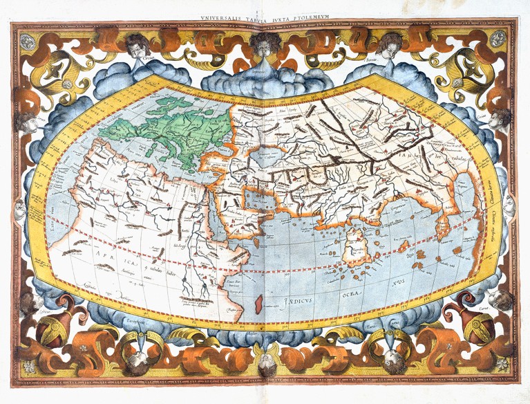
People have long projected their known worlds on maps.
This depiction, from Gerardus Mercator’s copy of Geography by Claudius Ptolemy, dates back to second-century Alexandria, Egypt.
Credit: Royal Geographical Society via Getty
From Nature By Dhruv Shenai
What the UN vote to ditch the Mercator projection means for education, navigation and public perception.
What the UN vote to ditch the Mercator projection means for education, navigation and public perception.
A view of the world that has prevailed for around 450 years has been challenged.
On 4 September, the United Nations General Assembly voted to phase out use of the Mercator map, a sixteenth-century projection that is widely used but has been criticized for not representing countries’ sizes accurately.
The UN resolution instead endorses use of the Equal Earth projection, which better shows the relative sizes of land masses.
That’s an important step towards correcting biases in the Mercator map, researchers say, even though that projection will still be useful in some scientific applications.
“Changing the projection used for global representation has geographic, educational and symbolic significance,” says Melinda Laituri, a geographer at Colorado State University in Fort Collins.
On 4 September, the United Nations General Assembly voted to phase out use of the Mercator map, a sixteenth-century projection that is widely used but has been criticized for not representing countries’ sizes accurately.
The UN resolution instead endorses use of the Equal Earth projection, which better shows the relative sizes of land masses.
That’s an important step towards correcting biases in the Mercator map, researchers say, even though that projection will still be useful in some scientific applications.
“Changing the projection used for global representation has geographic, educational and symbolic significance,” says Melinda Laituri, a geographer at Colorado State University in Fort Collins.
Projection preferences
The Mercator projection, presented by Flemish cartographer Gerardus Mercator in 1569, shows the meridians as straight lines — allowing for easy navigation with compasses.
It gained popularity from the eighteenth century, at a time of increased European maritime expansion and became the go-to map for governments and classrooms the world over.
Most web-based map services, including Google Maps and MapQuest, adopted it.
But critics point out that it shows the Northern Hemisphere as disproportionately large, because it increasingly stretches land masses — nearly 70% of which are north of the Equator — the closer they get to the poles.
For example, Canada and Russia seem much larger than they really are.
And Greenland and Africa seem to be similar sizes even though Africa’s area is about 14 times larger than Greenland’s.
That’s problematic, say researchers, because people are inclined to conflate size and importance.
“Maps don’t simply identify the location of places.
They also exist as social texts which influence how we imagine the importance, centrality or peripheral position of places,” says Derek Alderman, a geographer at the University of Tennessee in Knoxville.
“The effect of the Mercator projection on people’s mental map of the world is difficult to quantify.
It was a common assumption among cartographers that the Mercator projection has strong cultural influence and may be doing irreparable damage to our ability to think accurately about the world,” says Bernhard Jenny, a cartographer at Monash University in Melbourne, Australia, and co-creator of the Equal Earth projection.
Jenny cites a research article from 2009 showing that map readers don’t tend to compensate for distortions even when they know they exist 1.
Because all maps are projections from the 3D globe onto a 2D surface, they inevitably distort shapes, distances, areas and directions.
The Equal Earth projection, developed in 2018, shows the relative sizes of land masses more accurately than its Mercator counterpart does by curving the meridians (see ‘Bent into shape’).
However, this affects some shapes and angles, notably in New Zealand, which is stretched diagonally and sits on the edge of the map.

What will this change?
How widely used the Equal Earth projection will be remains to be seen.
The resolution was proposed by Togo with the backing of the African Union and the geography research community.
They say that shrinking Africa affects how the continent is perceived in media, education and policy.
Six nations abstained from the vote and only one, the United States, voted against, saying that the resolution "mocks the work and purpose" of the United Nations.
In the same week, after US President Donald Trump signed an executive order to rename Lake Ontario as Lake America, Google Maps and Apple Maps made this change for US-based users.
“The resolution is non-binding.
No country is compelled to remove a Mercator map tomorrow and Google is not suddenly required to redesign every digital map,” says Ashley Gunther, a geographer at the University of South Africa in Pretoria.
“If the vote does not eventually change geography education and the default world maps encountered on digital platforms, then its impact will remain primarily symbolic.”
On the technological side, geographic information systems — software that store, manage, analyse and map spatial data — will continue to use the Mercator projection, says Dawn Wright, an oceanographer and chief scientist of the Environmental Systems Research Institute (Esri) in Redlands, California.
“The Mercator projection is not going away, as it is still appropriate for marine navigation.
This is because mariners can measure their compass bearings most effectively on a Mercator map,” she says.

Japan demanding that new UN map, which places Kuril Islands under russian jurisdiction, be revised
Wright adds that the Equal Earth projection is already being used for scholarly research “such as population density studies, land use and climate vulnerability mapping, especially when representing these characteristics at a global scale”.
Geographers and other researchers around the world are excited by the UN resolution and keen to see how its adoption will progress over time.
But Gunther says that “publishers, international organizations, universities and companies should be engaged, and geography teachers should use this moment not merely to introduce Equal Earth but to teach a generation of students to be critical readers of maps”.
Links :
Geographers and other researchers around the world are excited by the UN resolution and keen to see how its adoption will progress over time.
But Gunther says that “publishers, international organizations, universities and companies should be engaged, and geography teachers should use this moment not merely to introduce Equal Earth but to teach a generation of students to be critical readers of maps”.
Links :
- doi: https://doi.org/10.1038/d41586-026-02820-x References :Battersby, S. E. Cartographica 44, 33–44 (2009)
- EarthSky : What is an Equal Earth projection map? See comparisons here
- The Guardian : UN votes to adopt new world map that shows Africa’s true scale / Japan seeks change to new UN world map over Russia 'misconception'
- BBC : UN votes to adopt new world map to reflect Africa's true size / What different world maps get right - and what they get wrong
- UN : UN tells the world: Stop making Africa look small
- CNN : UN votes to adopt new map that makes our world look very different
- Diplomacy&Law : UN New World Map: Legal Effect of the Equal Earth Resolution
- Newsweek : U.N. Votes on Major Change to World Map: How Different Versions Compare
- The Economist : In search of the least wrong map
- MoneyControl : A map is political, and it always was
- Scroll in : Size matters: Why India has a stake in the Africa-led campaign to decolonise world maps
- SaveMind : Who Owns the World Map?
- Equal Earth : political wall map
- https://freethemap.org/
- Chatham House : ‘We need messier maps’

Vietnam : The map was never innocent.
ReplyDelete