see map
From Global Fishing Watch
To better visualize activity at sea, Global Fishing Watch engineers new technology to power updated map
Despite its overwhelming benefits and the value it brings to all life on Earth, the ocean remains one of the least observed areas of our planet.
We have been able to see very little of what’s happening across the water, both above and below the horizon of the sea.
Without that global picture, we cannot truly grasp humanity’s impact on life below water.
But things are rapidly changing.
An explosion in new data—about the ocean and the human activity taking place on it—is changing our ability to understand this complex ecosystem.
This data must be harnessed in open tools that create new insights and empower decision-makers to improve marine governance.
However, visualizing billions of dynamic ocean data points in a single interactive map is a huge challenge—one we’re taking head on.
In an effort to advance its mission to create and publicly share knowledge about the ocean and strengthen maritime governance, Global Fishing Watch has released the next generation of its flagship map.
Initially launched publicly in 2016, our map is the first open-access online tool that can be used to visualize and analyze vessel-based human activity at sea.
Our latest version builds on this technology, adding in innovation to deliver a revolutionary, open-source, robust system that supports the transparent sharing of data and new insights about our ocean and planet.
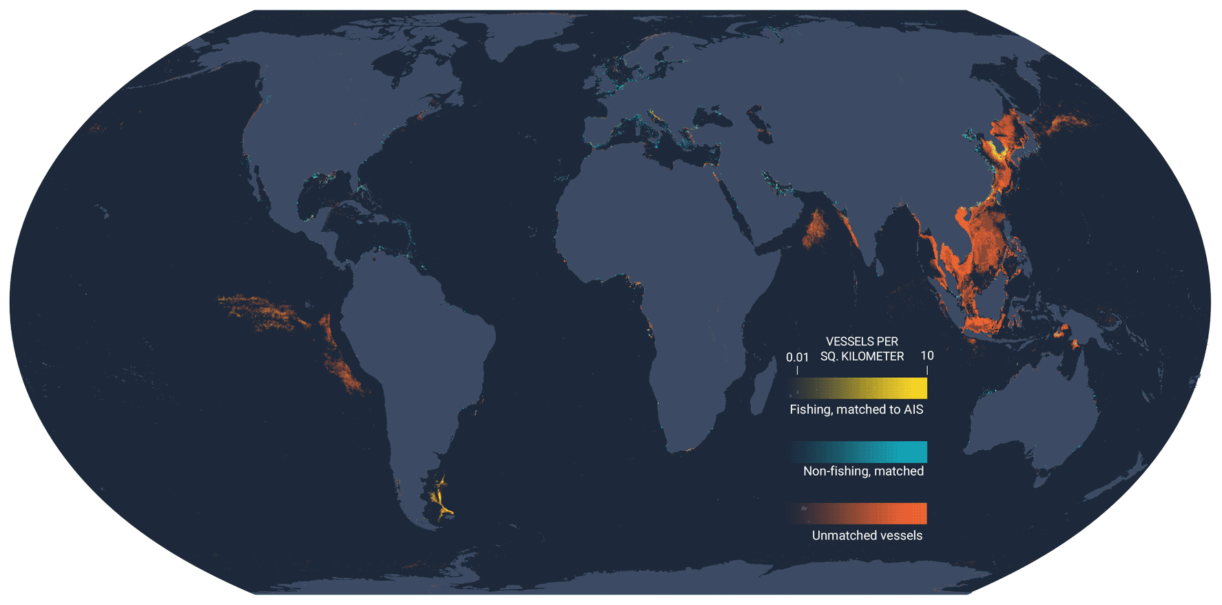
Data Source: Earth Observation Group, Global Fishing Watch
The challenge: processing billions of ocean data points
Our map users—representing a diverse group that include researchers, marine managers, policymakers and fisheries analysts—are always in search of more precise information.
More detail equates to more knowledge, which can often be challenging to display in a visualization.
Take Google Maps for example: if you were to view the entire country of France, the map would show you the names of regions and cities.
Once zoomed in, however, you are provided with more information, like the individual names of streets.
This feature has been available for years, solving the problem of how much information to display for an area based on the context.
But visualizing activity is more complex.
Fishing is something that happens not just over different geographic areas but over different times as well.
Analysis and ocean monitoring therefore need to conceptualize data over time—if we were to show fishing that is only happening at a precise moment in time, our stakeholders would be missing a significant part of the picture.
Big data is only as good as it is processed and analyzed.
For Global Fishing Watch, that processing needs to happen over space and time.
Let’s return to the Google Maps example.
To get directions somewhere, all you need to do is take out your phone, input a destination, press go, and you will quickly be provided with the best route.
But imagine if you also needed to map out all of the possible directions to a specific destination over different periods of time during the last eight years.
This is equivalent to policymakers needing to understand large-scale patterns of fishing activity, not just that of a single fishing vessel.
But it doesn’t stop there.
Imagine needing to focus in on a particular year to view all possible directions from point A to point B, but you also need to group and visualize those directions by hours, days, months or years at the touch of a button.
Multiply that one request by the approximately 65,000 vessels that Global Fishing Watch monitors through satellite tracking, on top of the thousands of people currently using the map, and you can begin to get an idea of the engineering challenge.
Access to information is also a key priority for Global Fishing Watch.
While one global ocean connects us all, fisheries monitoring and analysis are needed in some of the most remote areas of the planet, far removed from the rest of the world’s population.
Global Fishing Watch would not achieve its vision and mission if access to data was limited to the highest-end computers and fastest internet connections.
To ensure equity standards, we’ve had to make sure our map has parameters to support access from cities like Tokyo to remote islands like Tristan da Cunha or the Galápagos.
Once the computer and internet connection are accounted for, we also need to make sure that the tools being offered are easy enough to understand and use.
As a free, open-source online map, it’s essential that we consider an intuitive design that allows people to understand the activity data and empowers them to do their best work, from analyzing specific vessels to informing regional fisheries management.
For the past three years, we looked around for off-the-shelf solutions that allowed us the functionality we needed to effectively address these challenges.
But these options posed risks that would equate to an unresponsive website, leading to fewer users and less value from our map.
Ultimately, this would present a major barrier to Global Fishing Watch’s mission.
Although daunting, the answer was simple.
We had to create a responsive, dynamic system to process and present the data ourselves—a system that flies when processing billions of ocean data points.
The solution: combining technologies for a whole new use
Global Fishing Watch has developed a combination of open-source technologies that renders billions of data points with fast response times and supports dynamic filtering and different ways of interacting with data.
Inspired by the extraordinary feats of flying fish, we call this technology “4Wings”.
All of our map-based products, including our recently released marine manager portal and carrier vessel portal, now use this technology to deliver vessel and environmental information.
What’s more, 4Wings is open access so it can be applied to any dataset that needs to be visualized over space and time, from mapping sea ice cover or deforestation rates to tracking fishing vessel movements.
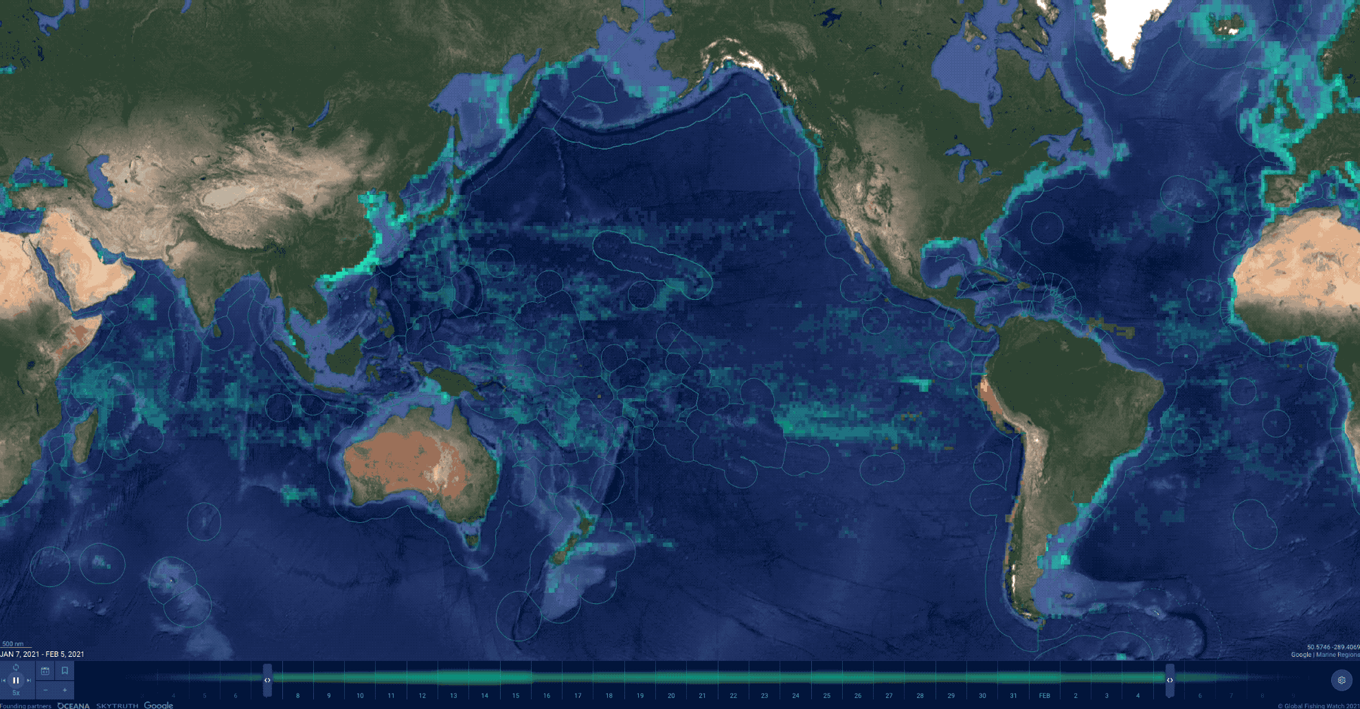
Global Fishing Watch produces two types of maps: Dot density maps, which use shapes to show the presence of vessels; and vessel track maps, which use lines to represent the tracks of vessels.
Both of these maps visualize geographical data, providing vital insights into instances of fishing activity and vessel encounters.
Analysts and researchers alike tend to favor precise maps with an abundance of detailed, gridded information with which to work.
Until now, however, Global Fishing Watch has had to use a technique that layers circular brushstrokes on top of one another to visualize data—this means it’s more difficult to be specific about where and when an activity is taking place on the water.
With 4Wings technology, visualizations are clear—all data is gridded and has been mapped to hexagon-shaped grids to allow comparisons of data across global latitudes without distortion, unlike a square grid which would distort significantly at the poles.
This means fishing activity at the equator can easily be compared with fishing activity in the Barents Sea.
Our new technology also provides map users with the ability to view several variables at once, such as apparent fishing effort, sea surface temperature and chlorophyll-a concentration in the marine manager portal.
This enables strategic analysis of large-scale areas while also providing the ability to drill down and extract intelligence that will help support the monitoring of them.
Smart management to load the map
At Global Fishing Watch, we want our tools to be as efficient and easy-to-use as possible.
Whatever preparation is needed to assemble the data in a way that can feed the various parts—or “tiles”—of the map, is carefully calculated so that the map updates instantly when users toggle between hours and months.
Our engineering team—they work on the underlying code—have developed a highly efficient format to do this.
Each tile is loaded from a concise list of numbers, which allows the computer’s internet browser to aggregate values and present the data in a way that is aligned with the current map settings.

The Global Fishing Watch Map now shows night light detections, adding new detail to the picture of worldwide fishing activity.
© Global Fishing Watch
A responsive and adaptive solution
There are 365 days in a year—that’s a well known fact.
But at Global Fishing Watch, we operate on 465 days.
To ensure the map is truly responsive, we built smart systems to pre-emptively load data based on the current view so anyone can seamlessly interact with the data and the information loads before they even need it.
For every year displayed on the map, we have pre-loaded 100 days of the following year’s data to allow analysts and managers to quickly adjust their required information without slowing their workflow down.
4Wings technology allows us to support the various ways people will use the map: animation, exploration and analysis.
Animation allows managers to visualize high-level trends over time where only low detail is needed.
Exploration supports much higher detail and responsiveness so visualizations load quickly and managers can rapidly investigate activity hotspots or vessels.
Finally, analysis supports fast visual sorting and filtering alongside the ability to show several different datasets at once for easy comparisons.
All of these use cases require different optimizations in the underlying code, and we have built them to adapt easily and automatically, requiring no work from the individual using the map.
Processing and visualization of dynamic global data
With the latest release of our map, Global Fishing Watch has harnessed new technology to visualize and animate global ocean datasets.
Whether someone wants to see that information in hours or years, they can now do it in a way that is fast, interactive, easy to maintain and accessible to everyone, regardless of their internet connection or computer’s processor.
Over the coming months, we look forward to seeing how the new map can support the incredible work that managers and analysts are doing to visualize data and better understand and manage our global ocean.
Links :
No comments:
Post a Comment