
From The Diplomat by James R. Holmes
Cartography helps set the parameters within which debates over policy and strategy unfold.
We mathematicians often stand accused of skullduggery, but we’ve got nothing on cartographers. Mark Twain jested that there were lies, damned lies, and statistics.
An old book from the 1950s instructs readers How to Lie with Statistics.
So fraught is the situation that University of Wisconsin math professor Jordan Ellenberg wrote an entire book — and a laugh-out-loud funny one at that — to debunk faulty mathematical thinking and the misadventures to which it gives rise.
Such are the consequences of our dark art.
But if numbers inform — and sometimes misinform — think about maps.
A map or nautical chart is a picture.
It’s a visual medium that conveys lots of seemingly factual information at a glance.
One vignette. Europeans, and Europeanists, fret constantly that the United States must turn its back on Europe to pivot to Asia.
You have to blame the Mercator map of the world for such claims.
If Washington, D.C. is America’s geopolitical pivot point, and if we assume U.S. leaders can only gaze in one direction, then pivoting to the Far East does indeed mean doing an about-face.
When I discuss the rebalance with various audiences, consequently, I’ve taken to showing the pivot on a Mercator map … and then showing it on a polar azimuthal equidistant projection a spaceman’s-eye view down on the North Pole.

When you do so, behold!
Forces based on the U.S. west coast and Hawaii surge across the Pacific Ocean, sweeping around one side of the Eurasian periphery.
But forces based on the east coast reach Asia through the Mediterranean and Red seas, their closest route to the western Indian Ocean and Persian Gulf.
That pathway takes them around Eurasia’s other side.
Bottom line: naval task forces may steam past rather than to Europe, but they’re hardly vacating Atlantic and European waters.
Indeed, when you plot the Pacific and Atlantic/Mediterranean/Red Sea/Indian Ocean pathways on the map, it appears as though North America is hugging Eurasia.
That’s a kinder, gentler mental image than someone turning a cold shoulder, n’est-ce pas?

It’s also more accurate.
Maps, then, can mislead.
Or they can signal how someone or some group of people looks at the world.
And in the hands of clever cartographers, they can shape how various audiences look at the world.
Mapmakers like Richard Edes Harrison, for instance, drew up projections during World War II that make the North Atlantic look like an inland sea — and North America and Western Europe like the halves of a grand North Atlantic community.
That helped coalesce transatlantic unity for war and, subsequently, for cold war.
Diplomatic historian and Naval Diplomat mentor Alan Henrikson fashioned the concept of “mental maps” back in the 1970s to make sense of all this.
Professor Henrikson defines a mental map as a “spatial frame of reference, which is usually centered on an imagined point of origin within the core area of a country from which the activities of that society are organized and proceed.”
How political leaders, military officers, and ordinary people conceive of the world guides “the foreign thrusts as well as the domestic initiatives of a regime and nation.”
So ideas about geospatial relationships, whether accurate or inaccurate, mold foreign policy and strategy.
So does the location of Henrikson’s central reference point.
Which brings us to China.
Last month the conversation about China’s rise alighted briefly on a new map that depicts South China Sea waters and disputed lands along the Indo-Chinese frontier as part of metropolitan China.
A statement of political purpose?
Maybe.
Cartographic imagery is just another tool whereby Beijing wages its “three warfares.”
It projects China’s territorial claims to audiences foreign and domestic, largely through party-controlled outlets, for psychological effect.
That’s the three warfares in a nutshell.
China’s new map made a major splash, but such tactics are nothing new for Beijing.
Party leaders, of course, embraced a Republic of China map portraying the waters within a nine-dashed (and now, apparently, ten-dashed) line enclosing most of the South China Sea.
It marks out a zone of “indisputable sovereignty” where China’s fiat is law. Some observers connect cartography with sea-power theory.
In 2001, writing in the Communist Party daily Nanfang Ribao, one pundit deplored Chinese maps’ propensity to exclude waters claimed under Chinese law.
He cites Alfred Thayer Mahan’s “theory that mastery of the seas determined a nation’s destiny, its rise and fall.”
Mahan’s geopolitical vision, he says, spurred the construction of a powerful U.S. Navy that’s “still at our doorstep.”
China should make Mahan’s logic its own, putting to sea great merchant and naval fleets.

Appearances count for scribblers of such leanings.
The Nanfang Ribao author likens the Chinese landmass to a rooster, an image unworthy of China’s majesty.
Including the sea areas claimed by China, however, gives the nation an appealing shape on the map — namely a torch.
On maps encompassing both land and sea, “the tray and handle of the ‘torch’ is the blue ocean, symbolizing that the ocean provides the ‘fuel’ for the blazing torch.”
This represents “a totally accurate characterization of the dependency relationship between the Chinese mainland in the future and the natural resources of China’s seas.”
“Chinese map,” he intones, “you are the collected emotion and wisdom of the Chinese people, their coagulated blood and raging fire, symbolic of their power and personality, the embodiment of their worth and spirit.”

Heady stuff.
Maps, it seems, constitute one more medium for national messaging and branding, and for political and cultural interchange.
For China, maps broadcast political purpose and the resolve to back purposes with the full weight of Chinese power.
Within China, the same maps shape how rank-and-file citizens see Asia and their nation’s place in it.
Cartography, then, helps set the parameters within which debates over policy and strategy unfold.
And it funnels not-strictly-rational passions toward the nation in directions mapmakers and their political masters want them to go.
A picture’s worth a thousand words — and who doesn’t prefer a torch to a rooster?
Links :
An old book from the 1950s instructs readers How to Lie with Statistics.
So fraught is the situation that University of Wisconsin math professor Jordan Ellenberg wrote an entire book — and a laugh-out-loud funny one at that — to debunk faulty mathematical thinking and the misadventures to which it gives rise.
Such are the consequences of our dark art.
But if numbers inform — and sometimes misinform — think about maps.
A map or nautical chart is a picture.
It’s a visual medium that conveys lots of seemingly factual information at a glance.
One vignette. Europeans, and Europeanists, fret constantly that the United States must turn its back on Europe to pivot to Asia.
You have to blame the Mercator map of the world for such claims.
If Washington, D.C. is America’s geopolitical pivot point, and if we assume U.S. leaders can only gaze in one direction, then pivoting to the Far East does indeed mean doing an about-face.
Mercator projection
When I discuss the rebalance with various audiences, consequently, I’ve taken to showing the pivot on a Mercator map … and then showing it on a polar azimuthal equidistant projection a spaceman’s-eye view down on the North Pole.

Forces based on the U.S. west coast and Hawaii surge across the Pacific Ocean, sweeping around one side of the Eurasian periphery.
But forces based on the east coast reach Asia through the Mediterranean and Red seas, their closest route to the western Indian Ocean and Persian Gulf.
That pathway takes them around Eurasia’s other side.
Bottom line: naval task forces may steam past rather than to Europe, but they’re hardly vacating Atlantic and European waters.
Indeed, when you plot the Pacific and Atlantic/Mediterranean/Red Sea/Indian Ocean pathways on the map, it appears as though North America is hugging Eurasia.
That’s a kinder, gentler mental image than someone turning a cold shoulder, n’est-ce pas?
Richard Edes Harrison - working methods from Data Deluge
It’s also more accurate.
Maps, then, can mislead.
Or they can signal how someone or some group of people looks at the world.
And in the hands of clever cartographers, they can shape how various audiences look at the world.
Mapmakers like Richard Edes Harrison, for instance, drew up projections during World War II that make the North Atlantic look like an inland sea — and North America and Western Europe like the halves of a grand North Atlantic community.
That helped coalesce transatlantic unity for war and, subsequently, for cold war.
Diplomatic historian and Naval Diplomat mentor Alan Henrikson fashioned the concept of “mental maps” back in the 1970s to make sense of all this.
Professor Henrikson defines a mental map as a “spatial frame of reference, which is usually centered on an imagined point of origin within the core area of a country from which the activities of that society are organized and proceed.”
How political leaders, military officers, and ordinary people conceive of the world guides “the foreign thrusts as well as the domestic initiatives of a regime and nation.”
So ideas about geospatial relationships, whether accurate or inaccurate, mold foreign policy and strategy.
So does the location of Henrikson’s central reference point.
Which brings us to China.
Last month the conversation about China’s rise alighted briefly on a new map that depicts South China Sea waters and disputed lands along the Indo-Chinese frontier as part of metropolitan China.
A statement of political purpose?
Maybe.
Cartographic imagery is just another tool whereby Beijing wages its “three warfares.”
It projects China’s territorial claims to audiences foreign and domestic, largely through party-controlled outlets, for psychological effect.
That’s the three warfares in a nutshell.
China’s new map made a major splash, but such tactics are nothing new for Beijing.
Party leaders, of course, embraced a Republic of China map portraying the waters within a nine-dashed (and now, apparently, ten-dashed) line enclosing most of the South China Sea.
It marks out a zone of “indisputable sovereignty” where China’s fiat is law. Some observers connect cartography with sea-power theory.
In 2001, writing in the Communist Party daily Nanfang Ribao, one pundit deplored Chinese maps’ propensity to exclude waters claimed under Chinese law.
He cites Alfred Thayer Mahan’s “theory that mastery of the seas determined a nation’s destiny, its rise and fall.”
Mahan’s geopolitical vision, he says, spurred the construction of a powerful U.S. Navy that’s “still at our doorstep.”
China should make Mahan’s logic its own, putting to sea great merchant and naval fleets.

Appearances count for scribblers of such leanings.
The Nanfang Ribao author likens the Chinese landmass to a rooster, an image unworthy of China’s majesty.
Including the sea areas claimed by China, however, gives the nation an appealing shape on the map — namely a torch.
On maps encompassing both land and sea, “the tray and handle of the ‘torch’ is the blue ocean, symbolizing that the ocean provides the ‘fuel’ for the blazing torch.”
This represents “a totally accurate characterization of the dependency relationship between the Chinese mainland in the future and the natural resources of China’s seas.”
“Chinese map,” he intones, “you are the collected emotion and wisdom of the Chinese people, their coagulated blood and raging fire, symbolic of their power and personality, the embodiment of their worth and spirit.”
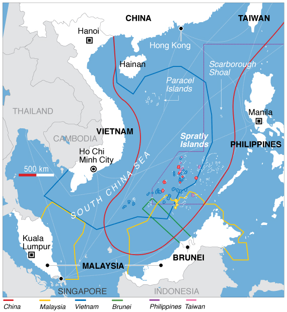
Dr. Yung’s Map of Competing Territorial Claims in the South China Sea
Heady stuff.
Maps, it seems, constitute one more medium for national messaging and branding, and for political and cultural interchange.
For China, maps broadcast political purpose and the resolve to back purposes with the full weight of Chinese power.
Within China, the same maps shape how rank-and-file citizens see Asia and their nation’s place in it.
Cartography, then, helps set the parameters within which debates over policy and strategy unfold.
And it funnels not-strictly-rational passions toward the nation in directions mapmakers and their political masters want them to go.
A picture’s worth a thousand words — and who doesn’t prefer a torch to a rooster?
Links :
- GeoGarage blog : New map boosts China's maritime claims / China's line in the sea / Battle of the South China Sea charts
- The China Story : The Paradox of the South China Sea Disputes
- EnerGeoPolitics : South China Sea
- Magnificent Maps: Power, Propaganda and Art
No comments:
Post a Comment