From MSN by Sukanya Datta
If you wanted to know when the bison were returning, and when to expect the next hearty steak, you likely checked the latest cave update, in Ancient Lascaux, France.
For nearly a century, ever since the caves were discovered in 1940, anthropologists have struggled to decode the lines, dots and Y-shaped marks carved into the rock here.
Now, in a study published last year, researchers from Durham University and University College London, analysed 800 such sequences and found that they contained 13 types of marks (sets of lines, dots and Y symbols), in patterns consistent with the 13 months in a lunar year.
Suddenly, the message of the marks became clearer: they could represent the mating, migration and birthing patterns of the deer, bison and horses drawn alongside.
No one likely lived in the Lascaux caves; they were more of an art and information centre.
And so these marks, made 17,000 to 20,000 years ago, could represent the earliest public data charts in the world.
Go further back, as much as 50,000 years ago, and bones have been found across Africa and parts of Eastern Europe, with notches in them that coincide with the phases of the moon.
Go further back, as much as 50,000 years ago, and bones have been found across Africa and parts of Eastern Europe, with notches in them that coincide with the phases of the moon.
These bones would have acted as a sort of early calendar.
These systems, of knots, notches and dashes, would endure for tens of thousands of years.
As recently as the 15th century, in South America — in the vast but largely isolated Inca civilisation that operated without money and without a script — a system of knotted ropes called quipu were used to track transactions and debt; record census data; and track stocks of royal grain reserves.
We have been visualising data in one way or another, then, since more or less the start of collective living.
Charts came before language. Before trade. Before poetry. Because, before tales of love and heroism, we had to tackle the question of how to track: the new sheep added to a flock, the days left before the wildebeest moved south, the number of people in a kingdom or the number of soldiers lost at war.
What would come later was the qualitative and quantitative analysis, says Venkatesh Rajamanickam, a professor of information graphics and data visualisation at the Industrial Design Centre of the Indian Institute of Technology-Bombay (IIT-B).
“How do festivals make us ‘feel’? What is it like to work in the office versus at home? That came later. But it is only when you record that you can analyse,” he says.
What were some of the earliest charts like?
Take a look.
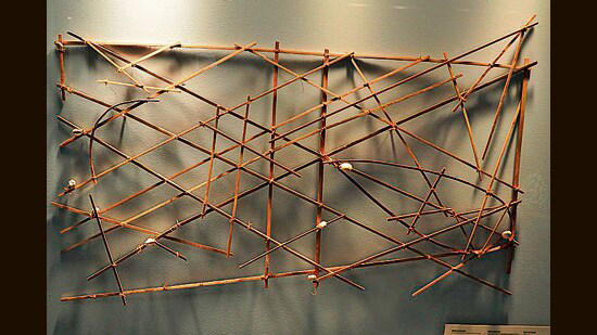
Stick sea charts; Marshall Islands

(Wikimedia)
Stick sea charts; Marshall Islands

(Wikimedia)
For thousands of years, the cluster of about 34 islands and atolls that make up the Marshall Islands used a sort of nautical map to visualise the complex math of tides, currents and ocean swells.
Curved bamboo or pandanus root sticks represented ocean swells; straight twigs stood in for currents and waves; seashells were the islands themselves.
“In a coastal environment, these sticks and shells were a practical choice,” says Rajamanickam. “They could weather rain and seawater, and were easy to carry. The Marshallese would study the charts on land before venturing into the sea.”
Star maps; China

A representation of the Suzhou star chart from the Song Dynasty, China. (Wikimedia)
In Ancient China, star maps were painted and etched onto the ceilings of tombs, onto stone tablets and onto scrolls, in what were likely attempts to help the dead navigate the heavens.
These charts were also used to create calendars, predict celestial events such as eclipses and make astrological divinations.
They helped in early attempts at astronomy.
A particularly interesting such map is a tomb painting dating to 1116 CE. It shows the Great Bear or Ursa Major constellation, depicted as seven red dots connected by lines.
A particularly interesting such map is a tomb painting dating to 1116 CE. It shows the Great Bear or Ursa Major constellation, depicted as seven red dots connected by lines.
At a distance are nine small discs of varying sizes, believed to indicate the sun, moon and five naked-eye and two invisible planets.
Links :
Links :

No comments:
Post a Comment