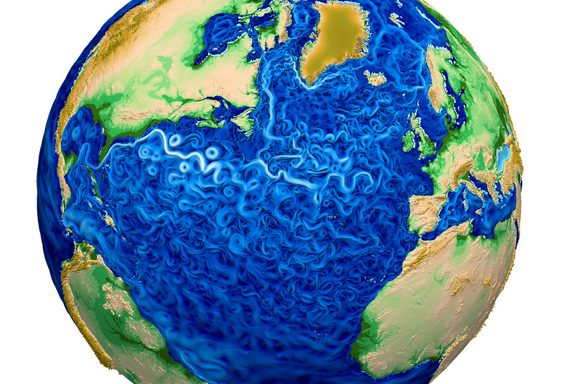
The paint-like swirls of this visualization from Los Alamos National Laboratory depict global water-surface temperatures, with the surface texture driven by vorticity.
Cool temperatures are designated by blues and warmer temperatures by reds.
Trapped regions of warmer water (red) adjacent to the Gulf Stream off the eastern coast of the U.S. indicate the model’s capability to simulate eddy transport of heat within the ocean, a key component necessary to accurately simulate global climate change.
From LiveSciences by Shannon Hall
A new global map of the world's oceans is so visually stunning that it could be mistaken for art.
The paintlike swirls of the visualization, which was released earlier this month by Los Alamos National Laboratory, depict global water surface temperatures.
And the resulting image is beautiful.
Blue areas designate cool temperatures, and reds indicate warmer temperatures.
The map shows a clear divide between the Northern Hemisphere and the Southern Hemisphere, but finer details — including trapped regions of hot water adjacent to the Gulf Stream in the Atlantic Ocean, and warmer water in the Mediterranean — can also be seen.
The simulation is dubbed the Model for Prediction Across Scales Ocean (MPAS-O).
It's a variable-resolution model, which means researchers can easily sharpen the simulation's resolution on regional scales (where they have more data).
In fact, the map has a resolution of 9 miles (15 kilometers) in the North Atlantic and 47 miles (75 km) elsewhere.
MPAS-O uses data from the National Oceanographic Data Center's World Ocean Circulation Experiment (WOCE) — the most comprehensive data set ever collected from the global ocean.
For years, researchers sailed the world's oceans and dropped instruments overboard every 35 miles (56 km).
The instruments measured water temperature and salinity at regular intervals from the surface to the seafloor.
Another visualization (March 2012) shows sea surface current flows.
The flows are colored by corresponding sea surface temperature data.
This visualization is rendered for display on very high resolution devices like hyperwalls or for print media.
This visualization was produced using model output from the joint MIT/JPL project: Estimating the Circulation and Climate of the Ocean, Phase II or ECCO2..
This visualization was produced using model output from the joint MIT/JPL project: Estimating the Circulation and Climate of the Ocean, Phase II or ECCO2..
ECCO2 uses the MIT general circulation model (MITgcm) to synthesize satellite and in-situ data of the global ocean and sea-ice at resolutions that begin to resolve ocean eddies and other narrow current systems, which transport heat and carbon in the oceans.
The ECCO2 model simulates ocean flows at all depths, but only surface flows are used in this visualization.
source (NASA)
The simulation will help researchers understand ocean temperatures, which add to the climate's complexities by acting like giant sponges for additional heat.
The model's ability to simulate eddies — small pockets of moving water that break away from the main current and help transport heat through the oceans — as broad paint-brush strokes is already promising.
Such fine details will help researchers accurately model the effects of climate change.
Global ocean surface kinetic energy with maximum kinetic energy – or movement energy – designated by white with minimum values in black.
Color is on a log scale.
Observe the prominent jet stream off the eastern coast of the U.S. with adjacent eddy rings.
When winds blow across the ocean, kinetic energy is transferred from the wind to water as a result of the friction between the wind and the sea surface.
Sunlight on the oceans also adds thermal energy to the surface layer, and currents carry the thermal energy to other regions of the world.
Sunlight on the oceans also adds thermal energy to the surface layer, and currents carry the thermal energy to other regions of the world.
The model itself is only a small part of the U.S. Department of Energy's Accelerated Climate Model for Energy (ACME), which is expected to be the most complete climate and Earth system model once it is finished.
The model is being developed with resources from 14 research institutions across the United States, including eight national laboratories.
ACME, which will be created on the country's most advanced supercomputers, will answer questions in three areas that drive climate change: Earth's water cycle, biogeochemistry and the cryosphere (the ice-covered regions of the planet).
Another visualization (February 2012) shows the Gulf Stream stretching from the Gulf of Mexico all the way over towards Western Europe.
This visualization was designed for a very wide, high resolution display (e.g., a 5x3 hyperwall display).
This visualization was produced using NASA/JPL's computational model called Estimating the Circulation and Climate of the Ocean, Phase II or ECCO2. ECCO2 is high resolution model of the global ocean and sea-ice.
This visualization was produced using NASA/JPL's computational model called Estimating the Circulation and Climate of the Ocean, Phase II or ECCO2. ECCO2 is high resolution model of the global ocean and sea-ice.
ECCO2 attempts to model the oceans and sea ice to increasingly accurate resolutions that begin to resolve ocean eddies and other narrow-current systems which transport heat and carbon in the oceans.
The ECCO2 model simulates ocean flows at all depths, but only surface flows are used in this visualization.
There are 2 versions provided: one with the flows colored with gray, the other with flows colored using sea surface temperature data.
The sea surface temperature data is also from the ECCO2 model.
The dark patterns under the ocean represent the undersea bathymetry.
Topographic land exaggeration is 20x and bathymetric exaggeration is 40x.
source : NASA
Links :


Weather : Beautiful Maps Show the World's Oceans in Motion
ReplyDelete