Acquire a skill that will probably be of no use to you:
“Learn to draw wind lines in the style of portolan charts from the 13th-15th centuries”.
It's really not complicated and it does magical things!
From @SavoirsEnBulles

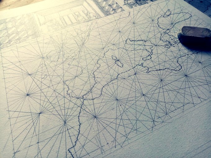
Three brief words of introduction: portulan charts are marine maps that appeared from the 13th century onwards, depicting mainly (at first) the Mediterranean and its shores.
Maps packed with fascinating details!
(Map: Dulcert Angelino, 1339, detail.)

But today, we're going to talk about the background: the "wind lines" or "Rhumb".
These
lines indicate the points of the compass, and were theoretically used
to determine the direction from one point to another.
(Map: Benincasa Grazioso, 1467, detail.)
(ps: the image is totally anachronistic, but I couldn't resist)
And I don't know about you, but once we get there, we're already on to something very satisfying.

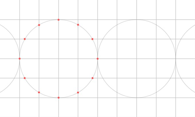
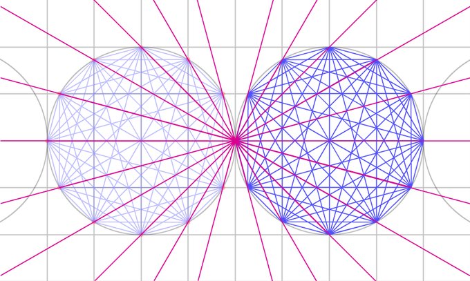
Let's move on to the practical side: although it may look very complex, the system of wind lines on a portolan is actually very simple.

For this example, I've used two complete squares.

— Les Savoirs Ambulants (@SavoirsEnBulles) March 1, 2024And do it for all the points. The first ones are the longest, since the further you go, the fewer strokes you have to do per stitch. I swear it's quick to do!

— Les Savoirs Ambulants (@SavoirsEnBulles) March 1, 2024
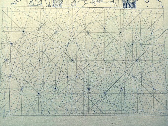
At
this stage, you've done the same preparatory work as Pietro Vesconte
around 1321, for this map of the Iberian Peninsula (South-facing map, so
North is at the bottom!).
Well done!
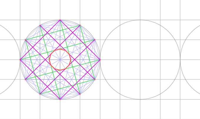
It gets even more fun when you realize that the circles are
connected... start, for example, by connecting the 11 points of the
first circle to the one that touches the circle next to it (the 12th
point).
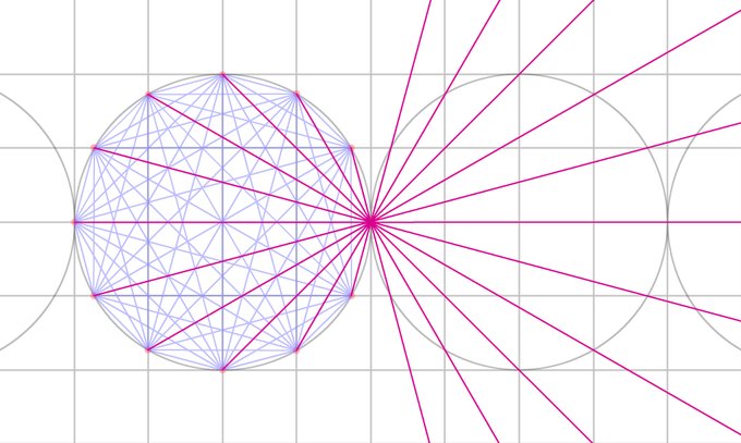
So, if from the outset, rather than limiting ourselves to a circle, we draw straight lines rather than segments...
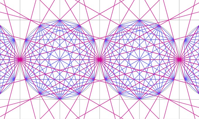
The result is rhumb lines
As in the Pisan chart (circa 1290), the oldest known portolan (and probably the only one to have actually sailed, the others being mainly maps for drawing-room chic).
— Les Savoirs Ambulants (@SavoirsEnBulles) March 1, 2024

On this one, it's easy to get lost as the 8 panels overlap a little, but I swear the structure is exactly the same, in 4 circles!

In short, you now know how to create a Rhumb line background to enhance your own map, whether realistic or imaginar
Granted, it's unlikely to save your life one day.
Granted, it's unlikely to save your life one day.
But you never know!
All the old maps used are available in high definition
No comments:
Post a Comment