
From BBC
With new GPS technology, it is almost impossible to get lost nowadays.
So how will the death of paper maps change the way we live, asks Simon Garfield.
Simon Garfield is a journalist and author of On The Map: Why the World Looks The Way It Does
Got truly and outstandingly lost recently?
Enjoy the feeling while you can, for it's becoming an increasingly difficult task.
As a curious race we have always liked to know where we are, but it is now almost impossible not to know - our phones, computers and sat navs keep us continually co-ordinated, and through them we are involuntarily tracked ourselves.
Once the preserve and privilege of the rich and influential, maps and accurate wayfinding have suddenly come to feel like a birthright, to the point where if things don't meet our expectations (good afternoon Apple Maps), we feel worse than deprived, we feel truly disorientated.

The Tabula Rogeriana was made by Arab geographer Muhammad al-Idrisi in 1154.
It was the most accurate world map for some 300 years.
It has been rotated 180 degrees, with al-Idrisi's original placing north at the bottom.
It is now hard for most people aged below 25 to remember a time when we used maps that folded (or at least maps that came folded from a shop, and never folded quite so well again).
And it is a sobering thought that our most influential maps are now in the hands of a very new breed of cartographers.
These are not people traditionally charged with representing our landscape with carefully plotted co-ordinates and contours, and with recognisable symbols and important landmarks.
The new maps are gridded by technicians and pixel masters, who may be more concerned with screen-loading speeds than the absence on a map of certain parts of, say, Manchester or Chicago.
There is already a visible backlash.
Organisations such as OpenStreetMap enable us all to become new wiki-style digital cartographers by adding areas of specific or local knowledge to a global map.
And the internet is alive with sign of a renewed and vibrant passion for hand-drawn maps, offering a personal and often humorous view of our lives beyond the corporate uniformity of the big mapping companies.
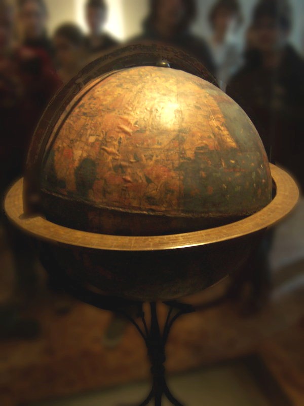
The Erdapfel (German: earth apple) produced by Martin Behaim in 1492 is considered to be the oldest surviving terrestrial globe.
But these days we are all really at the centre of our maps, which is both a useful and egocentric thing. A thousand years ago Jerusalem stood at the centre of the Christian world view, or if you lived in China it was Youzhou.
But now it is us, a throbbing green dot on our handhelds.
We no longer travel from A to B but from Me to B, and we spread out maps on the floor or on our laps in a car only with wistful nostalgia.
It is quite possible to walk, phones in our palms, from one end of a city to another without looking up. The loss is historical, social and monumental (as one inspired tweeter observed, I wouldn't change my Apple Maps for all the tea in Cuba).
In our cars, GPS may guide us quite merrily from one country to another, and we may arrive at our destination without any idea of how we got there.
En route from London to Cornwall, drivers may listen to a radio documentary about Stonehenge without realising that they have passed it on the right, for it is not on the sat nav.
We now tend to look just a few yards ahead, which is a shorter distance than our ancestors used to gaze when they lived in caves.
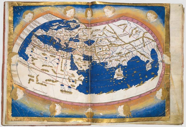
The Ptolemy world map is a map of the known world to Western society in the 2nd century CE.
There is another problem - digital maps may be shrinking our brains.
Richard Dawkins has suggested that it may have been the drawing of maps, rather than the development of language, that boosted our brains over that critical hurdle that other apes failed to jump.
Over the centuries, maps have always provided a key contribution and guide towards what makes us human, and they continue to record and realign our history.

Orbis Terrarum (Petro Plancio, 1594)
It is still too early to say whether a lessening in our spatial ability and perspective, and our ability to remember landmarks, will decrease that area in our hippocampus that serves as the engine room for such skills, but it is highly likely.
An examination of the brains of cab drivers has shown a great expansion in that area due, it is thought, to the retention of many miles of street plans.

Nova totius Terrarum Orbis geographica ac hydrographica tabula, a map of the world created by Hendrik Hondius in 1630, and published the following year in the atlas Atlantis Maioris Appendix.
Among its claims to notability is the fact that it was the first dated map published in an atlas, and therefore the first widely available map, to show any part of Australia.
Among its claims to notability is the fact that it was the first dated map published in an atlas, and therefore the first widely available map, to show any part of Australia.
Our lives have changed almost beyond recognition in the digital universe, but the most significant change - that of tracking our path through this world and being tracked by others - has come upon us stealthily and irrevocably.
And these are extremely early days.
My fellow cartographic historian Jerry Brotton recently observed that digital maps were at "the dot-matrix printer stage", which is to say early, buggy and unfocused.
There is no doubt that the range, accuracy and personalised nature of digital mapping will increase, and that mapping companies will become even integral to our lives.
Maps and location are arguably the most crucial elements of all new digital devices, and the principal driver of this advance will continue to be commerce.
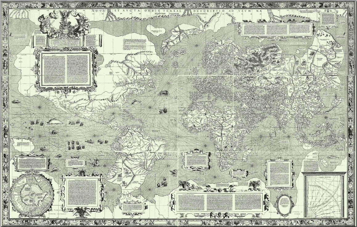
Flemish geographer and cartographer Gerardus Mercator world map of 1569 introduced a cylindrical map projection that became the standard map projection known as the Mercator projection.
Google Maps headquarters is located in the idyllic-sounding Mountain View, California, but when I visited to discuss the future of mapping I was ushered into a windowless conference room named after a famous explorer.
Then I realised that all the rooms were named similarly, and that the company had commissioned a jokey wooden signpost to help employees navigate their way around.
World maps usually center on the land, with the Pacific Ocean divided as bookends.
To show each ocean as a whole with the least distortion for our "Beneath the Oceans" supplement map, we used a map projection called an interrupted Mollweide centered on the Pacific.
The signpost, just a few years old, was chipped at the edges to make it look as if it was something Davy Crockett may have used, and the names carved upon it encapsulated the heroic human endeavour necessary to chart the world before satellites made this task obsolete.
Marco Polo was on there, as was Sir Francis Drake, Vasco da Gama, Magellan, Lewis and Clark and Shackleton.
It was a handsome sign, and a neat idea, but above all it was a vindication: Google was in charge now, directing its all-powerful employers to rooms where they would, in turn, direct the rest of us around the rest of the world.
Links :
- TheIndependant : On the Map: Why the World Looks the Way it Does, By Simon Garfield
- Back in vogue : Antique maps have enjoyed a steady rise in popularity, particularly over past five years, says map dealer Peter Stuchlik, of the Map House. "People are becoming conscious of importance, rarity, beauty and relative good value in the antiques market," says Stuchlik. "Demand is going up in the countries with an emerging class of wealthy people who have an interest in their own culture and history - such as Russia and China." (see Wikipedia : Early world maps)
- David Rumsey antique maps collection on Google Maps : GeoGarage
TheGuardian : On the Map by Simon Garfield – review
ReplyDelete