Greenland's size using the Mercator projection vs its actual size
courtesy of Bob Lammle, Mental Floss
 Many large countries seem to be as tall as Greenland
courtesy of Bob Lammle, Mental Floss
The Mercator projection creates increasing distortions of size as you move away from the equator.
As you get closer to the poles the distortion becomes severe.
Cartographers refer to the inability to compare size on a Mercator projection as "the Greenland Problem."
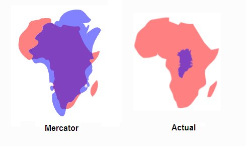
Greenland appears to be the same size as Africa, yet Africa's land mass is actually fourteen times larger (see figure below right).
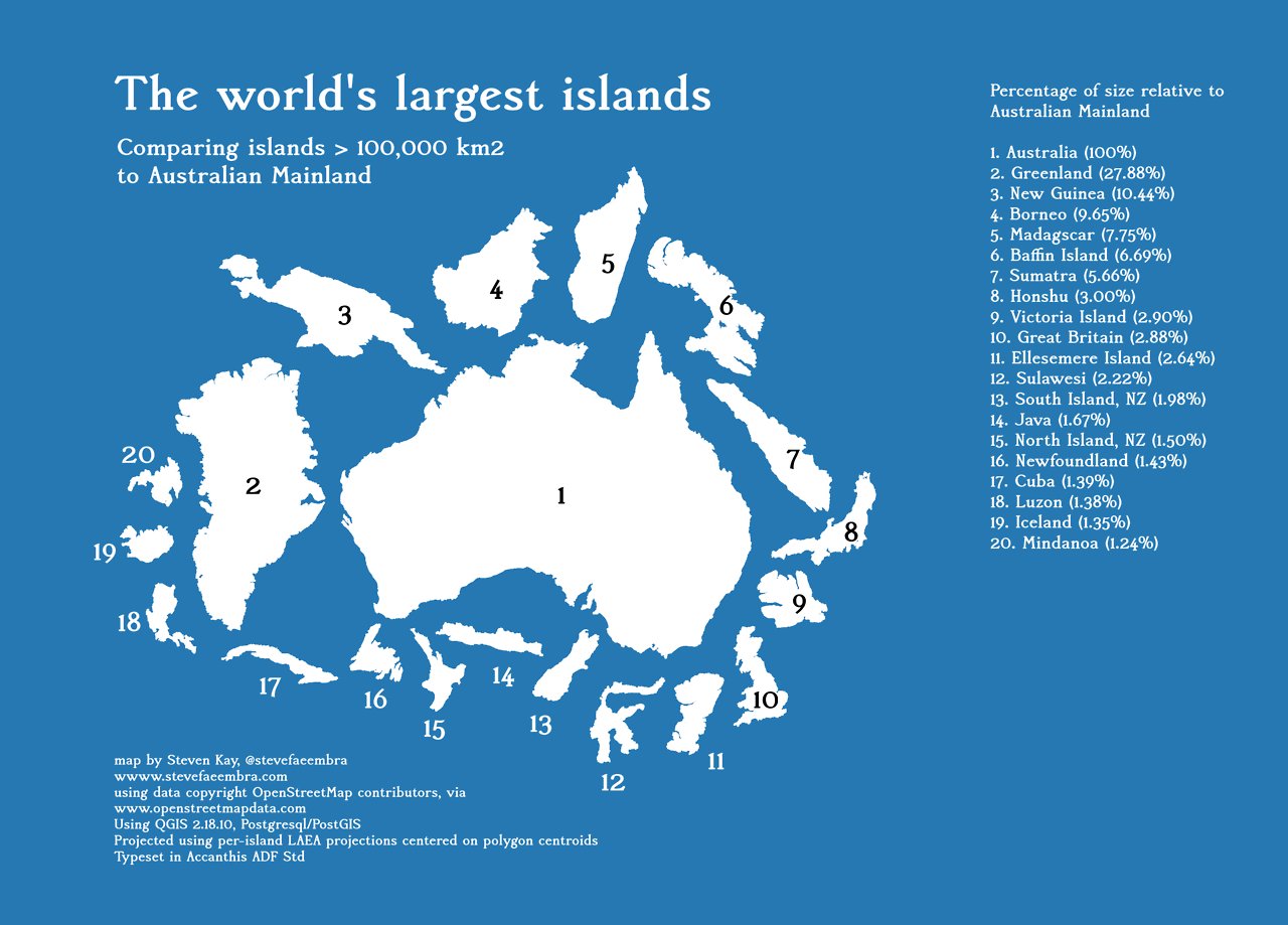
The nineteen largest islands in the world in a to-scale
Because the Mercator distorts size so much at the poles it is common to crop Antarctica off the map. This practice results in the Northern Hemisphere appearing much larger than it really is.
Typically, the cropping technique results in a map showing the equator about 60% of the way down the map, diminishing the size and importance of the developing countries. (from Peter's Map)
Whether you realize it or not, you're probably pretty familiar with the
Mercator projection.
It's the chosen map of Google, and often displayed
in classrooms around the country.
It's also inaccurate.
Links :
- Mapzen : Escape from Mercator
- MrGris : Mercator extreme
- GISgeography : Map distorsion with Tissot's indicatrix
- The True size
- Rhumb Lines and Map Wars: A Social History of the Mercator Projection by Mark Monmonier
- GeoGarage blog : Advisory notice on "Web Mercator" / Japan's 'Good Design Award' goes to this crazy accurate World Map
Cracked : Why Every World Map You’ve Ever Seen Is Probably Wrong
ReplyDelete