
The new book All Over the Map gathers together maps of all types, including this one of plants and animals found in the Pacific region.
It was created by Miguel Covarrubias as part of his Pageant of the Pacific atlas—six enormous, themed maps that he painted as murals for the 1939 San Francisco World’s Fair.
Courtesy of Rumsey and Covarrubias
Courtesy of Rumsey and Covarrubias
From National Geographic by Simon Worrall
Maps offer much more than directions.
They tell of incredible scientific achievement, bravery, and superhuman precision.
In the age of Google and Waze, maps may seem redundant.
But Betsy Mason, co-author with Greg Miller of All Over the Map, published by National Geographic Books, explains that maps can do much more than help us avoid a traffic jam or find the next Starbucks.
They can map poverty, bring to life the beauty of the Grand Canyon, or record war damage.

London’s Waterloo and Elephant and Castle neighborhoods suffered a lot of damage from German bombs during World War II, as shown on this map that was hand colored to indicate the severity of the destruction as damage reports came in.
Courtesy of London Metropolitan archives
When National Geographic caught up with her in California, Mason explained how a woman named Marie Tharp was one of the first people to chart the ocean floor; how 3-D models created by a top-secret military unit helped plan D-Day; and why extraterrestrials could one day use information carried by the Voyager spacecraft to find us.
The first maps date to ancient Babylon.
Give us a brief history and explain the many different uses maps have been put to.

The lava that flowed from 28 eruptions of Mount Vesuvius between 1631 and 1831 is recorded on this map, with the flows from each eruption marked in a different color.
The oldest eruption recorded on the map (colored pink) was also the largest.
Courtesy of Houghton Library, Harvard University
Our book is not a history of cartography, and it’s not an academic work on cartography.
We like to think of it as a book of stories that happen to be about maps.
When we were choosing maps for this book, our goal was that they should be visually appealing because it’s a large-format coffee table-style book.
But we also wanted to make sure that every map we put in there had an interesting story, either about the map, the making of the map, the map maker, how the map influenced history, or how it elucidates things that you wouldn’t be able to see any other way.
The oldest map is from the third century; it’s a tile of a map of Rome.
We have maps that are still being worked on and maps that were finished just barely in time for our deadline in March.

Profiles of famous landmarks like the Hagia Sophia are recognizable on this groundbreaking 16th-century map of Istanbul by Matrakçı Nasuh.
The painting was a two-page illustration in a written history of the Ottoman Empire.
Courtesy of Istanbul University Library of rare books
One of the most famous maps in the United States is Bradford Washburn’s map of the Grand Canyon.
Tell us about how it was made, and the man behind it.
This is one of my favorite maps ever!
Bradford Washburn was an amazing man.
He was a National Geographic explorer for decades.
He was the first to reach the top of more than a dozen peaks in Alaska and led tens of expeditions, a lot of them in Alaska, starting when he was just 24 years old.
He was also the director of the Boston Museum of Science and wanted to put rock from the bottom of the Grand Canyon in its rock garden.
So he and his wife, Barbara, went to the Grand Canyon.
When they got there they looked for good maps of the area and found that there were none.
His response to this was, “I guess I’m going to have to make a better map myself.”

This 1947 Japanese military map shows the area around Pyongyang, the current capital of North Korea.
Courtesy of Standford University Libraries
He spent eight years making his beautiful map, which involved almost 150 days of field work, and over 700 helicopter landings getting them to various hard-to-reach places in the canyon.
After they finished the fieldwork, he was focused on portraying the canyon in a spectacularly beautiful way.
So he used National Geographic’s own Swiss-trained cartographer to do the relief painting with an airbrush.
What you get is this beautiful, colored map of the Grand Canyon with all the different reds and browns and the green area on the outside showing some of the vegetation that grows near the top of the canyon.
It’s extremely accurate and incredibly beautiful.
The first time I saw it was at an exhibit at the Harvard Map Library and it stopped me in my tracks! As I was researching it, the National Geographic librarian, Michael Fry, contacted me and said, “Hey, we have a bunch of boxes in the archives that are full of materials related to the making of this map.” That’s how I learned how the map was made.
It was this trove of correspondence from Washburn and everybody else who was involved: internal Geographic memos, receipts, and itemized lists of everything that was used.
So it was fun going through it and piecing together the story.
Sorry, I could talk all day about this one! [laughs]

The landscape of Colorado’s Breckenridge Ski Resort has been subtly altered on this map by artist Jim Niehues to let skiers see all the slopes in one easily understandable view.
Courtesy of James Niehaus
By the mid 20th century most of the earth had been mapped, but the ocean floor was still a blank slate.
A redoubtable woman named Marie Tharp changed that, didn’t she?
She was amazing but sadly she was not recognized for her work until much later, though fortunately before she died.
She was one of the few female geologists trained in the early 20th century.
One of the reasons she was even able to go to graduate school was because of the Second World War.
There weren’t as many male candidates to fill geology departments, so a few of them opened their doors to women.
She got a job as an assistant, doing drafting work.
At one point she was paired with another geologist named Bruce Heezen, who was specializing in gathering data on the depths of the sea floor by using sonar on ships.
He was getting these profiles of the Atlantic Ocean floor and, eventually, the rest of the ocean.
She took those profiles, studied them, and started to visualize what was there in the ocean.
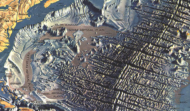
Atlantic Ocean Floor by Heinrich Berann
She used this technique called physiographic diagrams, where she was drawing, almost in 3D, structures on the ocean floor.
This had never been done before.
Most of the public thought of the ocean floor as this flat, featureless plane, so it was the first time that people had a chance to visualize what it really looked like.
National Geographic paired her and Bruce Heezen with an incredible landscape panoramist from Austria named Heinrich Berann.
He used her physiographic maps to make absolutely stunning portrayals of the ocean floor, as people had never seen it before.
During the Blitz in World War II, the Luftwaffe dropped millions of bombs on London.
A team of cartographers and surveyors kept a real-time record of the destruction.
Tell us about these amazing maps and the circumstances they were made in.
These were truly incredible.
There was a team of architects and surveyors in London who, as the bombs were falling—pretty much as soon as they had landed—would rush out to survey the damage.
They would first take part in trying to rescue as many people as they could.
They would be the ones deciding whether the building was about to collapse and the rescuers had to get out or not, then they would decide whether the building was damaged beyond repair, completely destroyed, or if it was repairable or the damage was just light.
For each of those categories, they put on a map of the city the corresponding color on every single building that suffered any damage.
What you get is this amazing set of 110 maps that cover what is now known as Inner London.
They’re really beautiful, which is a little bit disconcerting because of the destruction and misery that they’re actually portraying.
The surveying team itself lost 54 people in the bombings.
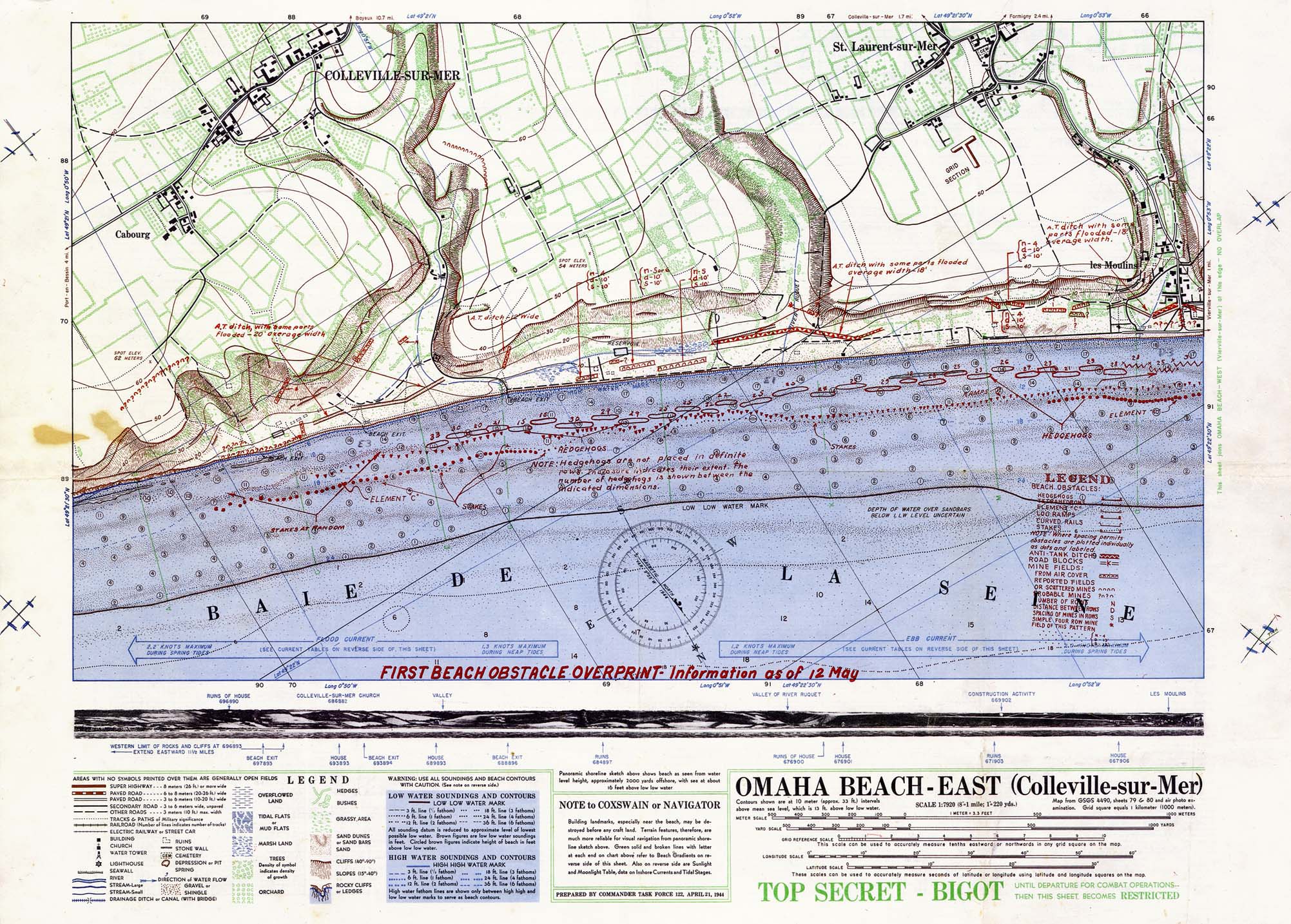
Omaha beach - East
Maps were also crucial for D-Day.
Describe the incredibly detailed scale models of the Normandy beaches made by the British and Americans, and the effect they had.
This was another amazing, and largely unknown, mapping effort.
There was this small, secret group of American and British military personnel that was tasked with making three-dimensional terrain models of every important battlefield in the war.
These turned out to be extremely useful for planning the attack and for briefing troops who were about to head into the field, because many of them didn’t understand how to read a topographic map or interpret aerial photographs.
The people in this map-making group, which was called V Section, took the accuracy of these models extremely seriously because mistakes could cost lives.
They used the shadows cast on aerial photos to determine exactly how tall buildings should be and developed all kinds of new ways to portray different structures.
They had a machine, which was sort of like a cake icer, to build the hedgerows that are so common in the Normandy countryside.
One man said he even clipped hairs from his moustache to use as the tiny masts for boats that they had put in a harbor.
[laughs]
These maps are credited with saving countless lives and were critical for the planning and execution of D-Day.
The Library of Congress has one of the few surviving examples of these maps, of Utah Beach.
When I saw that I thought, Wow, what is that?
If aliens want to find us, they will probably need maps.
So we’ve sent one up into the heavens with Voyager 1, haven’t we? How was it created?
NASA wanted to send some information out into space on a spacecraft that would help explain what Earth is like.
They tasked astronomer Frank Drake along with Carl Sagan to craft some sort of message to whatever intelligent aliens might encounter this spacecraft, Voyager, as it traveled out of our solar system into interstellar space, which was the plan for the end of its mission.
Frank Drake worked for the Search for Extra-Terrestrial Intelligence—also known as the SETI Institute—so he had spent a lot of time thinking about what other intelligent organisms might have in common with us, how they might see the world, so he wanted to make a map that would show them where our solar system is.
He decided that the best way to do this was to use these things called pulsars, which had been discovered just a few years earlier.
They are the remnants of supernova explosions.
The reason pulsars were appealing is because they’re rotating and they still have some light emanating from them.
These beams of light as they rotate make a very specific pattern of light pulses that you can see through a telescope.
Each one has a signature pulse pattern so you could identify specific pulsars.
Drake felt that any intelligent being that was able to intercept our spacecraft in interstellar space after it left our galaxy would certainly understand what a pulsar was and would be able to understand how to locate our solar system using this map.
People sometimes get a little freaked out by this because they think we’ve sent information to help extraterrestrials come and destroy our way of life.
But, as Carl Sagan said, “Because space is very empty, there is essentially no chance that Voyager will enter the planetary system of another star.”
He still felt that this project was a very hopeful gesture by humans.
The whole project was more about us trying to understand our place in the universe than actually contacting another intelligent species.
Many people of my son’s generation—he’s in his thirties—no longer know how to read a map.
They just use Google.
Is there a danger that in the age of satellites and GPS cartographers that maps will soon join the dodo and become extinct?
[Laughs] I get that question a lot but I don’t personally think there’s much of a risk of that because maps do so much more than just help us navigate.
You can’t use your iPhone screen or Google Maps to understand where pockets of poverty are, or what the geology is beneath the landscape.
That’s the aspect of maps that made me fall in love with them, and that’s the kind of thing that we have tried to select in this book.
We have maps that show things about the human condition, like poverty in London in the 19th century or the first ethnographic atlas, which shows where the origin of the different people of the world was thought to be at the time.
Then we’ve got maps that were used for science.
Sometimes they are just beautiful ways to display the data.
So I hope that people like your son, who don’t have much experience reading maps, might find this book and be delighted by the different stories and all the things that maps can actually do.
Links :
- National Geographic : All over the map
- GeoGarage blog : Discover fascinating vintage maps from National ... / These are the cleverest, weirdest mapping ideas ... / New maps reveal California's sensational seafloor ... / Why your mental map of the world is (probably) wrong / How one brilliant woman mapped the ocean floor's ... / Marie Tharp: the woman who mapped the ocean floor / Secretly mapping the sea floor / The great challenge of mapping the sea
No comments:
Post a Comment