List of visualizations: 00:00 Title 00:08 Earth Observing Fleet (August 2021) 00:48 Earth: A System of Systems 01:49 Why sustained Observations (see below) 02:43 Ocean Color Montage (see below) 03:19 Global seascapes (see below) 04:09 Ocean Surface CO2 Flux with Surface Winds 05:39 EXport Processes in the Ocean from Remote Sensing (EXPORTS) (see below) 07:29 20 Years of Global Biosphere (updated) 08:57 CORAL - Toward a Global Coral Data Set (see below) 10:06 Blue Marble 2015
Saturday, February 12, 2022
Friday, February 11, 2022
The Kunstmann III chart, 1501-1502, anonymous portuguese
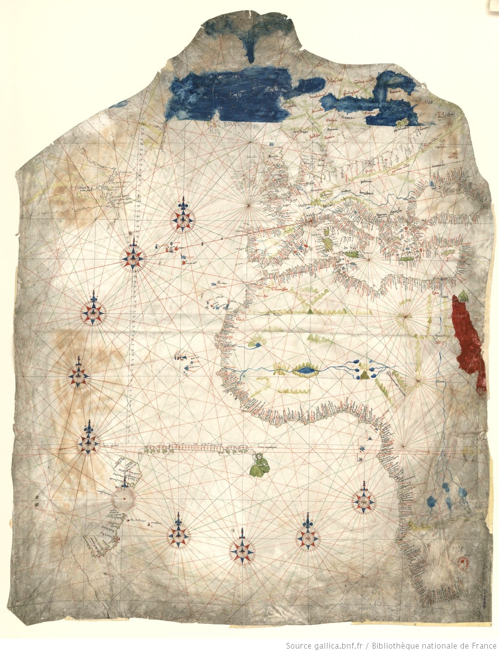
Author: Anonymous Portuguese
Date: 1501-02 Country: Portugal Archive: Lost, possibly destroyed
Call number: BNF, CPL GE B-1120 (RES) [Copy by O. Progel] Dimensions: 1170 x 870 mm
Medea Database Entry | Entrada na Base de Dados Medea
Medea Database Entry | Entrada na Base de Dados Medea
- see large scale Wikimedia -
From Medea chart by Bruno Almeida
The Kunstmann III chart, now presumably lost, was an historically invaluable map that showed the result of early European exploration of the New World and of the African coast in the south Atlantic.
It is likely that its construction started before the Cantino planisphere (1502), making it the earliest known Portuguese representation of the southwestern coast of Africa.
The Kunstmann III is probably also the earliest known nautical chart showing the locations of places as determined by astronomical observations.
This puzzling chart owes its designation to being the third in an atlas of facsimiles published by Friedrich Kunstmann in 1859.
Unfortunately, as is sometimes the case in the history of cartography, this delightful chart has almost certainly been destroyed, having disappeared from the archives of the Bayerischen Armeebibliothek during World War II.
Luckily, present-day researchers and map enthusiasts have at their disposal a photograph of the original (published in four sheets, in 1903, by Edward L. Stevenson, originals also lost) and a magnificent coloured copy made by Otto Progel in 1836.
It has been argued that the Kunstmann III was made in several stages between 1501 and sometime after 1505.
It integrates long-held geographical knowledge with the data from expeditions occurring in the early 16th century.
The drawing of the Mediterranean and the coasts of Europe derive from earlier cartographical knowledge, also depicted in many portolan charts.
In contrast, recent studies show that the places on the west coast of Africa, in the northern hemisphere, were situated by means of astronomical readings of the latitude, a method not used in the construction of contemporary charts of the Mediterranean.
Notwithstanding, the examination of the southwestern African coast indicates that the representation was not based on astronomical readings of the latitude but made using dead reckoning information collected from Portuguese exploration occurring before 1501.
The chart shows the results of the ill-fated voyages of the Corte Real brothers, Gaspar and Miguel, to Greenland and Newfoundland.
The chart’s image of Greenland derives from Gaspar Corte Real’s first journey that took place in 1500.
Later, in October 1501, after his second expedition, Gaspar’s ship was lost in Newfoundland.
In the following year, Miguel set off to rescue his brother, but likewise became lost, never returning to Portugal.
In both cases, other ships participating in the expeditions returned home with new geographical information about the explored regions.
Another source for the geographical content of the Kunstmann III was the Coelho-Vespucci voyage of 1501–1502, during which the mariners explored South America, reaching what is now Rio de Janeiro on New Year’s Day of 1502.
This expedition was the source for the data of the Brazilian coastline presented in the chart.
Using Stevenson’s photographic record and Progel’s copy, we may see that the Kunstmann III covered Europe, West Africa, the Mediterranean, the Black Sea and the Atlantic with Newfoundland, Greenland, and the Brazilian coast.
The chart has a latitude scale drawn in the western Atlantic Ocean in the Northern Hemisphere, starting at the Equinoctial, and going up to 68 degrees north in Greenland.
This seemed a sign that the incorporation of latitudes did not extend south of the Equinoctial, which has been confirmed by recent research.
The Kunstmann III shows no flags and depicts a few inland features, such as important rivers, mountain ranges, Bohemia, and Mount Sinai.
There are also representations of eastern European cities and of Cairo, albeit poorly rendered.
Progel’s coloured copy shows a dark blue Arctic Ocean and an unmistakable Red Sea.
The wind roses are drawn in a transitional style, with two different designs that are very similar to those found in other charts, such as the Dijon chart.
The placenames on the chart show at least four different handwriting styles.
Despite the previous studies of this beautiful chart, there are several mysteries remaining for future generations of researchers to unveil, such as the reason for the erased compass rose over the coastline of Brazil, and the identity of the enigmatic androgynous figure holding the scale of leagues over the Equinoctial.
Links :
- Kunstmann III: The Oldest Known Nautical Chart Incorporating Latitudes
- Gallica BNF : Planisphères et atlas du monde
Thursday, February 10, 2022
How do scientists measure sea level?
From The Conversation by Gary Griggs
As climate changes, so does sea level.
There are about 330 million cubic miles of water in the world oceans today, 97% of all the water on the planet.
Early in our planet’s 4.5 billion year history, water from the atmosphere and from the interior of the Earth gradually collected in the low areas on the planet’s surface to form the ocean basins, accumulating salts along the way.
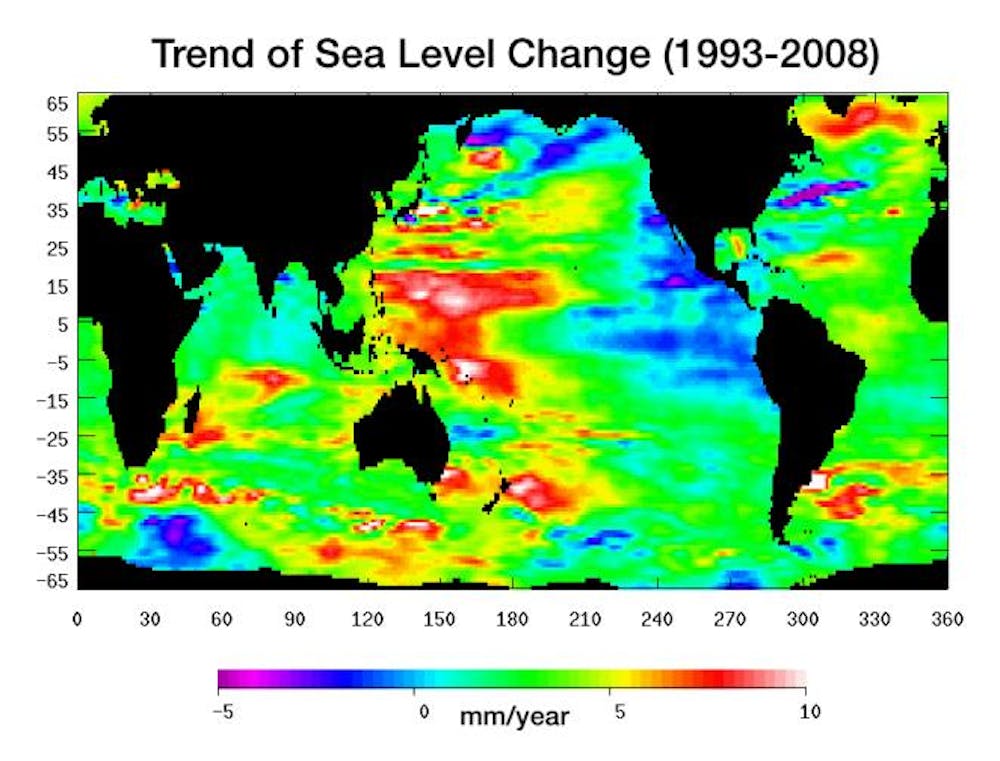
Sea level change between 1993 and 2008. NASA/JPL
The level of the ocean around the Earth, and therefore the location of the shoreline, are directly related to the total amount of water in the oceans, and also closely tied to climate.
As climate changes, so does sea level.
Throughout the history of the oceans, which goes back about 3.5 billion years, give or take a few million, climate has constantly changed and, in response, sea level has gone up and down.
As seawater warms, it expands and sea level rises.
As the Earth warms, ice sheets and glaciers melt and retreat, adding more water to the oceans, which raises sea level.
People have been keeping track of sea level, or the elevation of the oceans, for about 200 years. Until fairly recently, this was done with tide gauges, which are water-level recorders anchored to some structure along the coastline. It might be a wharf, a concrete breakwater or some other solid structure that is stable over long periods of time.
The oldest tide gauge in the world is on the coast of Poland and was installed in 1808.
In the United States, there are two tide gauges that have been in operation since 1856, one in New York and one in San Francisco.
There are many others as well, but most of them are much newer; many were set up over the past 50-75 years.
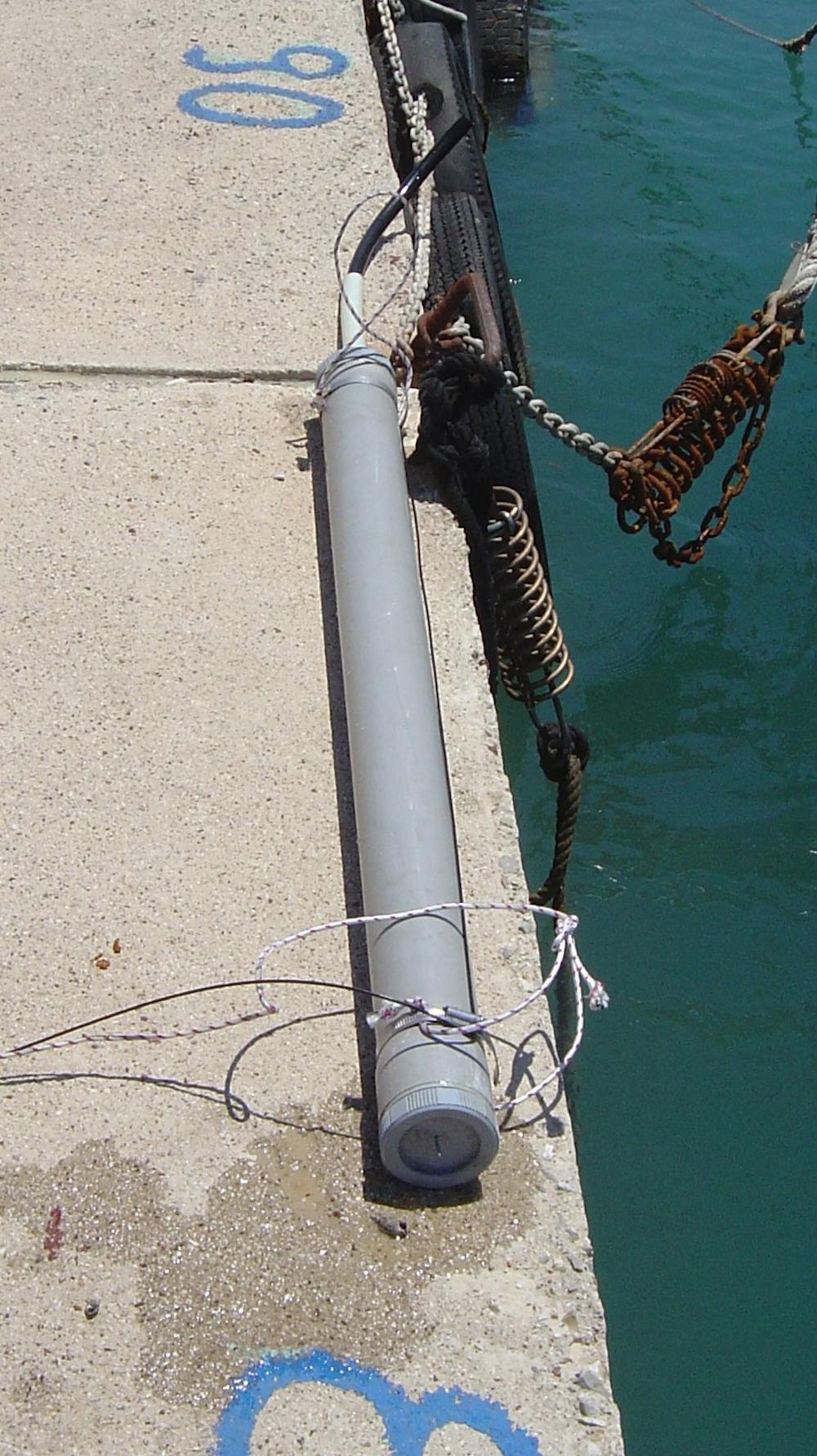
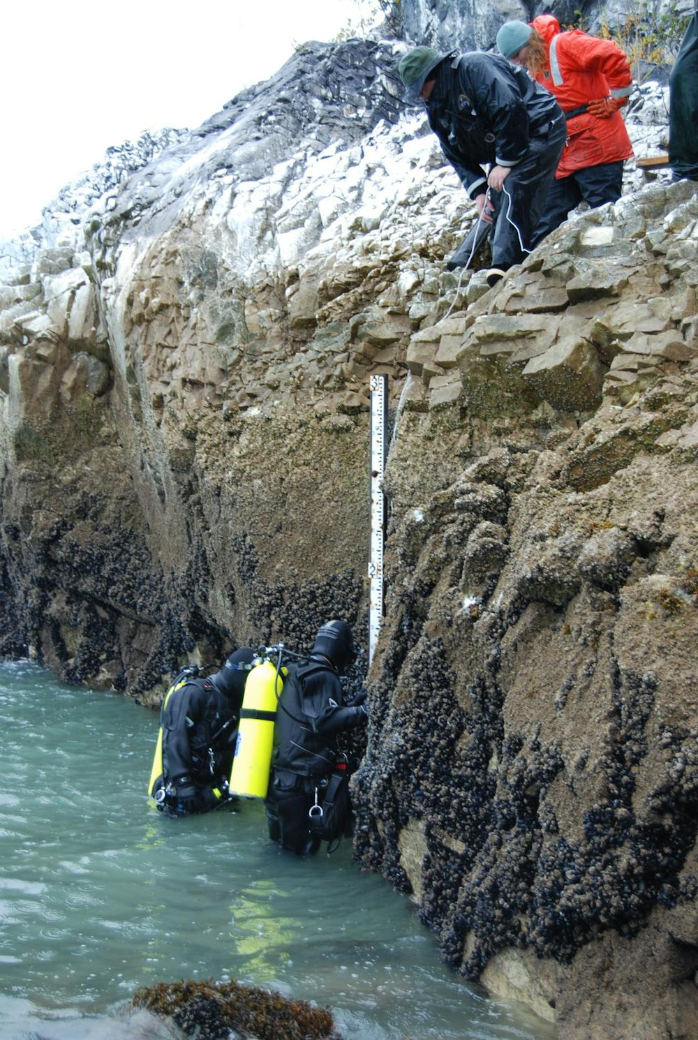
A tidal gauge, ready to be installed.
A tide gauge is essentially a large pipe inserted into the ocean, which has a float inside that moves up and down as the water level changes. As the tide rises and falls each day, these gauges record those changes in water level, day after day, year after year.
These instruments were first set up to provide accurate information on water depths so ships could enter and leave ports safely.
As time went on, however, it became clear that sea level recorded on these instruments was rising globally.
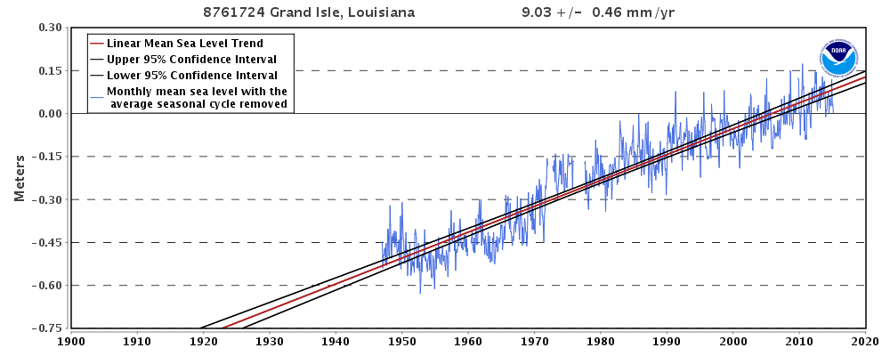 NOAA tide gauge data for Grand Isle, Louisiana (near New Orleans), where sea level is rising relative to the land at 9.03 mm/yr (36 inches/century) due to subsidence of the Mississippi delta area. NOAA
Each of these official tide gauges keeps track of sea level at a particular coastal location. Many coastal areas are not stable, however.
Some are sinking (such as New Orleans or Venice), and some are rising (Alaska and Scandinavia, for example).
Each tide gauge keeps track of how sea level is changing relative to the land on which it is anchored.
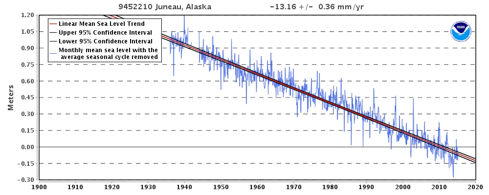 NOAA tide gage record for Juneau, Alaska, where local sea level is dropping relative to the land at 13.16 mm/year (4.3 feet/century) due to uplift of the coastline. NOAA
Even though sea level rose around the world at a rate of about 1.7 millimeters per year over the last century (nearly seven inches per century), because some gauges are on coasts that are rising and some on coasts that are sinking, these local sea-level rise rates will vary.
In parts of Alaska, the land is rising faster than sea level, so the tide gauge actually records a drop in sea level relative to the land.
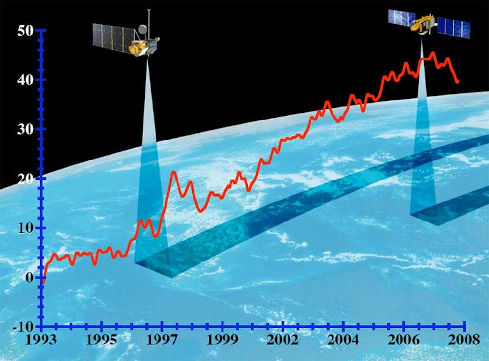 Global mean sea level as measured by satellite. University of Colorado/NASA
These geographic variations were resolved in 1993 when two satellites were launched that use radar to measure the level of the ocean very precisely from space.
This high-tech approach eliminates the problems of land motion on Earth and has given us a new global sea-level rise rate over the past 22 years of 3.2 millimeters per year, the equivalent of 12 inches per century.
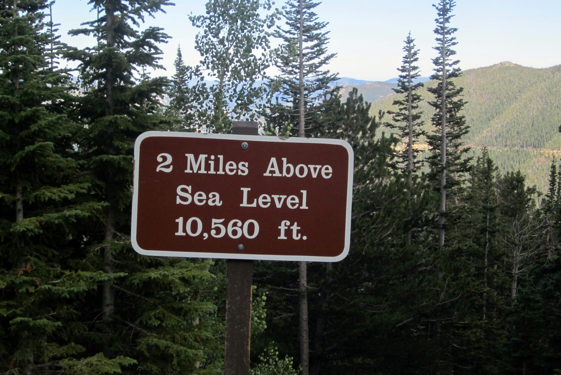
Elevations on land, contour lines on maps and depths on nautical charts are based on the long-term average of sea level.
This is complicated by the fact that sea level around the world at any instant is not the same, due to local variations resulting from differences in water temperatures, currents, atmospheric pressure and wind.
In order to bring some order to all of these geographical variations, and to provide a constant point of reference, a datum or base level was established based on averaging out the elevation of sea level from many tide gauges over an extended period of time.
This datum is now called the North American Vertical Datum (or NAVD) and is the elevation (close to mean sea level) on which all map elevations are based.
So if a wharf, highway or building is “20 feet above sea level,” it is 20 feet above this official North American Vertical Datum.
Links :
- GeoGarage blog : NASA-led study reveals the causes of sea level rise since 1900 / The struggle to track global sea level rise / Seas aren't just rising, scientists say / Satellite observations show sea levels rising, and climate ... / Fingerprinting' the ocean to predict devastating sea level rise / Sea level rise accelerated over the past two decades ...
Wednesday, February 9, 2022
Extreme heat in the oceans is out of control
A 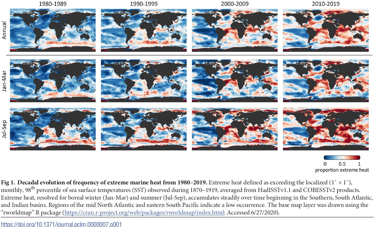
new analysis of monthly sea surface temperatures across the global ocean reveals how more and more patches of ocean saw heat extremes every year.
new analysis of monthly sea surface temperatures across the global ocean reveals how more and more patches of ocean saw heat extremes every year.
These four decadal snapshots show temperature shifts since 1980.
Beginning in 2014, more than half of the ocean began to reach extremes hotter than even the most extreme events from 1870 to 1919.
From Wired by Matt Simon
More than half of the sea now logs temperatures once considered extreme, threatening countless species, livelihoods, and the air we breathe.
WITHOUT THE OCEAN, climate change on land would be even more catastrophic.
The seas have absorbed over 90 percent of the excess heat from greenhouse gas emissions, essentially saving humanity from itself.
But it’s taking a toll: The ocean, too, is rapidly warming.
And just as we have heat waves on land, parts of the ocean can experience temperature spikes too.
The seas have absorbed over 90 percent of the excess heat from greenhouse gas emissions, essentially saving humanity from itself.
But it’s taking a toll: The ocean, too, is rapidly warming.
And just as we have heat waves on land, parts of the ocean can experience temperature spikes too.
New research exposes just how bad the problem has gotten.
Researchers from the Monterey Bay Aquarium began their calculation by analyzing surface temperature data from 1870 to 1919, sampled from across the globe.
(Yes, ships have been taking the ocean’s temperature for 150 years.) Once they knew the historical high temperatures for each month in different parts of the ocean, they had a baseline for marine temperature extremes before the escalation of climate change.
In the 19th century, only 2 percent of the ocean surface experienced such extremes.
Then they compared this data to readings in the same places taken from 1920 to 2019.
Their results show that by the year 2014, half of the ocean surface was logging temperatures once considered extreme—exceeding those historical highs.
By 2019, that figure was 57 percent.
In 150 years, the occurrence of extreme heat had become the new normal.
Take a look at the map above.
The redder the area, the more months that it logged temperatures higher than that historical baseline measured between 1870 and 1919.
Or, put another way, what used to be extreme is now normal in those red areas.
Notice how in the 1980s the extreme heat was mostly around Antarctica, but by the 2010s it had spread all over the world, particularly around the equator.
“Now, that's really concerning,” says Van Houtan, “because obviously that's the distribution of corals.
Coral reefs in the past decade have had dramatic and widespread bleaching events.” This happens when warming waters stress the corals, causing them to release the photosynthetic algae that help them produce energy.
Without energy, the corals die, contributing to the collapse of the reef ecosystem.
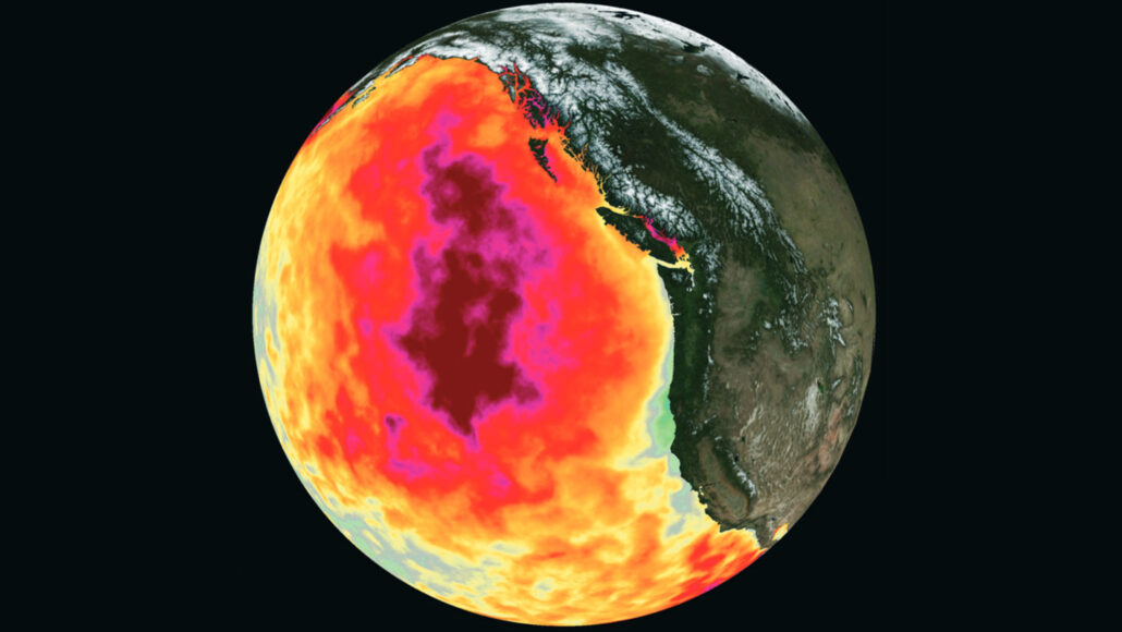
From 2013 to 2016, a mass of sweltering water in the eastern Pacific Ocean, known as the Blob, wreaked havoc on marine ecosystems.
This illustration shows how unusually hot the waters were in May 2015, with deepest red representing 3 degrees Celsius above average.
CHELLE GENTEMANN, CHARLES THOMPSON AND JEFFREY R. HALL/PO.DAAC/JPL
CHELLE GENTEMANN, CHARLES THOMPSON AND JEFFREY R. HALL/PO.DAAC/JPL
These spikes are different from the overall rise in water temperature, which is also caused by global warming.
For one thing, a particular region can come back down off of a high when winter arrives.
And the location of the spikes can vary over time, meaning some places were affected earlier than others.
So while half the ocean surface was logging temperature extremes by 2014, the South Atlantic had actually crossed that threshold back in 1998.
“And that is ludicrous,” says ecologist Kyle Van Houtan, president and CEO of the Loggerhead Marinelife Center, who coauthored today’s paper in the journal PLOS Climate describing the findings.
(Van Houtan did the research in his previous role as the chief scientist at the aquarium, with marine biologist Kisei Tanaka, now at the National Oceanic and Atmospheric Administration.)
“There's some major changes going on right now in the ocean, and we think that this calculation, this index, of marine heat that we built is helping to describe why,” he continues.
“I think extreme marine heat is much more of a problem than we thought it was.
It's actually common today, which is scary, because historically it was just extreme—it was rare.”
“I think extreme marine heat is much more of a problem than we thought it was.
It's actually common today, which is scary, because historically it was just extreme—it was rare.”
“The trends they're seeing are consistent with results from a lot of other papers that conclude that marine heat waves are becoming more frequent, they're warmer, and they're lasting longer,” says Bridget Seegers, an oceanographer at NASA, who wasn’t involved in the work.
(She was, though, among the researchers who recently reported that 2021 was the sixth hottest year ever recorded.)
(She was, though, among the researchers who recently reported that 2021 was the sixth hottest year ever recorded.)

The graphic above shows another way of looking at it by country.
The areas that tallied the most months of extreme marine heat are the Maldives in the Indian Ocean, Tanzania on the east coast of Africa, and Micronesia in the Pacific—all of them are along the equator.
The areas that tallied the most months of extreme marine heat are the Maldives in the Indian Ocean, Tanzania on the east coast of Africa, and Micronesia in the Pacific—all of them are along the equator.
You might have noticed a glaring exception to the overall heating trend in the first map.
The Pacific Ocean off South America—that big blue blob on the map—resists extreme heat because of the upwelling of cold, deep waters.
But, Van Houtan cautions, this shouldn’t be read as an indicator that this area is unaffected by climate change.
“This is not a map of warming. Everywhere is warming,” he says.
“This is a map of the occurrence of extreme heat.
And so those large blue areas may be warming—and in fact, are warming—but they are areas that historically have had a lot of variability in those systems.”
“Different places actually kind of take turns increasing rapidly,” agrees Daniel Rudnick, a physical oceanographer at the Scripps Institution of Oceanography, who wasn’t involved in the new research.
For example, Rudnick studies the North Pacific, where he saw a major increase in heat in 2014.
“I think that's going to be the story in general, that different regions will kind of take their turns.
There is a general trend for the whole Earth to warm, but how it will be happening in any region will be different.”


Current temperature anomaly for the World is 0.0C (1979-2000 base)
Extra heat must be going into the Ocean (which store 90% of the world's excess heat) and we're going to get our payback for this 2022 La Nina driven oasis of cool soon enough.
Ocean depth plays a big role in how regions are affected.
While the depth of the middle of the Pacific Ocean allows cooler waters to upwell, the shallower areas around tropical islands get no such relief.
Island nations are at additional risk because water gets bigger as it gets hotter, a phenomenon known as thermal expansion.
“The same mass of water takes up more volume, and so there you go—sea level rise,” says Rudnick.
In fact, roughly half of human-caused sea level rise is from runoff from melting glaciers, and the other half is from warmer waters just taking up more space.
But more locally, almost all of the regional variability in sea level rise is due to thermal expansion, Rudnick adds.
The hotter the coastal water, the more the sea rises.
This can happen quickly with extreme heat events, whereas sea level rise from ice melt happens at a, well, more glacial pace.
The ecological consequences of rising heat—both in terms of overall warming and spikes from extreme heat—are both obvious and subtle.
Species with the ability to flee, like fish, are moving toward the poles.
“Like lobster, for example.
We're seeing some dramatic changes in the geographic distribution of that fishery off the northeast US,” says Van Houtan.
“There used to be a fishery in New York and New Jersey, and that is essentially nonexistent.
And now Maine is thriving, but in 10 years Maine may be on the back side, and it may just be a Canadian fishery moving forward.” Similarly, subsistence fishers in the tropics may lose their livelihoods as entire fish populations move away.
But species that are fixed in place, like sponges and corals, can’t leg it (or fin it) to cooler areas.
“The fixed ones are likely going to be seeing absolute thresholds of heat that they can't coexist with, and so you're going to see a decline of those,” says Van Houtan.
Fraction of the ocean surface annually experiencing extreme heat, grouped by a, northern hemisphere and b, southern hemisphere and indian ocean basins. the point of no return (ponr) occurs when each series surpasses and remains above 50%(dashed grey line), or when the historical baseline of extreme heat becomes ‘normal’.
This first occurs in 1998 in the south atlantic basin and for the global ocean occurs in 2014.
Extreme heat poses an additional danger, even for species that are already in the process of gradually migrating to cooler areas.
“When you have these abrupt events like marine heat waves, they don't give any time for adaptation,” says Seegers.
“So they can result in really high mortality.
This happens across ecosystems from coral reefs to kelp forests, and they can cause seabirds to die.”
“It can take the system years to recover,” Seegers adds, “because if you have a lot of mortality, it's not going to necessarily go right back to normal.”
Further complicating matters, these heat extremes often coincide with low winds.
The wind plays an important role in the ocean food chain, because it mixes the water, bringing up nutrients from the depths.
Tiny photosynthetic organisms called phytoplankton rely on these nutrients, just the way the plants in your garden rely on fertilizer.
These phytoplankton feed animal species called zooplankton, which feed fish, which feed marine mammals and seabirds.
Losing the phytoplankton to extreme heat, then, assaults the base of the food web.
And crucially, phytoplankton produce most of the oxygen in our atmosphere.
“The reality is that we have two lungs on the planet: One of them's green—the forests—and the other one's blue—the ocean.
The ocean supplies more than half of the oxygen that we breathe,” says Van Houtan.
“It's no understatement to say that the ocean is the beating heart of our climate system, and the ocean is absolutely critical for sustaining human life on this planet.”
The only way to keep that life support system online is by massively cutting greenhouse gas emissions, and fast.
The oceans can’t take much more of this heat.
Links :
- Eureka : Monterey Bay Aquarium study finds extreme heat is the ‘new normal’ for the ocean
- The Guardian : Extreme heat in oceans ‘passed point of no return’ in 2014
- Vice : Extreme Heat is the ‘New Normal’ in Earth’s Oceans, Study Warns
- ScienceNews : The past’s extreme ocean heat waves are now the new normal
- Mongabay : ‘There’s not much hope’: Mediterranean corals collapse under relentless heat
- PBS : Ocean heat is at record levels, with major consequences
Tuesday, February 8, 2022
Huge bank of dead fish spotted off French Atlantic coast
Watch: A drone captured a massive spill of dead fish in the Atlantic Ocean
From BBC by
France's fisheries minister has called for an investigation after a spillage of more than 100,000 dead fish off the country's Atlantic coast.
Video footage filmed by environmental activists shows a mass of corpses floating on the sea surface.

Margiris 28/01/20022 position (MarineTraffic)
An industry statement said the Margiris, the world's second-largest super trawler, had reported a "fishing incident" after its net broke.
It said the fish were blue whiting, a species of the cod family.
The lost fish would be deducted from the vessel's quota, the statement added.
WE'RE LIVE! Join Sea Shepherd Captain Thomas Le Coz of the M/Y Age of Union to discover the first images of our Ocean Killers campaign in France's Bay of Biscay, live on our FB page now: https://t.co/kAYOMAT9hi pic.twitter.com/ByAkvTsqpn
— Sea Shepherd (@seashepherd) February 3, 2022
The Sea Shepherd France environmental group filmed the fish on Thursday, saying they covered an area of about 3,000 sq m (32,300 sq ft).
Its head Lamya Essemlali told Reuters it wanted to "raise awareness among the French public" about the trawler, which it said had been banned from Australian waters and frequented the Bay of Biscay.
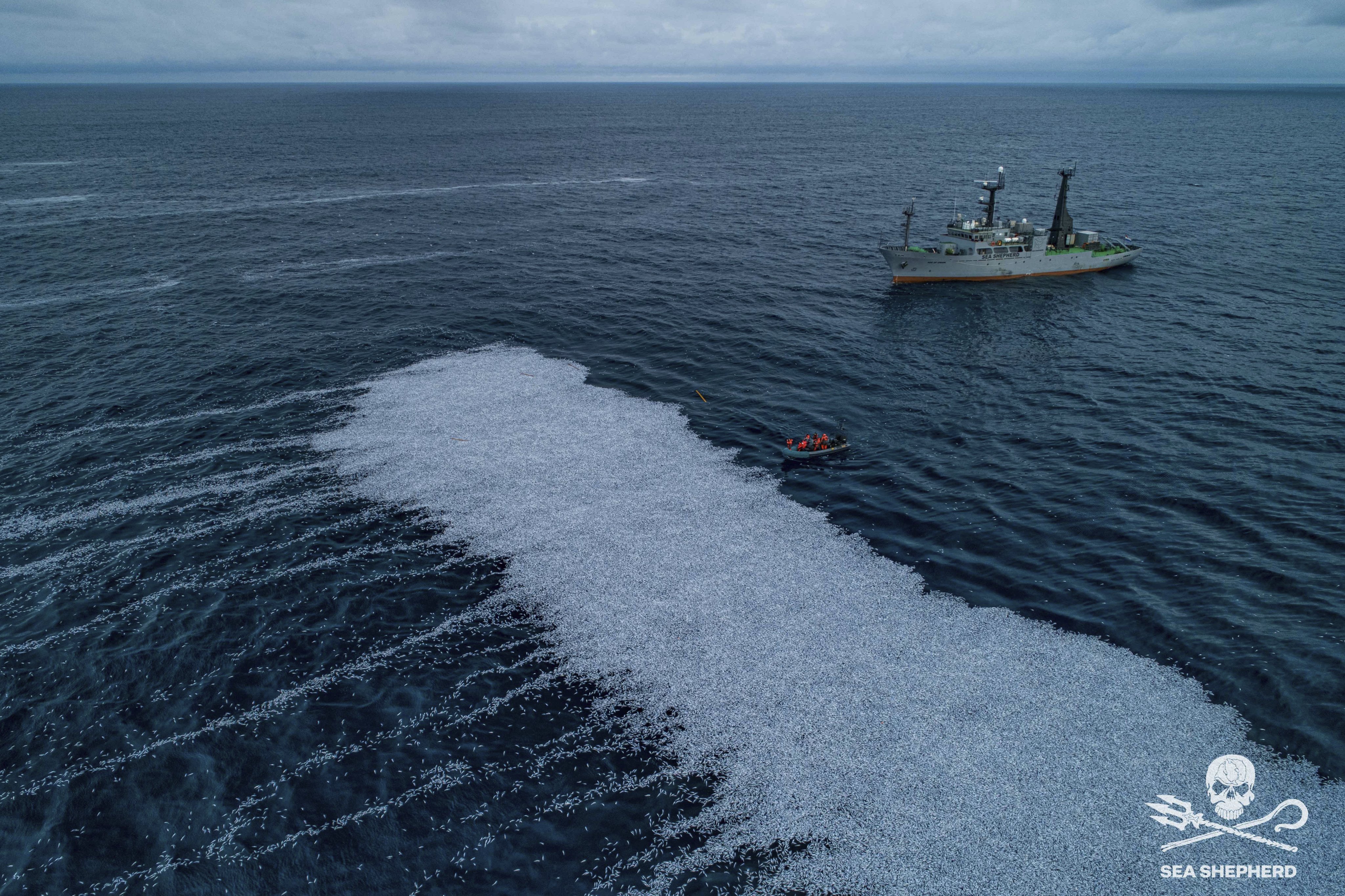
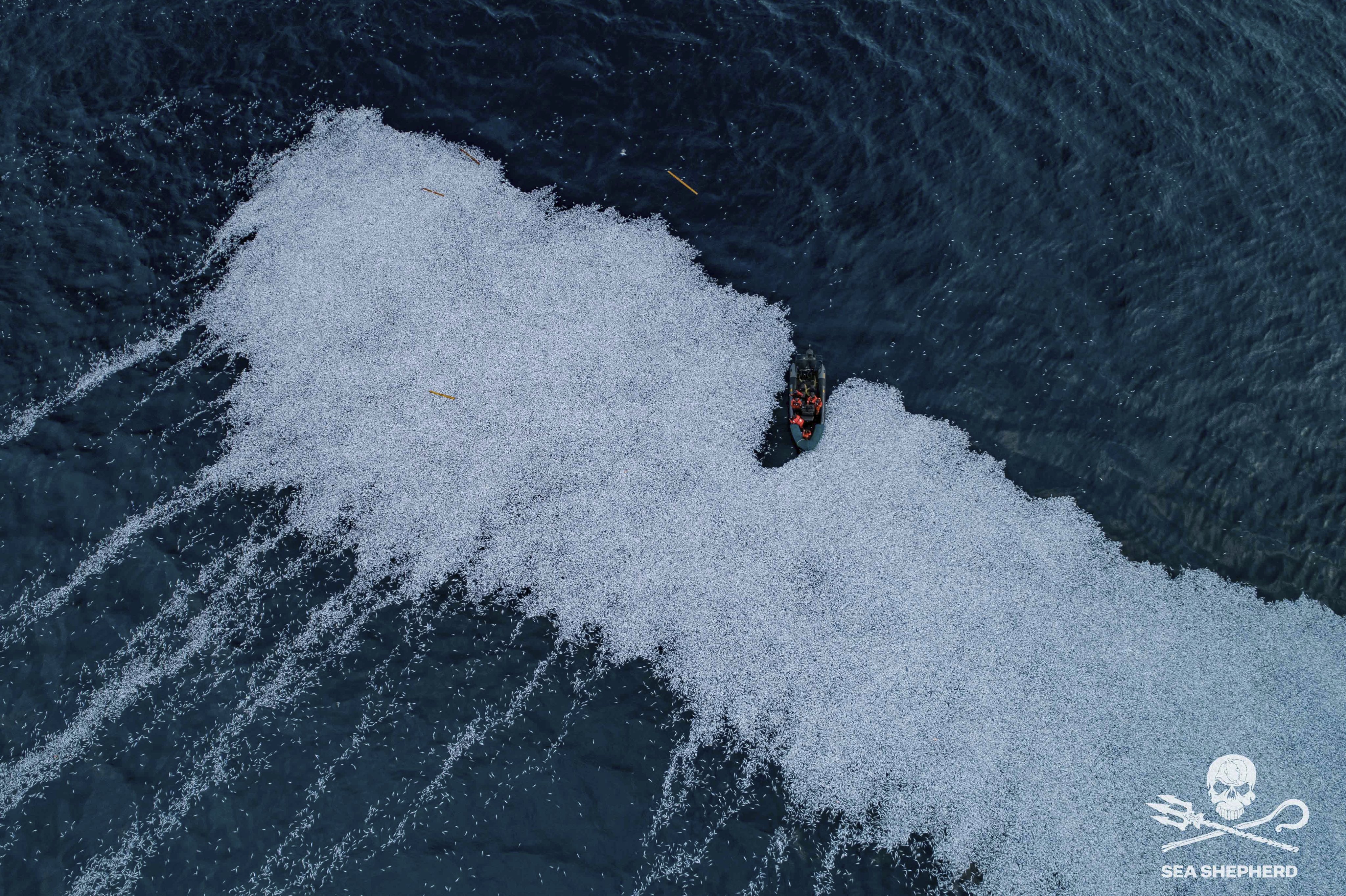

Sea Shepherd filmed the bank of dead fish, which it said covered 3,000 sq m
Fisheries Minister Annick Girardin tweeted (in French) that she was investigating, and that the images were shocking.
The EU Commissioner for Environment, Oceans and Fisheries, Virginijus Sinkevicius, also said he was seeking "exhaustive information and evidence about the case".

The Pelagic Freezer-Trawler Association issued a statement saying a net on the Margiris had ruptured at 05:50 local time (04:50 GMT) on Thursday morning, adding that this was a "very rare occurrence".
"In line with EU law, this has been recorded in the vessel's log book and reported to the authorities of the vessel's flag state, Lithuania," it said.
"In line with EU law, this has been recorded in the vessel's log book and reported to the authorities of the vessel's flag state, Lithuania," it said.
Links :
- The Sunday Times : Anger as supertrawler FV Margiris deposits 100,000 dead fish off French coast
- The Guardian : Shock in France after giant trawler sheds 100,000 dead fish off coast / UK drops ‘absurd’ case against Greenpeace for dropping rocks in sea
- Maritime Executive : Photos of Spilled Catch Shock European Fisheries Regulators
- GeoGarage blog : Supertrawlers 'making a mockery' of UK's protected seas / Trawler 14 times the size of UK fishing boats is plundering fish
Monday, February 7, 2022
Rotterdam to partly dismantle historic bridge for Jeff Bezos’s superyacht
Oceanco launched the Y721 at their shipyard in Zwijndrecht for Jeff Bezos .
The 127m/ 417ft three-masted schooner is not only Holland’s largest superyacht to date, but also the World's largest sailing yacht
Central section of Koningshaven Bridge to be removed to make way for Amazon founder’s $485m superyacht
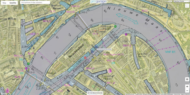
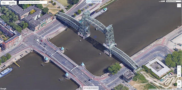
The Koningshaven bridge, known to Rotterdammers as De Hef.
on the GeoGarage platform (NLHO nautical raster chart)
A historic steel bridge in the Dutch port city of Rotterdam is to be partly dismantled to allow a superyacht built for Amazon founder Jeff Bezos to pass, local authorities have announced.
Bezos’s gigantic, 430-million-euro ($485m) yacht is too big for the iconic Koningshaven Bridge, which dates from 1878 and was rebuilt after being bombed by the Nazis in 1940 during the second world war.
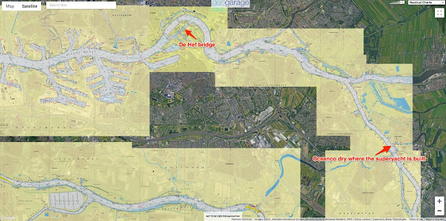
The shipyard building the three-masted mammoth in Alblasserdam, near Rotterdam, has asked the local council to remove the bridge’s central section so it can pass through.“It’s the only route to the sea,” a spokesperson for the mayor of Rotterdam told AFP, adding that the Amazon owner would foot the bill for the operation.
The decision has angered some in the Netherlands as the local council promised after a major renovation in 2017 that it would never again dismantle the bridge, known to Rotterdammers as De Hef.
The mayor’s office emphasised the economic benefits and jobs created by the construction of the boat, but promised that the bridge would be rebuilt in its current form.
The middle section of the huge steel-girdered bridge will be removed to give enough clearance for the 40-metre (130-foot) high boat, Dutch media reported.
The middle section of the huge steel-girdered bridge will be removed to give enough clearance for the 40-metre (130-foot) high boat, Dutch media reported.
The Y721 at the shipyard of Dutch shipbuilder Oceanco in Alblasserdam.
The process will take a few weeks and is expected to happen this summer.
Bezos, 57, is one of the world’s richest men after transforming online bookseller Amazon into a global shopping giant.
Links :
Sunday, February 6, 2022
Le Bassin d'Arcachon in winter
video : Drhon-el (Gabriel Grasso)


Photo credit: Image DRHON-EL
Links :