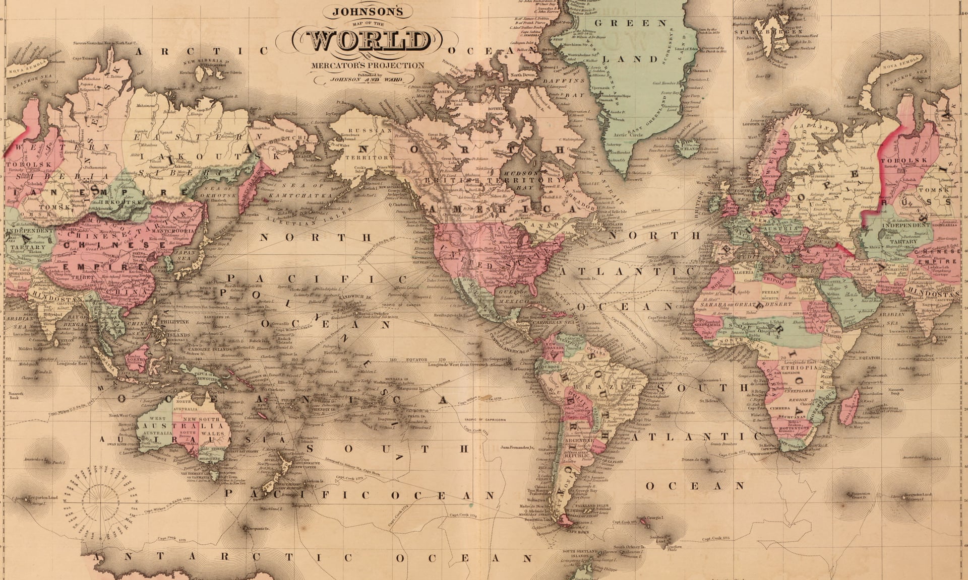
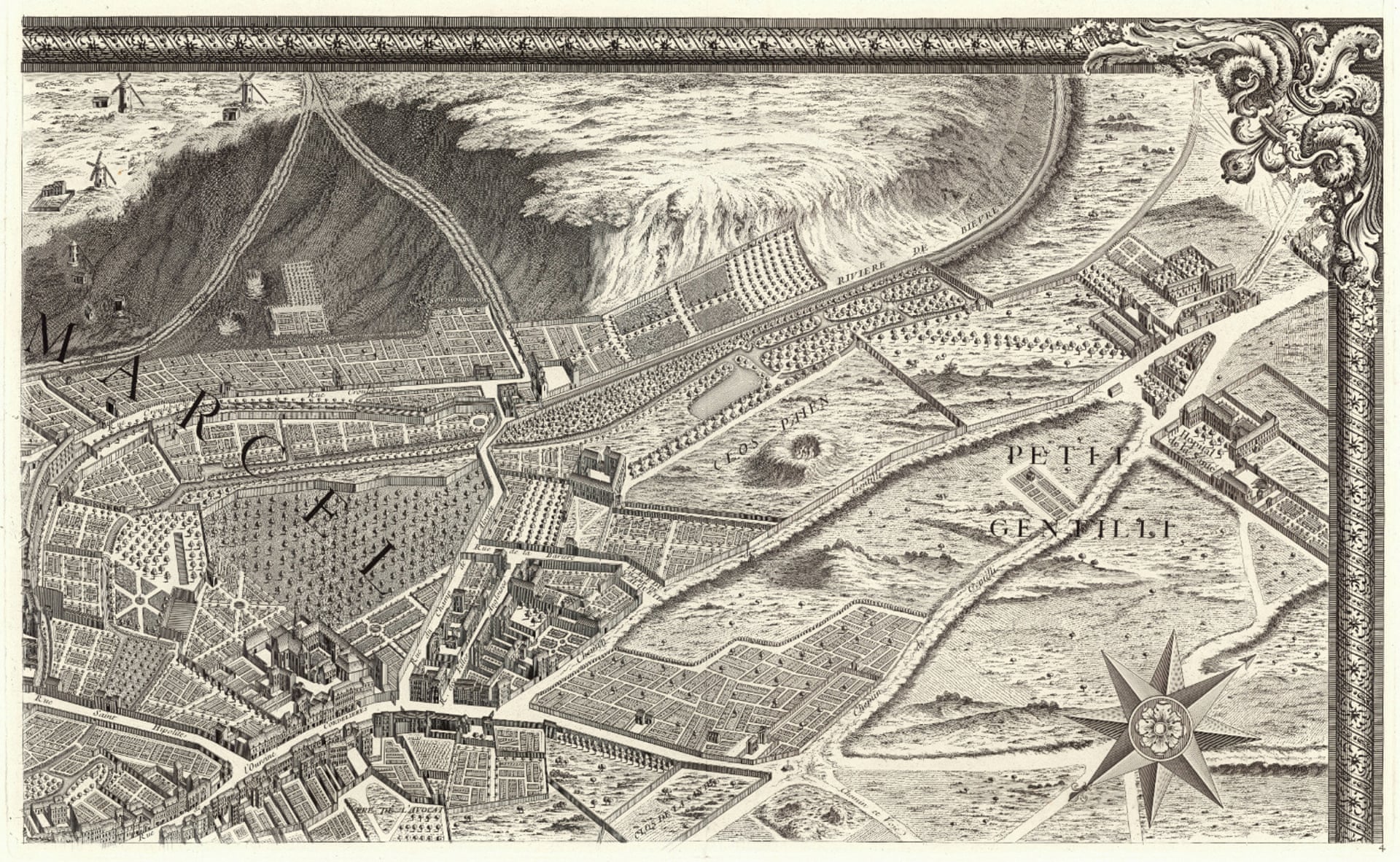
World Map circa 1900: Mercator Projection of the World.
Photograph: Buyenlarge/Getty Images
From The Guardian by Jeff Sparrow
Digital maps might be more practical in the 21st century, but the long tradition of cartography is magical
“Some for one purpose and some for another liketh, loveth, getteth, and useth Mappes, Chartes, & Geographicall Globes.”
So explained John Dee, the occult philosopher of the Tudor era.As someone who loves the #outdoors & loves his maps, I'm devastated to hear that hard copy topographic maps will become a thing of the past.https://t.co/LIy3XjwBbh— Martin Tye (@martinrev21) October 3, 2019
😞 pic.twitter.com/Wd9V0kPI4I
The mystical Dr Dee would, perhaps, have understood the passion stirred by Geosciences Australia’s recent decision to stop producing or selling paper versions of its topographic maps in December, citing dwindling demand.
In the 21st century, digital files might be more practical, particularly for a cash-strapped federal government agency.
But not everyone loveth and getteth their maps for purely practical reasons.
Just ask Brendan Whyte.
He’s a curator at the National Library of Australia, responsible for acquiring a copy of every map published in Australia, as well as managing a collection of perhaps a million or so charts and about the same number of aerial photographs.
A geographer by training, he knows that some people don’t appreciate electronic cartography.
“One of the problems, with the development of GIS [geographic information systems] and everyone making their own maps is that people just dump their data without thinking about the aesthetics or what the map is trying to tell a reader.”
A map, he says, needs beauty so that users want to look at it and absorb what it contains.
But that’s less about particular platforms, whether digital or otherwise, than the cartographer’s skill.
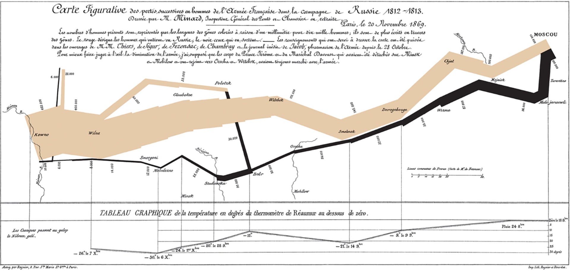
Figurative map of the successive losses in men of the French army in the Russian campaign 1812-1813, Charles Minard, 1869.
Photograph: Wikimedia
Whyte gives, as an example of what can be done with data, Minard’s famous map of Napoleon’s Russian campaign, on which a band represents both the progress and the extent of the Grande Armée juxtaposed against temperatures in 1812 and 1813, so that the viewer necessarily imagines the privations of a disintegrating army throughout a terrible Russian winter.
Whyte also admires the artistry of the Marshall Island stick charts from the NLA’s own collection.
It’s believed to be from the early 1970s.
“They’re thin pieces of coconut wood put together in a sort of lattice like a cat’s cradle and wherever there was an atoll they’d lash on [a] little cowrie shell to represent that island.
The bits of coconut wood represent the routes, the wave patterns, the winds, the currents.
So they’re not a geographical representation like a modern map, but more how a navigator might get from one island to another via the sea route in a canoe with a big sail.”
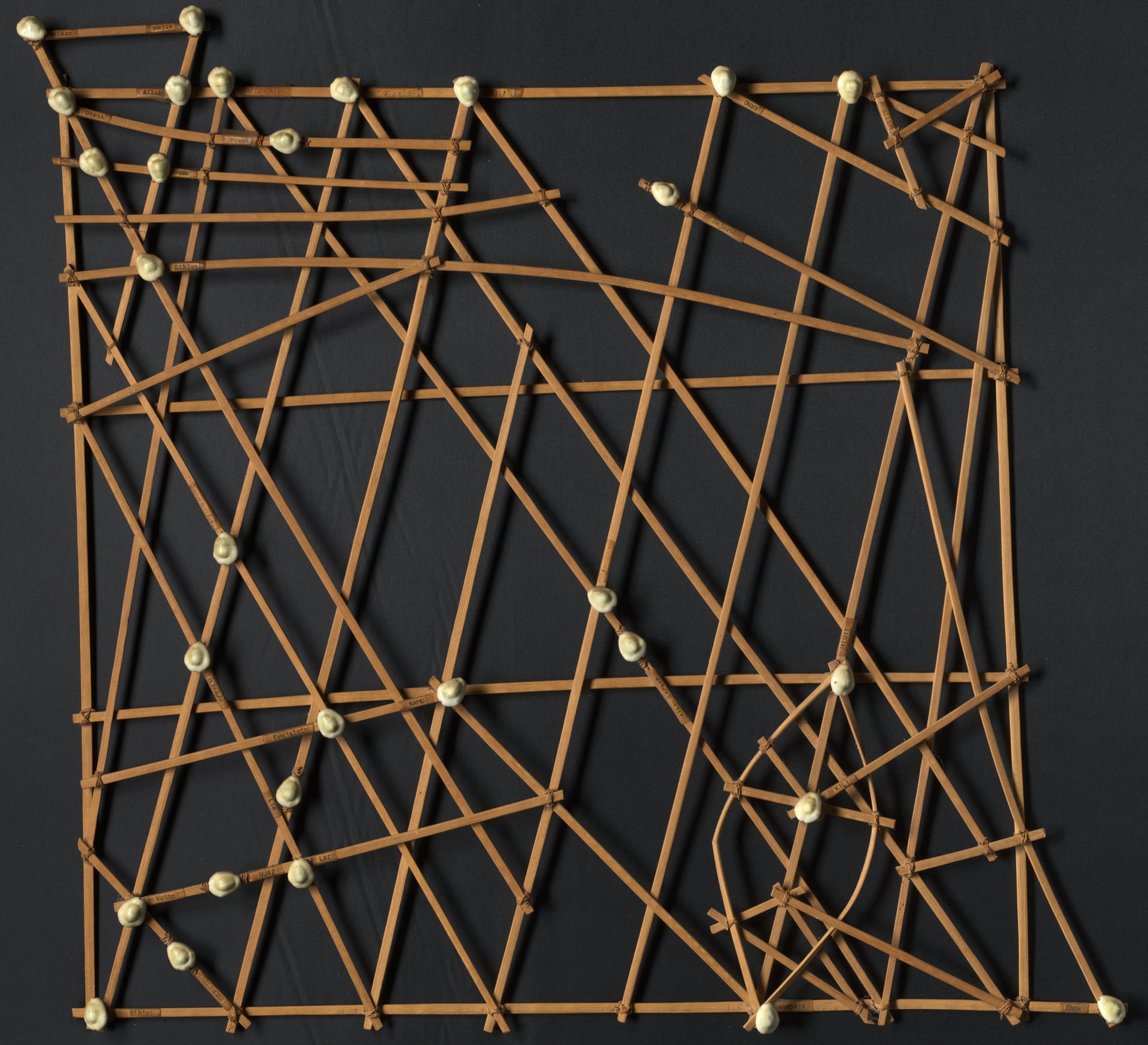
Stick chart of the Marshall Islands.
Photograph: National Library of Australia
His favourite catalogued item might also be one of the smallest, an atlas from Queen Mary’s dollhouse.
“A lot of publishing companies and authors produced real books for her dollhouse.
The famous map shop and publishers Stanfords made her the Atlas of the British Empire, reducing it to about two inches high.”
At the State Library of Victoria, the librarian Sarah Ryan also nominates an atlas – albeit a rather bigger one – as a particularly treasured item.
“It’s known as the first modern day atlas, even though it was produced in 1572: Ortelius’s Mirror of the World.
The printing of that volume is beautiful and the maps are very colourful, and you’ve got lots of iconography like sea monsters and ships and compass roses.”
She agrees that, while digital maps can be more convenient, a lot of people still prefer paper, particularly for recreational uses.
Ultimately, though, it’s relationships that matter.
“What pulls you to maps,” she says, “is that connection with people and place and culture.”
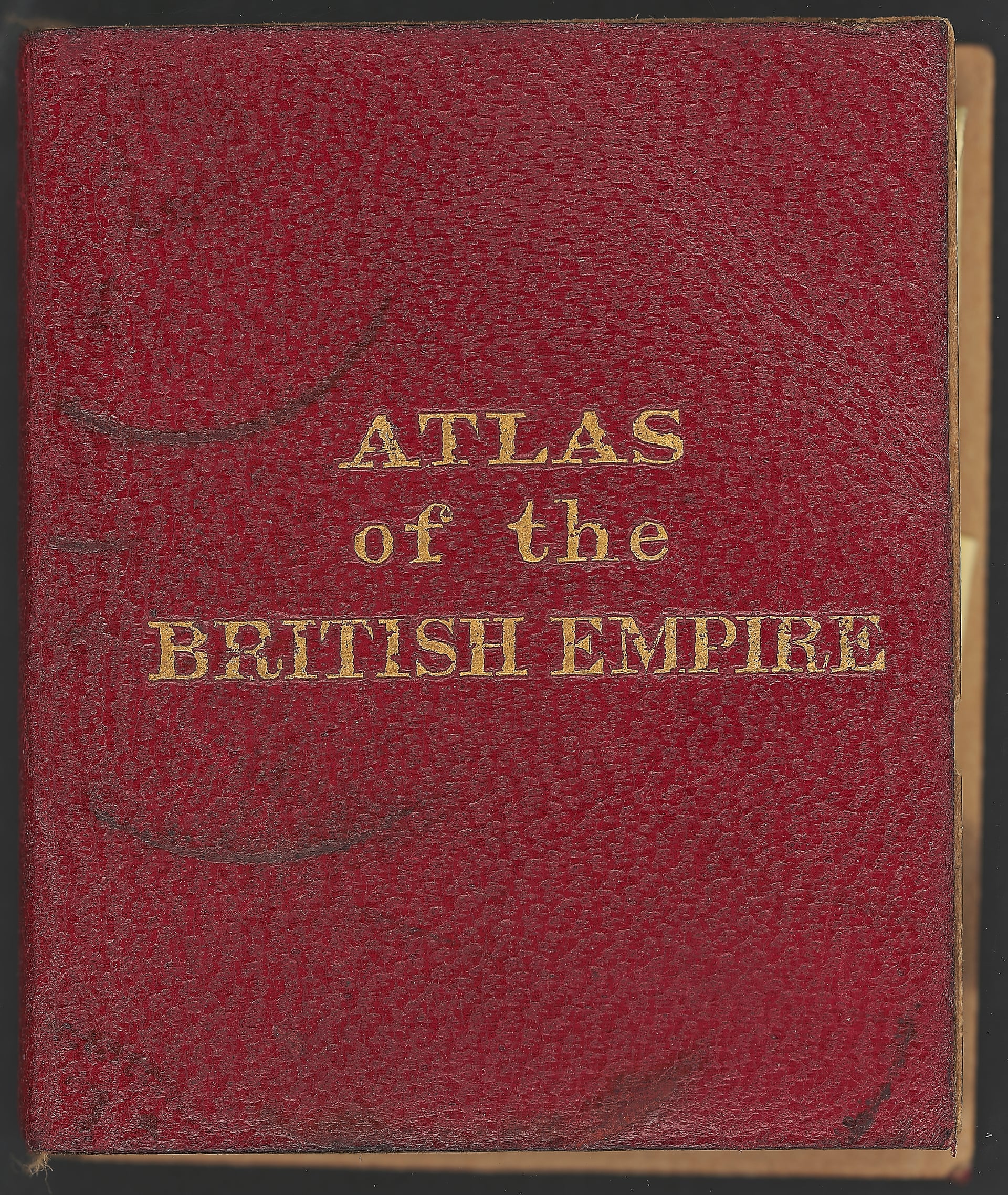
A miniaturised Atlas of the British Empire, made for Queen Mary’s dollhouse.
Photograph: National Library of Australia
By way of example, she talks of looking at the SLV’s Atlas of Paris from 1739, just after her own first trip to the city.
“I’d visited all those places, so that has a strong connection to me.”
Maps, of course, also document territorial claims.
David Rumsey Map Collection – Turgot Michel Etienne, Paris 1739.
Photograph: David Rumsey Map Collection
The catalogue describes the SLV’s rarest map as coming “from the survey of Mr Wedge and others”.
The attribution sounds innocuous until you identify the surveyor as the John Wedge who accompanied John Batman on his expedition across Bass Strait.
The yellowing paper thus signals the plans for a township in Port Phillip – and the beginning of Indigenous dispossession.
Yet, if maps represent power, they can also show change.
It’s a point made by Kay Dancey, the CartoGIS Services Manager at the College of Asia and the Pacific at the Australian National University.
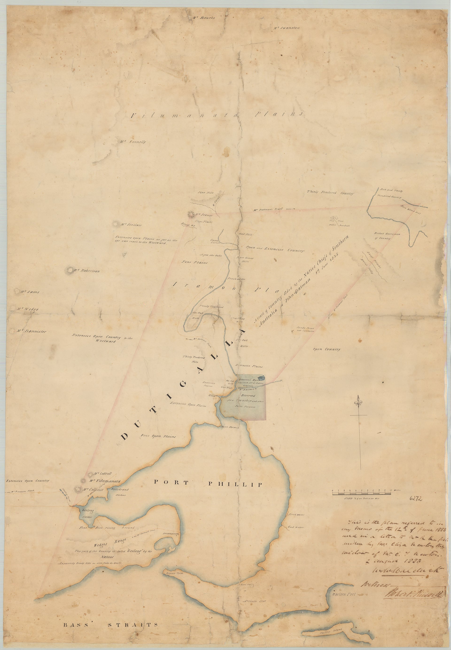
Map of Port Phillip from the survey of Mr Wedge and others.
Photograph: State Library Victoria
A cartographer by training, Dancey provides data visualisation for ANU researchers, as well as managing a collection of hardcopy and digital maps.
Her holdings feature items dating back to the 17th century, and include 18th-century works by the French hydrographer and philosopher Jacques-Nicolas Bellin.
“The sheer craft of how they produced these maps … They’re invariably copper engravings, and there’s such skill required in this process.
And then there’s the beauty: the fabulous colours and cartouches that they employ.”
But, when asked to describe a favoured map, she nominates something very different.
“There’s a lovely map here,” she says, “a wall map of Africa from the 1950s.
It’s one of my favourites because it has hand made corrections to the country name Zaire or the Democratic Republic of the Congo, as it is now.
I particularly love that because it has been in this mapping unit for 60 years and these hand annotations have been by made by cartographers over that time.
So it’s a gorgeous link back to the people who have worked as cartographers at the ANU, a reminder of changing sovereignties and what a map is: a snapshot of time and an abstraction of place.”
In that spirit, she notes the real innovations of digital technology making both data and mapping platforms more widely available, and thus facilitating what she calls “a democratising phase of cartography”.
The maps of Adam Mattinson provide an obvious example.
By day, Mattinson works as a geospatial analyst for an engineering firm.
In his own time, he uses his cartographic training to represent the local landscape in strange and fantastical forms.
In one project, he depicts a Melbourne constructed on Port Phillip as it looked in the Ice Age; in another work in progress, he imagines the city after massive rises in sea levels.
In the book How to Lie with Maps, Mark Monmonier notes what he calls “the cartographic paradox”.
To present complex information from a three-dimensional world clearly in two-dimensional format, the surveyor must abstract and distort.
In other words, as Monmonier says, “to present a useful and truthful picture, an accurate map must tell white lies.”
Mattinson’s work takes that idea to its logical conclusion.
He’s probably best known for his Tolkienesque depiction of the Yarra Ranges, in which The Patch looks almost like Hobbiton and the warning “Puffing Billy Roams this Area” appears alongside a depiction of a dragon.
“It’s covering an area in which I grew up,” he says.
“To me, the landscape there really lends itself to a Middle Earth kind of quality.”
As a child, Mattinson used to open the street directory at a random page and then trace his finger to find his way home.
“I think that’s where the passion for maps springs for a lot of kids.
They look at a map and they see that the world is bigger than they had thought.”
Though he works with digital platforms, he loves how physical maps encourage people to gather and discuss the landscape.
“It really is a perfect combination of art and science, cartography.
To have something that’s beautiful to look at but also an object you can look at and think, ‘Oh, I used to live near here’ or ‘I want to go there’ and so on.
It’s part of the beauty of mapping, the shared experience.”
A kind of magic, as John Dee understood.
Links :
- GeoGarage blog : Off the chart: the big comeback of paper maps / Why modern maps put everyone at the ... / The future of maps: Cartography in the 21st ... / Paper is past: Digital charts on the horizon ... / Use of Electronic Charts and publications in lieu of paper ... / Does NOAA want to stop making NOAA ... / The travel guide that charted our world / From Ptolemy to GPS, the brief history of maps
No comments:
Post a Comment