Red lines are flights, blue line are ship tracks and green lines are roads
Created by London-based data visualisation studio Kiln and the UCL Energy Institute
This video and interactive map of global ship movements based on AIS data is worth a minute of your time
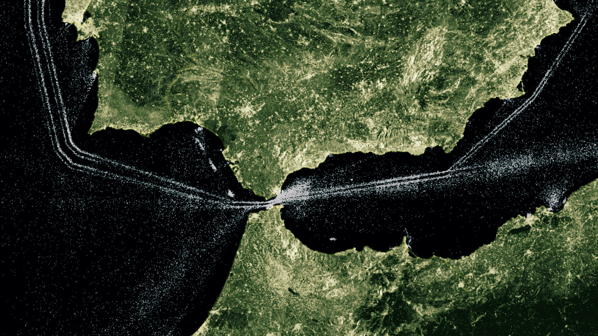
Computing the maximum of each pixel across a time series of Sentinel-1 images enables to visualize sea lanes.
When a ship is illuminated by Sentinel1’s radar, it returns a strong signal & a bright spot is captured, while sea surface absorbs most of the signal & looks darker
When a ship is illuminated by Sentinel1’s radar, it returns a strong signal & a bright spot is captured, while sea surface absorbs most of the signal & looks darker

Vessel density EMODnet map allows users to visualize vessel movement patterns & distribution of maritime traffic in EU waters by ship type.
Links :
- EMODnet
- StatMaps&Pix : Watching ships go by UK marine traffic
- GoogleMapsMania : Europe busiest shipping routes revealed / World map of shipping traffic
No comments:
Post a Comment