/cdn0.vox-cdn.com/uploads/chorus_asset/file/6882819/CartographicGrounds_finalcover.0.jpg)
In a world where our phones are our navigators, a new book argues mapmakers should make time for better design
/cdn3.vox-cdn.com/uploads/chorus_image/image/50285305/CartographicGrounds_fig2.12b.0.0.jpg)
Jean-Charles Adolphe Alphand, Plan des Courbes de Niveau du Parc des Buttes Chaumonts, Promenades de Paris. Paris: J. Rothschild, 1867–71.
Courtesy of the Frances Loeb Library, Harvard University Graduate School of Design
From navigating through our neighborhoods with Google Maps and watching our ride slowly approach on Uber, to dodging gridlock with Waze or hunting digital creatures with Pokemon, the average person spends more time with maps than ever before.
But during what could perhaps be called a cartographic golden age, at least on our mobile devices, are we losing some of the aesthetic pleasures and communicative power that comes from a well-designed map?

In the new book Cartographic Grounds: Projecting the Landscape Imaginary (Princeton Architecture Press), Jill Elizabeth Desimini, a professor of landscape design at Harvard University's Graduate School of Design, argues for a more holistic approach to mapmaking in the digital age.
The prevalence of Google Maps, an extremely functional and useful tool, can limit the scope of what we think a map can do, and just how much design can impact its effectiveness and communication potential. As users are presented with maps that contain more and more information, they tend to depend on them and their directions, she says, and lose their critical eye.
As cartography moves toward non-physical things, such as check-ins, and abstract forces, Cartographic Grounds raises the question of geographic precision and just what it means to map well.

This is a great 19th century map of Bordeaux France,
complete with nice illustrations of the waterfront.
“Even Google Maps has an aesthetic point of view,” says Desimini, “and people don’t always think about it. They make a lot of choices about how things are drawn and how information is presented. We take it as a kind of standard, and don’t really make demands about graphic quality, or think about what’s missing."

Discover the action around you with the updated Google Maps
see Google Maps blog
Cartographic Grounds, which she co-wrote with Charles Waldheim, looks at mapping through the lens of design.
Each of the book’s 10 section explore a different convention, such as shaded relief and cross-hatching, showcasing various approaches in an attempt to argue for a more design-oriented approach to cartography.

Map of Biarritz, France, published around 1914 by German cartography firm, Wagner and Debes.
courtesy of IDVsolutions
Centuries of case studies, from ancient watercolors of European cities to computer generated climate surveys, offer a meditation of minimalism and good communication.
The underlying message, of simple and considered visual communication, reads like a page from the book of Edward Tufte.
Desimini believes there is a happy medium for modern cartographers, a place where precise design meets the functionality of modern mobile apps.
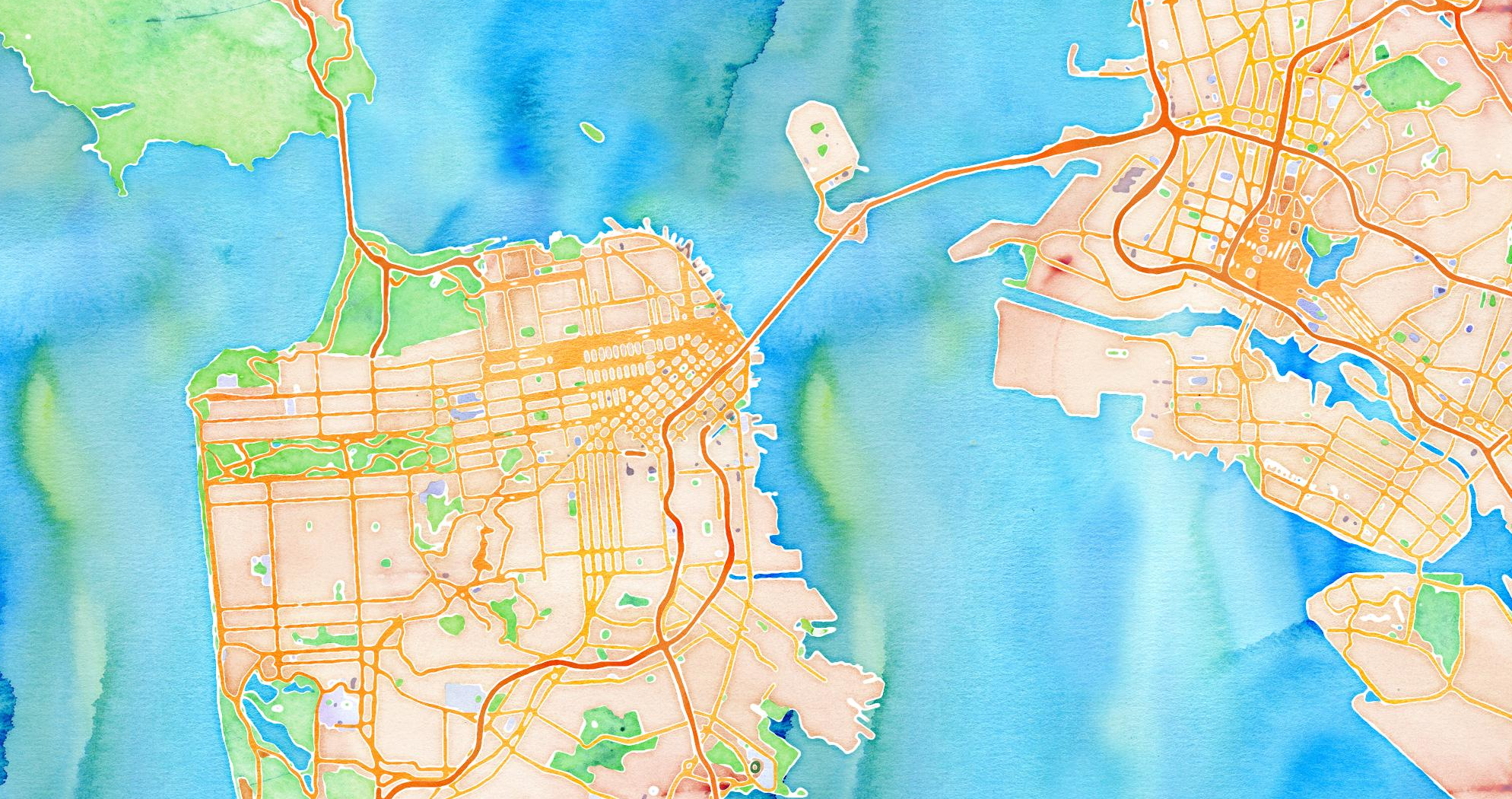
Stamen watercolors
She points to the work of a studio such as Stamen Design in San Francisco as great examples of work that meets the high bar we set for maps in the digital age, cutting through the clutter while still being data rich.
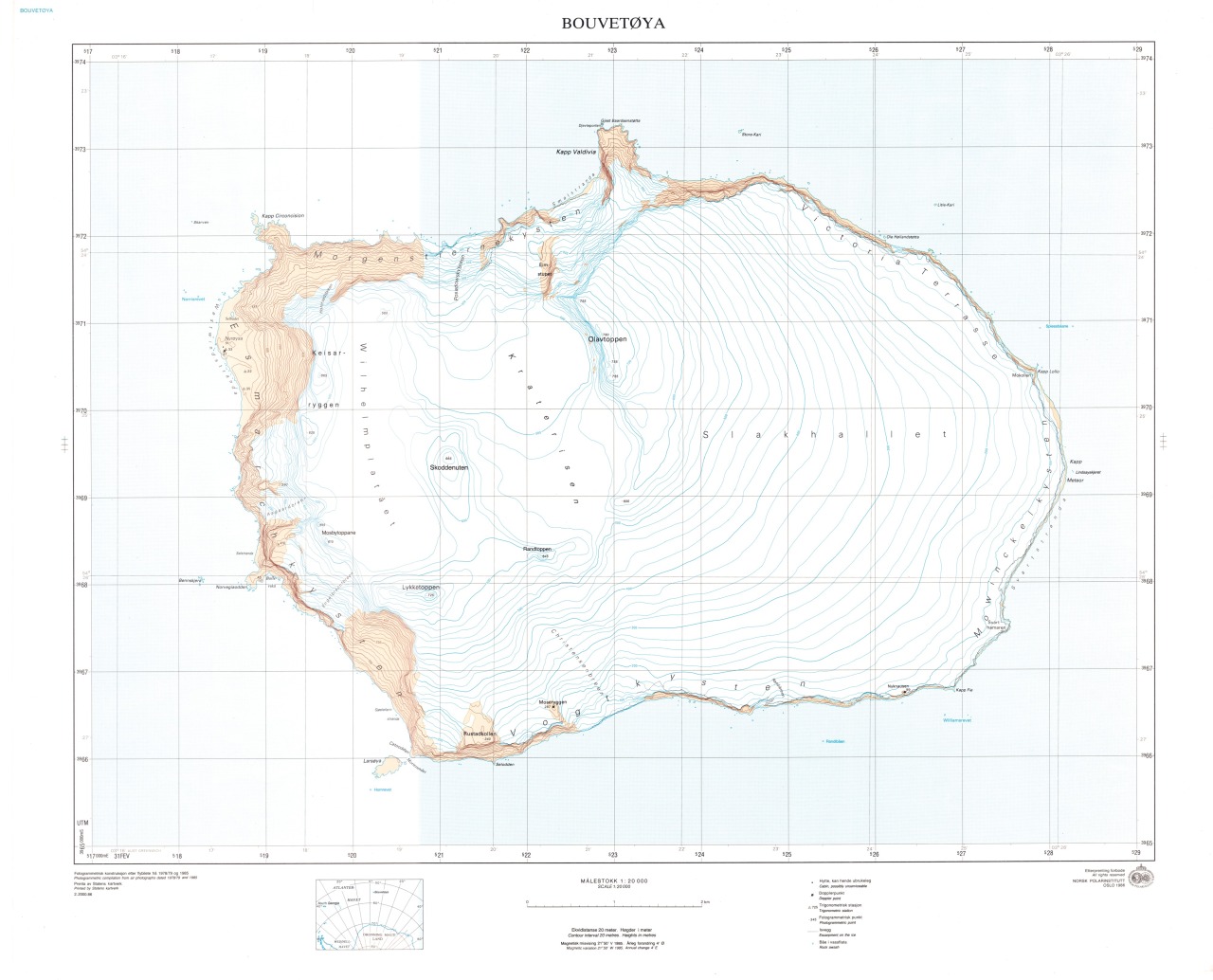
Bouvet island (Norsk Polar Institute)
Desimini says that at a time when our basic cartographic literacy is being challenged—think of how many times you or someone you know has struggled with directions when their phone dies—it’s more important than ever to make room for good design.
“The more ubiquitous something like Google Maps becomes, the less likely we are to look at other types of information,” she says.
“I’m arguing for multiple points of view, and maps that would allow us to see the world differently and respond in different ways.”
Links :
- ESRI : Charting a course
No comments:
Post a Comment