.1411593200653.jpg)
The first known compass rose depicted on a map, in a detail from the Catalan Atlas from 1375, attributed to cartographer Abraham Cresques of Majorca.
Bibliotheque national de France/Wikipedia
From BBC by Caroline Williams
Why are almost all modern maps the same way up?
Caroline Williams explores the intriguing history that led to this orientation – and discovers why it shapes how we see the world in more ways than we realize.
Imagine looking at the Earth from space.
What is at the top of the planet?
If you said the North Pole, you probably wouldn’t be alone.
Strictly speaking, you wouldn’t be right either.
The uncomfortable truth is that despite almost everybody imagining that the world is this way up, there is no good, scientific reason to think of north as being the roof of the world.
The story of how it came to be considered to be that way is heady mix of history, astrophysics and psychology.
And it leads to an important conclusion: it turns out that the way we have decided to map the world has very real consequences for how we feel about it.
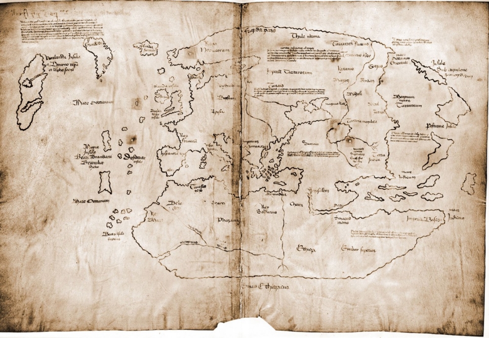
The Vinland map, a 15th century world map purportedly based on a 13th century original.
If authentic, it is the first known depiction of the North American coastline.
Yale University/Wikipedia
Navigating brain
Understanding where you are in the world is a basic survival skill, which is why we, like most species come hard-wired with specialised brain areas to create cognitive maps of our surroundings.
Where humans are unique, though, with the possible exception of honeybees, is that we try to communicate this understanding of the world with others.
We have a long history of doing this by drawing maps – the earliest versions yet discovered were scrawled on cave walls 14,000 years ago.
Human cultures have been drawing them on stone tablets, papyrus, paper and now computer screens ever since.
Given such a long history of human map-making, it is perhaps surprising that it is only within the last few hundred years that north has been consistently considered to be at the top.
In fact, for much of human history, north almost never appeared at the top, according to Jerry Brotton, a map historian from Queen Mary University, London and author of A History of the World in Twelve Maps.
“North was rarely put at the top for the simple fact that north is where darkness comes from,” he says. “West is also very unlikely to be put at the top because west is where the sun disappears.”
Confusingly, early Chinese maps seem to buck this trend. But, Brotton, says, even though they did have compasses at the time, that isn’t the reason that they placed north at the top.
Early Chinese compasses were actually oriented to point south, which was considered to be more desirable than deepest darkest north.
But in Chinese maps, the Emperor, who lived in the north of the country was always put at the top of the map, with everyone else, his loyal subjects, looking up towards him.
“In Chinese culture the Emperor looks south because it’s where the winds come from, it’s a good direction. North is not very good but you are in a position of subjection to the emperor, so you look up to him,” says Brotton.

The Kangnido map, a Chinese-influenced Korean map from 1402 (Credit: Wikipedia)
Given that each culture has a very different idea of who, or what, they
should look up to it’s perhaps not surprising that there is very little
consistency in which way early maps pointed.
In ancient Egyptian times
the top of the world was east, the position of sunrise.
Early Islamic
maps favoured south at the top because most of the early Muslim cultures
were north of Mecca, so they imagined looking up (south) towards it:

Muhammad Al Idrissi’s map Tabula Rogeriana from 1154, upside down with north at the top (Credit: Wikipedia)
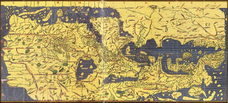
Konrad Miller’s 1929 re-creation of al-Idrisi's famous Tabula Rogeriana from 1154.
Bibliotheque nationale de France/Wikipedia
Christian maps from the same era (called Mappa Mundi) put east at the top, towards the Garden of Eden and with Jerusalem in the centre.

The Hereford Mappa Mundi from 1300 (Credit: Wikipedia)
So when did everyone get together and decide that north was the top?
It’s tempting to put it down to European explorers like Christopher
Columbus and Ferdinand Megellan, who were navigating by the North Star.
But Brotton argues that these early explorers didn’t think of the world
like that at all.
“When Columbus describes the world it is in accordance
with east being at the top,” he says. “Columbus says he is going
towards paradise, so his mentality is from a medieval mappa mundi.”
We’ve got to remember, adds Brotton, that at the time, “no one knows
what they are doing and where they are going”.

Nicolas Desliens 1566 upsidedown map
Mercator’s
world map, from 1569, was almost certainly a defining moment in
north-up map-making. His map was famously the first to take into account
the curvature of the Earth, so that sailors could cross long distances
without overshooting the mark.
Again, though, Brotton says that north
had little to do with it.
“Mercator projected the poles to infinity. He
says in his description that it doesn’t matter because we are not
terribly interested in sailing to them. North is at the top but nobody
cares about north because we’re not going there.”
Even so, he
could have put the map either way up.
Perhaps the choice was simply
because the Europeans were doing most of the exploring at the time: in
the northern hemisphere, there is far more land to explore and far more
people.
Whatever the reasons, north up is an idea that seems to have stuck.
Take
this famous Nasa image from 1973.
This photograph was actually taken
with south at the top, because the astronaut who took it was spinning
around at the time.
Nasa decided to flip it over to avoid confusing
people.

This image of Earth was photographed this way round, but flipped before publication (Credit: Nasa)
When you start looking at the Earth from space though, the idea of it
being any particular way up starts to make even less sense.
It’s true
that, as we all learned in school, the Earth lines up along the same
plane as all of the other planets in the solar system because they all
formed out of the same cloud of spinning dust.
It is also true, though,
that this picture could just as easily be put upside down or with the
Sun at the top or bottom, depending on where in space you happen to be
looking from.

And compared to the rest of the Milky Way, our entire solar system is off kilter by about 63 degrees.
While astronomers have found that stars and planets align with their neighbours in similar ways all over space,
Daniel Mortlock, an astrophysicist at Imperial College London, says
that this is only true at a tiny scale compared to the vastness of the
Universe.
“As far as we astronomers can tell, there really is no ‘up’ or
‘down’ in space,” he says.
So the answer to the question of which
way up is the Earth is simple: it is not any particular way up and
there is no good reason other than a historical superiority complex to
think of north as being the top of the world.
Yet is it time to
start embracing a different view of the planet from the one we are used
to?
Perhaps, because evidence from psychology suggests that our north-up
culture might be polluting the way we think of what is valuable in the
world.

Could there be a northern bias that shapes how we think about some parts of the planet?
(Credit: Nasa)
A well-known bias in psychology reveals that most people think of
north as being ‘up’ and south, ‘down’. Brian Meier, a psychologist at
Gettysberg College in Pennsylvania, has also found that people
unconsciously process positive words as if they were higher in space
than negative ones.
So he wondered whether these two things, north = up
and good = up affect the value that people put on different areas on a
map.
Sure
enough, when shown a map of a hypothetical city and asked where they
would like to live, people were significantly more likely to choose an
area in the north of the city.
And when another group of people were
asked where fictitious people of different social status would live,
they plotted them on the map with the richest in the north and poorest in the south.
It
isn’t too much of a stretch to think that people are less likely to
care what happens in countries or regions that are ‘lower’ than them on
the map or globe.

It ignores the norm (north on top) to lift Australia “out of the darkness of anonymity”.
And give it “its rightful position of dominance over its northern neighbors.”
The good news is that in Meier’s experiments the
relationship between ‘north’ and ‘good’ was eliminated by one simple
thing – turning the map upside down.
So perhaps the world might get a
little fairer if we just took a look at it another way up now and again.
South-up maps are
easily available online.
It is also something that Mortlock is very
much in favour of: “As an Australian, I think it should be done more
often,” he says.
If nothing else, it’s a sure-fire way to make the
world seem fresh, and unexplored, once more.
With so few earthbound
discoveries left for our generation to make, all we can do is – to
paraphrase Marcel Proust – look again at the world we’ve got, but this
time, through different eyes.
Links :
- Aljazeera : How the north ended up on top of the map
- Wikipedia : South-up map orientation
No comments:
Post a Comment