
From The Washington Post by
Over the years, scientists have attempted to visually communicate the Earth’s warming in many ways. They’ve developed an array of maps, charts, and animations that present an unmistakable picture of a warming world.
But I’ve seen no visual as striking and effective as the infographic posted to Twitter Monday by climate scientist Ed Hawkins.
Hawkins illustrates the warming in a series of circles, each one portraying a year in the historical climate record spanning 1850 and the present.
As time passes and the planet warms, the circles expand outward.
Together the circles are part of one unwinding spiral, which serves as a fitting metaphor for the long-term course of the Earth’s temperature.
Individually, the circles behave somewhat erratically.
At times, especially early in the record, the circles contract, conveying periods of cooling.
There are also periods when the circles are packed close together, signifying little temperature change.
But as time wears on, especially over the past few decades, you see more outward leaps, when climate warming is speeding up.
Of particular interest is the most recent burst coincident with the temperature increase of 2016. It is clearly warmer than anything preceding it by some distance and approaching 1.5 degrees Celsius above the baseline average.
The graphic plainly illustrates how unusual this year is in a long-term context, and it’s not difficult to see why climate scientists believe it is nearly certain to be the warmest year on record.
Hawkins also created a more conventional chart, shown below, which is also extremely effective at showing how anomalous 2016 is.

But the motion of the spiral animation makes it stand out among climate warming visualizations.
It unambiguously shows the planet’s relentless march toward higher temperatures, but without losing the interesting complexity seen in the year-to-year movements.
“The animated spiral presents global temperature change in a visually appealing and straightforward way,” Hawkins wrote on his blog, the Climate Lab Book.
“The pace of change is immediately obvious, especially over the past few decades.”
The animation uses global temperature data from the Hadley Centre of the United Kingdom’s Met Office.
Below are some other visuals which, in my view, also do a good job illustrating global warming:
This visualization illustrates Earth’s long-term warming trend, showing temperature changes from 1880 to 2015 as a rolling five-year average.
Orange colors represent temperatures that are warmer than the 1951-80 baseline average, and blues represent temperatures cooler than the baseline.
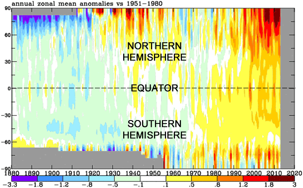
Produced by NASA, the chart illustrates how temperatures have compared
to “normal” (or the 1951-1980 average) from 1880 to present, from pole
to pole (-90 latitude to 90 latitude).

Global warming in one bar graph
No comments:
Post a Comment